
Today, creating content on the Internet is the norm, not the exception. It has never been easier to build a personalized website, digitalize a product and start seeing results. But what happens when we all start creating content on a massive scale, filling the web with more and more data, and storing hundreds of zettabytes of content?
Well, it is right at that moment when big brands and hosting platforms, such as Google or Netlify, seek solutions to optimize the data we generate, make the web lighter, and therefore faster, promoting measures and techniques to improve our website’s performance, and rewarding those who do so with better positions in the ranking of their search engines. That is why, today, Web Performance is as important and trendy as having an online presence.
Table of Contents:
What Is Web Performance?
Web performance refers to the speed at which a website loads, how fast it’s downloaded, and how an app is displayed on the user’s browser. It is both the objective measurement and the perceived user experience (UX) of an application.
If you minimize load times, improve UX and make your website faster, more users will be able to access your site regardless of device or Internet connection, increase visitor retention, loyalty, and user satisfaction, and this will ultimately help you achieve your business goals and rank better in search engines.

The Relation Between Images And Web Performance
It is clear that when we think of content, the first thing that comes to mind is text. But if we leave text aside, what other options are left? Video? Images? Yes, images play a very important role on the web today, not only on platforms that are 100% focused on this asset, such as Pinterest or Unsplash, but on most of the web pages we browse on a daily basis.
According to the Web Almanac in late 2021, 95.9 percent of pages contain at least one
<img>tag, and 99.9 percent have generated at least one request for an image resource.
And, just as the use of images is so present in content creation, optimizing them is key to improving our page load speed and rendering it in the shortest possible time, as images are responsible for more bytes than any other resource. Although in the last years, the size of the image transfer per page has been reduced, thanks to the use of new image optimization techniques, there is still a lot of work to be done.

Images are crucial elements for performance and UX, and data extracted from Core Web Vitals metrics such as Largest Contentful Paint, which attempts to identify the most important piece of the above-the-fold content on a given page, proves this.
According to the analysis carried out in the performance section of Web Almanac, the img tag represents 42% of the LCP elements of websites, while 71-79% of the pages have an image as an LCP element, because they can also be applied as background using CSS. This data makes it clear that there will be no good performance without well-optimized images.
Key user-centric metrics often depend on the size, number, layout, and loading priority of images on the page. This is why a lot of our guidance on performance talks about image optimization.
Why Image Optimization Is So Important For A Jamstack Site?
As you may already know, image optimization is the process that a high-quality image has to go through to be delivered in ideal conditions, sometimes with the help of an Image Transformation API and a global Content Delivery Network (CDN) to make the process simpler and scalable.
And while optimizing images is a must in any application, in the Jamstack ecosystem, it is even more paramount, considering that one of the main goals of the Jamstack architecture is to improve web performance.
Jamstack is an architectural approach that decouples the web experience layer from data and business logic, improving flexibility, scalability, performance, and maintainability.
A Jamstack site is decoupled: the front end is separated from the backend and pre-built into highly optimized static pages before being deployed. But it’s not all static. It also allows dynamic content by using JS and APIs to talk to backend services.
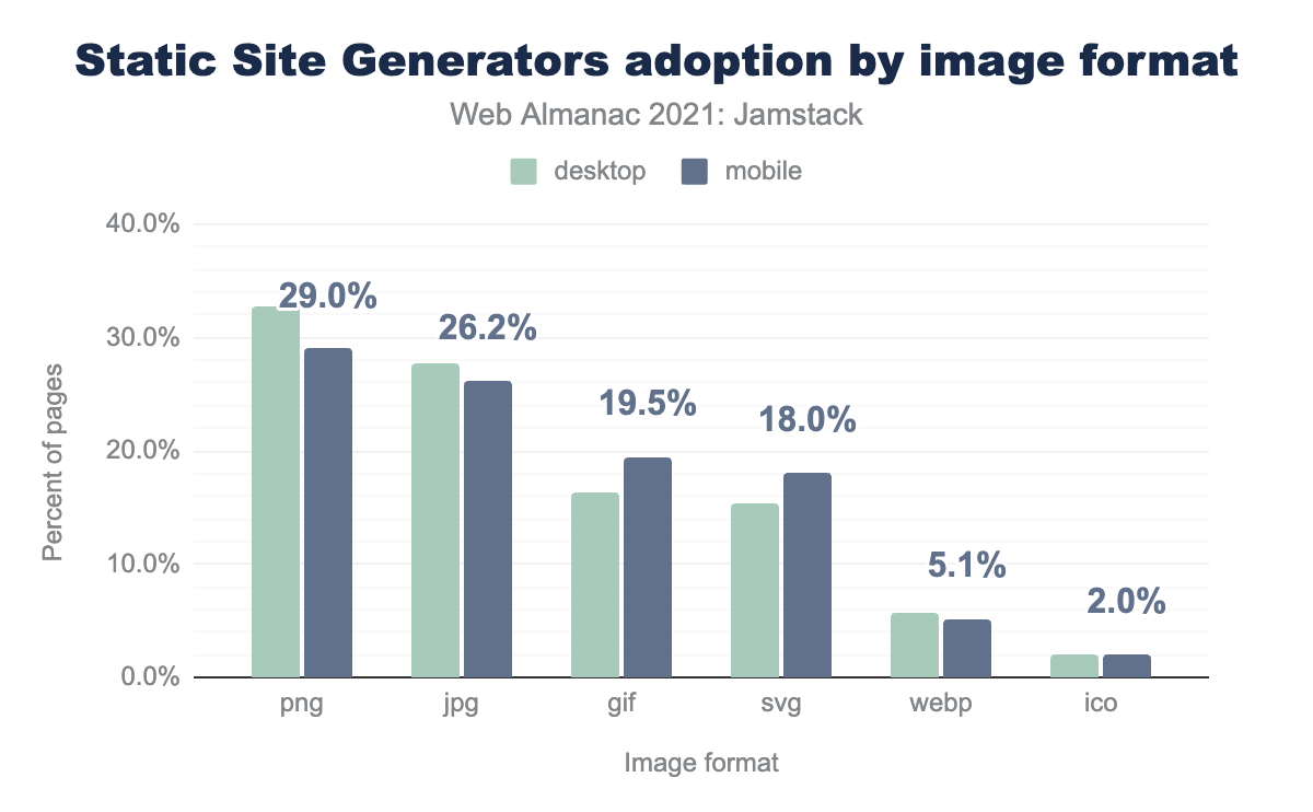
And you might ask, what do images have to do with this static site architecture? As Web Almanac addresses in the section on the impact of images on Jamstack sites, images are the main bottleneck for a good UX. Most of the blame lies with using older formats, such as PNG and JPEG, instead of using the next generation ones, such as WebP or AVIF, making the user wait too long and producing poor scores in Core Web Vitals metrics.
But if you’re worried that you’re not getting the performance you expected because of large, poorly optimized images, don’t worry because that’s what you’re reading this article for!
Fixes To Common Problems
In most web performance measurement tools, such as WebPageTest or PageSpeed Insights, when we generate a report on the status of our website, we can find parameters related to images. These parameters talk about the size, format, encoding, and so on, namely how optimized our images are.
In this section, we will enumerate the problems that usually appear due to the use of images and what would be the theoretical optimization technique for each of them.
1. Use Compressed Files
Imagine working on a project like DEV.to, where hundreds of people can upload content to your platform without being reviewed. In such a case, it would be expected for your project to have large, high-resolution images, as not everyone is aware of the bandwidth consumption and the slowdown in loading times that this entails.
Solution
Clearly, we want to give freedom to our content creators, but we can leave to chance neither the resolution nor the speed of delivery and download of the images that will be displayed on our website.
The solution is to optimize our images, compressing them and reducing their size with almost no loss of quality. There’re two well-known compression techniques:
- Lossy compression
This compression type uses algorithms that eliminate the less critical data to reduce the file size.
When considering the use of this lossy technique, we must keep two things in mind: by discarding part of the image information, the image quality will be negatively impacted, and if someone were to compress a picture with this technique and we wanted to compress it again, it would lose even more quality. - Lossless compression
On the other hand, lossless compression compresses the data without interfering with the image quality.
This technique allows the images not to lose quality in subsequent compressions. Still, it leads to a larger file size, which we try to avoid in cases where quality is not a game changer for the project’s value proposition.
When deciding on one of these techniques, the most important thing is to know our users and what they are looking for from our website. If we think about social networks, we can see two clear trends, those focusing on text and those focusing on multimedia content.
It is clear that for text-focused social networks, losing a little bit of image quality is not a big problem for them and can reduce a fifth of the image file size, which would mean a big increase in performance. So it is clear that lossy compression would be the ideal technique for that case. However, for social networks focused on image content, the most important thing is delivering images with exceptional quality, so lossless compression would play a better role here.
Tip: While using an Image Service CDN, compression is usually included, but it is always good to know more tools that can help us compress our images. For that, I bring you open-source tools that you can use to add image compression to your development workflow:
- Calibre Image Actions is a GitHub Action built by performance experts at Calibre that automatically compresses JPEGs, PNGs, and WebPs in Pull Requests;
- Imgbot, which will crawl your image files in GitHub and submit pull requests after applying a lossless compression.
2. Serve In Next-generation (Next-gen) Formats, Encode Efficiently
Part of the problem above may be due to the use of older image formats such as JPG and PNG, which provide worse compression and larger file sizes. But not only is compression an essential factor in deciding whether to adopt a next-gen image format, but also the speed of its encoding/decoding and the quality improvement.
While it is true that in recent years we have heard a lot about next-gen formats such as WebP, AVIF, or JPEG XL, it is still surprising how many websites have not migrated to these formats and continue providing bad UX and bad performance results.
Solution
It is time for us to move to a better world, where the compression of our images and their quality have no direct relationship, where we can make them take up as little space as possible without changing their visual appearance, and where next-gen formats are used.
By using next-gen formats, we will be able to reduce the size of our images considerably, making them download faster and consume less bandwidth, improving the UX and performance of our website.
“Modern image formats (AVIF or WebP) can improve compression by up to 50% and deliver better quality per byte while still looking visually appealing.”
— Addy Osmani (Image optimization expert)
Let’s look at the two most promising formats and how they differ from each other.
It is an image format that supports lossy and lossless compression, reducing file size by 25-34% compared to JPEG, as well as animation and alpha transparency, offering 26% less file size than PNG. It was a clear substitute for these formats until AVIF and JPEG XL came out.

Its advantages are its uniform support across most modern browsers, its lossless 8-bit transparency channel and lossy RGB transparency, and support for metadata of various types and animations. On the other hand, it does not support HDR or wide-gamut images, nor does it support progressive decoding.
It is an open-source AV1 image file format for storing still and animated images with better lossy and lossless compression than most popular formats on the web today, offering a 50% saving in file size compared to JPEG. It is in direct competition with JPEG XL, which has similar compression quality but more features.

The advantages of the AVIF format are that it supports animations and graphic elements where JPEG has limitations, improves JPEG and WebP compression, supports 12-bit color depth enabling HDR and wide color gamut, monochrome and multichannel images, and transparencies with alpha channel. However, the major drawback of AVIF is that it is not compatible with all browsers and its encoding/decoding is more expensive in terms of time and CPU, causing some Image CDNs to still not apply AVIF as an automatic format.
Note: If you want to know the differences between each format in detail, I recommend you read the article “Using Modern Image Formats: AVIF And WebP” by Addy Osmani, and trying out the AVIF and WebP quality settings picker tool.
And remember, regardless of which format you choose, if you want an effective result, you must generate the compressed files from a master image of the best possible quality.
Extra tip: Suppose you want to take advantage of the features of an image format with limited browser support. In that case, you can always use the <picture> HTML tag, as shown in the code below, so that the browser can pick the image format supported in the order provided.
<picture> <!-- If AVIF is not supported, WebP will be rendered. --> <source srcset="img/image.avif" type="image/avif"> <!-- If WebP is not supported, JPG will be rendered --> <source srcset="img/image.webp" type="image/webp"> <img src="img/image.jpg" width="360" height="240" alt="The last format we want">
</picture>
3. Specify The Dimensions
When the width and height attributes have not been added to the <img> tag, the browser cannot calculate the aspect ratio of the image and therefore does not reserve a correctly sized placeholder box. This leads to a layout shift when the image loads, causing performance and usability issues.

<img> HTML tag without width and height attributes before and after rendering, showcasing the layout shift. (Large preview)Solution
As developers, it is in the palm of our hands to improve the UX and make the layout shifts less likely to happen. We already have part of the way done by adding width and height to the images.

<img> tag with width and height attributes before and after rendering, showcasing the placeholder box. (Large preview)At first glance, it seems like a simple task, but in the background, browsers do a tedious job of calculating the size of these images in different scenarios:
- For images that are resized in responsive design.
If we have a responsive design, we will want the image to stay within the margins of the container, using the CSS below for that:
img { max-width: 100%; height: auto;
}
For browsers to calculate the aspect ratio and then the correct size of our images before loading, our <img> tag must contain the defined height and width attributes when we specify the height (or width) in the CSS and the opposite property, width (or height), as auto.
If there is no height attribute in the <img>, the CSS above sets the height to 0 initially, and therefore there will be a content shift when the image loads.
<img src="image.webp" width="700" height="500" alt="The perfect scenario"> <style>
img { max-width: 100%; height: auto;
}
</style>
- For responsive images that can change their aspect ratio.
In the latest versions of Chromium, you can set width and height attributes on <source> elements inside <picture>. This allows the parent container to have the right height before the image is loaded and to avoid layout shifts for different images.

<source> width attribute at 20th October 2022. (Large preview)<picture> <source media="(max-width: 420px)" srcset="small-image.webp" width="200" height="200"> <img src="image.webp" width="700" height="500" alt="Responsive images with different aspect ratios.">
</picture>
Note: To know more about this topic, I recommend you to look at the article “Setting Height And Width On Images Is Important Again” by Barry Pollard.
4. Optimize Images For All Devices, And Resize them Appropriately
Usually, with CSS, we have the superpower to make our images occupy the space we want; the problem is that all superpower comes with great responsibility. If we scale an image without previously having optimized it for that use case, we will make the browser load an image with an inadequate size, worsening the loading time.
When we talk about images that are not optimized for the device and/or viewport on which they are displayed, there are three different cases:
- The change of resolution
When large images intended for desktops are displayed on smaller screens consuming up to 4 times more data, or vice versa, from mobile to desktop, losing image quality when enlarged. - The change of pixel density
When images resized by pixels are represented on screens with higher pixel density and not providing the best image quality. - The change of design
When an image with important details loses its purpose on other screen sizes by not serving a cropped image highlighting them.
Solution
Fortunately, today we have responsive image technologies to solve the three problems listed above by offering different versions, in size, resolution, and/or design, of each image to browsers so that they determine which image to load based on the user’s screen size, and/or device features.
Now let’s see how these solutions are implemented in HTML for each case:
1. Resolution change fix: Responsive images with different sizes
The solution is to properly resize the original image according to the viewport size.
To do this, using the <img> tag with the src attribute won’t be enough since it only allows to specify an image file to the browser. But by adding the srcset and sizes attributes, we can specify more versions of the same image and media conditions so the browser can choose which one to display.
Let’s see a simple example of a responsive image and understand each attribute:
<img src="image-desktop.webp" srcset="image-mobile.webp 360w, image-tablet.webp 760w, image-desktop.webp 1024w" sizes="(max-width: 1024px) calc(100vw - 4rem), 1024px" alt="Image providing 3 different sizes for 3 viewports">
src
We must always add thesrcattribute to our images just in case the browser does not supportsrcsetandsizesattributes. Thesrcwill serve as a fallback, so adding an image large enough to work on most devices is crucial.srcset
Thesrcsetattribute is used to define a set of images with their corresponding width descriptors (image widths represented in the unit w), separated by commas, from which the browser can choose.
In the above example, we can see that360wis a width descriptor that tells the browser that image-mobile.webp is 360px wide.sizes[Optional]
Thesizesattribute ensures that responsive images are loaded based on the width they occupy in the viewport and not the screen size.
It consists of a comma-separated list of media queries that indicate how wide the image will be when displayed under specific conditions, ending with a fixed width value as a default value.
Note: Units such as vw, em, rem, calc(), and px can be used in this attribute. The only unit that cannot be used is the percentage (%).
Once we have our responsive image ready, it is up to the browser to choose the correct version using the parameters specified in the srcset and sizes attributes and what it knows about the user’s device.
The browser process consists of knowing the device width, checking the sizes attribute, and then choosing from the srcset images the one that has that width. If there is no image with that width, the browser will choose the first one larger than the size got from sizes (as long as the screen is not high-density).
2. Device’s pixel density change fix: Responsive images with different resolutions
The solution is to allow the browser to choose an appropriate resolution image for each display density.
| Device vs CSS Pixels | 360px width image by screen resolution |
|---|---|
| 1 device pixel = 1 CSS pixel | 360px |
| 2 device pixels = 1 CSS pixel | 720px |
| 3 device pixels = 1 CSS pixel | 1440px |
To achieve this, we will use srcset again, but this time, with density descriptors, used to serve different images based on the device pixel density, not the image size, and without the need to specify the sizes attribute:
<img src="image-1440.webp" srcset="image-360.webp 1x, image-720.webp 2x, image-1440.webp 3x" alt="Image providing 3 different resolutions for 3 device densities">
src
Havingimage-1440.webpas a fallback version.srcset
In this case, thesrcsetattribute is used to specify an image for each density descriptor, 1x, 2x, and 3x, telling the browser which image is associated with each pixel density.
For this case, if the device’s pixel density is 2.0, the browser will choose the image version image-720.webp.
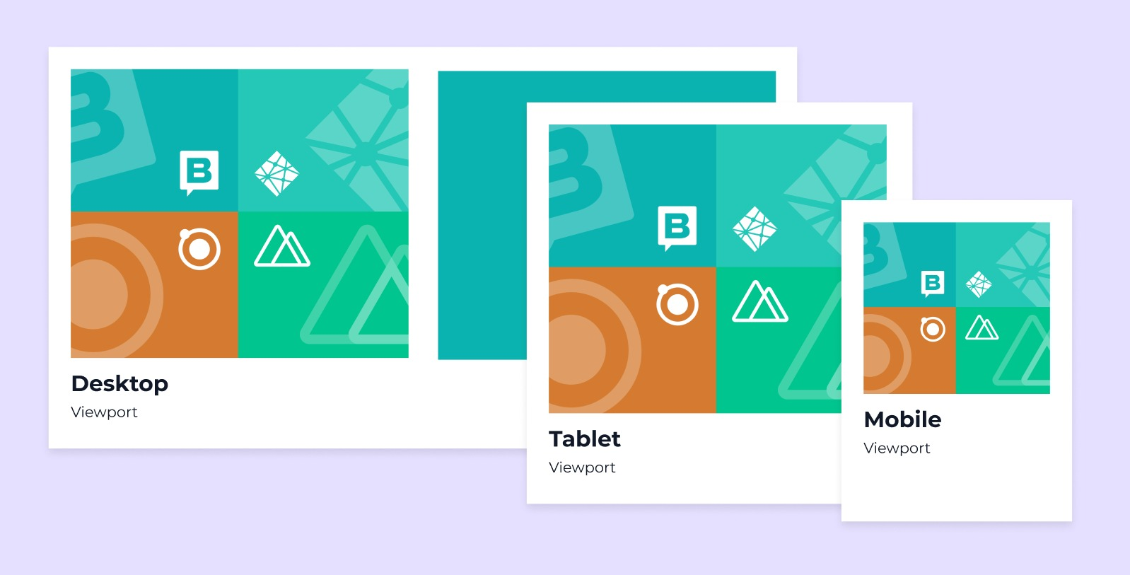
3. Design change fix: Different images for different displays
The solution is to provide a specially designed image with different ratios or focus points for each screen size, a technique known as art direction.
Art direction is the practice of serving completely different looking images to different viewports sizes to improve visual presentation, rather than different size versions of the same image.
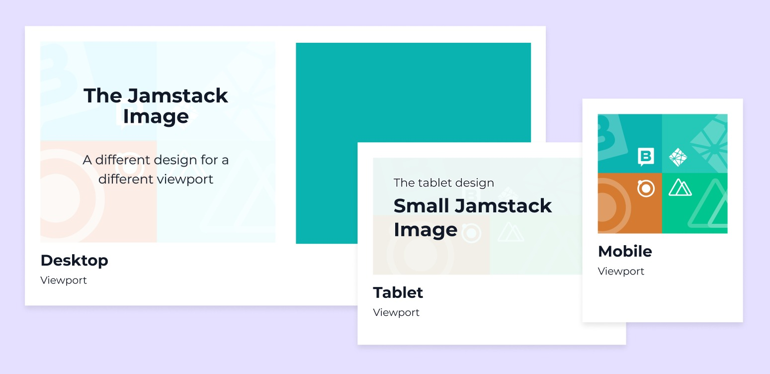
The art direction technique makes this possible through the <picture> tag, which contains several <source> tags providing the different images from which the browser will choose, and adding <img> as a fallback:
<picture> <source media="(max-width: 420px)" srcset="image-mobile.webp" width="360" height="280"> <source media="(max-width: 960px)" srcset="image-tablet.webp" width="760" height="600"> <img src="image-desktop.webp" width="1024" height="820" alt="Image providing 3 different images for 3 displays">
</picture>
picture
The wrapper of the different images brought by 0 or more<source>and an<img>.source
Each<source>tag specifies a media resource, in this case, an image, with itssrcsetattribute being the file path to that resource.
The order of placement of this tag matters. The browser will read the conditions defined in themediaattribute of each<source>from top to bottom. If any of them are true, it will display that image, and if the subsequent ones are true, they won’t be read.
An example would be themedia="(max-width: 960px)"of the second<source>. If the viewport’s width is 960px or less but more than 420px,image-tablet.webpwill be displayed, but if it is less than 420px,image-mobile.webpwill be displayed.img
When a browser does not support the<picture>or<source>tags or none of the media queries are met, the<img>tag will act as a fallback or default value and will be loaded. Therefore, it is crucial to add an appropriate size that will work in most cases.
Extra tip: You can combine the art direction technique with different resolutions.
<picture> <source media="(max-width: 420px)" srcset="image-mobile.webp 1x, image-mobile-2x.webp 2x" width="360" height="280"> <source media="(max-width: 960px)" srcset="image-tablet.webp 1x, image-tablet-2x.webp 2x" width="760" height="600"> <img src="image-desktop.webp" srcset="image-desktop.webp 1x, image-desktop-2x.webp 2x" width="1024" height="820" alt="Image providing 6 different images for 3 displays and 6 pixels density">
</picture>
By making use of width and pixel density at the same time, you can amplify the criteria for which an image source is displayed.
Note: If you want to learn about tools that can help you crop and resize your images efficiently, you can take a look at Serve Responsive Images by web.dev.
5. Load your images after critical resources
By default, if we do not specify the priority of our images, the browser will load them before the critical resources of our site, causing poor performance and increasing the Time To Interactive (TTI).
Solution
Fortunately, native solutions such as lazy loading allow us to defer off-screen images, the ones the user does not see initially, and focus on the most important ones, the images above the fold.
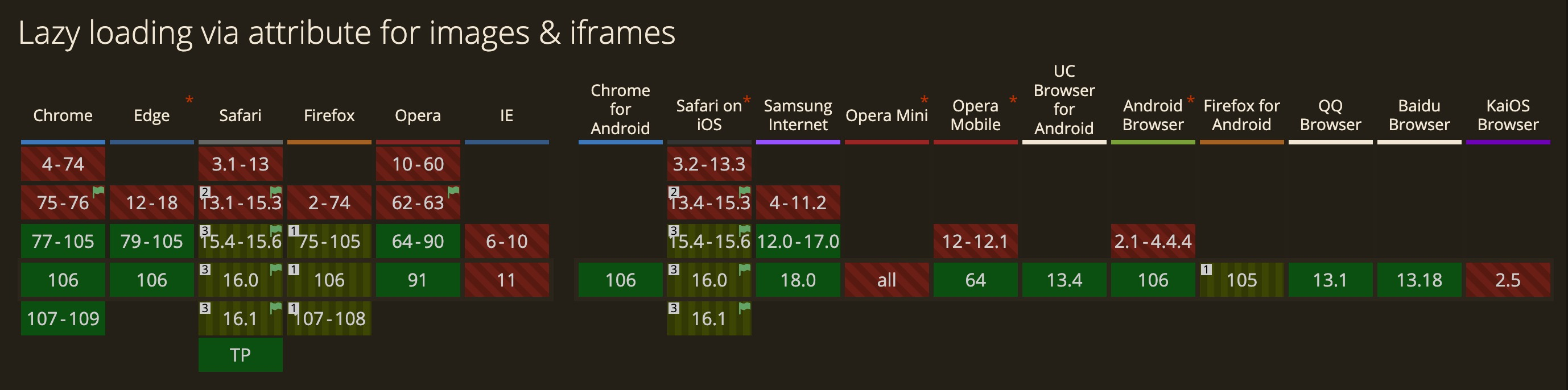
To make use of this native solution, we must add the loading attribute to our images with the lazy value:
<!-- Native lazy loading -->
<img src="image.webp" loading="lazy" width="700" height="500" alt="Loaded by appearance">
The loading attribute can have two values:
lazy: Postpones the loading of the resource until it reaches the viewport.eager: Loads the resource immediately, regardless of where it is.
Although this is the browser’s default behavior, it can be helpful in cases where you prefer to setloading="lazy"automatically on all your images and manually specify which ones will be visible first.
Since our goal is to defer images that do not appear above the fold, we mustn’t add the
loadingattribute for those displayed first. Otherwise, we can set theloading="eager"and addfetchpriority="high"to load them quicker.
Extra tip: Responsive images using the <picture> element can also be lazy-loaded only, including the loading attribute to the fallback <img> element.
<picture> <source media="(max-width: 420px)" srcset="image-mobile.webp"> <img src="image-desktop.webp" loading="lazy">
</picture>
6. Cache Your Images
A website’s performance can suffer if frequently accessed images are not cached, as many requests will be made to images that have already been loaded in the user’s system.
Users should be able to view the images directly from their system and not wait again for them to download.
Solution
The solution is to store the heavily accessed images at the end of the user’s browser cache and use a CDN service to cache them on the server for you.
Note: To understand how the cache works for a user and the different strategies we can follow, I recommend the talk and article “Love your cache” by Sam Thorogood.
Once we have an optimization technique for each of the problems that images bring us, it is worth remembering that there are more things to consider for the accessibility and SEO of our images, such as the alt attribute, the file name, and its metadata.
That said, it is time to see how an image service will save us hundreds of headaches. Let’s go there! 🚀
The Benefits Of Using An Image Service CDN
All the solutions to the problems we have seen in the previous section could be solved with external tools. But why complicate things if we can just use an Image Service CDN, saving us time, reducing infrastructure costs, and automating and scaling the image optimization?
An Image Service CDN is a combination of an Image Transformation API and a CDN network. It allows you to transform images on the fly by adding a few extra parameters in the URL and delivering them to users through a fast CDN with optimized caching.

The image transformations provided by this kind of service include modifying their format, focal point, and size by cropping or resizing them, as well as applying effects and other visual enhancements. In addition, it also allows you to optimize images so that they have the smallest possible size without losing quality, thus improving the UX and using the minimum bandwidth.
Note: You can always learn more about the transformations that some services offer by reading their documentation, as in Cloudinary or Imagekit.
Thanks to the combination of the image service with the CDN network, we can speed up the delivery of our images since, after the first request, the image will be cached and served from there in future requests. But not only does it cache the original image, but it also stores all the transformations and combinations we make from it. And if that is not enough, it also creates new transformation requests from the cached version of the original image. Can it be more optimal?
In the Jamstack ecosystem, it couldn’t be easier to access these services. Most headless CMSs already have their Image Service CDN, so you don’t have to leave their premises to perform your image transformations, optimizations, or cache and deliver them quickly. This article will use Storyblok Image Service CDN as an example.
So now, let’s see how the Storyblok Image Service CDN can resolve the problems we listed before:
Compressing Images
The problem of using large image files can be resolved by adding /m/ at the end of the image URL.
But of course, if you want to change the compression rate of your images, you can use the quality filter with a value between 0 and 100 by adding /filters:quality(0-100) to the URL.

)
Serving The Right Format And Encoding Effectively
If we want to serve our images in a next-gen format, Storyblok’s Image Service CDN makes it easy by:
- Automatic conversion to WebP if the browser supports it.
Storyblok chooses the WebP format as the default format due to its capabilities. By adding/m/to the image URL, it will be automatically served in WebP if the browser supports it. - The format filter
If we want to set a specific format, we can do it by using the format filter, which supportswebp,jpeg, andpng.
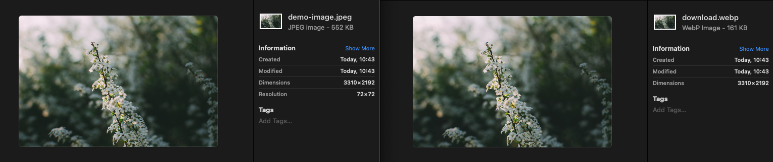
→ demo-image.jpeg/m/200×0/filters:format(jpeg)
)
Note: If anything, I miss the integration with more new formats, such as AVIF, but I understand that they are waiting for it to consolidate and become supported by more browsers.
Defining Width And Height From Storyblok
Although the Image Service CDN cannot help us define the image sizes, the Headless CMS, on the other hand, can streamline this process.
By simply adding a field for each attribute in our image component (Block), we can automate our front-end image component to suit the requirements of each use case.
Tip: By creating presets of the most used images, we can make these fields be filled by default and thus improve the content editor experience.
Cropping Or Resizing Images
If your website has or expects to have a large number of images, maintaining each version generated for each resolution, density, or focal point can be time-consuming.
An Image Service CDN saves you from manually creating cropped or resized versions from the master image through two methods:
Resizing
It iss perfect for responsive images using width or density descriptors.
By adding width x height in the URL of the original image, right after /m, you will have a new version of your image. By setting one of the parameters to 0 each time, you will have an image with the same aspect ratio, wholly resized.
Cropping
It is perfect for art direction, different aspect ratios, and focal points.
By using the same technique in resizing but always providing width and height, you will be able to crop the image.

Smart Cropping Of Images
To put the subject of the image in the center automatically, the Image Service CDN allows you to make use of its smart feature by simply adding /smart to the path:

Custom Focal Point Filter
In case the subject is not a person and the previous technique does not work for us, the Image Service allows us to specify in our images the point that we consider to be the center of a crop, also known as the focal point.
This can be implemented by adding the focal filter to our image path:
Note: This can be further simplified if we are using Storyblok as a headless CMS, as it returns a focus variable on each of our images via the delivery API.
Specifying The Loading Option Of The Images
As with image width and height attributes, lazy loading is not something we do through the Image Service CDN; instead, we implement it in the front-end code.
To automate this process, create a single-option field on the headless CMS Storyblok showing the eager and lazy options, so the content editors can choose the option that best suits each case.

Note: This field can be ignored if the website only has images above the fold.
In addition, another thing that can improve the loading of our images is to use the hint preconnect by adding the Image Service CDN domain, in this case, https://a.storyblok.com/.
The preconnect keyword is a hint to browsers that the user is likely to need resources from the target resource’s origin, and therefore the browser can likely improve the UX by preemptively initiating a connection to that origin.
— MDN docs
<link rel="preconnect" href="[https://a.storyblok.com/](https://a.storyblok.com/)">
Caching Your Images
In this case, we don’t have to do anything from our side. By adding /m to our URL, we are already using the Image Service CDN, which by default caches our images the first time they are loaded and serves them from there in the next requests.
We already know the parameters we have to add to our image URL to make use of the image service and optimize them. Combining it with an image component in the associated Headless CMS, Storyblok, which is responsible for receiving the data initially, such as the width and height attributes or their responsive sizes, we will be able to standardize the use of optimized images and create presets to automate their definition in our project.
Case Study: Image Component In A Jamstack Site
For this demo, we will use Nuxt 3 to build our static site, Vue 3 with script setup to define our image component and Storyblok as a headless CMS and Image Service CDN provider. But everything we will see can be extrapolated to any other technology.
Step 1: Create The Nuxt Project And The Storyblok Space
Let’s start by creating an account on Storyblok and a new space from scratch.

Now, following the steps in the article Add a headless CMS to Nuxt 3 in 5 min, we are going to create our Nuxt 3 application and connect it to our space. Go to the command line and run:
npx nuxi init
Install the dependencies with yarn and launch your project with yarn dev to ensure everything goes well.
To enable the Storyblok Visual Editor, we must define a default HTTPS preview URL. First, set up SSL in Nuxt 3 and then go to your space Settings > Visual Editor and add https://localhost:3000/:

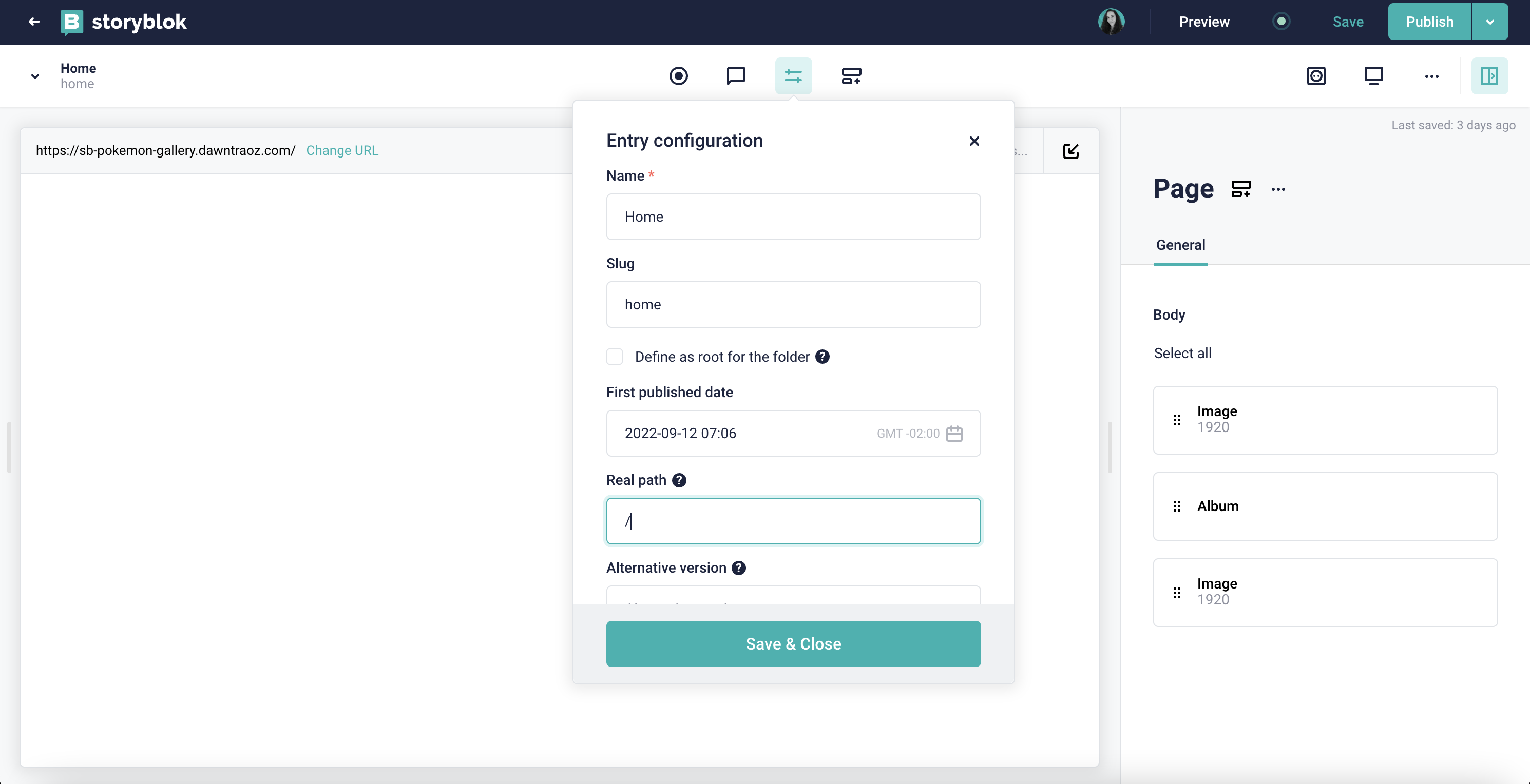
Now go to the Content section in the left menu, and open the Home story. In order to see your Nuxt project, open the Entry configuration and set the real path to /, save, and voilá, you should be able to see the Nuxt landing page in the Visual Editor:
Step 2: Connect The Nuxt Project To The Space’s Content
Once the Visual Editor is set up, the next step is connecting Nuxt 3 with Storyblok. To do that, we need to install the Storyblok SDK:
yarn add @storyblok/nuxt axios # npm install @storyblok/nuxt axios
And then, include the SDK as a module inside nuxt.config.js, providing the Preview API token that we can grab at Settings > Access Tokens from our space:
export default defineNuxtConfig({ modules: [ [ '@storyblok/nuxt', { accessToken: '' } ] ]
})
The new space, by default, already contains some blocks (components), such as page, grid, and so on. Instead of using those, we are going to define our own components, so you can remove all nestable components from this space and leave only the content type Page.
Note: Check the tutorial Structures of Content tutorial by Storyblok to understand the difference between Nestable and Content Types blocks.
Step 3: Create The Blocks (Components) In The Storyblok Space
Now, let’s create the blocks needed for this demo project in the space Block Library, where (*) means required:
Design Image (design_image) is the component we will use to define different images on different devices when using the art direction technique.

A nestable component with the required fields:
- image (*) (Asset > Images)
- width (*) (Number)
- height (*) (Number)
media_condition(*) (Single-Option > Source: Self) with the key-value pair options: mobile →(max-width: 640px)& tablet →(max-width: 1024px), being(max-width: 640px)the default value.
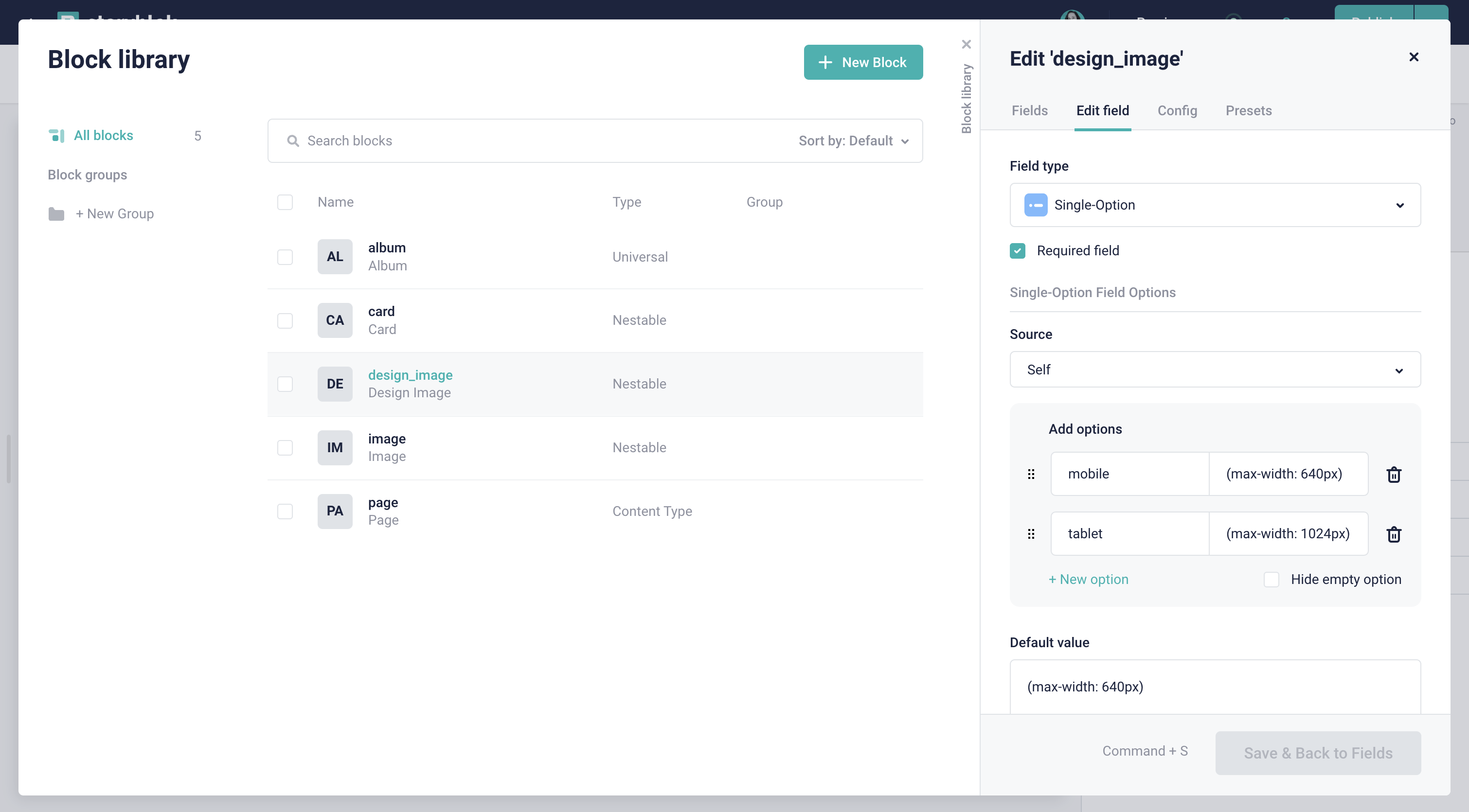
media_condition field of the Design Image nestable block. (Large preview)Image, the component responsible for collecting all the information necessary to optimize the image.
A nestable component with the tabs:
- General, the tab containing the fields:
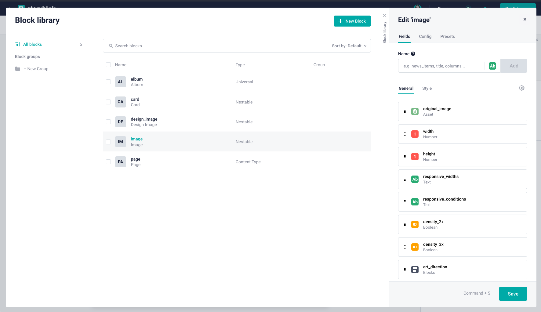
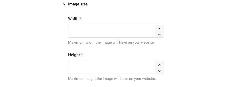
original_image(*) (Asset > Images)- Image size (Group)
- width (*) (Number): Maximum width the image will have on your website.
- height (*) (Number): Maximum height the image will have on your website.
- Responsive image (Group)
responsive_widths(Text > Regex validation: (^$|^\d+(,\d+)*$))
Comma-separated list of widths that will be included onsrcset.
Example: 400,760,960,1024.responsive_conditions(Text)
Comma-separated list of media queries, with their image slots sizes that will be included on the attribute sizes.
- Supported densities (Group)
density_2x(Boolean)density_3x(Boolean)
- Art Direction (Group)
art_direction(Blocks > Allow onlydesign_imagecomponents to be inserted)

art_direction field of the Image nestable component. (Large preview)- Style, the tab containing the fields:

- loading (Single-Option > Source: Self) with the key-value pair options: lazy →
lazyand eager →eager. - rounded (Boolean).
Card

A nestable component with the fields:
- image (Blocks > Allowed maximum 1 > Allow only image components to be inserted)
- title (Text)
- subtitle (Text)
- color (Plugin > Custom type:
native-color-picker)
Note: To be able to see the custom type native-color-picker available in that list, you need to install the Colorpicker app in the space App Directory.
button_text(Text)
Album

A universal (mix between nestable & content type) component with the field:
- cards (Blocks > Allow only card components to be inserted)
Step 4: Create The Main View, Layout, And Install Tailwind CSS In The Nuxt Project
Once we have defined the schema of our blocks in the Storyblok space, let’s go back to the code of our Nuxt 3 project and start creating the pages and components needed.
The first step will be to delete the app.vue view from the root of the project and create a pages folder with the [...slug].vue view in it to render the pages dynamically by slug and fetch the data from the Storyblok space.
- […slug].vue (
pages/[…slug].vue)
<script setup>
const { slug } = useRoute().params;
const url = slug || 'home'; const story = await useAsyncStoryblok(url, { version: 'draft' });
</script> <template> <div class="container"> <StoryblokComponent v-if="story" :blok="story.content" /> </div>
</template>
In the template, we use the StoryblokComponent component that the SDK provides us to represent the specific blocks coming from the Content Delivery API, in this case, the page.
And since our goal is to generate a static page, we’re using the useAsyncStoryblok composable provided by the SDK too, which uses useAsyncData under the hood.
Next, let’s create a default layout, so our page has some basic styles and metadata.
- default.vue (
layouts/default.vue)
<template> <main class="min-h-screen bg-[#1A0F25] text-white"> <slot /> </main>
</template> <script setup>
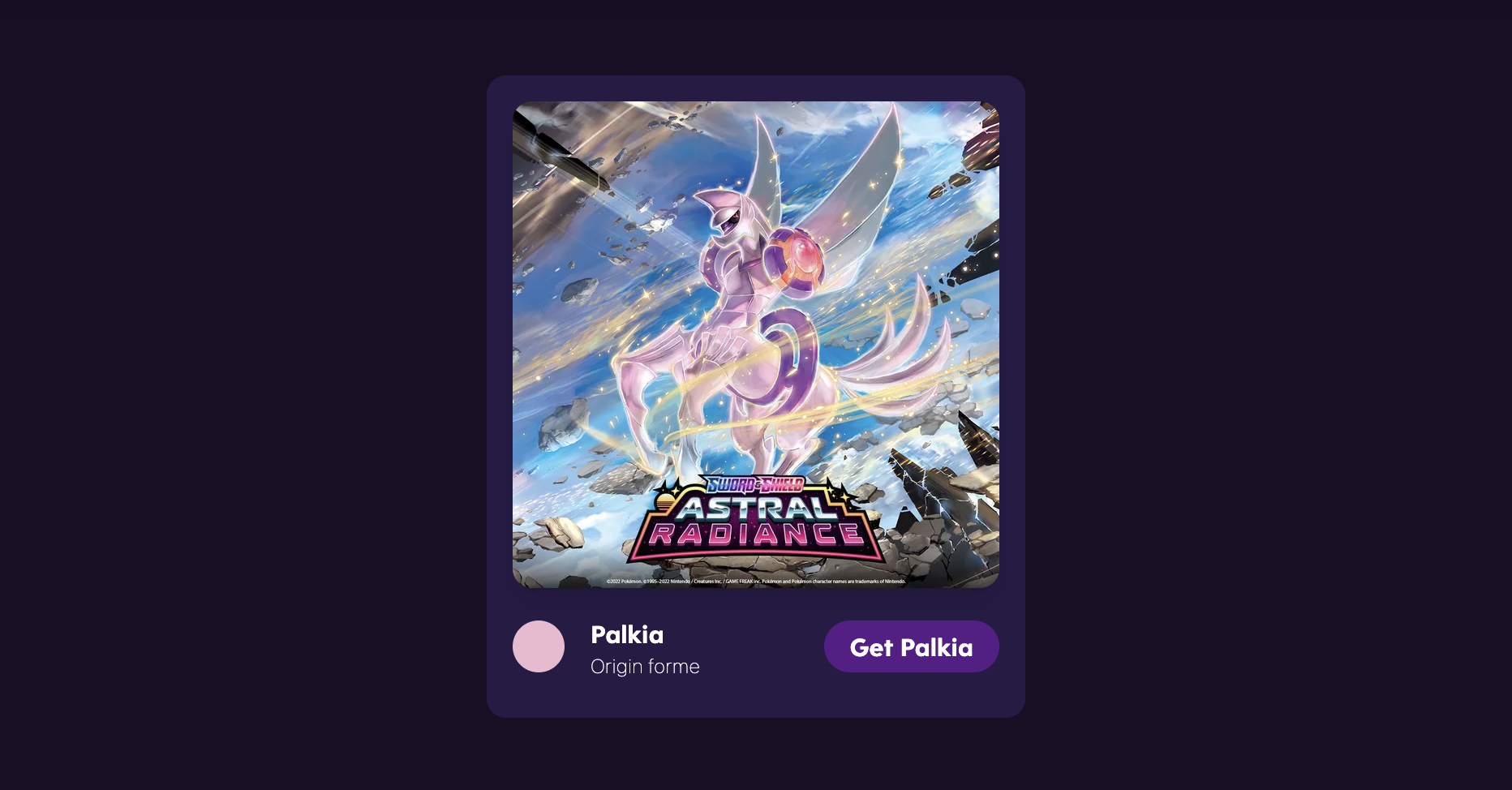
useHead({ title: 'Pokemon cards album', meta: [ { name: 'description', content: 'The Pokemon album you were looking for with optimized images.' } ], htmlAttrs: { lang: 'en' }
})
</script>
As Tailwind CSS is used for styling this demo example, let’s install and configure it in the Nuxt 3 project using the Nuxt Tailwind module. For that, run:
yarn add -D @nuxtjs/tailwindcss # npm install -D @nuxtjs/tailwindcss
Then add the code below to the modules in nuxt.config.ts:
export default defineNuxtConfig({ modules: [ // ... '@nuxtjs/tailwindcss' ]
})
Create tailwind.config.js by running npx tailwindcss init and copy/paste this code:
module.exports = { content: [ 'storyblok/**/*.{vue,js}', 'components/**/*.{vue,js}', 'pages/**/*.vue' ], theme: { container: { center: true, padding: '1rem', }, }, plugins: [],
}
Finally, create an assets folder in the root of the project, and inside, include a css folder with a file named tailwind.css that the Nuxt Tailwind module will use to get the Tailwind styles:
@tailwind base;
@tailwind components;
@tailwind utilities;
Now the project is ready to represent all the defined styles!
Step 5: Define The Components Related To The Blocks In The Nuxt Project
Let’s create a new folder called storyblok under the project’s root. The Storyblok SDK will use this folder to auto-import the components only if used on our pages.
Start by adding the components:
- Page.vue (
storyblok/Page.vue)
<template> <StoryblokComponent v-for="item in blok.body" :key="item._uid" :blok="item" />
</template> <script setup>
defineProps({ blok: Object })
</script>
All components will expect the blok prop, which contains an object with the fields’ data of that specific block. In this case, the content type page will have only the body field, an array of objects/components.
Using the v-for, we iterate the body field and represent the items dynamically using StoryblokComponent.
- Album.vue (
storyblok/Album.vue)
<template> <div v-editable="blok" class="container grid grid-cols-[repeat(auto-fit,332px)] justify-center gap-10 py-12" > <StoryblokComponent v-for="card in blok.cards" :key="card._uid" :blok="card" /> </div>
</template> <script setup>
defineProps({ blok: Object })
</script>
The same will happen in this component, but instead of being the blok.body field, it will be the blok.cards field.
- Card.vue (
storyblok/Card.vue)
<template> <article v-editable="blok" class="bg-[#271B46] rounded-xl p-4 pb-6"> <StoryblokComponent v-if="blok.image[0]" :blok="blok.image[0]" /> <header class="pt-4 flex gap-4 items-center"> <div class="rounded-full w-8 h-8" :style="`background-color: ${blok.color.color}`"></div> <h3 class="flex flex-col"> {{ blok.title }} <span class="font-sans font-thin text-xs">{{ blok.subtitle}}</span> </h3> <button class="ml-auto bg-purple-900 rounded-full px-4 py-1">{{ blok.button_text }}</button> </header> </article>
</template> <script setup>
defineProps({ blok: Object })
</script>
As card is one of the last levels of nested blocks, we won’t iterate in this component, but we will directly represent the fields in the HTML.
Step 6: Create The Image Component Property By Property
Let’s build a generic image component in Vue, using the parameters coming from the Storyblok image block and taking advantage of the Image Service CDN to render an optimized image.
The Foundation Of The Image Component
Let’s define the core functionality of the image component with the original_image, width, and height properties that come from the image block in our space and create a custom method called createImage that returns the URL of the optimized image using the Image Service CDN:
<template> <picture v-editable="blok"> <img :src="createImage(filename, width, height)" :width="width" :height="height" :alt="alt" class="shadow-lg w-full" /> </picture>
</template> <script setup>
const props = defineProps({ blok: Object }) const { width, height } = props.blok
const { filename, alt, focus } = props.blok.original_image const createImage = (original, width, height, focal = focus) => { return `${original}/m/${width}x${height}/filters:focal(${focal})`
};
</script>
Adding Lazy Or Eager Loading
Once we have the image’s base, we can start adding new properties, such as loading, and specifying it as an attribute in the img tag:
<template> <picture v-editable="blok"> <img // all other attributes :loading="loading" /> </picture>
</template> <script setup>
const props = defineProps({ blok: Object }) const { /* all other properties */, loading } = props.blok
// ...
</script>
Adding Responsive Images Using Width Descriptors
If we need to represent different sizes of the same image on our website, using the responsive image technique, we can specify the widths and conditions using the responsive_widths and responsive_conditions properties.
<template> <picture v-editable="blok"> <img // all other attributes :srcset="srcset" :sizes="blok.responsive_conditions" /> </picture>
</template> <script setup>
const props = defineProps({ blok: Object }) // all other properties
let srcset = ref('') if (props.blok.responsive_widths) { const aspectRatio = width / height const responsiveImages = props.blok.responsive_widths.split(',') let widthsSrcset = '' responsiveImages.map(imageWidth => { widthsSrcset += `${createImage(filename, imageWidth, Math.round(imageWidth / aspectRatio))} ${imageWidth}w,` return true }) srcset.value = widthsSrcset
}
</script>
Adding Responsive Images Using Density Descriptors
When our site is used on different devices with different pixel densities, we must display our image in the appropriate resolution. By checking the density_2x and density_3x boxes to true and creating an image for each density with the following code, we can patch this problem.
Note: The original image must be large enough to work with a size three times larger than the image used in the viewport.
<template> <picture v-editable="blok"> <img // all other attributes :srcset="srcset" /> </picture>
</template> <script setup>
const props = defineProps({ blok: Object }) // all other properties
let srcset = ref('') if (props.blok.density_2x || props.blok.density_3x) { let densitiesSrcset = `${createImage(filename, width, height)} 1x` densitiesSrcset += props.blok.density_2x ? `, ${createImage(filename, width * 2, height * 2)} 2x` : '' densitiesSrcset += props.blok.density_3x ? `, ${createImage(filename, width * 3, height * 3)} 3x` : '' srcset.value = densitiesSrcset
}
</script>
Adding Different Images For Different Devices
When using the art direction technique, we will define one source tag per element in the art_direction array field. We will use that data to render a different image according to the specified media_condition.
<template> <picture v-editable="blok"> <template v-if="art_direction"> <source v-for="{ image, media_condition, width, height } in art_direction" :media="media_condition" :srcset="createImage(image.filename, width, height, image.focus)" :width="width" :height="height" > </template> <!-- Base Image --> </picture>
</template> <script setup>
const props = defineProps({ blok: Object }) // all other properties
const { art_direction } = props.blok
</script>
In the example repository for this demo, you can find Image.vue (storyblok/Image.vue), the resulting image component, combining all the cases above.
Note: These implementations are the only possible ways to solve the problems we have seen during this article.
Measuring Performance To Test The Image Component
It’s time to measure the performance results with and without the custom image component to demonstrate how the above optimizations improve our site.
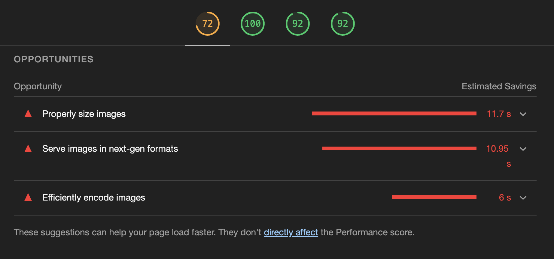
If we generate a report with Lighthouse from our website representing the images as they originally came from the headless CMS without going through the Image Service CDN or applying any optimization technique other than the definition of the width and height attributes in the img tag, the result we get is:

As we can see, the performance is already negatively affected, with only five unoptimized images in place. But at least the report not only gives us bad news but also provides us with a list of opportunities to improve the results and solve the problems.
Once we apply the improvements mentioned above using the image component we have developed and giving the necessary values in the CMS headless, the result is impeccable:

The next step will be to educate our content editors, designers, and developers to synchronize between them what values are required for each case and prepare self-defined presets in our Storyblok space to make their work a lot easier.
Simplifying Image Optimization With Next-generation Frameworks
What if I tell you that if you use a framework like Nuxt, Next, or Astro to build your applications, you don’t need to develop a custom image component? They have already created one for you. These being Nuxt Image, Next Image and Astro Image, among others.
These components are extensions to the <img> tag, which includes a number of built-in performance optimizations to help us achieve a better web experience.

By simply installing or using the component provided, we achieve the same result. To test the Nuxt Image in our project, let’s install it by running yarn add -D @nuxt/image-edge and adding the module to nuxt.config.ts with Storyblok as Image CDN provider:
export default defineNuxtConfig({ modules: [ // ... '@nuxt/image-edge', ], image: { storyblok: { baseURL: 'https://a.storyblok.com' } }
})
By replacing the Image.vue component with the code below, we will get similar behavior to our custom component but using the Nuxt Image enhancements:
Note: To render different images per device, we will have to add the source as in the custom component. This is not something that Nuxt Image supports yet.
<template> <picture v-editable="blok"> <NuxtImg provider="storyblok" :src="filename" :width="width" :height="height" :[srcset]="densitiesSrcset" :sizes="widthsPerSize" :modifiers="{ filters: { focal: focus } }" :loading="loading" :alt="alt" /> </picture>
</template> <script setup>
const props = defineProps({ blok: Object }) const { width, height, loading, responsive_widths, density_2x, density_3x } = props.blok
const { filename, alt, focus } = props.blok.original_image let srcset = responsive_widths ? '' : 'srcset'
let densitiesSrcset = ''
if (density_2x || density_3x) { densitiesSrcset = `${filename}/m/${width}x${height}/filters:focal(${focus}) 1x` densitiesSrcset += density_2x ? `, ${filename}/m/${width * 2}x${height * 2}/filters:focal(${focus}) 2x` : '' densitiesSrcset += density_3x ? `, ${filename}/m/${width * 3}x${height * 3}/filters:focal(${focus}) 3x` : ''
} let widthsPerSize = ''
if (responsive_widths) { const sizes = ['sm', 'md', 'lg', 'xl'] widthsPerSize = responsive_widths.split(',').map((w, i) => `${sizes[i]}:${w}px`).join(' ')
}
</script>
Looking at the code, you might think it’s not much different from the one we have created before, but the truth is that if tomorrow you consider changing the Image Service or you don’t define the width and height of the image, Nuxt Image will do the dirty work for you.
Conclusion
Image optimization, like web performance, is not a short-term task but constant work to progressively improve the website. That is why there are three things we must always keep in mind:
1. Stay Up To Date
The most important thing to keep your images in the best possible condition is to keep up with the latest trends in image optimization and web performance.
Following the work of expert authors in the field, such as Addy Osmani and Barry Pollard, can help you learn about new improvements in image optimization in advance. Likewise, renowned websites such as Smashing Magazine, web.dev, and Web Almanac by Google, Mozilla docs, among others, will let you know the state of the web and the latest developments.
2. Constantly Monitor The Status Of Your Images
Another crucial point to keep our website in good shape is to measure web performance continuously, in this case, emphasizing metrics related to image loading. You can start now by visiting Lighthouse and PageSpeed Insights.
Web performance involves measuring the speeds of an app and then monitoring its performance, ensuring that what you’ve optimized stays optimized. This involves a number of metrics and tools to measure those metrics.
— MDN
Some tools like WebPerformance Report send you a weekly report by email on the performance status of your website. This can allow you to be aware of any changes in browsers or web performance techniques, as you have a report that corroborates the good status of your website over time.
Moreover, there are always tools out there that allow us to ensure that the optimization quality of our images is the best we can offer. For example, RGBA Structural Similarity, a tool that calculates the (dis)similarity between two or more PNG and/or JPEG images using an algorithm that approximates human vision, maintained by @kornelski, can help us to check that we aren’t losing too much quality when compressing and thus better choose our compression parameters.
3. Align With Your Team, Create Standards
Most of the implemented solutions in this article are just possible proposals to optimize the images of our websites. Still, it is expected that you come up with new unique solutions agreed upon with your team of content creators, designers, and developers.
We must all be on the same page when creating a quality project; communication will allow us to solve problems more quickly when they occur. By creating standards or presets when uploading images and defining their size and different resolutions, we will simplify the work of our colleagues and ensure that it is a joint effort.
I hope the techniques presented will help or inspire you when dealing with images in current or future projects. Here are the main links to the demo project:
Many thanks to Joan León (@nucliweb) and Vitaly Friedman (@vitalyf), for reviewing the article and giving me powerful feedback.
(vf, il, yk)