
Softer colors, soothing palettes, and a lighter vibe are what the candy pastels design trend is all about. More projects are using this color scheme to create a subtle and softer feel for projects, a distinct shift from many of the bold, bright colors that have been popular for the last few years.
Usually featuring pastel shades of pink, blue, yellow, green, and purple, it’s a calm and comforting collection of colours. Inspired by sweets and confectionary of old, it’s dubbed “candy pastels”.
Here’s a look at the design trend and how you can make the most of it.
What is the Candy Pastels Design Trend?
The use of candy pastels is a color trend is a popular graphic design trend that is characterized by its use of soft and soothing hues. It is inspired by the colors found in confectionery, hence the name “candy pastels.”
The palette typically includes pastel shades of pink, blue, yellow, green, and purple, and is often used to create a feeling of calm, comfort, and playfulness.
You may find it in branding, packaging design, illustrations, and website design. It’s a great choice if your goal is to convey a fun and approachable vibe, and it’s also popular for event branding and marketing campaigns targeting young children or families or that want to exude a more whimsical tone.
Characteristics of Candy Pastels in Design

This design trend has a playful and approachable feel for the most part, which is why it is so popular. This color scheme can have a fun and modern feel as well.
This trend is fairly easy to identify because it uses color, but there are some other common characteristics as well.
- Soft and soothing colors: The colors used in this trend are typically pale, muted, and have a light, airy feel.
- Playful and approachable feel: The overall vibe is generally light, including color choices as well as the language and text used in the design.
- Flat or minimal design: Candy pastels are frequently paired with flat and minimal design elements, with simple shapes and bold lines. The focus is on the use of color to create visual interest, rather than textures.
- Versatility: The color trend can be adapted to fit a variety of design styles, from modern and minimalistic to whimsical and playful.
- Feminine feel: The softness of the candy pastel trend makes it a popular choice for businesses targeting women or for branding related to beauty, fashion, and wellness.
Tips for Using this Design Trend Well
There are really no “rules” for using this trend other than thinking about it in concert with other design best practices. Often, you’ll see candy pastels paired with a dark background or text to maximize color contrast.
To avoid an “Easter egg effect” with the design, candy pastels often work best when you have a limited palette or use just one or two of these colors. Too many pastels in the design can have an unintended overly busy or crowded effect.
Consider pairing your candy pastel colors with neutral tones such as white, gray, or black. This creates a balanced and sophisticated look that is easy on the eyes.
Additionally, these colors create an ideal opportunity for use of gradients to add depth and interest. Experiment with blending candy pastel colors with neutral tones to create soft and subtle gradients.
Mix and match candy pastel colors with different design elements, such as typography, icons, and illustrations. This will help to create a dynamic and visually interesting experience for users.
Contrast is the greatest concern with this color trend. Make sure that the colors you choose are easy to read against the background and that the design elements are clearly defined and accessible to users. For the most part, candy pastels are used as a background color with dark elements on top or as an accent color on a darker background.
5 Examples We Love
Need a little inspiration for using this website design trend? We’ve got five stellar examples to help jumpstart your thinking about using candy pastels.
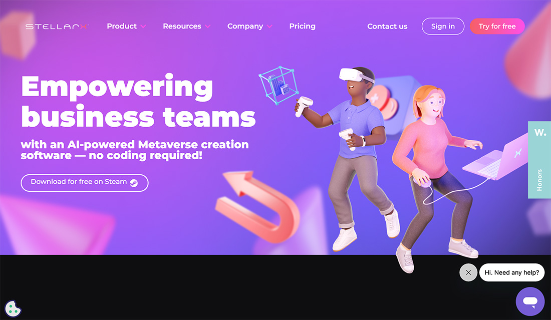
Lim London

What’s cool about this site is the combination of the pastel with animation to create a light feel that’s fun and visually interesting.
Flow.Ninja
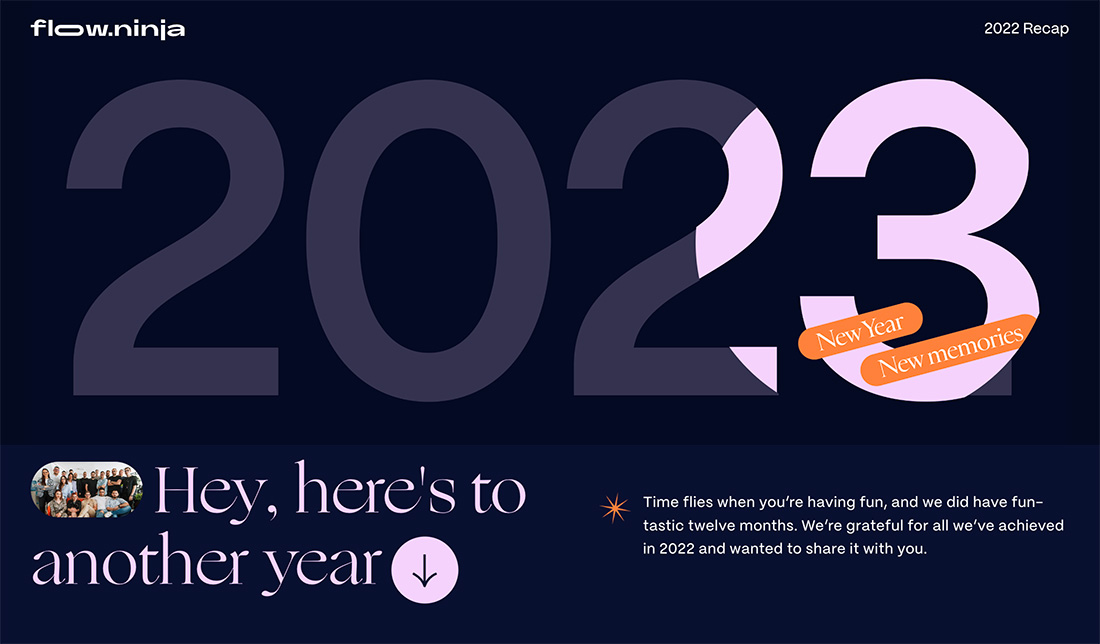
The soft pink with an orange accent is totally unexpected and engaging. The hover state also makes you want to move around the site more with layers of tints on the pastel hue.
Future London Academy
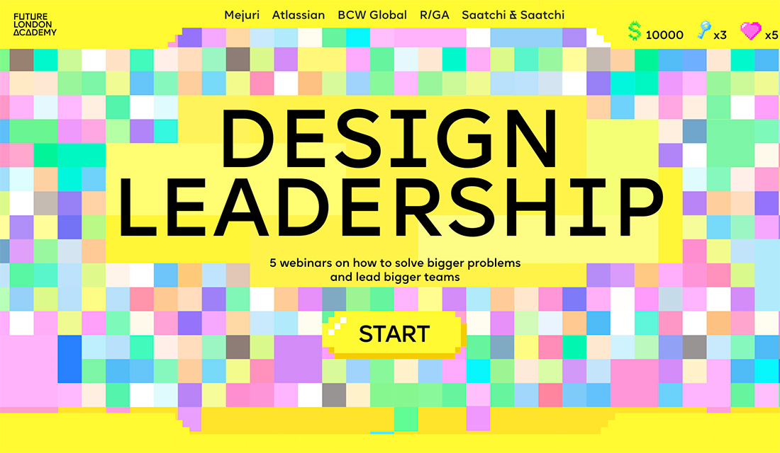
With bold yellow and lots of subtle pastels, you’d think this is too much color, but it works brilliantly.
Limbo
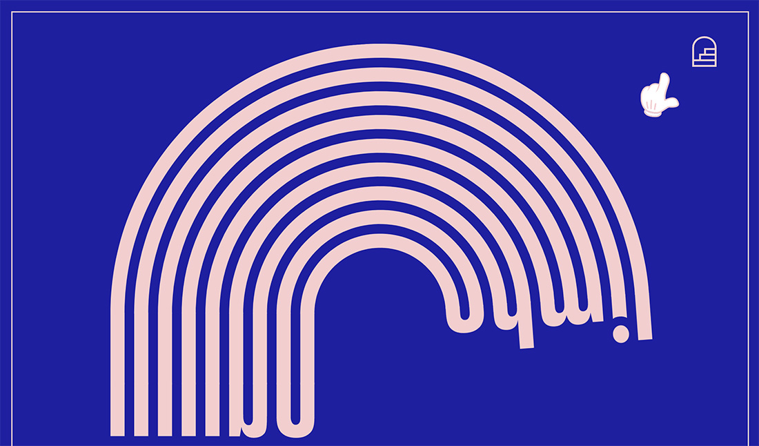
This example shows how to pair two color trends for a super modern look. The bright blue is from the bold color scheme we’ve seen a lot of and the baby pink is from the candy pastels trend. Together they are engaging and interesting. (Plus, this site has a pretty cool typography animation if you click through.)
Awwwards Conference
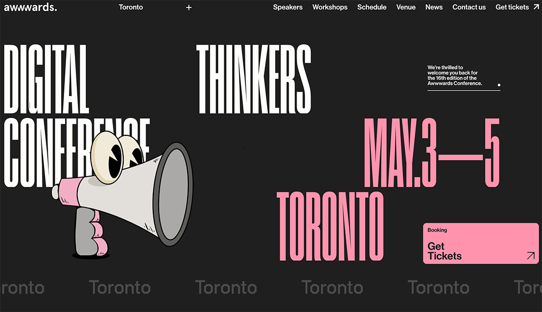
Black and white with pink. This is minimal and bold and candy pastel all in one. You almost can’t stop looking at it.
5 Colors to Try
Conclusion
This is a fun design trend that you can deploy for event design, landing pages, and packaging. If you want to make the most of it, try tints and tones of your existing color palette as a starting point so you get a design that’s on-brand, but still stylish!
This can also be a lot of fun when thinking about new projects as well. Pastels are a nice way to convey a message without feeling too in your face. They work great for a variety of applications.