
When we think about closed captioning, we often think about noisy environments, be it busy restaurants, shopping malls, or airport lounges. There, consuming content via audio is difficult, and so captions help communicate information in an alternative, textual way.
This is, of course, useful for video streaming like Netflix or Hulu, but also for games, video courses, social media content, and real-time communication on Zoom, Google Meet, and so on with automated captioning turned on. That way, however, is the only way for some of us who are hard of hearing — temporarily or permanently — nevermind of how noisy or busy the environment is.

In fact, the environment might not matter that much. Many people turn on closed captioning by default these days to comfortably follow along in the video. Perhaps the spoken language isn’t their native language, or perhaps they aren’t quite familiar with the accent of some speakers, or maybe they don’t have headphones nearby, don’t want to use them, or can’t use them. In short, closed captions are better for everybody and they increase ROI and audience.
Just a decade ago, closed captioning would be difficult to come by on the web. Yet, today it’s almost unimaginable to have a public video produced without proper captioning in place. And it doesn’t seem like a particularly complicated task. Isn’t it basically just text flowing over lines, with a few time stamps in between?
Well, it doesn’t have to be. With captions, we can embed a lot of contextual details that are somehow lost between the lines when translated from audio to text — be it sarcasm, music information, synthetic voice, background noise, or unexpected interruptions. But first, we need to talk about how subtitles and captions are different.
Pssst! This article is part of our ongoing series on design patterns. It’s also a part of Smart Interface Design Patterns 🍣 and is available in the live UX training as well.
Subtitles vs. Captions
At the first glance, subtitles and captions might appear to be the same. In the end, it’s all about conveying information in a textual way. However, as kindly pointed out by Svetlana Kouznetsova in her book an audio accessibility, they aren’t really interchangeable.
Accordion to Svetlana,
Captions are considered as part of accessibility and designed for deaf people to access aural information in the same language with accessibility elements such as speaker identifications, sound descriptions etc.
Subtitles, on another hand, are considered as part of internationalization (not accessibility) and designed as a translation from one spoken language to another written language for hearing people who don’t understand the original language.
While captions are designed for people with hearing difficulties, subtitles are designed to support hearing people who might not understand the original language. They often lack speaker IDs and sound descriptions and consequently, subtitles aren’t necessarily accessible.
In this article, we focus both on subtitles and captions, with some general guidelines of how we can improve both. Our journey starts with a general conversation about design conventions for subtitles.
Subtitles Formatting and Design Conventions
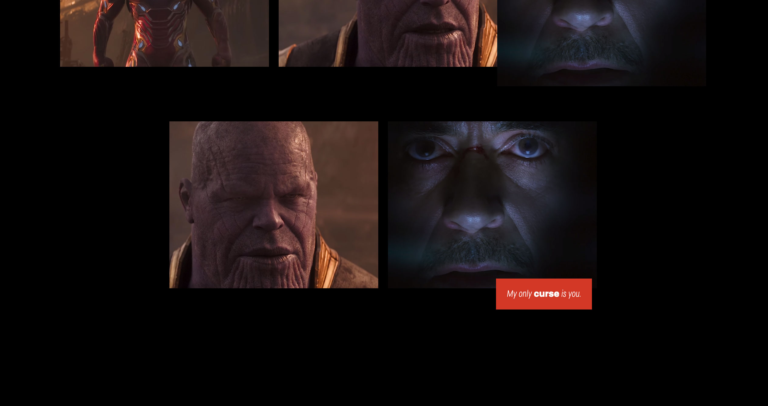
Fortunately, there are already golden rules of transcription, best practices as well as an established visual language for closed captions and subtitles. When we want to indicate any subtle changes in the background, emphasis on specific words, whispering, or a short pause, we can rely on simple text formatting rules in subtitles to communicate it.

Gareth Ford Williams has put together a visual language of closed captions and has kindly provided a PDF cheatsheet that is commonly used by professional captioners.
There are some generally established rules about captioning, and here are some that I found quite useful when working on captioning for my own video course:
- Divide your sentences into two relatively equal parts like a pyramid (40ch per line for the top line, a bit less for the bottom line);
- Always keep an average of 20 to 30 characters per second;
- A sequence should only last between 1 and 8 seconds;
- Always keep a person’s name or title together;
- Do not break a line after conjunction;
- Consider aligning multi-lined captions to the left.
There are some minor differences in formatting between different languages (and Gareth writes about them in the article), but the resource can be used as inspiration and a checklist to make sure you don’t forget any fine details.
Captions Natively Integrated In The Content
On their own, closed captions and subtitles are often seen as an additional layer that lives on top of existing audio or video content and supports users in addition to that main piece of content. However, what if we designed them to be natively integrated into the video player?

Ethics for Design provides a very different video experience: subtitles take a prominent role in the design, with supplementary information about the speaker remaining on the page as the video advances. The text isn’t hardcoded into the video but is available separately, being fully accessible for copy-paste, for example. Also, additional materials and illustrations are highlighted as a speaker is speaking.


Another way of natively integrating subtitles in the video is the on-screen text technique used in various shows such as Sherlock TV series. The idea there was to provide storytelling through visual text embedded into visuals but also make text messages more accessible without having to show the entire phone screen to viewers.


For his thesis at the Hogeschool van Amsterdam, Agung Tarumampen was asked to come up with a concept of what sound visualization would look like if we were designing a first-class experience for deaf people.
Agung has experimented with Living Comic, with more striking typography, a bit of animation and a comic book style to transform seemingly boring subtitles into an integral visual part of the experience.
It can even go beyond subtitles, though. When there is a fight happening in the video, the frame of the video player changes its color and starts glowing. The result is very dynamic and impressive but probably a little bit elaborate to produce. (Discovered via Vasilis van Gemert).
Add Search Within Subtitles and Transcripts
When released, some videos come along with transcripts that are properly edited and broken down into sections. That’s common for TED videos, where viewers can jump to a specific part of the speech, as every sentence in the transcript is linked to the time stamp within the video.

With a transcript in place, it’s useful to allow users to search for specific terms in the transcript and jump right there. In TED’s case, viewers can do so with an in-browser search tool. But with most videos that have only subtitles, it’s usually impossible — and easy to fix.

As an additional feature for subtitles/captioning settings, we could enable search as well. After all, subtitles are just a text file that already includes everything: the content and the time stamps. That’s a great little tool to help users navigate the video faster and more precisely, and it could work similarly to Zoom’s search within an auto-generated transcript (pictured above).
Decouple Audio Track and Subtitles
We might be assuming that viewers prefer to read subtitles in the same language as the original video track, but that’s not necessarily the case. Sometimes subtitles are available in the user’s native language, while the audio track isn’t. Sometimes captioning includes detailed audio descriptions in one language but doesn’t have them in another.

Also, some users might watch the video with its original audio track by default and then choose subtitles or captioning in a language that fits them best. And, of course, some people might have a strong preference for watching the video in one language but reading subtitles or captioning in another.
Similar to the design of the language selector, we can allow them to freely choose their preference without any assumptions on our end. Whenever possible, decouple settings for the audio track and subtitles/captions.
Allow Multiple Languages At The Same Time
Most video players allow a selection of a single subtitle language. However, if multiple people are watching a movie together, it might be a good idea to consider allowing users to select multiple languages at the same time. In that case, various languages would need to appear differently and probably be taking over one line at a time.

Of course, it doesn’t make much sense to allow users to select multiple variants of the same language, e.g., English and English with Audio Description. It’s worth stating that the selection of languages might need to be grouped and alphabetized in addition to the most popular languages used on the site. Flags aren’t languages, though, so using a flag to highlight a language is a dangerous path to embark on.
Customization Settings For Subtitles And Captions
Where and how should subtitles and captions be displayed? Surely some websites will have specific branding and specific typography, and these design choices would carry over to subtitles as well. However, some fonts might be more appropriate for people with dyslexia, and sometimes font sizes might need to be enlarged.

On YouTube, users can select a font used for subtitles and choose between monospaced and proportional serif and sans-serif, casual, cursive, and small-caps. But perhaps, in addition to stylistic details, we could provide a careful selection of fonts to help audiences with different needs. This could include a dyslexic font or a hyper-legible font, for example.
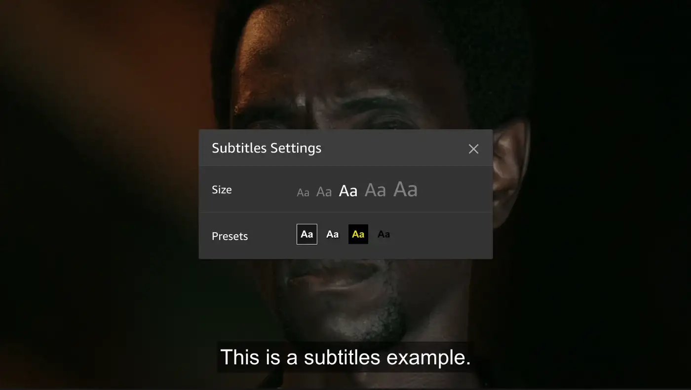
Additionally, we could display presets for various high contrast options for subtitles, and that’s how it’s done on Amazon. This gives users a faster selection, requiring less effort to configure just the right combination of colors and transparency. Still, it would be useful to provide more sophisticated options just in case users need them.
Position of Subtitles
One fine detail that’s always missing in customization settings is the adjustment of the position of subtitles and captions on the screen. Often video streaming companies elaborately adjust the position of subtitles depending on what’s currently displayed in the video. On Netflix, for example, Japanese subtitles sometimes appear on the side to not overlap any text or any important details on the video.

On Netflix, viewers can’t adjust the position of subtitles, but it actually might be a very good idea to do so. The research conducted by BBC (pictured below) showed a significant improvement when changing the subtitle location from the standard position of within a video at the bottom to below the video clip.

According to BBC, “additionally, participants responded positively when given the ability to change the position of subtitles in real-time, allowing for a more personalised viewing experience.” It’s worth noting that the test was performed with news segments, which is likely to be a slightly different context compared to immersive movies.

Some video players provide that level of customization out of the box. VLC and KM video players, for example, provide an option to adjust the scale and position of subtitles or captions and even try to synchronize them automatically. That’s the level of customization that is often missing on the web.
In general, having options to change the font based on a user’s need, choose presets for the display of subtitles, and allow users to relocate the caption on screen seems like a safe combination of features that subtitles settings need to provide.

This is especially useful in real-time communication tools like Zoom or Google Meet, where captions might overlap a shared screen or a photo of a person who is currently speaking.
Captioning Turned On By Default?
If a vast majority of viewers prefer to watch a movie with subtitles or captions turned on, it might be worth considering having them turned on by default. However, that requires an assumption about the preferred language and the type of captioning a user prefers to watch. And viewers who prefer not to be disturbed by running text would need to turn them off every time they want to watch a movie.

Ideally, a video player would include a setting to turn on or off captions by default and respect the user’s choice whenever a user chooses to come back to the site or rewatch a video. Or even further than that, users could save captioning preferences as presets, adjusting everything from font size to the location of subtitles on the screen. So rather than turning subtitles on by default for everyone, it could be an opt-in setting that could be set once and then stay a default as long as it isn’t changed.
Wrapping Up
Subtitles and captions might appear like an obvious and simple design challenge. Still, to improve the experience of viewers, we need to consider everything from formatting, editorial, and design conventions to different ways of displaying captions natively, to the location, and customization settings and presets.
The guidelines and ideas listed above might be helpful when you are choosing a video platform for your video content or when you edit captions for your social media content.
And it’s worth remembering: a vast majority of your customers are likely to use some sort of captioning when they watch your content, so it’s worth spending a bit of extra attention to ensure that their experience is as good as it can be — nevermind what capabilities they might or might not have.
A kind thank you note to Svetlana Kouznetsova for her kind feedback on this article.
Useful Resources
- Guidelines and Best Practices for Captioning Educational Video, Captioning Key, Described and Captioned Media Program (DCMP)
- The Golden Rules of Transcription, Checksub
- “Subtitles were never designed. The missing element in TV typography design”, Avi Ashkenazi
- “The UX design case of closed captions for everyone”, Sebastian Greger
- “Using Subtitles to Improve Accessibility: Instagram TV UX Design”, Divami Design Labs
- “Reading television: the cognitive experience of closed-captioned TV”, James Beber
- “Typefaces for Dyslexia”, Adrian Roselli
- BBC Subtitle Guidelines
- “Implementing Japanese Subtitles on Netflix”, Rohit Puri, Cyril Concolato, David Ronca and Yumi Deeter
- “Design Principles for Real-Time Captions in Video Calls”, Quinn Keast
- “Games UX: All About Subtitles” (behind a Medium paywall), Chris Bam Harrison
- Usability tests for personalized subtitles (academic paper, behind a paywall), Lluís Mas Manchón and Pilar Orero
- Sound Is Not Enough, a book on audio accessibility by Svetlana Kouznetsova (preview)
Meet “Smart Interface Design Patterns”
If you are interested in similar insights around UX, take a look at Smart Interface Design Patterns, our shiny 9h-video course with 100s of practical examples from real-life projects. Design patterns and guidelines on everything from mega-dropdowns to complex enterprise tables — with 5 new segments added every year. Just sayin’! Check a free preview.

100 design patterns & real-life
examples.
9h-video course + live UX training. Free preview.
(yk, il)