
I am currently working on research linked to a project on creating a complete guide to developing a UI kit as a technical system. In the first stage, I collected technical decisions, requirements, and possible solutions by analyzing open-source and proprietary UI kits. My initial plan was to to dive deep into every detail after collecting the main decisions that were made in dozens of such UI kits.
At my main workplace, an open-source UI kit is used under the hood. I soon noticed that it was difficult to understand its API when it came to anything related to colors.
I had many questions:
- Which tasks does the kit’s API solve?
- Which concepts does its API implement?
- How is the API implemented?
- What should I know before starting to implement such mechanics in a UI kit from scratch?
- What are the best practices?
I decided to temporarily interrupt my data collection and dive deep into this topic. In this article, I want to share some things that I’ve learned. I suppose that I’m not the only one who has such questions, and this article’s goal is to answer these questions to save you time. It will also help me not to burn out and to continue my research work.
How to deal with colors is one of many technical decisions. It incorporates many subdecisions and relates to other decisions, such as:
- How to implement theme switching — according to user action or the OS setting?
- How to provide theme configuration for different system levels?
- How to automatically make a color palette?
- How to implement color-contrast checking?
- How to support different contrast models? (Windows has high-contrast mode, whereas macOS has inverted colors.)
In the article, I’ll cover two parts. First, we’ll look at base operations, which include the definition and use of colors and known issues and practices related to color. Secondly, we’ll look into an approach to solving tasks by analyzing existing solutions and understanding the connections between them.
Some code examples will contain Sass and TypeScript, but these aren’t the focus of this article. You will hopefully come to understand a model that you can implement with the tools of your choice.
Also, I’d like to warn you against trying to create your own UI kit. The subdecisions that I mentioned aren’t done consciously. You will see that even implementing a small part of a kit, such as the definition and use of colors, is not as easy as it seems at first glance. Can you imagine the complexity of developing an entire system?
As reference examples, we will use Material UI and Fluent UI React Northstar.
Why them?
As for Material UI:
- It contains a lot of best practices (I have compared it with others).
- It’s one of the most popular UI kits in open-source software (at least according to the GitHub stars).
- I have a lot of experience in using and customizing it.
As for Fluent UI React Northstar:
- It contains a lot of best practices (I’ve also compared it with others);
- It’s used in large-scale enterprise projects.
- It contains new concepts that simplify the public API and implementation based on previous experience developing UI kits (see the Fluent UI Web readme).
As a bonus, you will understand how to use the APIs of these UI kits.
To achieve the article’s goals, we will follow a few steps:
- Consider which tasks are required to be solved.
- Define the terms and their meaning. Without a common language, it would be hard for us to understand each other.
“A project faces serious problems when its language is fractured. Domain experts use their jargon, while technical team members have their own language tuned for discussing the domain in terms of design.
The terminology of day-to-day discussions is disconnected from the terminology embedded in the code (ultimately the most important product of a software project). And even the same person uses different language in speech and in writing so that the most incisive expressions of the domain often emerge in a transient form that is never captured in the code or even in writing.
Translation blunts communication and makes knowledge crunching anemic.”
— Domain-Driven Design Tackling Complexity in the Heart of Software, Eric Evans, Addison-Wesley, 2004
- Consider problems we might encounter and how to solve them.
- Illustrate solutions by considering the implementation of reference UI kits.
- Follow the example of the best reference.
Let’s dive in!
Colors Mechanics Model
Terminology
Let’s say that our ultimate goal is to provide the ability to switch themes. In this case, the following concepts come into play:
- Color, hue
This refers to the type of color (red, blue, and so on). The term we’ll use in this article is “color”. - Color shade, color gradient, color variant, color tone
Color may be determined by hue, brightness, and saturation. The term we’ll use in this article is “color variant”.
“One important detail about Munsell’s color system is that he divided the color space into three new dimensions: The hue determined the type of color (red, blue, and so on), the value determined the brightness of the color (light or dark), and the chroma determined the saturation of the color (the purity of the color). These dimensions are still used to this day in some representations of the RGB color model.”
— “A Short History of Color Theory”, from Programming Design Systems
- Color palette
This is a set of variants of color. We’ll refer to it in this article as “color palette”. - Design tokens
These are general component property names from a design point of view. The term we’ll use in this article is “visual properties”. For example:- border,
- text,
- background.
- Color scheme, theme, color theme
A color scheme is created to impose some constraints. The term we’ll use in this article is “color scheme” because “theme” is more general than “color scheme” (encompassing font size and so on). For example, a color scheme might:- contain only variants of the color pink,
- be tailored to light or dark illumination of the space around the device,
- be tailored to people with vision impairment,
- be tailored to specific device constraints.
Producing Operations With Color
We’ll consider basic operations such as defining and using color.
Color is defined according to various color model notations (RGB, HSL, etc.).
In the case of development of a digital user interface, a color scheme is created to color UI components. Each UI component might have a different color for its various properties in each scheme. For example, the background color of a call-to-action button might be red or blue depending on the current theme.
So, how can colors be represented?
How to Name Variables?
If you just name variables according to their color, you will get into a situation where a variable named redColor should have a blue color value in another scheme.
Also, the components that show an error state should still be able to use the red color from the redColor variable. So, another layer of abstraction needs to be introduced to solve the problem.
This additional layer organizes colors by their function (for example, error state) or visual property name (for example, background). It acts as a color scheme.
It’s interesting that organization by function was already introduced to CSS properties.
Each value in the layer’s structure would be mapped to the color palette value by color name and color variant.
How To Remember Use Cases?
After adding colors to the layer, you might encounter a minor problem — how to remember their use cases:
I remember the very first time I tried Sass on a project. The first thing I wanted to do was variablize my colors. From my naming-things-in-HTML skillz, I knew to avoid classes like
.header-blue-left-bottombecause the color and position of that element might change. It’s better for them to reflect what it is than what it looks like.So, I tried to make my colors semantic, in a sense — what they represent, not what they literally are:
$mainBrandColor: #F060D6;
$secondaryFocus: #4C9FEB;
$fadedHighlight: #F1F3F4;
But I found that I absolutely never remembered them and had to constantly refer to where I defined them in order to use them. Later, in a ‘screw it’ moment, I named colors more like…
$orange: #F060D6;
$red: #BB532E;
$blue: #4C9FEB; $gray-1: #eee;
$gray-2: #ccc;
$gray-3: #555;
I found that to be much more intuitive, with little, if any, negative side effects. After all, this isn’t crossing the HTML-CSS boundary here; this is all within CSS and developer-only-facing, which puts more of a narrow scope on the problem.”
— Chris Coyier, “What do you name color variables?”
In the initial stage of the project, writing comments next to the variables might help. And creating a dictionary might help to communicate with a design team in subsequent stages.
“The use of dictionaries as a means to establish a common understanding of terms has already proved its benefits in various software-related fields. Literature on software project management recommends the usage of a project glossary or dictionary that contains a description of all terms used in a project. This glossary serves as a reference for project participants over the entire project life cycle.”
— Concise and Consistent Naming, Florian Deissenboeck, Markus Pizka, 2006, Software Qual J
Now we understand why just using color names wouldn’t work. But it points to the solution for another minor problem: defining names for variants of a particular color.
How To Define Names For Color Variants?
The solution is simple. Just add numbers as suffixes to the names. The advantage of this approach is that adding a new color will be easy, and the suffix will tell you that the color is a variant of another color. But this is still hard to remember.
$gray-1: #eee;
$gray-2: #ccc;
$gray-3: #555;
Another approach is to give a unique name to each color. This approach is the least convenient because names wouldn’t have any useful information, and you would have to remember them. You would need to define the names or use a name generator, which is an unnecessary dependency.
A better solution is suggested by Zain Adeel in his article “My Struggle With Colors”:
Using a scale from 10–100 with a tone at each ten is by far the simplest. A purple-10 will understandably be the lighter tone in comparison to a purple-50. The familiarity of such an approach allows the system to grow predictably.
The approach provides maximum useful information by name. Also, it can cover more cases if a prefix is added. For example, the prefix “A” can denote an accent color. As explained in the Material UI documentation:
A single color within the palette is made up of a hue, such as “red”, and shade, such as “500”. “red 50” is the lightest shade of red (pink!), while “red 900” is the darkest. In addition, most hues come with “accent” shades, prefixed with an A.
A disadvantage is that the cascade will change if you ever have to add an intermediate color with a brightness variant. For example, if you have to add a color between gray-10 and gray-20, then you might replace gray-20 and then have to adjust the following color values (gray-30, gray-40, and so on).
Also, any solution comes with potential maintenance issues. For example, we would have to ensure that all color definitions have all possible variants in order to avoid a scenario where we have gray-20 but not red-20.
One approach to solving problems is Material Design’s color system. One of the values of this guide is that it doesn’t contain details of technical implementation, but rather focuses on concepts containing only important information.
Illustrating Solutions
Let’s look at an implementation from top to bottom.
Fluent UI React Northstar (@fluentui/react-northstar@0.63.1)
Color Scheme
Let’s consider the “Teams” theme.
Fluent UI React Northstar has a two-dimensional color scheme model.

“Brand” is the color scheme. “Light theme,” “HC theme,” and “Dark theme” will also be color schemes in this article.
Grouping Approach
Color scheme object keys are visual properties combined with states.
export const colorScheme: ColorSchemeMapping = { amethyst: createColorScheme({ background: colors.amethyst[600], backgroundHover: colors.amethyst[700], backgroundHover1: colors.amethyst[500], backgroundActive: colors.amethyst[700], }),
};
Note: Check out the source code.
In the siteVariables key of the theme configuration, the colors palette is located in the colors key, and the color scheme is in the colorScheme key. They are explicitly separated.
Color Palette
A color palette is an object. Interestingly, some color values are defined with transparency, and the palette contains colors named according to their function.
export const colors: ColorPalette<TeamsTransparentColors> = { ...contextualAndNaturalColors, ...primitiveColors, ...transparentColors,
};
Note: Check out the source code.
“Colors in Teams color palette have the following categorization.
Primitive colors
This part of the palette contains colors that, semantically, cannot have any tints. This group is represented by two colors, black and white — as there is nothing blacker than black and nothing whiter than white.
[…]
Natural colors
This part of the palette includes colors from those that are the most commonly used among popular frameworks (blue, green, gray, orange, pink, purple, teal, red, yellow). Each color includes at least ten gradients; this allows us to satisfy the most common needs.
This decision is experienced from Material UI and allows us to define more variants than by using semantical naming (lightest, lighter, etc.). However, there is no requirement for a client to define all the gradient values for each color — it is just enough to define those that are actually used in the app.
[…]
Contextual colors
This part of the palette may include brand color as well as danger, success, info colors, and so on.”
— “Colors”, Fluent UI documentation
The value in the object’s key by color name may be an object containing keys such as a color variant or just a color string literal of a specific color model.
export const naturalColors: TeamsNaturalColors = { orange: { 50: '#F9ECEA', // darkOrange[50] 100: '#EFDBD3', // app orange14 200: '#EDC2A7', // old message highlight border 300: '#E97548', // orange[900] 400: '#CC4A31', // app orange04 darkOrange[400] 500: '#BD432C', // app orange03 600: '#A33D2A', // app orange02 700: '#833122', // app orange01 darkOrange[900] 800: '#664134', // app orange14 dark 900: '#51332C', // app orange16 dark },
}
Note: Check out the source code.
export const primitiveColors: PrimitiveColors = { black: ‘#000’, white: ‘#fff’,
};
Note: Check out the source code.
Material UI (@mui/material@5.10.4)
Color Scheme
Material UI provides only dark and light color schemes as default schemes.
Grouping Approach
The palette key of the theme configuration contains the color scheme used in this article.
Keys linked to the colors of the color scheme have been chosen according to the following groups:
- The functional purpose of the color:
primaryprimaryDarktextgrayerrorsuccesswarningsecondaryinfoactiondivider
As the value in these object keys, they may be the following keys:
lightmaindarkcontrastText
- Visual property name
For example,background. - Colors grouped in a category:
{ common: { black: "#1D1D1D" white: "#fff" }
}
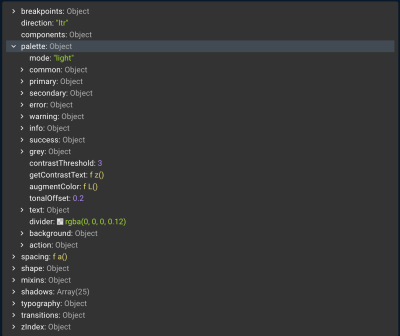
At the same time, the values in theme.palette contain other stuff:
- The current color scheme mode:
{ mode: 'dark', } - Utilities such as
getContrastText, - …and more.
Color Palette
Each color is an object. Keys are a color variant. The prefix A denotes the accent color.
const blue = { 50: '#e3f2fd', 100: '#bbdefb', 200: '#90caf9', 300: '#64b5f6', 400: '#42a5f5', 500: '#2196f3', 600: '#1e88e5', 700: '#1976d2', 800: '#1565c0', 900: '#0d47a1', A100: '#82b1ff', A200: '#448aff', A400: '#2979ff', A700: '#2962ff',
}; export default blue;
Note: Check out the source code.
Comparison
We will choose the best reference example according to the following factors:
- an API that corresponds with the given terminology agreed on by client;
- implementation that corresponds with the given terminology;
- following best practices for the designated tasks.
Correspondence With Given Terminology
Fluent UI React Northstar
Pros:
- The color palette and color scheme are explicitly separated.
Cons:
- The color palette contains not only common color names (red, green, and so on).
Material UI
Pros:
- The color scheme (the “palette” key in the theme configuration) contains not only colors.
- The “palette” key name is confusing because if you want to use a color palette, you would import the “colors” object from the
@mui/materialpackage. - Misunderstanding is compounded by incomplete compliance with the Material UI guide:
Used Practices
From the point of view of this factor, let’s consider only the differences.
Fluent UI React Northstar
Adding a postfix denoting the brightness of color was chosen as the approach to name variables. The color palette contains colors named by their function and common color names (red, green, and so on). The color scheme groups color by visual properties combined with states.
Material UI
Adding a suffix denoting the brightness of the color and a prefix denoting the accent color was decided on as the approach to naming variables. The color palette contains colors named by their common color names (red, green, and so on). The color scheme groups color by visual properties and function.
I would use the Fluent UI React Northstar as the reference for implementation because it accords with the given terminology. If the topics that were mentioned in the introduction as not being considered were to be considered, then the choice might have been different.
Conclusion
Let’s summarize the key points:
- If you want to implement something, examine the best references in order to avoid reinventing the wheel, and focus instead on finding solutions to unresolved problems.
- During the examination process, you will encounter solved tasks and terms. Make a summary of them.
- Choose the best solutions according to your task’s requirements and limitations.
- Choose the best reference that corresponds with the solutions that you chose.
- Implement by following the best reference.
If you want to dig into color theory, I strongly recommend the book Programming Design Systems, written by Rune Skjoldborg Madsen.
I would like to thank Andrey Antropov, Daniyal Gabitov, and Oleksandr Fediashov for their suggestions for improvement and valuable additions. I would also like to thank the editors of Smashing Magazine for their assistance.
(vf, yk, il, al)