
Design should never be a trade-off when it comes to creating an accessible web. There are many features coming to the web that will make creating contrast a lot easier. But even though CSS functions such as color-contrast() are only available in Safari behind a flag, we can already do a lot to create contrast in an easy way by using custom properties.
Good Design For Accessibility Shouldn’t Be Hard
When we design, we think about creating something beautiful that enables emotion and can project the philosophy of a brand. We want to reach as many people as we can, but there are times we start struggling to find a way to design something accessible while still respecting the look & feel of a brand. While there might not be an easy way to overcome this when it comes to printed design, we can create better experiences for people on the web by creating small tweaks to our contrast using CSS. I’m not going to lie to you, this does evolve some careful planning and creating a solid design system, but we can do this! Let’s create a design for everybody’s eyes.
Before we really start to take a deep dive into how we can create such a high-contrast system, let’s debunk some of the myths that are still floating around in the world.
Myth 1: We Have To Create Two Designs
With a careful, thought-out design system, it shouldn’t be necessary to create multiple designs in order to create a high-contrast version. All it takes is careful planning of colors and components. While it’s not always possible, you could create high-contrast colors for the brand from the outset. When it comes to the actual design of your components, creating two color definitions in your design system is a good starting point: your primary design colors and high-contrast variants.
When creating those different color sets, we should think about our components. Instead of looking at each component individually, we could think about how to replace all of their colors at the same time. Of course, that is the ideal situation, and we might need to specify some components in detail if necessary.
Myth 2: It Takes Too Much Time
Ah, the good old myth about accessibility and time management. But let’s keep it real. Creating extra options for high contrast will take a small amount of extra time when it comes to design planning. It’s a bit more work than adding some extra aria attributes (which you should avoid, if possible) or using (r)ems for font sizes. But to be fair, the returns you get for that little extra time could be substantial, especially if you decide to create a design with lighter colors or subtle color palettes.
Myth 3: Contrast Is Subjective
While it is true that multiple types of disabilities affect the way a user perceives your website, contrast is a measurable profusion for accessibility. Getting a triple-A score can be a bit more challenging than going for double-A. If achieving a triple-A score across your whole website is really too big of a challenge, you could create a plan where you make choices based on the importance of the content, creating the highest contrast for the main content and navigation and maybe settle for double-A for less important information. The fact that you are already thinking in those terms shows that you have the right mindset and care about your users. A double score shouldn’t be too hard to achieve, but at least try to go for more.
Taking care of a better contrast is caring for your users. We should always try to achieve the highest contrast possible from the start. Even though there are a few software solutions, such as overlays and even manual solutions (screen adjustment), to help with low contrast, we want to make a statement to our users by showing we care. Do we really want our users to visit our website with an external tool? I think we want to give our users the best experience possible. And provide the users with something designed for them.
Myth 4: It Wouldn’t Be True To The Branding, Because The Branding Is Low-contrast.
This is probably the myth that we hear most. But what if we stay true to the branding while also optimizing? If your brand has a low-contrast logo, it’s still better to create an alternative version with high-contrast colors. The reason for this is quite simple: if you want to force people to the low-contrast banding, then you’re just excluding people, and if you are running a webshop, you might potentially lose some sales. We don’t have to just use the colors from the logo, either. You could also add supplementary (high contrast) colors to your palette.
It’s much easier (and cheaper) to create a high-contrast version of your website than to do a complete rebranding. You could even create a high-contrast version of your logo and control the SVG with CSS, which is why in my demo, the logo was slightly altered for low contrast. But I’m getting ahead of myself. Let’s start at the beginning.
If you want to read more about some of the myths about contrast and colors, I suggest you read this smashing article by Andrew Somers.
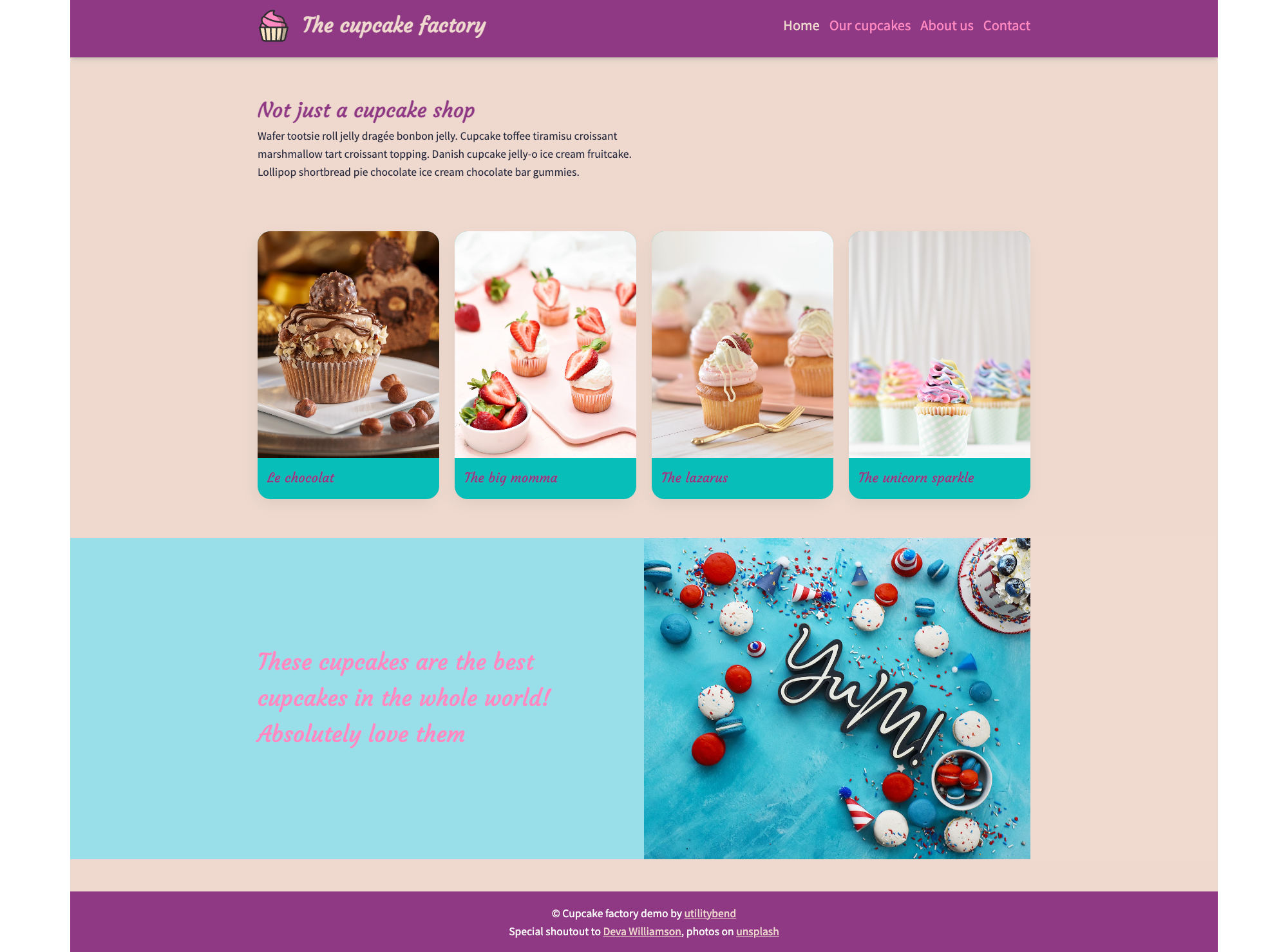
You Can Plan Ahead Or Optimize While Developing
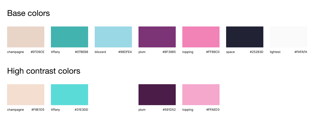
In the first part of this article, we chose to plan ahead and already create a design system that handles the low-contrast colors. But we all have deadlines and might not find the time to create something like this. So what can we do to adjust our colors for low contrast when we don’t have the plan to start with? Before we set off, let’s start with our basic design; I made a “cupcake factory” with light colors to illustrate contrast issues:
As the title of this article stated, we used custom properties to set our basic colors inside the root of our website.
:root { --color-champagne: #EFD9CE; --color-tiffany: #07BEB8; --color-blizzard: #98DFEA; --color-plum: #8F3985; --color-space: #25283D; --color-lightest: #FAFAFA; --color-logo-basket: #F8E6C4; --color-logo-topping: #FF89C0;
}
Our Initial Styling Using Custom Properties
We’re going to use these custom properties to color our website. In reality, we would use custom properties for a lot more than the colors, but to keep this demo to the point, let’s keep this to a minimum.
For example, our coloring would be something like this (stripping all other properties):
body { background: var(--color-champagne); color: var(--color-space);
} h2 { color: var(--color-plum);
} header { background: var(--color-plum);
} .branding { color: var(--color-champagne);
}
We will be overwriting these colors later on by using the media query that detects if the user prefers more contrast:
@media (prefers-contrast: more) { /* overwrites here */
}
This media query is available in all of the evergreen browsers.
A Small Note On The prefers-contrast Media Query
It’s always a better practice not to rely on this media query. There are many users out there who struggle with low contrast that haven’t had any education about high contrast system settings. We are now assuming that we don’t have any choice but to use low-contrast color combinations and therefore want to implement some improvements for the people who actually know these settings. However, do not completely underestimate the impact of this improvement, as people are finding their way to these settings a lot more often. There are contrast settings on both Windows and Mac.
Detecting Our Contrast Issues
You can follow along by viewing the full demo of this on CodePen while you read through the article.
See the Pen [The cupcake factory [forked]](https://codepen.io/smashingmag/pen/poZrmqm) by utilitybend.
After creating our cupcake factory, we can check for potential contrast issues. Luckily, Chrome DevTools has some great options to do this. We can check color by color inside of the styles panel by clicking on our color and opening the contrast information:
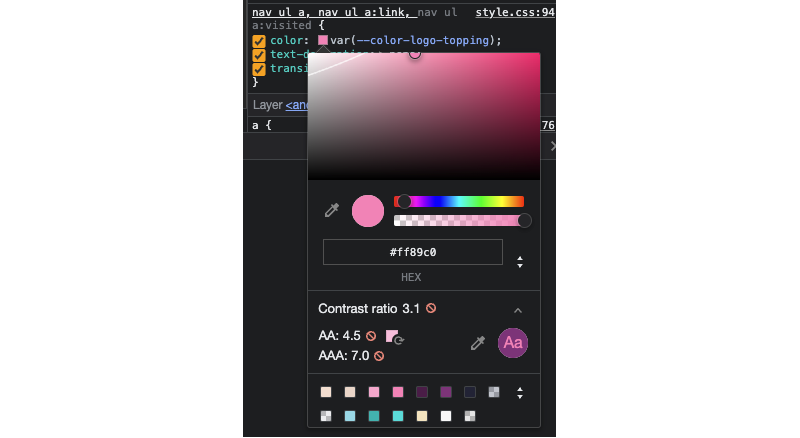
It actually shows how far away your contrast ratio is to provide a double or triple-A ratio. Another neat feature of this is the little white line you can see in this screenshot, which actually shows the range you should go to for the right amount of contrast. This might come in handy when we start changing our colors. Also, notice the suggested color next to the “AA” ratio score.
But there is another handy feature for our initial detection when it comes to contrast issues, which is the “CSS Overview” panel. If you don’t have this, it’s probably still hidden; you can access this by pressing the three dots on DevTools and selecting more tools > CSS Overview.
Select the colors tab inside of this overview, and you will get all your contrast issues right away.
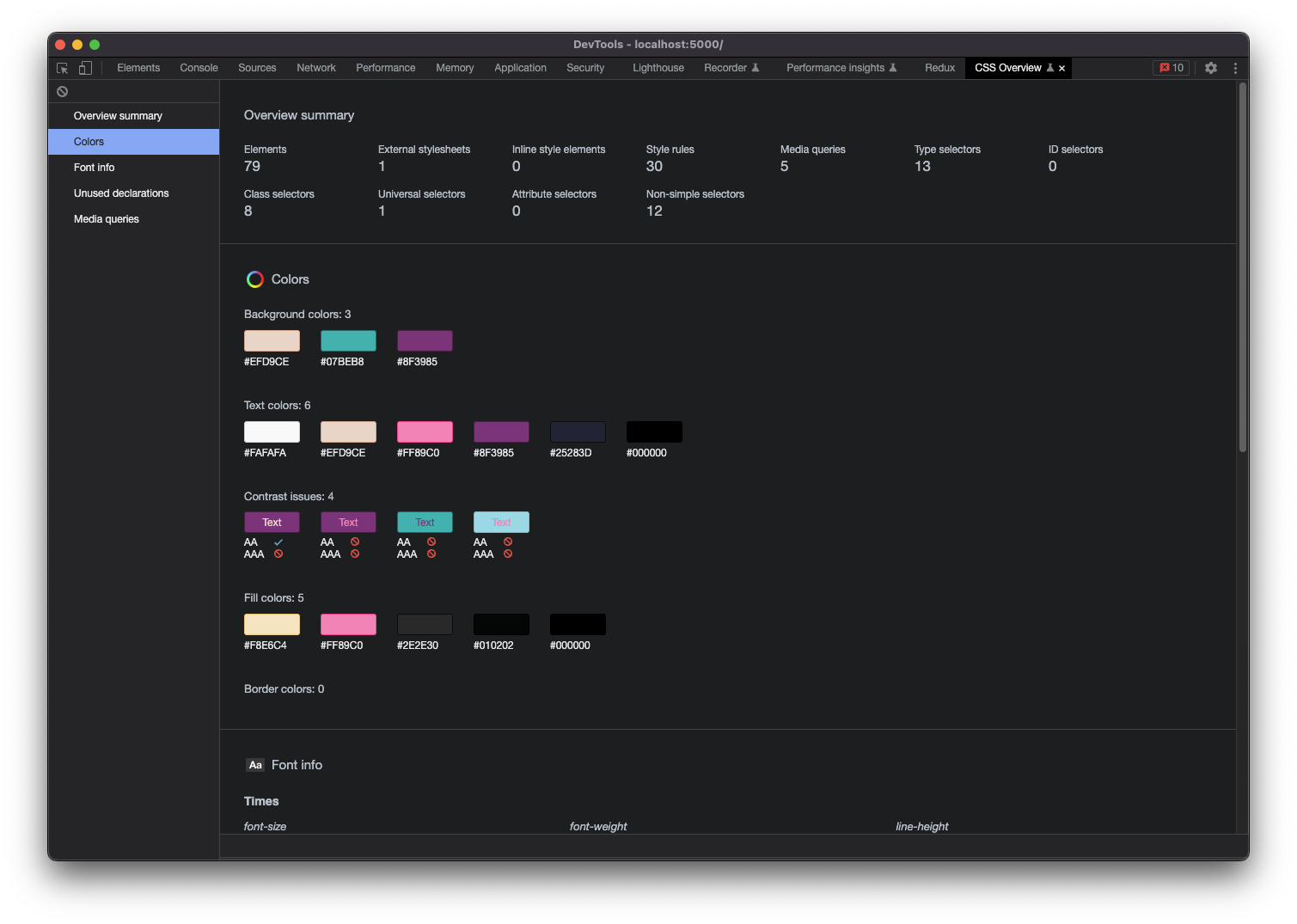
As expected, we are having some contrast issues. We’re not getting to the minimum of an “AA” in most cases. We can optimize quite a bit, so let’s get to it and create some more happy customers to try our delicious cupcakes.
Optimizing Our Contrast Issues
The first thing we want to do is actually view our page while enabling this media query. No need to use a special plugin or change settings for that — DevTools has got it covered.
We will need to open our rendering drawer in order to do so. If you don’t have this drawer, you can press cmd+Shift+p in DevTools and type in rendering and select it; this should open that drawer.
There are a lot of options here to test our website for accessibility, also including reduced motion (which is always a great practice take care of). But we will be focussing on the “Emulate CSS media feature prefers-contrast.” Select this option and set it to “more.”

So far, nothing has changed on our website, but we will be able to change our colors now, and since this emulation keeps active while refreshing, it can really speed up our optimization.
Inside our root declaration, let’s add that media query we talked about. I am using Scss for this demo, but it’s certainly not a requirement.
:root { --color-champagne: #EFD9CE; --color-tiffany: #07BEB8; --color-blizzard: #98DFEA; --color-plum: #8F3985; --color-space: #25283D; --color-lightest: #FAFAFA; --color-logo-basket: #F8E6C4; --color-logo-topping: #FF89C0; @media (prefers-contrast: more) { /* let's overwrite our colors here */ }
}
One of the bigger problems we detected was our navigation. Our “plum” color is already pretty dark, so maybe we can make this a bit darker already.
:root { /* original colors here */ @media (prefers-contrast: more) { --color-plum: #591D52; }
}
The result is staggering, and we can already measure a lot more contrast:

But when taking a closer look at our navigation, we notice that we achieved our “AA” ratio. As this is the navigation, I especially want to achieve a “AAA” ratio here. Since our logo is in SVG, we will change the topping of our cupcake logo as well. This might not be needed, but it will create some harmony in our high-contrast design. So let’s turn to our DevTools again to change the links and cupcake color.

We are so close to getting our ratio of 7. What’s handy about this view in DevTools, is that it actually suggests a color to get better contrast and shows two different lines between the different ratios. Let’s click on the color that was proposed. And add the new hex code to our custom properties.
Note: We could use rgb() or hsl() as well. We can even toggle between color modes inside the DevTools panel.
:root { /*our original colors */ @media (prefers-contrast: more) { --color-plum: #591D52; --color-logo-topping: #FFAED3; }
}
After doing this for a few more of our colors, the final result looks like this:

We’re really close but our quote actually got a bit worse in the process. This is why we sometimes have to take control of our specific components.
We selected the color based on the container of our CTA, so let’s overwrite this:
.container { /*other styles*/ color: var(--color-logo-topping); @media (prefers-contrast: more) { color: var(--color-plum); } }
When it comes to our contrast, we pretty much nailed it. But there are a few things missing. At the moment, the navigation’s active state is only differentiated by color. The same goes for our clickable cards, where the only indication is a hover state.
Always make sure active states and possible actions are clearly visible. Make sure you rely on more than just color to indicate that something is active and/or clickable.
Let’s indicate the links and active state more clearly by adding a text decoration on the link itself.
@media (prefers-contrast: more) { text-decoration: underline;
}
If you find a text-decoration to be a bit boring for the active state, you can always take another approach such as adding an arrow indicator before the active element. The choice is yours, as long as you don’t rely on colors alone.
The final design looks like this:

Going A Bit Deeper With Visual Deficiencies
We can do a lot more checks for our contrast. How about checking some visual deficiencies? In our rendering tab, we can select some of those to have a look at our page. I suggest we toggle through them.

Achromatopsia, for example, is about having a very poor ability to see colors. While my cupcake factory wasn’t optimized for this at all, when combining this deficiency with the high contrast media query and adding a text-decoration to my cupcake list, it looks very good. You can emulate a lot of other deficiencies with this tool. There are many types of color blindness that you can check with them. Make sure you give them a try.

A Final Conclusion On Contrast
Managing our colors will truly help people to access our content. I also love the idea that we can add meaningful design value to those users. Will a user with achromatopsia browse our website in high contrast? Has the user actually enabled a high-contrast setting? These are questions that we can never know the answer to. Not relying on media queries for this is and will always be the best approach, but it’s nice to have this possibility in CSS for tackling those edge cases. So, by all means, don’t ever rely on them for a complete website; this is just a demo to show the possibility.
Thinking about our users, spreading awareness, and exploring possibilities are certainly big steps in the right direction.
The best practice is always to create a website that has a good contrast to start with. I actually liked the high-contrast version of this little demo more and struggled to create the low-contrast version. But even though I’m (certainly) not the best designer out there, I’ve seen some examples where low-contrast design fits the branding (unfortunately).
CSS is growing at a rapid pace, and more tools are becoming available to us. But no matter which method you use now or in the future, if you have already added some value for users that struggle with contrast issues, you certainly are making the world (wide web) a better place.
You can view a full demo of this on CodePen.
And a special thanks to Deva Williamson on Unsplash for the beautiful cupcake photos.
(yk, il)