
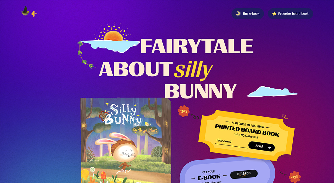
You’ve likely heard the phrase “a photo is worth a thousand words.” If that’s true, then so is a typeface.
Font selection can greatly impact what you say in through design and how easy it is to read, as well as the emotion and human psychology attached to it. Even through words are meant to be read, they are also looked at and establish a visual connection.
What is Font Psychology?
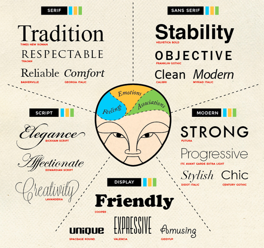
This infographic from the CrazyEgg blog is still one of the best complete examples of the psychology of fonts.
There are some pairing guidelines to start with for different typography styles.
- Serif: Timelessness, formality
- Modern serif: Glamour, high fashion
- Slab serif: Importance, attention
- Sans serif: Neutral, easy
- Ultra thin or condensed: Authoritative, busy
- Italic (serif or sans serif): Motion, distinction
- Black or bold (serif or sans serif): Importance, stop
- Script: Elegance, personal
- Novelty: Casual, lighthearted
- Geometric: Retro, childlike
- Monospaced: Code-based, techy
- Bubble or rounded: Friendly, jovial
- Vintage: Trendy, cool
- Grunge: Rough, mysterious
As you browse some of the examples throughout this article, think about how the typefaces impact how you feel about or your trust in the design and what it is trying to say. What do you trust? What gives you pause?
What is Persuasive Design?

Persuasive design is almost any type of graphic element that is intended to help someone make a choice.
The Interaction Design Foundation explains it like this: “Persuasive design is an area of design practice that focuses on influencing human behavior through a product’s or service’s characteristics. Based on psychological and social theories, persuasive design is often used in e-commerce, organizational management, and public health. However, designers also tend to use it in any field requiring a target group’s long-term engagement by encouraging continued custom.”
When you are thinking about design for websites you can further think about persuasive design as an approach that aims to influence and guide user behavior toward a certain conversion. This might use techniques such as making things easy or appealing, or using social proof or gamification.
The goal of persuasive design is to create products that are functional and able to influence users’ thoughts, emotions, and actions. All of this is accomplished through a combination of words, images, and visual elements – including typefaces.
How Can Fonts be Used to Persuade?
Most of the time you probably aren’t directly thinking about how typefaces are persuading you in a design. But everything about the font choices can create tiny reactions in your brain that make you feel a certain way about what you are seeing.
Some people love or hate serif typefaces online, for example. We’ve been talking about whether sans serifs are better for online reading for more than a decade. On the other hand, many books use serif typography and no one questions it.
This impacts how you feel about the design and whether you feel it is credible or trustworthy. (Just think if you picked up a novel and it was printed in Comic Sans; you’d have a certain feeling about that.)
UX Collective’s Dora Cee broke the context down like this, which makes a lot of sense.
“Serifs decrease reading speed, so if you want your audience to spend more time on your content, you can use this to your advantage by picking, for example, Times New Roman, Garamond, Georgia, Didot, or whatever else takes your fancy from the Serif family.
“We can also shift the perspective here. For larger chunks of text, you may want to choose Sans-serif fonts for a speedier read — which also improve accessibility. The 10 percent of the population believed to have dyslexia will likely thank you for going sans to help with reading performance. Those with low vision also seem to prefer sans-serifs according to a research review.
“Serif typefaces significantly increase memory recall. As highlighted before, because they take longer to read and decipher, they can lead to a deeper, more solidified knowledge.”
You can also extend that context to a variety of other goals pertaining to website goals and tone. Font psychology can impact persuasion by:
- Establishing credibility: Use of clear, professional fonts can create a sense of credibility and trust in the website’s content.
- Conveying a particular tone: Font choice can influence the mood and tone of a design, such as a playful font for a fun, lighthearted brand or a more serious font for a professional, traditional brand.
- Creating hierarchy: Different font sizes and styles guide attention to specific elements that creates a visual hierarchy that prioritizes information.
- Facilitating readability: Easy to read typefaces help keep visitors engaged and reduce the likelihood that they will leave the page due to frustration.
- Matching brand identity: Choosing a font that aligns with the brand’s personality and values can help reinforce identity and create a consistent user experience across all mediums.
3 Examples of Great Use of Fonts in Persuasive Designs
When you think of persuasive design, e-commerce is probably one of the first things that comes to mind because it is a direct conversion and sale. Here are three designs that do a great job with font psychology and persuasion for their online stores.
Old Navy
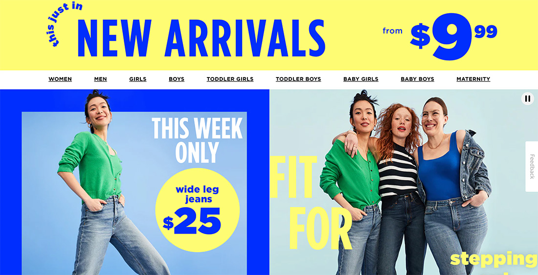
Old Navy wants to feel young, fun, and approachable. They use easy to read fonts in bright colors to emphasize that emotional – and shopping – connection.
Vollebak
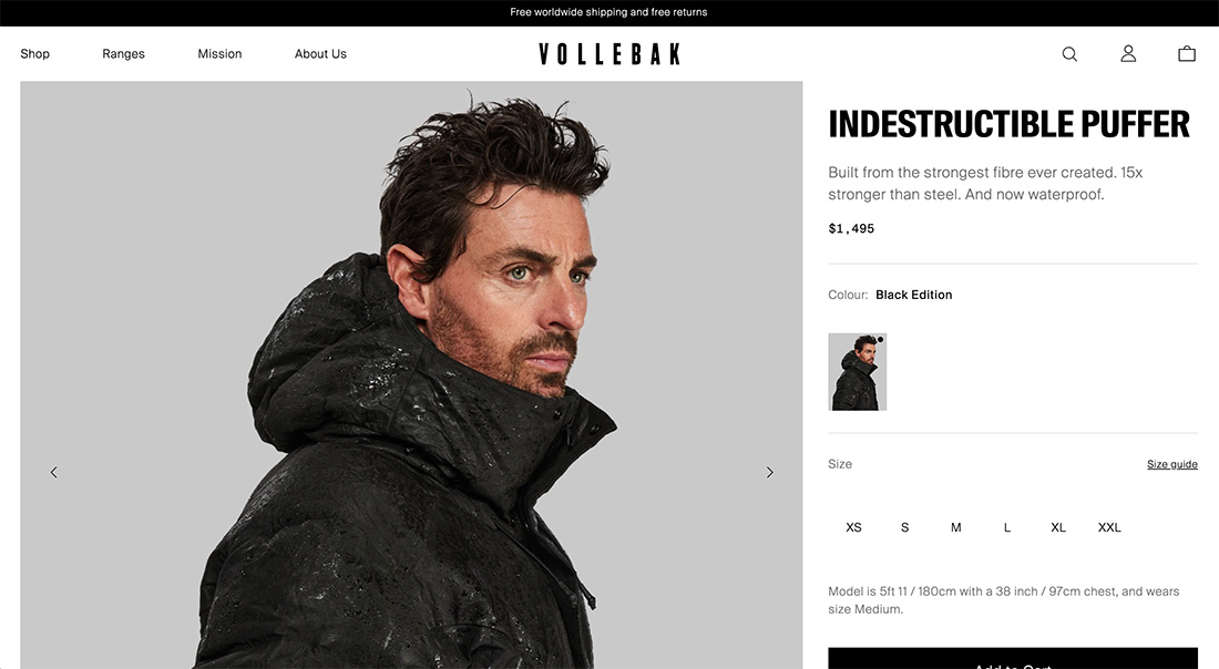
Simple typefaces help create better understanding and trust in the brand. When there are larger price tags, trust is especially important. The hierarchy of the font choices, from bold slabs to lighter descriptions to sizing and pricing in the middle, helps guide you visually through the sales process.
GXVE Beauty
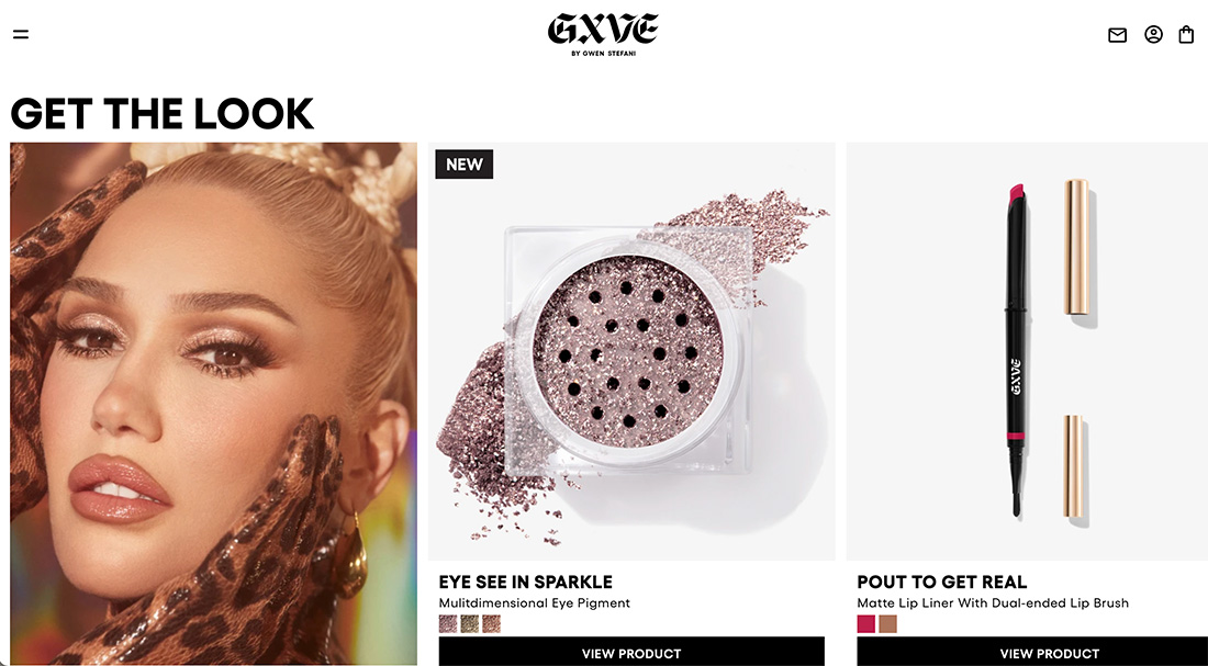
This brand does two things with typefaces:
- The brand uses a funky logotype in an old-world style to create an edgy feel
- They pair it with highly readable typefaces with a distinct bold to regular hierarchy for readability
Conclusion
Font psychology comes down to a simple factor: The right typefaces emphasize what you are trying to communicate in a design. The wrong fonts can have a negative impact and make messaging unclear or create misalignment or confusion.
Using the right typefaces can work to help you drive conversion and establish better brand connectivity. Think about your goals and you choose typefaces for projects to ensure the best alignment possible.