
I love to make CSS do stuff it shouldn’t. It’s the type of problem-solving brain training you’d get building a calculator in Minecraft, except you probably won’t get a job working with Minecraft Redstone no matter how good you get at that, whereas CSS skills are worth actual money, and many generalist programmers are scared of CSS, so studying it can be a way to stand out from the pack. Also, when you’ve done the impossible with CSS, all normal CSS tasks seem easy.
I’ve read interesting discussions on the web about whether CSS is a Turing complete language and whether CSS and HTML qualify as programming languages. I haven’t decided, but I can say that in the quest to support common UI patterns in a standard way, some of the newer CSS features blur the line between styling and functionality.
Challenging ourselves to solve logical problems with only CSS and HTML can force us to spend quality time with some of the newish, programing-like features of CSS, such as custom properties and logical functions. It still wasn’t clear how these could be used to build a Sudoku solver using only CSS, but as crazy as the idea sounded, the constraint-based logic of Sudoku seemed like it might be compatible with the declarative nature of CSS, so I wasn’t shocked to find someone else claimed to have built a “CSS3 Sudoku solution solver.” As it turned out, this was more like a sudoku validator in CSS than a solver. It also used a tiny bit of JavaScript to work with textboxes.
After days of valiantly trying to build a full Sudoku solver and generator app in pure CSS, I learned three things.
- You can unit test Sass functions and mixins, which is awesome. If you’re heavily using and reusing these Sass features, which is what they are meant for, they become as mission-critical and as scary to change as any other part of your codebase. They deserve tests around them.
- Chrome DevTools shows an infinite spinner of death when you throw 50MB of Sass-generated CSS at it.
- Maybe it’s impossible to translate something like this Python script into pure CSS. Maybe.
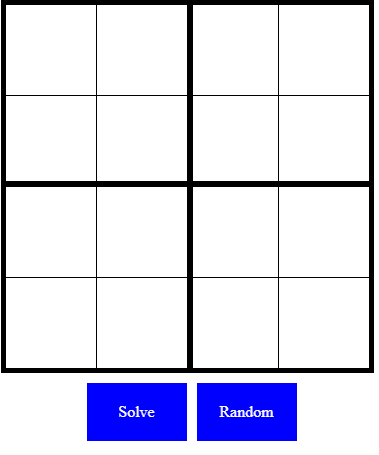
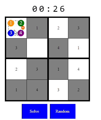
However, we can achieve a Sudoku solver and generator app for 16-square Sudoku which you can play with below, then we’ll break down how its features work. Where is your god now, simple puzzle intended for young children?
The value selector
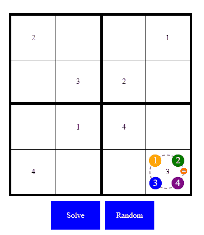
Since we’re experimenting with CSS, we are contractually obligated to include something visually interesting, though nothing too over-the-top as Sudoku players seem to appreciate a UI that stays out of the way. In my opinion, the way you select numbers on some of the Sudoku apps could be more intuitive, so I decided to apply the radial menu UI pattern, which dates all the way back to days of black and white Macintosh and is still popular in modern video games. Someone actually built a nice pure CSS library for radial menus, but I got a crush on React Planet as I love the way it captures both selecting an item with the circle around it, and how it attractively displays the available actions. I wanted to see if I could build a similar effect with just CSS.
I took some of the dashed circle code from this Pen and then made the numbers out of labels using the old border-radius: 50% trick, then I used absolute positioning to make the numbers “stick” to the correct point on the dashed circle even when the animation makes it change size.
.context .number.top { background: green; margin-left: auto; margin-right: auto; left: 0; right: 0; top: -12.5px;
} .context .number.left { background: orange; margin-top: auto; margin-bottom: auto; top: 0; bottom: 0; left: -12.5px;
}
The animation fades the number picker in while making its z-index higher so it becomes clickable. We are also animating the top and left margin from 50% to zero so the circle expands from the center to fill the available space.
@keyframes bounce-out { 0% { z-index: -1; width: 35%; height: 35%; margin-left: 50%; margin-top: 50%; opacity: 0; } 100% { z-index: 2; opacity: 1; width: var(--circle-radius); height: var(--circle-radius); }
}
Then, to simulate bouncy physics similar to React Planet, I use a cubic-bezier() function on the animation. The website easings.net was a big help in making easing functions easy.
.context { animation: bounce-out cubic-bezier(.68,-0.6,.32, 2.5) .5s forwards; }Both the selection of values and the behavior of opening the value selector for the selected square operate using radio button hacks, to remember which values were selected and achieve mutual exclusivity. CSS-Tricks has an excellent article on checkbox and radio button hacks, so I won’t repeat that information here, but I will show how we set CSS variables at the level of the Sudoku CSS grid based on checkboxes, as it’s central to the way this experiment works.
As we are using variables, we can get the same behavior when a value is set, regardless of whether it’s the user checking a box to specify a value, or the puzzle generator setting that same value for the square. There are many combinations of squares and values, so we are using Sass rather than writing all the combinations out by hand. We are also creating separate bit values for each value-square combination, and another custom property to tell us whether the square is unsolved. That’s because CSS gives us limited ability to compare one value to another (it’s possible but can be tricky). We are defining these values in a way that might look a bit odd at first, but will make life easier for us when it comes to validating whether a set of Sudoku square values is solvable or not.
@for $i from 1 through 16 { @for $j from 1 through 4 { #select-#{$j}-value-square-#{$i}:checked ~ .sudoku { --square-#{$i}-unsolved: 0; --square-#{$i}-equals-#{$j}: 1; } }
}
Validating the grid
Doctor Google tells us that even with only 16 squares, there are four billion possible combinations of four numbers. But a program that brute forces all these combinations and outputs the ones that are valid according to the rules of Sudoku shows that there are only 288 valid solutions in 4×4 Sudoku, which is a big difference from the number of possible valid solutions in a 9×9 grid. With only 288 possible solutions, this is where Sass can really come into its own. I’m still not sure if CSS is a Turing complete language, but Sass is, and it gives us some proper data structures, such as lists. With a bit of regex magic we can transform the list of valid 4×4 puzzles linked above into a Sass-powered two-dimensional list!
$solutions: ((1,2,3,4,3,4,1,2,2,1,4,3,4,3,2,1),(3,1,2,4,2,4,1,3,1,3,4,2,4,2,3,1),(1,2,3,4,3,4,1,2,2,3,4,1,4,1,2,3),/*...many lines later...*/(2,4,3,1,3,1,4,2,4,2,1,3,1,3,2,4),(4,3,2,1,2,1,4,3,3,4,1,2,1,2,3,4));
Sweet! If our CSS hack were a multi-tier application, this would be our database. Validation could have used the same approach of checking row and column values like the 9×9 validator we saw in the introduction, but since we know the answer it seems like we shouldn’t need to bother checking blocks and columns and rows. Instead, we can check whether the entered numbers could still be a valid puzzle or not. In pseudocode this might look something like:
foreach (s in squares) { if (solutionsContains(s.value, s.index) or s.isUnsolved()) { showValidationError(); } } Remember we created those weird variables whenever a square value is selected?
--square-#{$i}-unsolved: 0; --square-#{$i}-equals-#{$j}: 1;So now we have answers to both questions in the condition in line 3 of the pseudocode above, but how can we do a logical OR operator in CSS? There’s a great article on CSS-Tricks about using calc() to simulate logic operators in CSS, and I’m not sure I would have even thought of some of the code in my Sudoku solver without it, but some of the formulas explained in that article get a bit unwieldy, especially if you want to do nested ANDs and ORs with more than two operands. For example, we need the CSS equivalent of this pseudocode:
if ((squareOneEqualsOne and squareTwoEqualsTwo /*...*/ and squareSixteenEqualsOne) or (squareOneEqualsOne and squareTwoEqualsThree /*...*/ and squareSixteenEqualsOne)) { sudokuIsValid(); } }Well, that article showing how to do logic using calc() was written in 2019. Nowadays, in addition to calc(), we have the well-supported min() and max() math functions which meet our needs even better. If you Google “CSS min, max and clamp” (the last of which is just convenient sugar for a combination of min() and max()), you’ll find many examples are showing how they can be used to simplify fluid typography. That’s one compelling use case, but you can use these math functions anywhere you’d use a number, which adds a lot of power to CSS. For example, if you pass bit flag variables to CSS min(), that’s equivalent to AND. If you pass the same flags to CSS max(), that’s equivalent to OR. We can prove this using the following truth tables.
| A | B | A AND B | min(A, B) |
|---|---|---|---|
| 0 | 0 | 0 | 0 |
| 1 | 0 | 0 | 0 |
| 0 | 1 | 0 | 0 |
| 1 | 1 | 1 | 1 |
| A | B | A OR B | max(A, B) |
|---|---|---|---|
| 0 | 0 | 0 | 0 |
| 1 | 0 | 1 | 1 |
| 0 | 1 | 1 | 1 |
| 1 | 1 | 1 | 1 |
We can get pretty sophisticated with that, especially when you add the helpful fact that we are allowed to do anything calc() can do within min() and max(). CSS just took a step closer to being its own weird scripting language. Now we can implement the condition in our validation pseudocode above in CSS. (In practice, we generate this from Sass since it’s very repetitive.)
.sudoku { --square-1-matches-puzzle-1: max(var(--square-1-unsolved), var(--square-1-equals-1, 0)); --square-2-matches-puzzle-1: max(var(--square-2-unsolved), var(--square-2-equals-2, 0)); /*...*/ --square-16-matches-puzzle-1: max(var(--square-16-unsolved), var(--square-16-equals-1, 0)); --puzzle-1-found: min(var(--square-1-matches-puzzle-1), /*...*/ var(--square-16-matches-puzzle-1)); --solution-found: max(var(--puzzle-1-found), /*...*/ var(--puzzle-288-found));
}
By checking if each square is either unsolved or has a value that exists in the same position in one of our pre-calculated solutions from the Sass 2D list, we can produce a variable that tells us whether the currently defined squares exist in a valid 4×4 sudoku puzzle. Now as long as we can find something numeric that will drive a behavior in CSS, we can base that CSS behavior on --solution-found. For example, to make our grid turn red when it’s invalid we can put this in each square:
.square { color: rgb(calc(255 * (1 - var(--solution-found))), 0, 0);
}
Not every CSS property can be driven by a number, but many can, and both z-index and opacity are especially versatile CSS properties for this usage. Other behaviors can be trickier but often achievable. For example, I was a bit stuck thinking about how to trigger the shake animation for an invalid grid with just a numeric bit flag property so that the grid would shake any time it became invalid, but this is a great example of how hacking CSS forces you to read the specs and understand the edge cases for each property. I found my solution on this page about animation-duration.
A value of
0s, which is the default value, indicates that no animation should occur.
So we can base animation duration of the shake animation on --solution-found and remove the animation each time a number is clicked using the :active pseudo-class to make the animation replay any time the solution becomes invalid, and do nothing otherwise.
#select-#{$j}-value-square-#{$i}:active { animation: none;
} #select-#{$j}-value-square-#{$i}:checked ~ .sudoku { animation: shake cubic-bezier(.36,.07,.19,.97) calc((clamp(0, 1 - var(--solution-found), 1)) * 1s) forwards;
}
A pure CSS Sudoku app would probably be impossible if we didn’t have CSS custom properties, and they are more powerful than they may seem at first glance. The way they get reevaluated and update the UI whenever a property they depend on changes is like a simpler version of the reactivity you get from a fancy JavaScript framework like Vue. It’s fair to say reactivity is built right into the browser in the form of CSS variables!
Now that we have this approach for validation and our stylesheet knows the solution in its subconscious any time we set valid values in our Sudoku, we are close to implementing the solver!
Solving every 4×4 Sudoku
Remember when we introduced these intermediate variables?
.sudoku { --puzzle-1-found: min(var(--square-1-matches-puzzle-1), /*...*/ var(--square-16-matches-puzzle-1));
}
That wasn’t only to make the validation code easier to write and understand. Knowing which of the 288 possible puzzle(s) are matched allows us to write the solver!
#no-solution { z-index: 1; color: red;
}
@for $solution-index from 1 through 288 {
label[for=solution-#{$solution-index}] { cursor: pointer; z-index: calc(var(--puzzle-#{$solution-index}-found) * #{$solution-index});
} #solution-#{$solution-index}:checked ~ .sudoku { @for $square from 1 through 16 { --square-#{$square}-solution:"#{nth(nth($solutions, $solution-index), $square)}"; --square-#{$square}-color: grey; --auto-#{$square}: 1; }
I put the optional plural in the word “puzzle(s)” above because, if the user hasn’t filled out many squares, it’s possible there are multiple valid solutions. I dig solvers like this JavaScript one that can quickly produce a solution even if you haven’t specified enough values for a human to be able to solve it without guessing.
The trick in my CSS solver is that while the “solve” button looks like a single button, it’s actually 288 radio button labels stacked one on top of the other — but all of them look the same. Imagine a stack of cards: they all have the same design on the back, but different values on the front. The solver logic is putting the card with the solution on the top of the pile with z-index, so if you pick it up and read the other side of it, you will always have the correct solution. It still works if there are multiple correct solutions, because the solution that comes later in our list of valid answers will be placed on top, since we calculate the z-index by multiplying the flag by $solution-index. If no solutions are matched, the z-index of all the solve buttons will be zero and, since the disabled version of the button with the “invalid puzzle” message has z-index of one, it will appear on top. If puzzle number one is the solution, we will still see the puzzle one button, since the invalid button comes earlier in the HTML.
Stacking context can behave unexpectedly if you haven’t read up on it, so this is is a nice illustration of one of the non-obvious stacking behaviors.
Generating puzzles
We can think of the generating puzzles as another version of the solver with extra requirements.
- Some random squares need to be left unsolved when the puzzle generator button is pressed.
- The combination of randomly unsolved squares and a correct solution should be different each time the generator button is pressed.
- Pressing the solve button should reveal the complete solution.
- If the user manually solves the generated puzzle, we’d like to reward them with a victory screen that gives feedback about how fast they solved it.
CSS has no random() function (though Sass does), so it might not be obvious how we can get a different behavior each time we push the same button. But the solver explanation above was a bit of a spoiler as it already does something similar with a button that looks like a single element but is actually different depending on the current valid solution.
The question with the “generate” button is how we can get an unpredictable result each time we click. Full credit to Alvaro Montoro for his article on CSS-Tricks about how to generate seemingly random values with just CSS. The combination of radio button hacks and animating the stacking order seems to work nicely. I tried hard to see if I could do it without extra markup, but I concluded that this approach is the best and the simplest. To reuse the deck of cards analogy from the solver explanation, it’s like the deck of puzzle cards is invisibly shuffling all the time so that whenever you take a card, you discover it has a different face.
We can combine this pseudo randomness with the actual randomness offered by the Sass random() function to give our Sudoku game replay value.
@for $j from 0 through 287 { label[for=generate#{$j}] { animation-delay: #{$j * .35s}; } label[for=generate#{$j}]:active:after { z-index: 300; width: 100%; } #generate#{$j}:checked ~ .sudoku { $blockCounts: (1: 2, 2: 2, 3: 3, 4: 2); $shuffleSquares: (1, 2, 3, 4, 5, 6, 7, 8, 9, 10, 11, 12, 13, 14, 15, 16); @for $square from 1 through 16 { $index1: random(16); $index2: random(16); $temp: nth($shuffleSquares, $index1); $shuffleSquares: set-nth($shuffleSquares, $index1, nth($shuffleSquares, $index2)); $shuffleSquares: set-nth($shuffleSquares, $index2, $temp); } @each $square in $shuffleSquares { $row: ceil($square/4); $column: 1 + ($square - 1) % 4; $block: if($row < 3, 1, 3) + if($column < 3, 0, 1); $count: map-get($blockCounts, $block); $val: nth(nth($solutions, $j + 1), $square); --square-#{$square}-solution-#{$val}: 1; @if ($count > 0) { $blockCounts: map-merge($blockCounts, ($block: $count - 1)); --square-#{$square}-unsolved: 0; --square-#{$square}-equals-#{$val}: 1; @for $other-value from 1 through 4 { @if ($other-value != $val) { --square-#{$square}-equals-#{$other-value}: 0; } } --square-#{$square}-color: grey; --auto-#{$square}: 1; } } }
}For each “block” (that’s Sudoku-speak for those 4×4 sections of the Sudoku grid with the thick border around them), we use Sass to randomly choose two out of four squares to solve, except for one “gimme” square which only has one unsolved square. Since the validation logic and solver logic uses the variables rather than being directly based on which values were checked using the value selector, the validation and solving logic both behave the same way. That means generated values are treated the same as if the user had individually selected each value.
The solving timer
Here’s the timer ticking through the first eleven seconds.
We’ll dive into the CSS for the solving timer in a moment, but let’s first show what one of the digits looks like without CSS overflow set to hidden, and with a green border around the element to show the part that would be visible to the user at each step of the animation.

We are using an infinitely repeating keyframes animation to shift the list of possible digits one character to the left at a desired interval (we use a monospaced font so that we can be sure each character will occupy the same exact width). The seconds digit will go from zero up to nine, and the next digit should only go up to five, increasing once per ten seconds before both digits of the seconds need to reset to zero.
Each digit is animating using the same technique you can use to animate a spritesheet in CSS, except instead of animatedly shifting an image background to achieve an animation effect, we are shifting a pseudo element containing the possible digits.
As with many tasks in CSS, there is more than one way to make an animated counter in CSS. But some don’t work cross-browser and really demand a preprocessor to keep the code succinct. I like my approach because it’s fairly short. CSS does the heavy lifting to figure out when and how to move to the next digit. All the markup needs to do is create a placeholder where each digit goes, giving us some freedom for how we present our timer.
Here’s the markup:
<div class="stopwatch"> <div class="symbol"></div> <div class="symbol">:</div> <div class="symbol"></div> <div class="symbol"></div>
</div>
…and the CSS:
.stopwatch { text-align: center; font-family: monospace; margin-bottom: 10px;
} .symbol { width: 1ch; overflow: hidden; display: inline-flex; font-size: 5ch;
} .symbol:nth-child(1)::after { animation: tens 3600s steps(6, end) infinite; content: '012345';
} .symbol:nth-child(2)::after { animation: units 600s steps(10, end) infinite; content: '0123456789';
} .symbol:nth-child(4)::after { animation: tens 60s steps(6, end) infinite; content: '012345';
} .symbol:nth-child(5)::after { animation: units 10s steps(10, end) infinite; content: '0123456789';
} @keyframes units { to { transform: translateX(-10ch); }
} @keyframes tens { to { transform: translateX(-6ch); }
}
You might notice that the counter starts again from the beginning after an hour. That’s because all of the iteration counts are set to infinite . We could fix it, but I figure if someone spends an hour solving one of these, they have bigger problems than a children’s Sudoku puzzle. 😛
What would be unfair, though, is if we allowed the same timer to just keep ticking even when the user generates a fresh puzzle. Can we make it reset? It turns out we’ve solved that problem already in the first step in this article, where we removed, and conditionally re-added, the animation for our number selector using the :active pseudo-class. This time, it’s actually simpler because every time we hit the “generate” button, we want to remove the animation on all the digits to take them back to zero. Then the animation will start again when the radio button is no longer active. So, it’s only one line of CSS we need to make the timer reset each time we generate!
input[name=generate]:active ~ .stopwatch .symbol::after { animation: none;
}
Sudokumeter™️
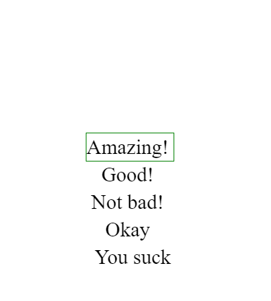
Even when the puzzle is solved, I want to offer replay value by giving the player visual feedback on their time performance and challenging them to solve puzzles faster. I also want to reward you for making it this far through the article by giving you a minimalist circular gauge you could reuse in your own projects. Here’s a standalone Pen with the circular gauge for you to experiment:
We’re applying the same principles used in the win screen from the game except, in this Pen, the rating displayed is controlled with radio button hacks, whereas in the game it’s controlled by animation that slowly moves to a lower rating as time passes. The gauge in the game is hidden using zero opacity and is only displayed (and paused) when we detect that the puzzle has been manually solved.
Let’s explain how we create the illusion of a semi-circle that’s divided into two sides by color. It’s actually a full CSS circle with its bottom half hidden using overflow: hidden.
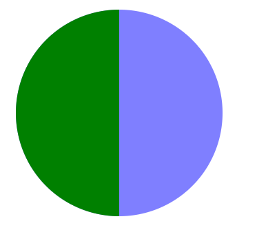
We apply the two colors using a pseudo-element that fills half of the <div>.
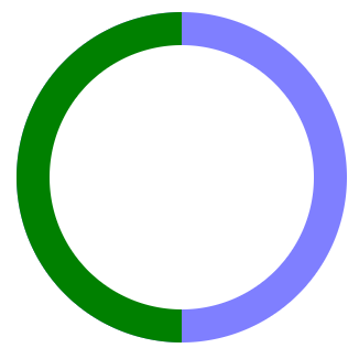
Then we cut a hole in the middle to make a donut, using another circle filled with the game’s background color, and center that inside the larger circle using flexbox.
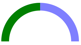
Next, hide half of it by making the size of the container half as tall as the full circle and, again, using overflow: hidden.
Now, if we rotate our donut, it looks like the gauge is filling up with green or losing green, depending on whether we rotate our donut by negative or positive degrees!
We’d like to put labels on both ends of the gauge and a description in between them, and it turns out flexbox is an elegant solution:
#rating { font-size: 30px; display: flex; width: 300px; justify-content: space-between;
}
Here’s the markup:
<div id="rating"> <div id="turtle">🐢</div> <div id="feedback"></div> <div id="rabbit">🐇</div>
</div>
That’s all we need to position our labels. If the rating <div> is the width of the diameter of our circle, flexbox will position the emoji labels at the ends and the description in the center of the circle!
As for controlling what the description says, it’s similar to the trick we used for our timer, except this time we do it vertically rather than horizontally since the feedback descriptions are of variable length. But they are always the same height.
Conclusion
I opened this article with questions about whether CSS is a programming language. It’s hard to argue the logic we were able to implement using just CSS wasn’t programming, but some of it is unusual usage of CSS to say the least. As with many things in the tech world, the answer seems to be “it depends,” and as much as we learned about CSS through this experiment, we’ve also illustrated that programming is as much about the mindset as the tech.
No CSS hacking article is complete without the disclaimer that although we’ve shown we can implement sophisticated logic in CSS and learn a lot in the process, most of the time we probably shouldn’t do this in production, because of maintainability, accessibility, and some other words ending with “ility.”
But we also saw that some things — such as what I think of as the built-in reactivity you get with CSS variables — are quite convenient in CSS but might require us to go through hoops in JavaScript, and probably use a framework. By pushing the limits of CSS we ended up creating a circular gauge that I believe could reasonably be used in a production app, and might even be the right thing compared to reaching for some JavaScript widget that might be heavy and do more than we really need.
On my wishlist for the CSS Sudoku app is a reset button. Currently, if you want to start a new Sudoku game, you have to refresh the page. That’s an inherent limitation of radio button hacks which makes CSS hacking different to conventional programming. At one stage, I believed I found a solution when I thought animations could be used to set CSS variables — but it turns out that is part of CSS Houdini and only supported in Chromium-based browsers. If and when that’s supported everywhere, it will open a Pandora’s box of hacks and be a lot of fun. In a future article, I may even explore why this innocuous feature we have in Chrome is a game changer for CSS hacking.
The jury is still out on whether a full 81-square Sudoku solver is possible in CSS, but if you’re curious to find out, leave your feedback in the comments. If enough people want it, we may go down that rabbit hole together and see what dark corners of CSS we can illuminate in the process.
The post Generating (and Solving!) Sudokus in CSS appeared first on CSS-Tricks.
You can support CSS-Tricks by being an MVP Supporter.