
Elementor has been making waves in the world of WordPress website design since its launch in 2016. Part of what makes this platform so appealing to creators is a constantly evolving set of features. As the web continues to transform, so too does the Elementor landscape.
Recently, in September 2021, Elementor released the latest version of its platform (3.4), which features a slew of updates to the feature set. Perhaps the most compelling change is the addition of new custom breakpoints – something Elementor fans have requested for a long time.
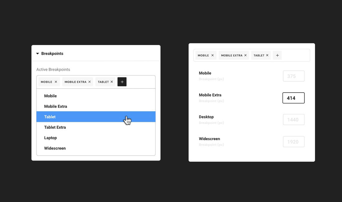
Elementor 3.4 updates your two existing breakpoint options to a total of 7 different solutions, two each for mobile and tablet users, and one each for desktop, widescreens, and laptops. Designers can now customize these designs however they choose to suit any screen size, making websites responsive, adaptive, and streamlined for any device.
What Are Custom Breakpoints (And Why Do They Matter?)
Breakpoints in web development are the point at which a responsive page responds to the screen size of a device, adjusting the layout. The new custom breakpoints in Elementor allow developers to design content for a range of different devices.
Imagine you finish designing a stunning website for your client, then they ask you what it’s going to look like on a wide-screen TV, or a tablet. With custom breakpoints, you can alter a design to suit any of those platforms.
The main benefit of custom breakpoints from Elementor is you’ll be able to create more dynamic web pages suitable for specific audiences and client requirements. It’s a chance to get more specific with how you want your content to appear on different devices. When you can adjust the style of each breakpoint, you can create a better experience for end users.
What Can Designers Do with Custom Breakpoints?
Custom breakpoints provide designers with more control over the way they display content on different devices. You might have a product photo gallery on a website page which you want to display four images on a desktop, but only two on a mobile device. Elementor’s custom breakpoints will allow you to do that, but it can also go beyond the basic mobile/desktop changes.
Elementor 3.4 enables designers to provide a different (highly optimized) experience for customers on different devices. You’ll have the flexibility to:
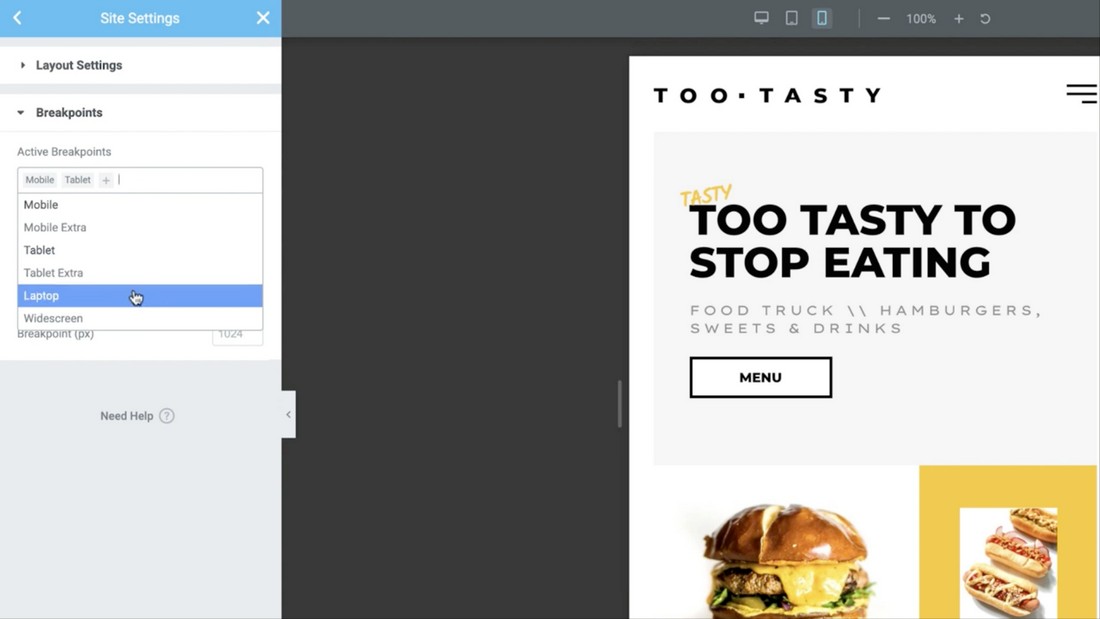
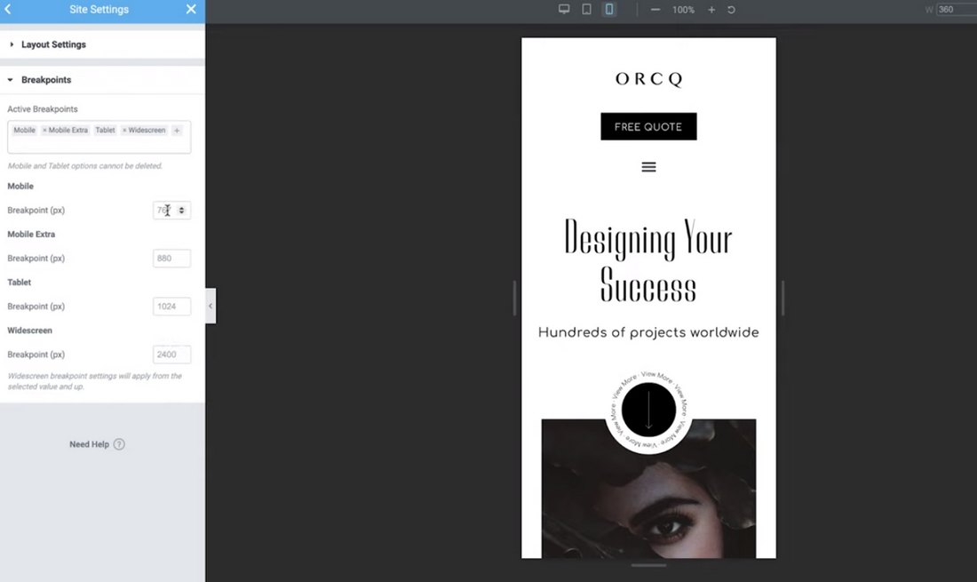
- Choose active breakpoints: You can set specific breakpoints for a range of environments. Outside of the original desktop and mobile, you’ll also have widescreen, laptop, and new tablet sizes to experiment with.
- Choose the value of the breakpoint: Designers can also manage the value of each breakpoint individually, setting specific rules for each platform.
- Scale the preview window: Zoom out to preview what your designs will look like on widescreen devices or zoom in to help you work on a design for a smaller screen. You’ll now have more flexibility with your previews too.
How to Use Custom Breakpoints on Elementor
Elementor follows cascading rule concepts across breakpoints, scaling down for every device you design for outside of widescreen. When using custom breakpoints on Elementor:
Set Desktop Sizes First
Remember, desktop will always be the default screen setting. When you adjust the desktop setting, the other larger and smaller screens will also be affected. For instance, if you set a title text size at 90px for your desktop screen, this size will immediately apply to all other breakpoints.
Explore the Relationships Between Devices
When you set custom breakpoints for a specific device, the breakpoints for all devices smaller than that specific object will follow the same rules. For instance, if you set the title text on tablets to 70 px, it will also be 70 px on mobile devices, but your standard desktop and larger settings won’t be affected.
Widescreen is the only custom breakpoint option from Elementor which doesn’t influence any other screen sizes. When you set your widescreen breakpoints, they’ll be unique to your website on widescreen devices.
If all this sounds confusing, it may help to know that Elementor has also added UI improvements to help you define which styles are inherited from existing breakpoints. For instance, if you set a margin on a tablet to 10px then move to your mobile view, you’ll see that inherited values on controls like margin, padding, and background images are presented as placeholders.
The 10px you set for your tablet display will appear as a greyed-out display on all devices smaller than the tablet. Keep in mind, you can only change the breakpoint style for values with the device icon next to the title.
Adjust Specific Values for Each Device
To optimize the user experience fully for every device, you’ll need to go into the settings for each device, and adjust your breakpoints accordingly. Start with the largest screen size and work your way down to avoid Elementor making automatic changes to your custom settings if you were to work from the smallest size up.
Extra Benefits of Elementor’s Custom Breakpoints
Elementor has worked hard to make the custom breakpoint feature as appealing as possible for users. To enhance the performance of its custom breakpoints, Elementor has re-built its entire responsive control loading mechanism from scratch.
This rebuild improved server response time for Elementor by an impressive 23%, while reducing memory usage by another 5%. Elementor even reduced 30% of data traffic to the editor load. These performance enhancements mean adding custom breakpoints to your design won’t negatively influence the performance of your websites. The same couldn’t be said if you were using duplicate code mechanisms instead.
Another bonus of using the Elementor tech today, is the company recently dropped the extensive support that used to be necessary for Internet Explorer. The result is a saving of around 110KB on each paid load, leading to faster operation for both developers and visitors alike.
The addition of the new custom breakpoints is just one of a series of updates made to the Elementor software. You also get Full Website Kits from Elementor now, which allow users to import and export entire websites, including their templates, site settings, content and layout. This could be a fantastic way to finish projects quickly.
There’s also the Elementor Academy offered with the latest version of Elementor. The Academy features useful tutorial and guidance on how to use Elementor features, including tools for responsive and dynamic design (like custom breakpoints).
Better Breakpoints = Better Websites
Though the addition of custom breakpoints is just one of the updates made to the Elementor environment recently, it’s an important step forward for the platform. Combined with enhancements like Full Website Kits and an Awesome Font upgrade, the introduction of new custom breakpoints will give designers more control over their content.
Custom breakpoints from Elementor make it easier to adapt your designs to different screens and deliver the excellent user experience people crave. Whether you’re adjusting your design to fit the latest Android, or a client’s widescreen television, custom breakpoints have you covered.
According to Elementor, the new features introduced in this most recent update are just the beginning. Who knows which components will get an upgrade next?