Creating a brand identity is one of the most important parts of creating any new business. After all, it’s what helps create your brand image.
One of the best ways to create an effective brand identity is to learn from the very best that already won the world with its brands. Today, we take a look at some of those winning brand identities and rebrand designs. And talk about what makes them effective.
If you’re a designer or a brand strategist working on a new business branding, you’ll learn a lot of useful things from this guide. First, let’s start with the very basics.
What Is Brand Identity?
A brand identity is what makes a brand recognized. The definition of the word itself describes it perfectly. But it’s not like the government-issued identity card or the passport we have. Brand identity is quite different. And design plays a key role in it.
In short, brand identity consists of the overall brand design, the colors it uses, the logo, brand name, the font, its style of advertisements, the brand message, and basically every visual element of the company. When all of it is put together and balanced in perfect harmony it gives birth to successful brand identity.
Take CocaCola, for example. It’s iconic red color and the typography logo is recognized around the world. Even people in rural countries who can’t even read English instantly recognize the brand by its colors and logo design alone.
That is the main purpose of a brand identity. To make the brand easily recognizable and memorable. Of course, brand identity is also part of consistency as well.
Why Is It Important?
A brand identity is about creating a design system for your brand designs. It’s about creating specific rules and standards like having a color palette, design style, fonts, and logos that can be used consistently.
A company never stays with the same advertising agency for too long. Imagine each agency using different colors for your brand campaign billboards and posters. Or using different fonts for your ads and labels. It will simply ruin brand consistency.
Having a proper brand identity helps you to be consistent with each and every aspect of your brand promotions and product designs. Because each time you hire a new advertising agency or design new product packaging, you can refer to your brand identity to pick the right colors and design.
This is exactly why big brands like CocaCola even has its own fonts. It’s all about consistency and making your brand recognizable.
Main Elements of a Brand Identity
It’s difficult to describe a specific set of elements for a brand identity. Because each brand has its own unique qualities. For example, creating branding elements for mobile apps and user interfaces are part of digital startups and companies.
Either way, these are some of the main elements you should have in every brand identity design.
- Logo: A clear and memorable logo design is a must-have for every brand. It’s what makes a brand recognizable and distinctive.
- Color Palette: Having a specific color palette helps a brand create consistent designs.
- Fonts: You don’t have to create your own fonts. But at least pick and use a specific set of fonts in all your designs.
- Visuals: Visual elements such as images, shapes, and icons are also part of a brand identity. You’ll see why it matters in the examples section.
- Design Style: Sticking to a design style is important. Whether its vintage design or modern material design, it’ll help create more relevant branding designs.
Top Brand Identity Examples
There’s one thing common with all these amazing brand identity designs—They are all crafted with passion and after thorough research. You’ll notice it instantly. Have a look.
1. Firefox
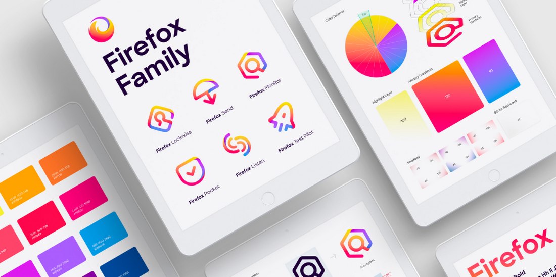
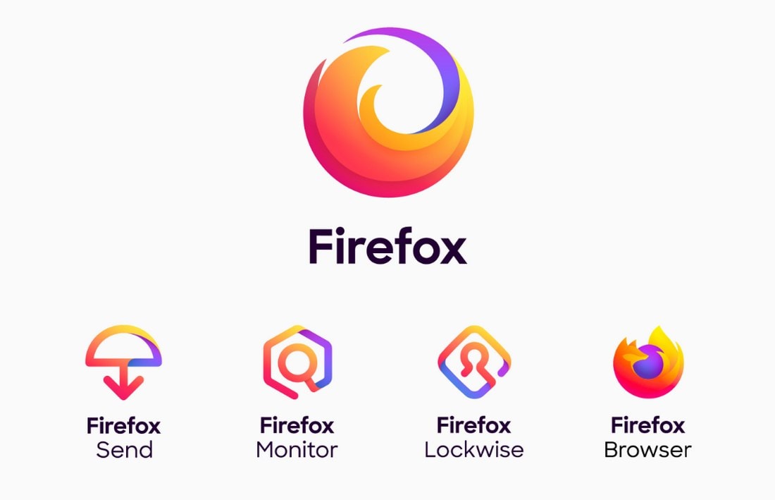
Firefox announced a new rebranding design in 2019 with the main focus on the digital representation of the brand. A design agency named Ramotion was in charge of the rebranding process. Firefox wanted to create a shared branding design that makes all of its different apps and services appealing to the new and upcoming generations. As well as to different cultures, genders, and all audiences.
This was a major redesign that span across its entire branding design. Everything from the logo to icons, app user interface designs, and more went through big changes.
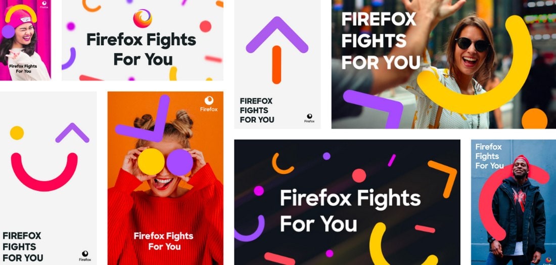
One of the most notable changes was the addition of geometric shapes in the visual branding identity. They called these “atomic particles”. These colorful atomic particles are part of making the brand relevant for younger generations while representing the brand’s core concepts at the same time. It was first put to test in the “Firefox fights for you” campaign.
According to the design agency, this new approach helped Firefox launch new products. As well as to create a new visual system and guidelines to be shared across its entire brand.
2. MailChimp
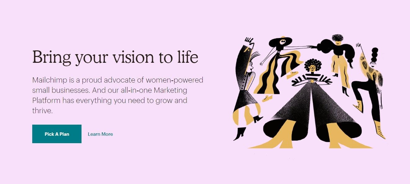
When MailChimp was first launched, many designers were confused about the brand’s use of a monkey mascot and its humor. Today the company serves millions of users and that funny winking monkey (AKA Freddie) is a symbol recognized anywhere on the Internet.
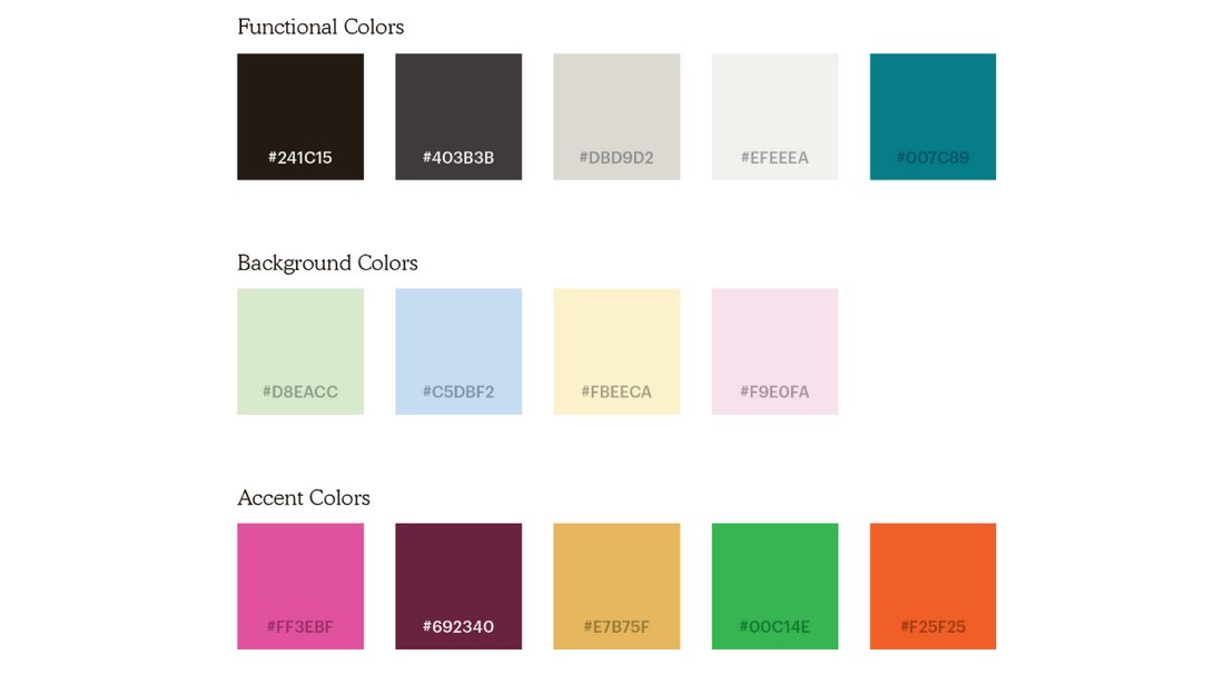
Over the years, MailChimp’s brand design evolved into a more mature state with subtle colors and hand-drawn illustrations. Now the brand uses Cavendish Yellow as its main brand color along with Cooper Light as its main typeface.
The hand-drawn illustrations are probably the most unusual feature of MailChimp’s new brand design. According to the company, it serves a purpose and helps represent their tools and practices in a simpler way.
3. Subway
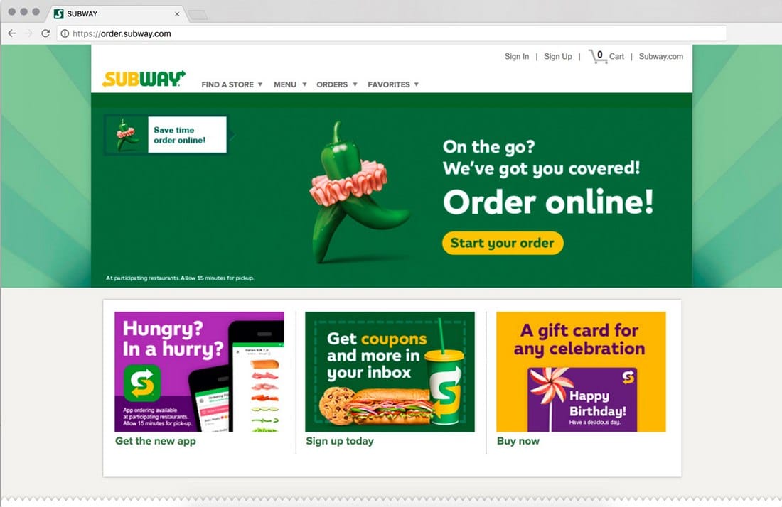
Designing visual identities is also part of a brand identity, especially for massive multinational corporations. Which is why we wanted to make an example of the Subway Visual Identity System.
Crafted by Turner Duckworth creative agency, this visual identity creates a standard set of visuals, art, and images to be used across many of Subway’s promotional campaigns, product packaging, and storefronts.
This visual identity system is a perfect example of how to create a specific identity for your brand’s visual elements. Keep in mind even the stock images you use in your website designs are part of your brand identity.
4. Uber
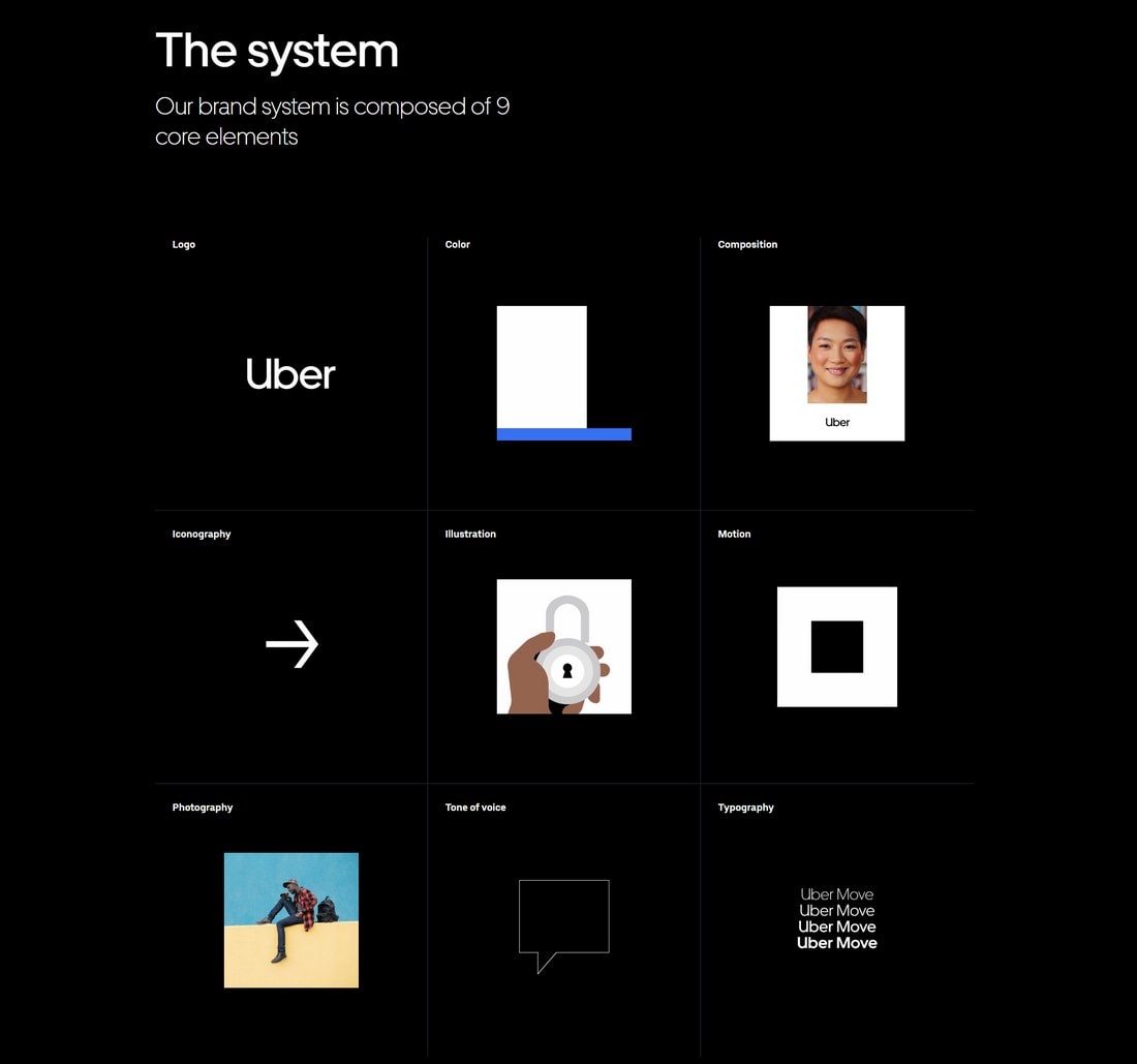
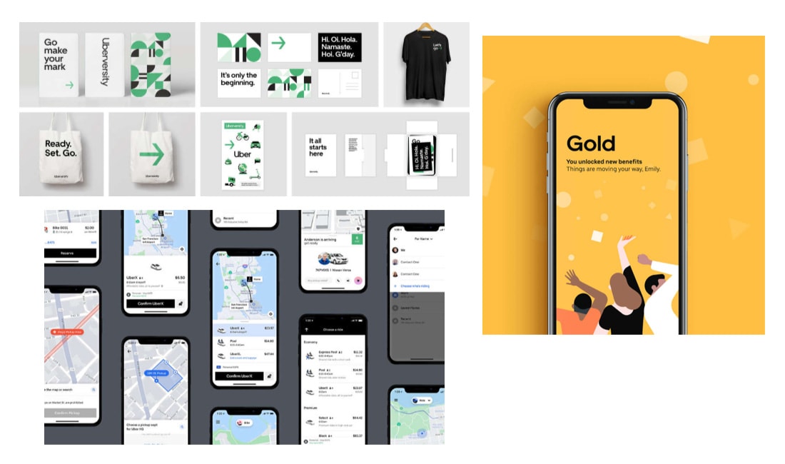
Uber takes its brand identity quite seriously. Calling their brand elements “a system, not assets”. Uber’s branding identity consists of 9 main elements. Each element is chosen to make the brand easy to represent in both digital and physical forms.
The main goal of the company was to create a brand and visual identity that help the company create various brand content in a “globally consistent” way.
So that no matter where you see an Uber logo or open the app, you can recognize the brand in an instant.
5. Pinpoint
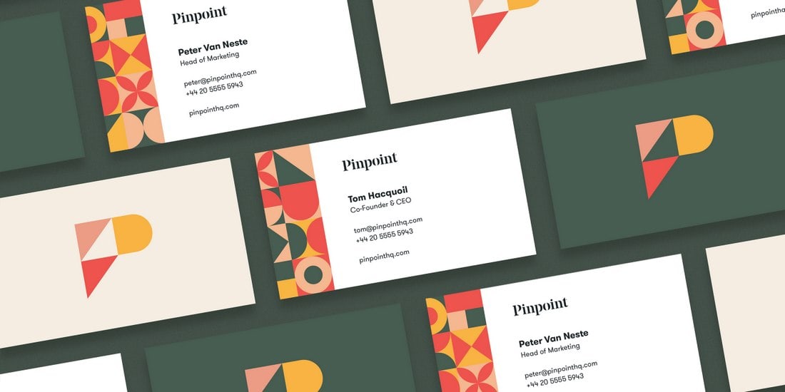
Pinpoint is a SaaS company specializes in recruitment. Even though you probably haven’t heard of this brand, their unique brand style caught our attention.
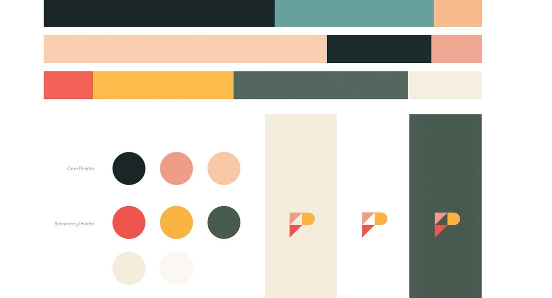
The most attractive feature of this brand identity is its color palette. It uses modern-vintage style colors. When it’s mixed with colorful geometric shapes it creates a brand identity that stands out from the crowd.
6. Redbox
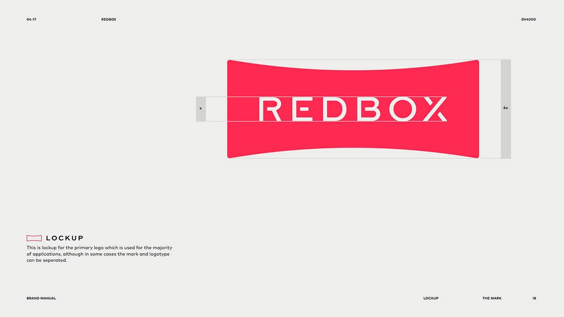
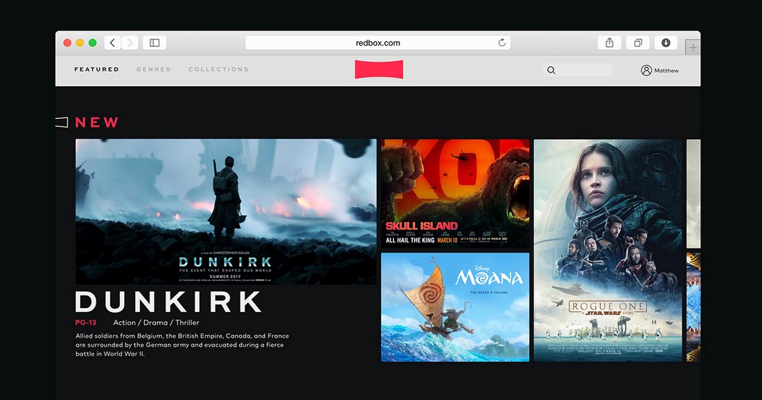
You may have heard of Redbox, the popular video rental company that used to be quite big before Netflix came along. Redbox recently revamped its brand identity to take on the digital world, especially with a heavy approach to VR technology.
The new Redbox branding identity has a lot in common with the Netflix brand identity. The colors, shape of the logo, and even the font choices have some similarities.
As you can see, even the biggest brands aren’t afraid of stealing a few ideas from successful brands when it comes to creating winning brand identities.
7. Evernote
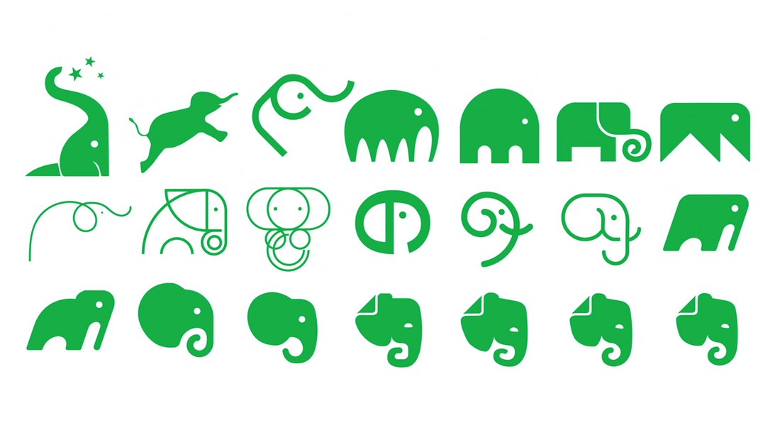
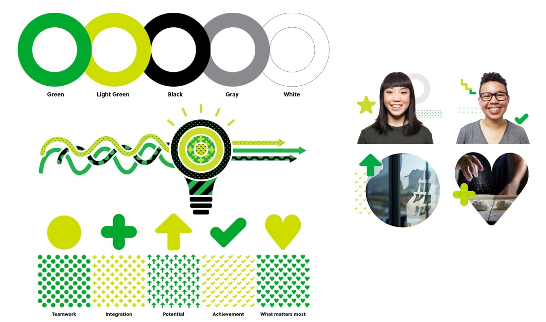
Evernote is a brand that has a close relationship with creatives. Their brand identity was designed with their target audience in mind. Featuring a very minimal color palette and a beautiful approach to shapes and illustrations designs.
Everything from its logo design to its use of geometric shapes and photos, Evernote tries to capture the essence of its products which is creativity.
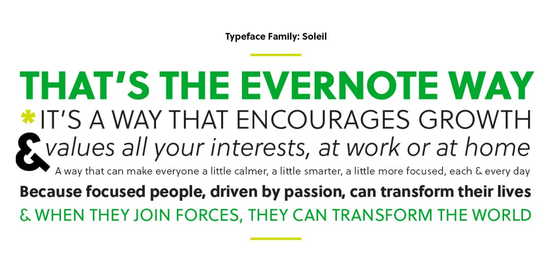
Each pattern, texture, and color used in Evernote’s brand identity serves a purpose. They even found a geometric typeface to go along with its geometric-heavy identity design.
8. Dropbox
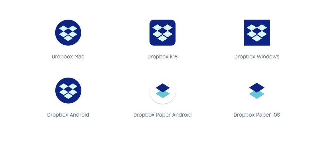
Dropbox is a great example of minimal brand identity designs. It uses a strict color palette limiting most of its designs to 2 or 3 colors.
One aspect you’ll notice in this brand identity is its approach to designs in different platforms. For example, you’ll notice that Dropbox uses different shades of the color blue in desktop and mobile app brandings.
It’s certainly a unique approach to digital brand identity designs.
9. Iterable
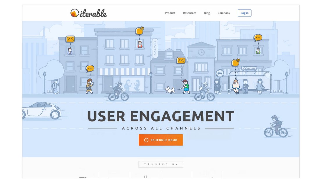
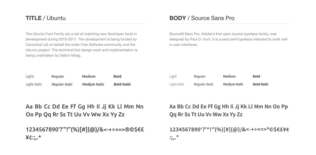
Iterable is a marketing platform that you probably haven’t heard of. But, we wanted to highlight its brand identity for one main reason. That is its choice of fonts.
As beautiful as its brand design seems, Iterable uses two very common fonts. Ubuntu and Source Sans Pro. Two of the fonts that are available for free on Google Fonts.
Designers and agencies often make excuses for not having a big enough budget to make branded designs look amazing. Iterable brand identity is a great example of how it’s done on a minimum budget. Of course, you can learn much more from the brand’s use of color and logo designs as well.
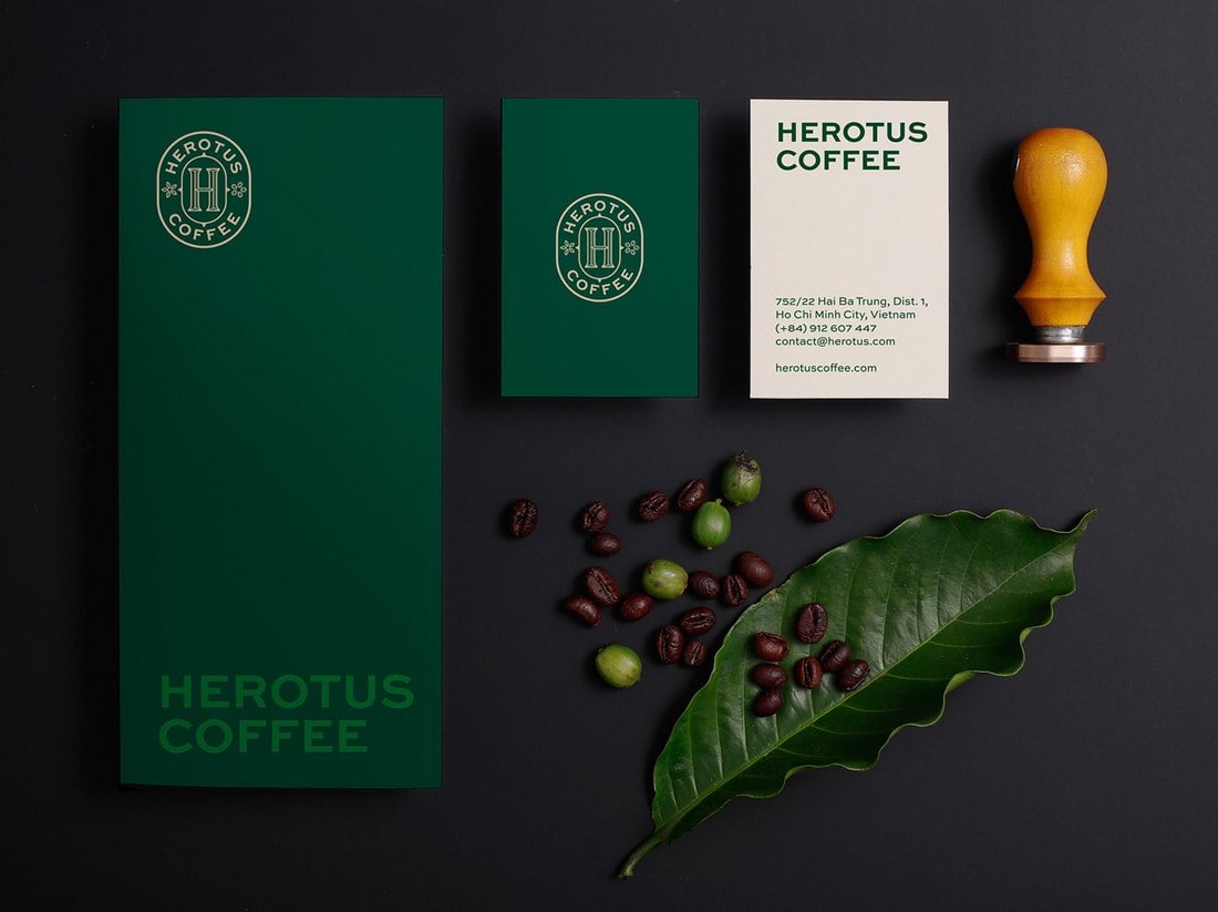
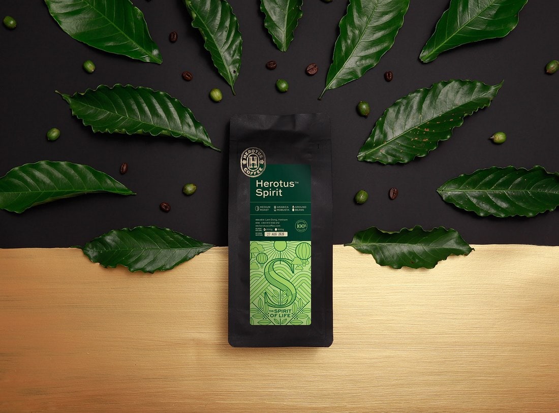
10. Herotus Coffee
How do you approach a coffee branding identity that has heavy physical world elements? Here’s a great example.
Herotus Coffee is a new and small coffee brand that uses an elegant vintage-style branding design. The main purpose of this brand identity design was to offer a nostalgic feel to its customers.
Everything from the product packaging to stationery designs was crafted with this goal in mind.
In Conclusion
Looking at great examples is always a good way to find inspiration and come up with new ideas for your own design projects. However, creating a brand identity is a responsible task you shouldn’t attempt to complete alone.
You should always do proper research, get feedback, consider the target audience, and collaborate with experts in the field in order to make a more effective brand identity.
