Choosing the right color scheme for your wedding is one of the toughest tasks of the wedding planning process. Because you need to make sure the colors you pick stays consistent across all aspects of the events.
The color scheme you pick will decide the colors for everything from wedding invitations to thank you cards, flower arrangements, decorations, and everything in between.
Needless to say, you need to carefully think and plan ahead when choosing a wedding color scheme. We’ll help you make the right decision.
In this post, we showcase some of the trendiest and prettiest wedding color schemes that are quite popular right now in the industry. These color schemes are perfect for designing invitations and all wedding stationery. As well as for all other aspects of the special event.
We also included some examples for each color scheme. You can download these example templates to quickly make beautiful wedding invitations just the way want them to be. Let’s take a look.
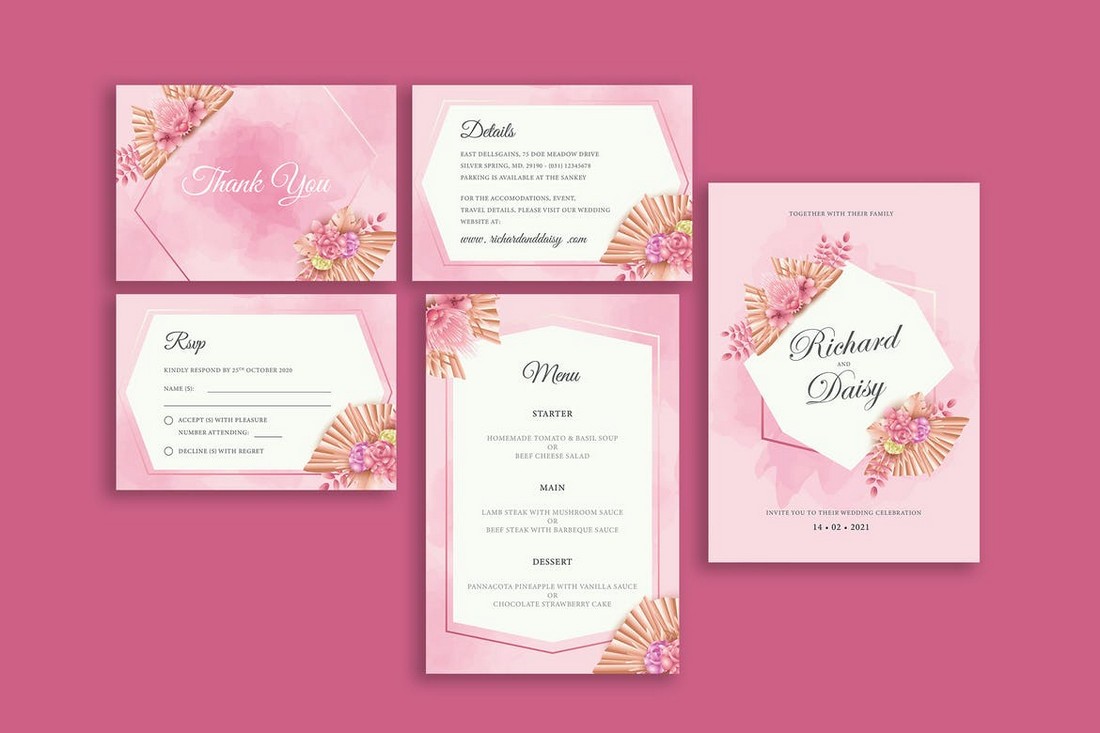
1. Pastel Pink
Pink is one of the most popular colors in wedding color schemes. Mainly because this color makes it much easier to create a consistent color scheme across various items in a wedding.
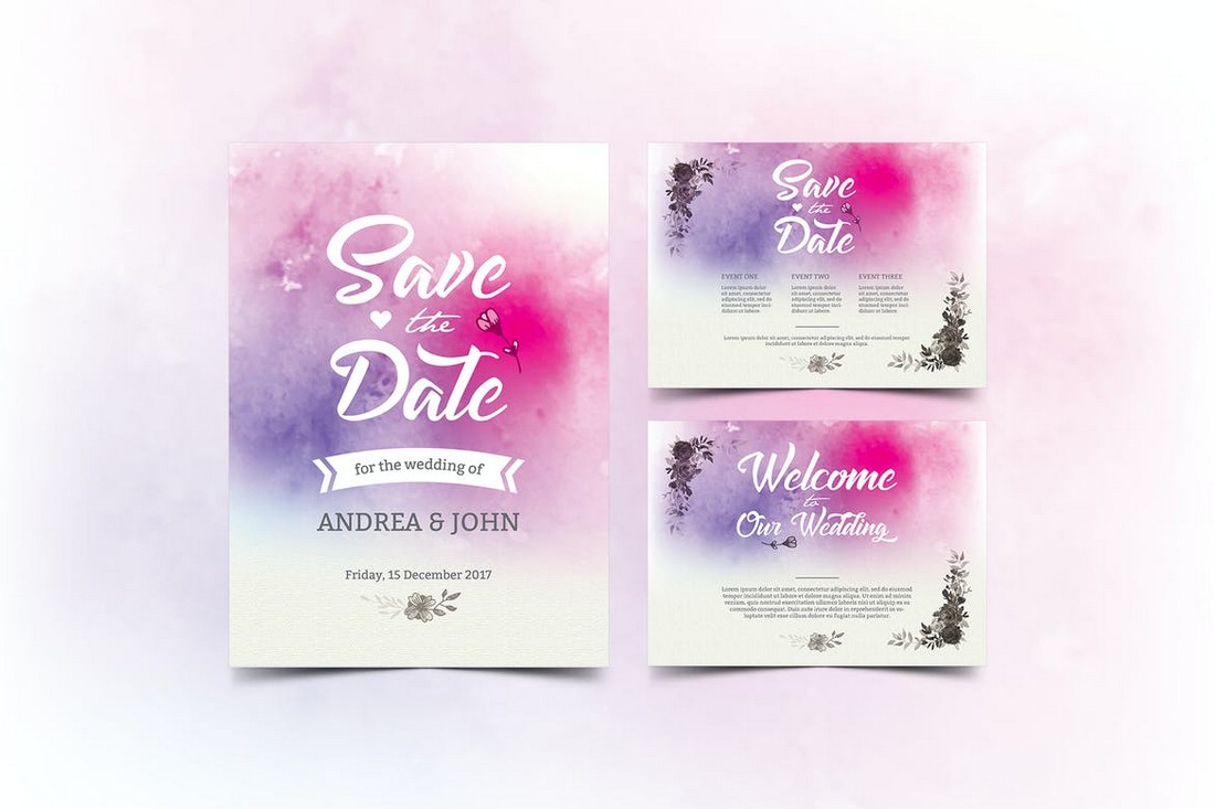
Lately, the wedding Pink color received a makeover by combining it with pastel tones. And it’s much more appropriate for modern wedding stationery designs.
Pastel pink colors are much more soothing to the eyes and are easier to replicate.
You can even experiment with paler and darker tones when working with pastel colors. They look more elegant especially when you add decorative elements to the design.
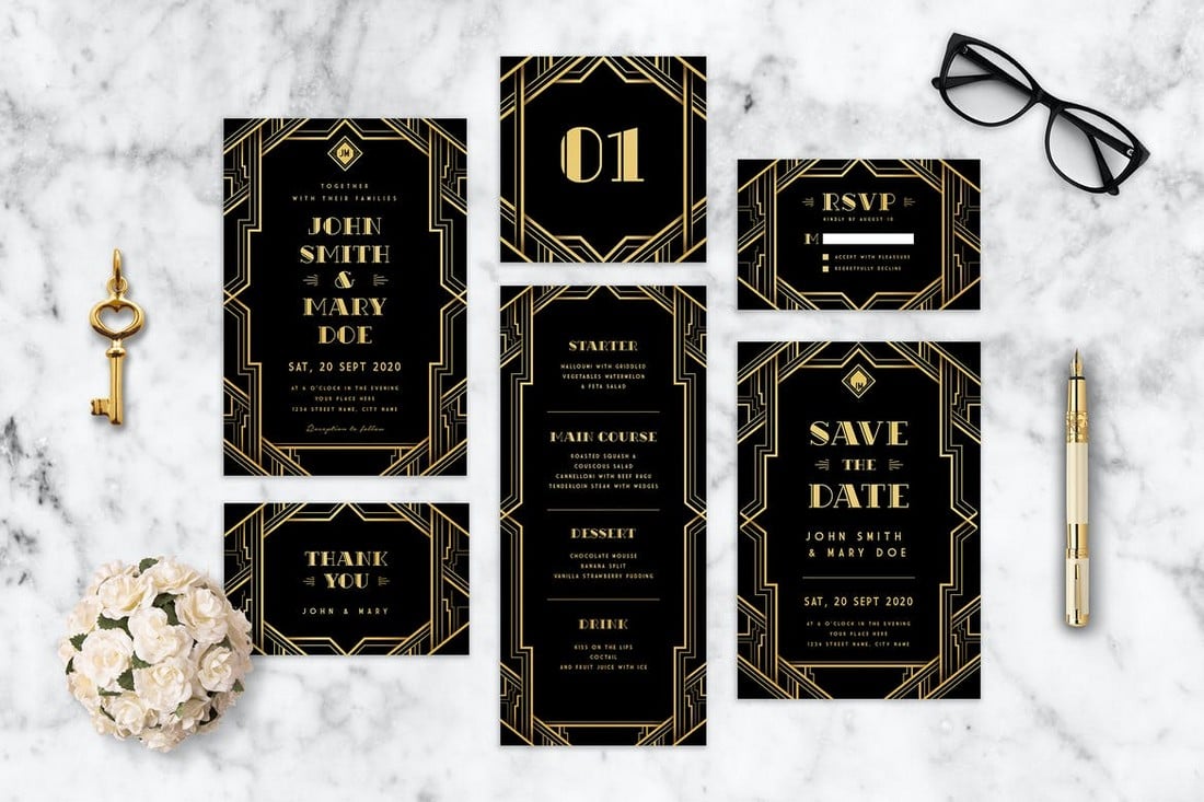
2. Art Deco
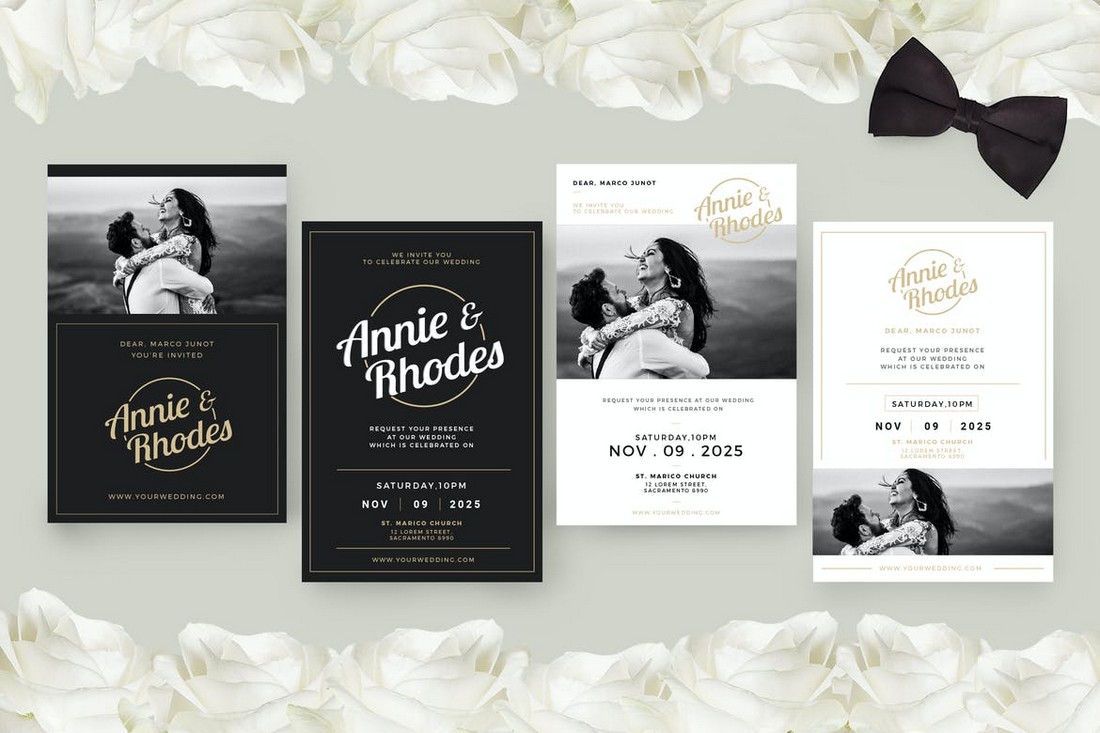
The Art Deco style designs are quite popular in many different industries today. It’s slowly making its way over to poster designs, flyers, and even wedding invitations. The way Art Deco adds a certain elegance to the overall look of the design is what makes it effective for wedding invitations.
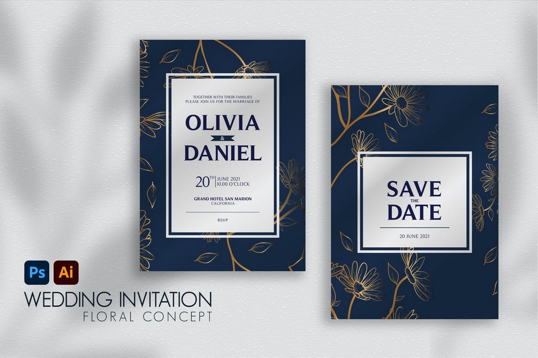
The main element of the Art Deco theme is its color combination. While using the gold color as the highlight, you can combine it with other colors like Black, Blue, and even White to create an elegant color scheme.
Of course, to achieve the Art Deco look and feel, you’ll need to incorporate the appropriate decorative elements as well.
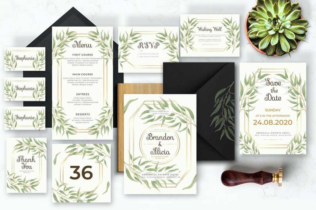
3. Floral Greenery
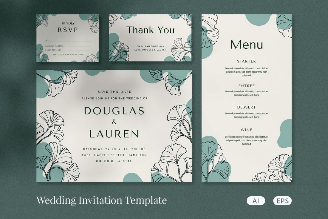
Floral greenery has the easiest colors you can work with when creating a wedding color scheme. Not only they make it much easier to find matching decorations but also make your entire wedding look more inspired by nature and down to earth.
While this color scheme is perfect for all wedding stationery designs, it’s great for all aspects of the wedding. Whether you’re planning an outdoor wedding or a fancy hotel venue, the floral greenery theme will fit right in with any environment.
4. Navy Blue and Gold
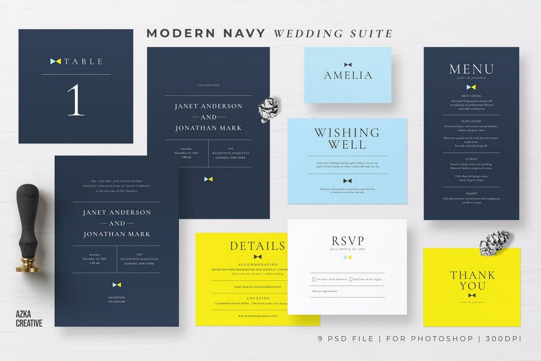
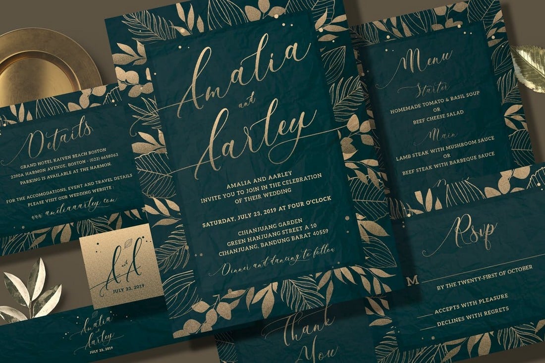
Similar to the Art Deco color theme, the Navy Blue wedding color scheme also gives off a very elegant and modern look to your wedding invitations and stationery designs.
Especially if you’re planning a wedding with a minimalist theme, this color combination will do wonders to make your designs look more in sync with all the other decorations and arrangements.
You can also take a bit further and create a set of wedding invitations based on a theme like postcard-style wedding cards.
5. Watercolor Gradients
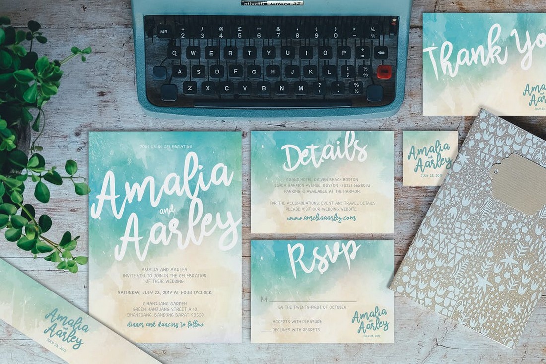
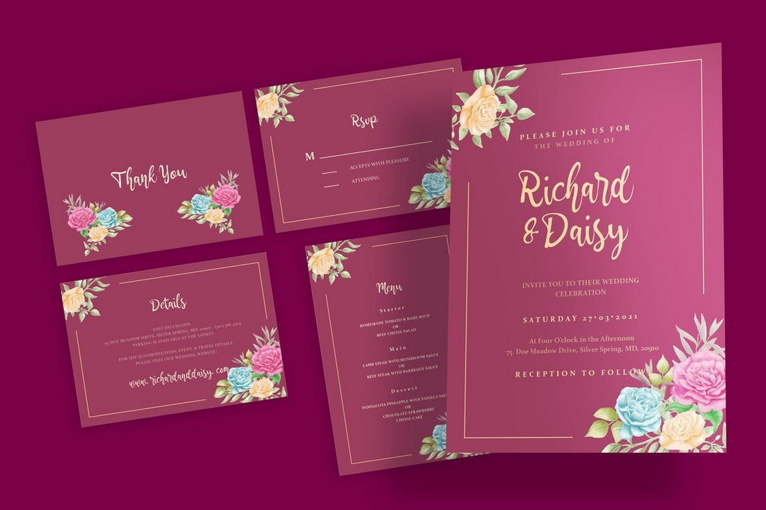
Choosing gradient colors for a wedding color palette used to be a risky move, but when you combine it with a watercolor theme, the result is quite amazing. It’s the perfect color scheme for a modern and casual wedding.
A watercolor gradient-based color scheme will also give you more room to choose different shades to not only design your invitations and cards but also more choices for floral arrangements and decorations.
6. Green and Ivory
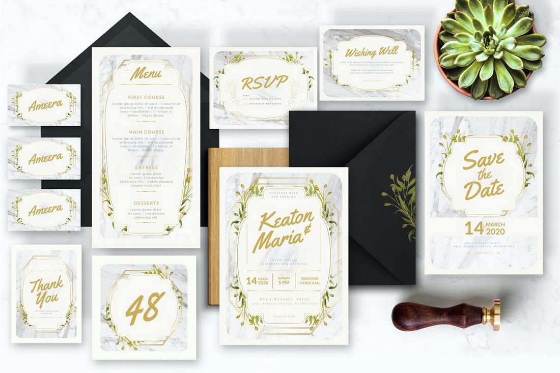
The green and ivory color scheme is another palette that’s easier to work with. This color scheme blends well with many different environments and it looks beautiful in invitation designs as well.
This mix of green and ivory colors also works well for a minimalist look as well as for giving a more DIY hand-crafted feel to your decorations. It’s ideal for a fall wedding color scheme.
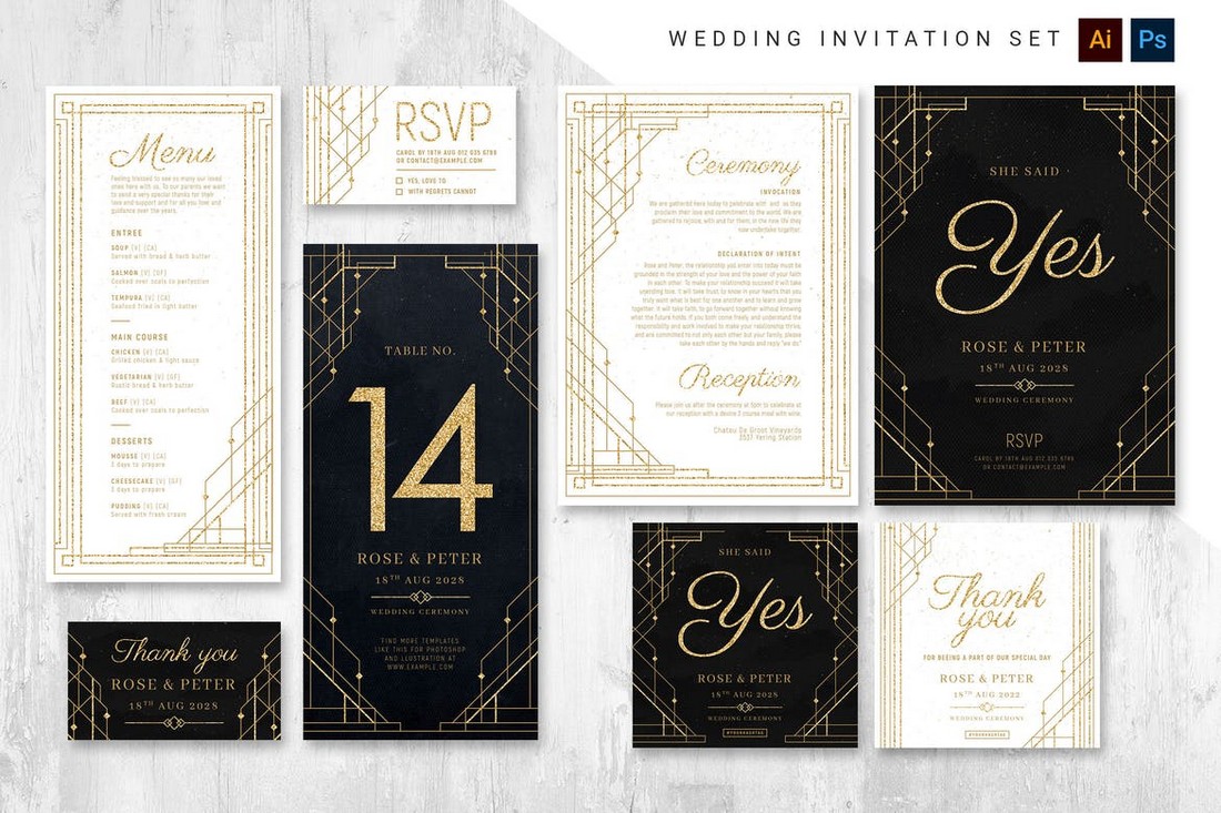
7. White and Gold
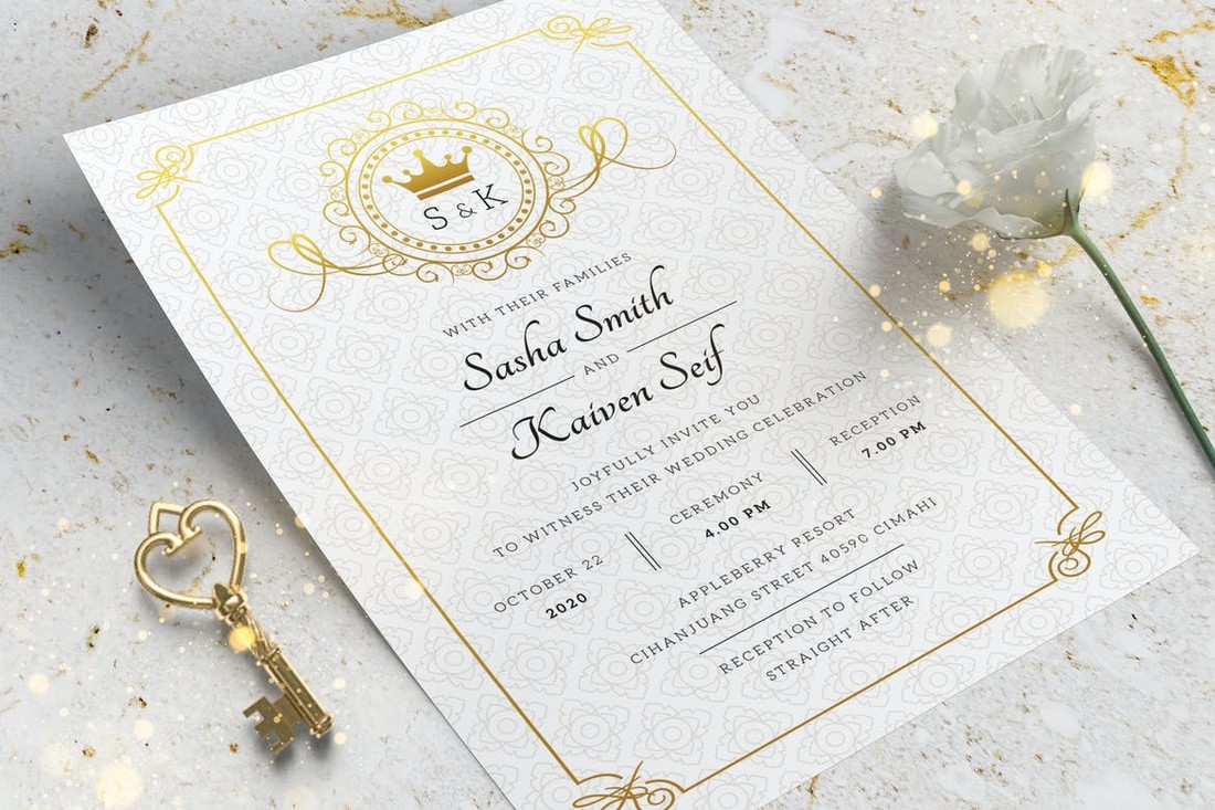
If you’re looking to plan a wedding with a simpler and cleaner aesthetic, going with a white and gold color scheme is the perfect approach for you. With this color combination, you can create an elegant design that gives off a luxury vibe.
By using different fonts and elements in your designs, you can also make this color scheme appropriate for both modern-casual and high-end weddings.
8. Rose Gold
The iconic color that defines beauty, rose gold is another pretty color scheme you can use to design beautiful wedding invitations and stationery.
A great thing about this color is that it pairs with almost any other color. For a secondary color, you can use White, Ivory, Pink, or even Black and your designs will still look great. You can use it to create a stylish summer wedding color scheme as well.
9. Black and White
The iconic black and white color combination from the good old days is still relevant today. Especially when it comes to designing minimalist wedding invitations, this is the ideal color scheme to create that simplistic look.
There are so many different ways you can incorporate this color scheme into your wedding cards as well as other decorations. Just let your imagination run wild.
10. Vintage Colors
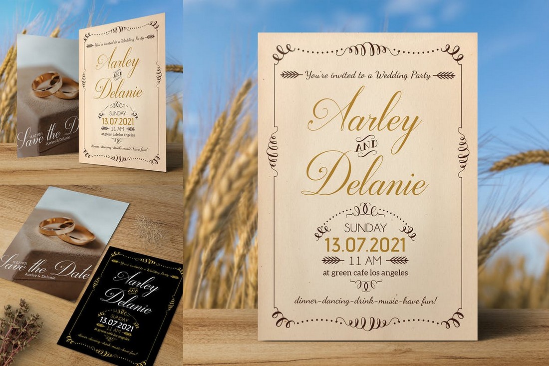
There’s no right color scheme for creating a vintage-themed design. And that’s what makes this one of the best options for creating your own wedding color scheme.
Whether you choose to go with old-school washed-out colors or mix modern floral elements, you can’t go wrong with a vintage-themed wedding invitation.
How to Create Wedding Color Palettes
You can also create your own color palettes based on specific color schemes. The process is much easier when you use a color palette generator.
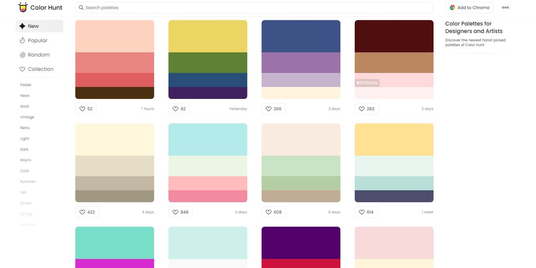
Color Hunt is a great place to start your search for a color palette. It includes lots of pre-made color palettes and allows you to browse colors based on different themes and categories as well. The site also allows you quickly copy HEX codes for the colors.
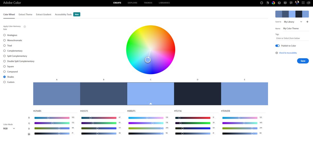
If you want to create more advanced color palettes, Adobe Color Wheel is a more appropriate option for you. It lets you create palettes by experimenting with different settings and options.
Read this guide to learn how to create professional color schemes.
Conclusion
Now that you have a great color scheme and templates to make the wedding invitation, it’s time to plan how to use the colors with other aspects of the wedding.
For further reading, make sure to check out our how to design wedding invitations guide. And the wedding card design samples collection.

