As an online shopper or buyer, you likely notice bad customer experiences before the good ones. A design that puts customers first feels seamless and intuitive and is pretty frictionless from the point of shopping to completing a transaction.
This kind of mindset is important in every project. A solid customer experience will keep users coming back for your product or service. You created a pleasant shopping destination that helped them find what they were looking for and buy it in a manner that felt safe, secure, and easy to manage.
The design can contribute to that quite a bit. Here are some tips to help you create a design that puts customers first.
1. Show Customers How to Interact
A big part of a successful customer journey is a design that shows them what to do from the time they arrive on your website until their experience is complete.
Sometimes showing in the design is harder than it seems. You can’t always control how a user gets to your site or what they see first, so a planned and consistent call to action that shows users what to do is important.
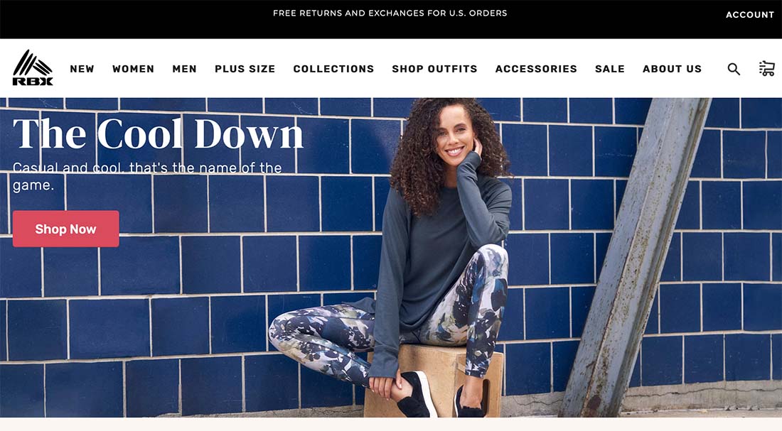
RBX uses clear images and big “SHOP NOW” buttons throughout the design to help establish that you want the product and then ensure you can access it easily. What’s really nice about this customer experience that is often overlooked with similar e-commerce sites is that each “SHOP NOW” button takes you to a landing page that matches the style and items from the image. (A lot of other designs often just link to the main shop page from everything.)
This feels custom and helps the shopper get to the item they were eyeing a lot faster.
2. Tell a Consistent Story
Storytelling is an important design element when it comes to online shopping. With so many customers thinking about things from your company policies to sustainability, it’s a good idea to emphasize your story, mission, and how your company is different when you can.
For some stores, this is woven into the fabric of the brand. For some, it can be a little tougher.
Think about Patagonia. You might know them for outdoor gear, but the company’s corporate social responsibility pledges from fair trade to environmental causes are a big draw for many customers.
3. Design Calls to Action
This might seem like a no-brainer. Of course, you’d design calls to action on your website.
But you should really design them.
Do calls to action have a consistent look and feel throughout the site? Are there special, larger, or different actions for buyers (versus other interactions? Is the microcopy engaging and helpful?
All of these small design elements can make or break the customer experience.
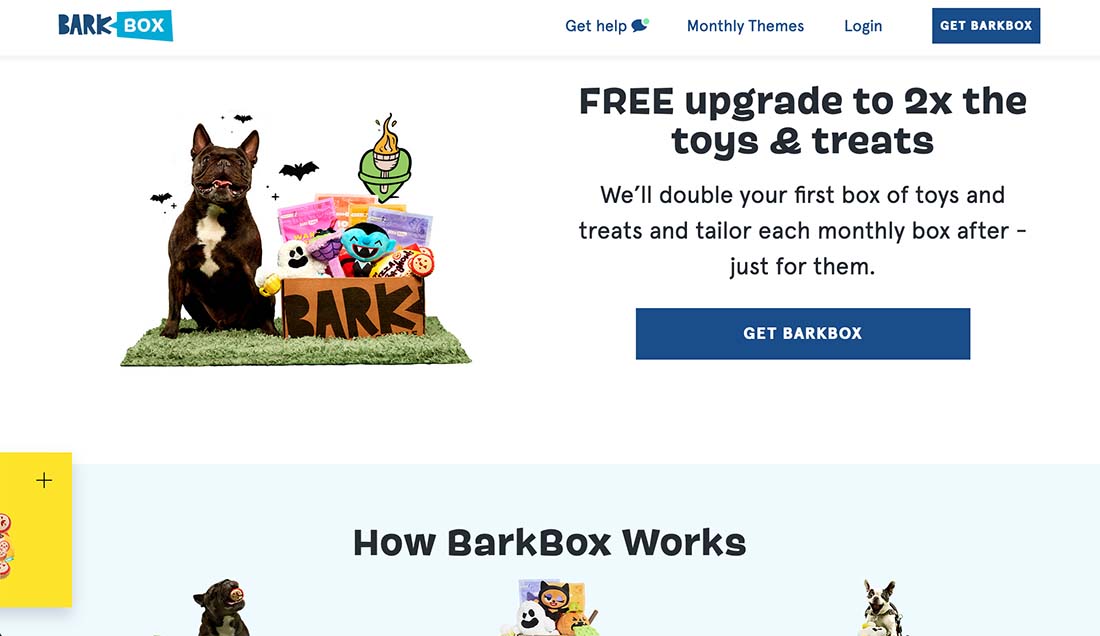
BarkBox uses a call to action of “GET BARKBOX” throughout – and on practically every screen. But where that action isn’t appropriate the language changes to something else such as “VIEW THEMES” or “CHAT WITH US.”
4. Create Multiple Landing Pages
The only path for a customer should not be from the homepage. You need to create multiple landing pages, likely with different products or services, that will appeal to different audience segments.
Use landing pages in concert with ads or social media posts to drive customers exactly to the item or items they saw elsewhere and are interested in. Landing pages can also include other information such as your story or causes you support.
Use these multiple landing pages to help the right customers find the right items at the right time. (An e-commerce success trifecta!)
5. Draw Attention With Color
Color can draw attention to the elements you want to be seen in the website design. They can help customers make choices and determine where on the screen to look. Use color to your advantage.
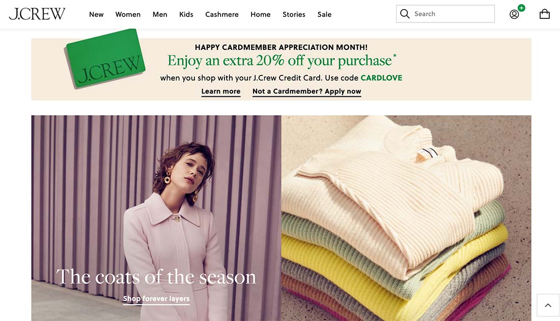
In the example above for J. Crew, there are two blocks of color that grab major attention.
- The green credit card image and promotion
- The mauve single color background and outfit block
While color gets your attention in different ways here, it can also appeal to two different types of shoppers – the deal-conscious and the fashion shopper.
6. Be True to Your Brand Self
You need to be your own brand during the customer journey. A shopper came to you for a reason; they expect a certain thing. It is important that your online customer experience meet these expectations.
Here is where it is important to know your customers and show it. Speak to them in the common language you have established, use images and videos that reflect that relationship, and ensure that your price points are within the levels that they are accustomed to. (If you cater to budget shoppers, for example, don’t lead with your most expensive item.)
7. Stick with Familiar Imagery
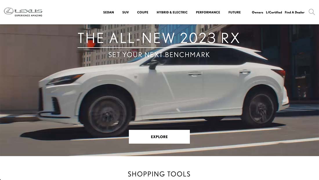
There’s a certain type of image that comes to mind when you think Lexus. The car brand with a tagline of “experience amazing” probably conjures specific types of images in your brain.
A brand needs to embrace that familiar imagery in the customer experience. It eliminates confusion and helps solidify the idea that the shopper has come to the right place.
Then there’s one more familiar thing you should consider: Shoppers are creatures of habit. By keeping the structure of your website similar or the same, you make it easier for them to come back over and over for more purchases. Avoid changing the navigation menu, color, or placement of elements frequently to ensure that the design always feels comfortable and familiar.
8. Show Real Products or Services
The primary thing that sets aside a credible online business from the rest is that it shows real products and services. Bonus points if the products or services are also shown with real customers.
This imagery can answer a lot of questions prior to checkout. How big (or small) is an item? Is it heavy? What’s the color actually like? And so many others.
Environmental photos are something that were not always the standard with shopping sites, but are growing in popularity because customers like them. Quite simply, show, not tell.
9. Personalize Where Possible
Personalization is not as difficult as it might sound. While you can’t know every user when they first get to your website, you can make it feel like you do.
In the example above from SimpliSafe, every call to action is to help the company get to know the user better to provide that custom experience. There are multiple options to “BUILD A SYSTEM” as well as quick questions throughout the design to help customize it for your needs from asking if you need a system for a house or apartment to how many floors you want to cover.
10. Use Data to Power Design Thinking
Everything about a solid customer experience is rooted in data. Think about it.
Your website will focus on best-selling or popular items, it will use images that can be attributed to strong sales in the past. Continue to track and use data to help make better choices for content, design, and your business as a whole.
And never feel like you can’t go back and rethink things. It comes with the territory.
Conclusion
Want to think even deeper about customer-centric design? Earlier this year, McKinsey & Company published a great article, “CX Without Design Only Gets You Halfway.” This explains the symbiosis between design thinking, CX, and design. “When mapping out the customer journey, combining traditional CX practices with user-centered design processes has proven to bring the greatest value.”


