
Different designers have different takes on what makes a great website. But, one thing we can all agree on is popularity never makes a website design great. We have proof.
Today we take a look at a few popular websites owned by well-known companies and brands. These websites receive millions of visitors every month. And they are well-known around the world. All these websites have one thing in common—they could all use a bit of a visual refresh!
Even though web design has come so far as an industry and has evolved with amazing new technologies, there are companies that still use outdated website designs.
We’re unsure whether these brands are afraid of change or simply don’t prioritise design as highly. Either way, we believe these websites need to be revamped for the better of their users. Keep reading to find out why.
1. Craigslist
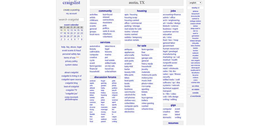
Craigslist is one of the most popular classifieds ads websites on the Internet. Craig Newmark started Craigslist as a simple email list back in 1995 and turned it into a website in 1996. From the looks of things, it’s safe to assume that the website might be using the same design they used back in 1996.
According to SimilarWeb, Craigslist receives over 360 million visitors every month. Yet it has one of the worst website designs you’ll ever see. Craigslist website design consists of all the mistakes you’d want to avoid when designing a website.
Why This Website Looks Bad?
For starters, Craigslist has a very cluttered design without any visual cues or a sense of direction. The website consists of nothing but text. Yet the font is way too small and makes it hard to read. The bright blue color of the font certainly doesn’t help improve readability either.
Above all, the website design is not responsive. It looks terrible when viewed on screens with different resolutions. The entire process of browsing ad listings, form designs for posting ads, and almost every other aspect of the website desperately needs to be improved.
How Can It Be Improved?
Even changing the font and the font color can be considered an improvement for Craigslist at this stage. However, a better way to find inspiration is to take a look at the Gumtree website.
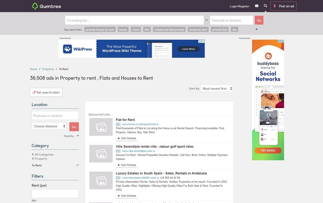
Gumtree is the UK’s biggest classifieds listing website. And its modern website design has everything we’d love to see on a classifieds website. It has a user-friendly design with a better search function, filters for narrowing the search, better previews and descriptions for scanning ads, and more.
2. AOL
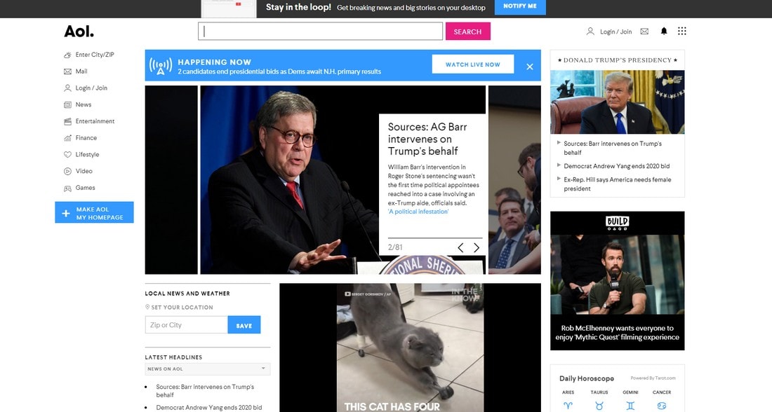
AOL used to be the biggest platform on the Internet and a company that owned most of the tools everyone was using back in the day. It had the potential to be something incredible. But, with the rise of its competitors, AOL lost track of time and failed to evolve with the current needs of the users.
Today, people barely know what AOL is. Even we were surprised to see the site still up and running. According to SimilarWeb, AOL still receives well over 200 million visitors each month. At first glance, the website looks great. So why do we think this needs to be redesigned?
Why This Website Looks Bad?
As always, AOL still seems to be playing catch up with modern user interface design but the company is still a few years behind. It still has a cluttered design filled with so many things from news to weather entertainment and more. Anyone who visits the site will immediately be confused about where to go and what to do.
When we visited the website we were bombarded with an auto-playing video with auto-sounds. Don’t make the mistake of using AOL to search something while you’re at work.
Needless to say, you’ll easily get distracted when you visit AOL.
How Can It Be Improved?
AOL website may remind you of another popular search engine. Yahoo! used to feature a very similar design. But not anymore. Even Yahoo! knew when to evolve.
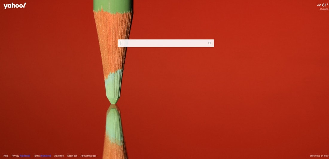
If there’s one thing AOL can learn from its competitors like Google, Bing, and DuckDuckGo is that people prefer search engines with minimal designs without distractions. That’s why Yahoo! also switched to a minimalist website design.
3. Hacker News
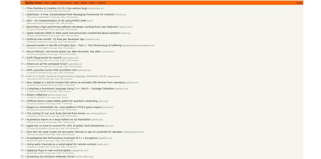
Hacker News is like Reddit for startups, programmers, and entrepreneurs. A single post on Hacker News could mean the difference between getting your startup idea funded or completely destroyed.
The site is one of the biggest news aggregator websites available today with more than 12 million people visiting every month. Yet it still features the same design it used back in 2007.
Why This Website Looks Bad?
Hacker News is making the same mistakes made by Craigslist. The only good feature we can think of in comparison is this site uses a sans-serif font with a color that’s easy on the eyes.
However, the site still features an unfriendly design that needs to be revamped. The biggest mistake made by the site is that the threads shown on the homepage directly link to the source page. You can’t open the Hacker News thread by clicking on the title.
In addition, we’d love to see it taking a more visual approach. While also optimizing the design for mobile devices.
How Can It Be Improved?
Remember when Reddit used to look like Hacker News? Thankfully, Reddit recently revamped its website design and it now looks much better than it ever was.
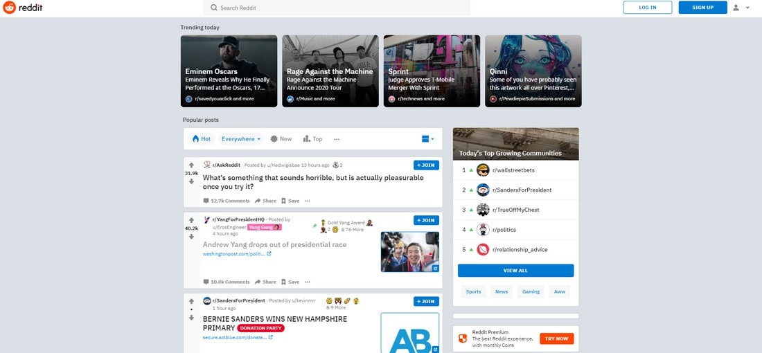
Hacker News can also adopt a similar design to Reddit. It doesn’t have to be as visual but the site will definitely look better when threads are highlighted and separated from one another. And allowing users to open the discussion threads by clicking on the title.
4. Berkshire Hathaway
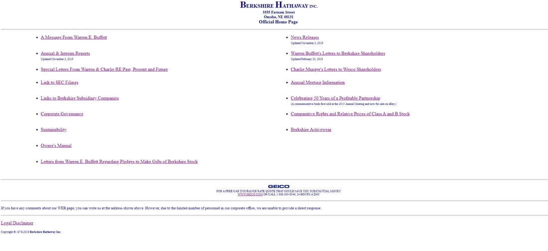
Can you believe that this is the official website of a multinational corporation that owns over $700 billion worth of assets and earning a net income of over $4 billion?
Berkshire Hathaway is a company owned by Warren Buffet, one of the richest people in the world. Yet it’s hard to believe he couldn’t afford a few hundred dollars to redesign the website.
Why This Website Looks Bad?
Where do we start? There are so many things wrong with this website. First of all, it doesn’t tell you what the website or the company is all about. Because it doesn’t have an “about” page.
The site acts as a list of links that redirects users to other websites to learn about the current state of the company. Most of which could’ve been easily included on the homepage and save users the trouble of loading other websites.
Worst of all, the site is also promoting another car insurance website on the homepage.
How Can It Be Improved?
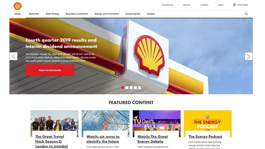
At this point, adding even a small description of the company should suffice to improve this website. But, it could take some inspiration from another multinational corporation like Shell Global.
Berkshire Hathaway could also use a similar and more visual design to avoid giving people the wrong impression of the company. And hopefully, turn the website into a hub of information for its investors and the general audience.
5. Alphabet
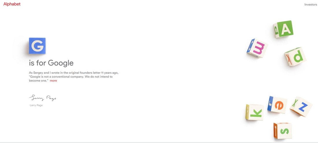
Alphabet is the parent company of Google and it has many other brands and companies under its name. However, its website is a mystery of its own.
Why This Website Looks Bad?
We had a few questions when visiting the Alphabet website. If “G” stands for Google, what other companies does it own? Who’s the CEO of the company? Rather than learning about your investors, where can we learn more about the corporation and what you stand for?
So many questions left unanswered due to the ultra-minimalist design of the website. We can understand that the company founders do things differently. But a company website should be able to provide information about the business.
How Can It Be Improved?
Even though IBM is not a direct competitor to Alphabet and doesn’t even have a very modern website, we think Alphabet can learn a lot from their website design.
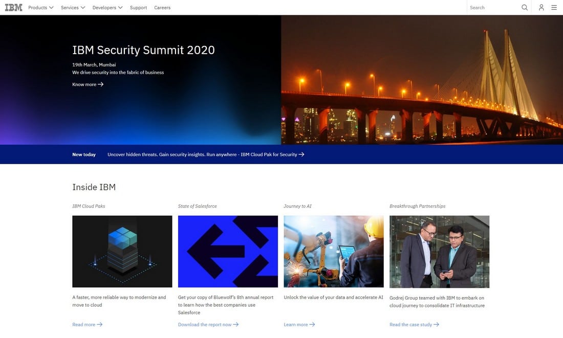
IBM uses a simple navigation system to let users learn about their products and services. More importantly, it has an “about” page detailing what the company is all about. Alphabet could use a few of those features on its website.
6. Amazon
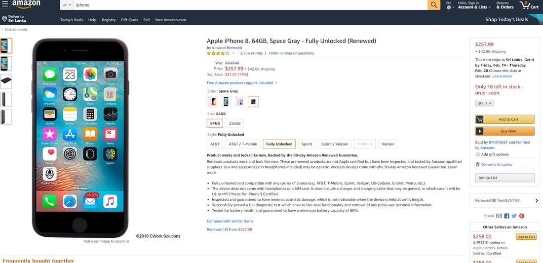
Amazon came a long way since its launch to become the world’s biggest retail website on the Internet. The site’s website design also remained the same for many years. Until recently where it got a refreshed homepage design.
However, the website’s product pages could still use some improvements.
Why This Website Looks Bad?
Amazon product pages have the most frustrating design that could confuse you if you’re new to the site. When viewing a product, the fullscreen page layout makes it more difficult to explore.
The product descriptions are too long and haven’t been formatted well for easier reading. When scrolling down to learn more about a product, you are first bombarded with so much upselling and similar product recommendations that make you wonder whether you’re on the right product page.
The checkout process of the website could also use a massive redesign.
How Can It Be Improved?
Redesigning hundreds of thousands of product pages is not an easy task. It’s probably why Amazon hasn’t considered a new layout for its product pages. However, we believe they can learn a lot from its competitors like Best Buy, which utilizes a more user-friendly design.
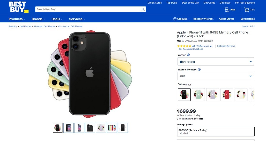
Instead of a fullscreen layout, Best Buy uses a boxed design for product pages. Different variations of the product are also neatly showcased on the side. And product descriptions are formatted into different sections for easy scanning. This is how you design a proper product page.
7. IMDb
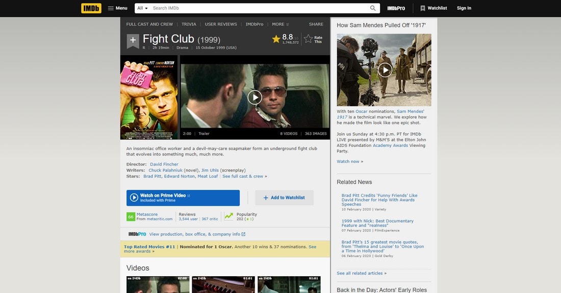
IMDb, or Internet Movie Database is the go-to platform for learning everything about movies and TV shows. The website receives more than 500 million visitors every month.
When you visit the IMDb homepage, it looks amazing. It features a fullscreen design with a dark color theme. And large previews of movies and TV shows for easily exploring its content.
But, wait until you open a product page. The difference between the IMDb homepage and a product page is like night and day.
Why This Website Looks Bad?
Even though IMDb website’s homepage was revamped recently, its product page layouts for movies and TV shows have remained the same. This layout uses a very narrow boxed design. This makes the pages look cluttered and more difficult to navigate the page and to find more information. The terrible choice of the font makes it harder to read its content as well.
How Can It Be Improved?
IMDb can certainly learn a few lessons from Metacritic’s page design.
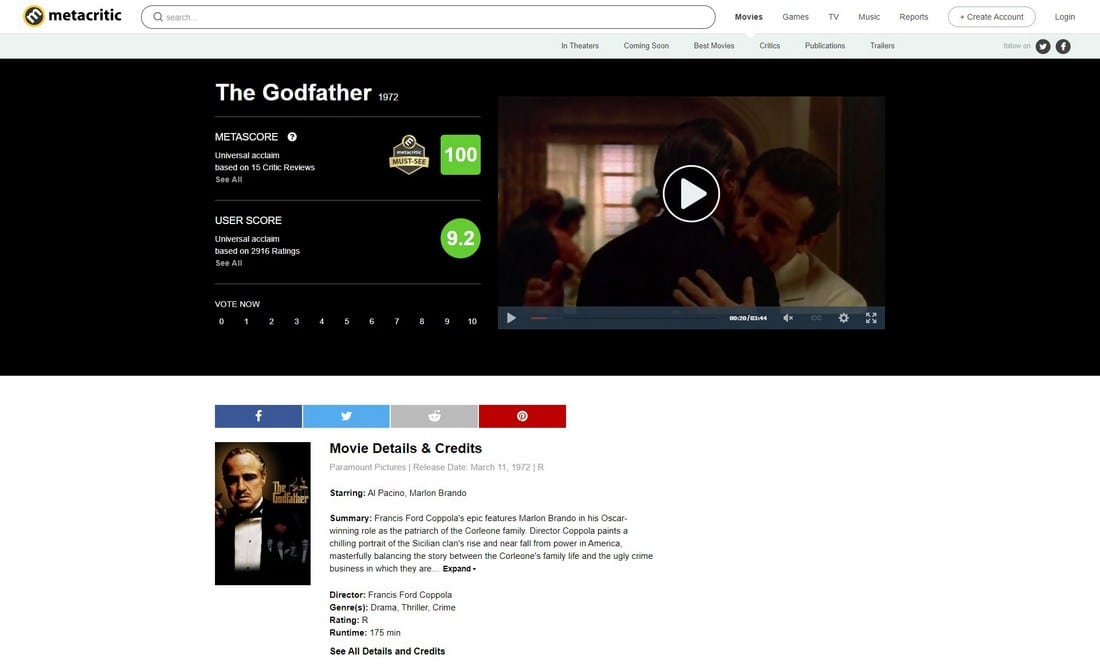
Metacritic uses a clean and fullscreen page design. The details and descriptions are easier to read. And offers clear navigation with visual elements. This same design approach would also fit in well with IMDb.
8. Wikipedia
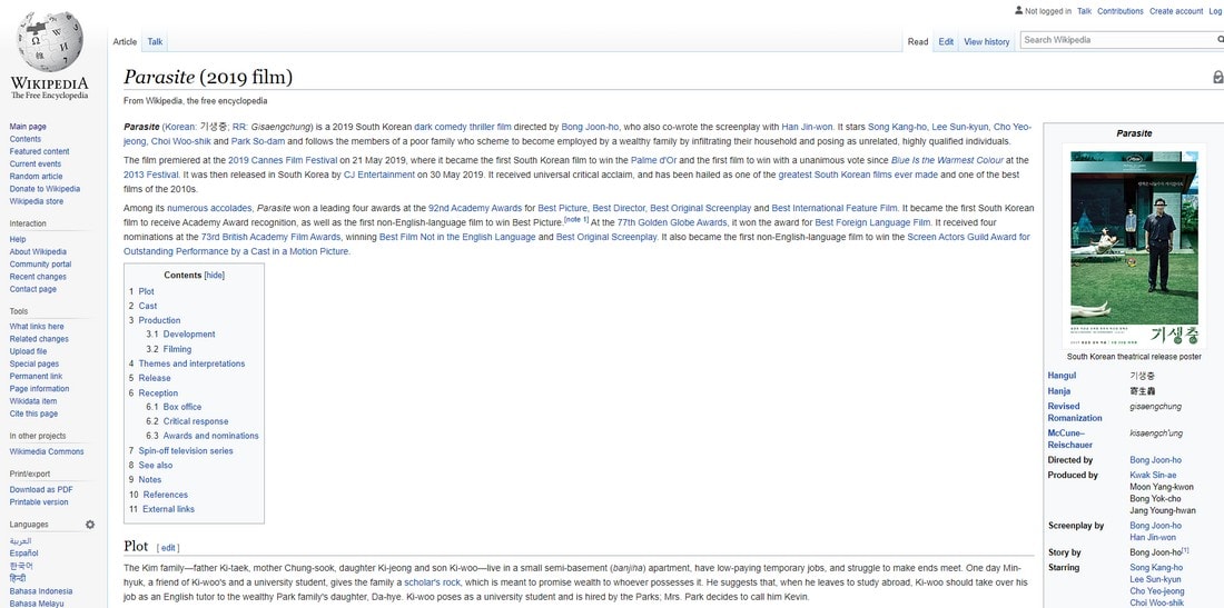
With more than 1.3 billion visitors every month, Wikipedia is one of the top websites on the Internet that everyone has visited at least once in their lifetime.
The website, however, still needs a major revamp to make it more relevant today and appealing to current audiences.
Why This Website Looks Bad?
Since Wikipedia is a non-profit website that is maintained with the help of donations, we can’t be too harsh on its design. After all, it’s providing a public service.
However, we believe a better design for its article pages could prove it much more useful and user-friendly. Especially to attract younger audiences.
The content formatting of the articles needs a lot of work. Wikipedia articles use a fullscreen design and as a result, the text paragraphs are stretched too long. And makes it difficult to read.
Above all, the site is in need of a proper navigation system.
How Can It Be Improved?
Even though Britannica’s days are over, Wikipedia can still learn a few tricks from their website design.
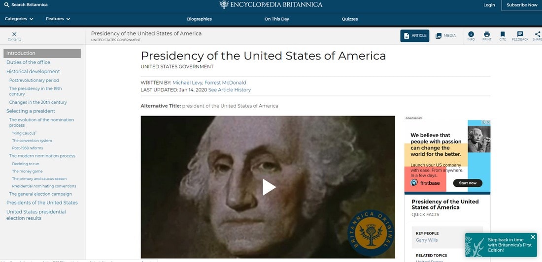
For example, Britannica’s page layouts feature a sticky navigation panel where users can jump to different sections of the article. It also has a much better page design with better formating that improves readability.
If Wikipedia had a design like this, we’ll be spending more time on the site actually reading its content.
9. University of Advancing Technology
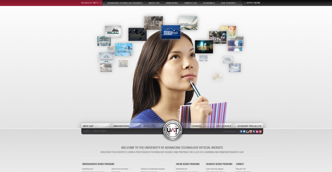
We were quite shocked to find a website that looked like this belonging to a university that specializes in “advancing technologies”. Somehow the university seems to have missed out on many years of advancements in web design technologies.
Why This Website Looks Bad?
For starters, the animated rotating navigation menu is what frustrates us the most. If you miss your chance to click on an item, you have to wait for it to make a full circle back to you. Arguably it’s the most frustrating navigation design we’ve ever seen.
How Can It Be Improved?
The main reason someone visits a college website is to learn about the college itself, its programs, and courses. This includes showing off a tour of the college. Including categorized navigation for easily finding courses. And pages about the teachers and the reputation of the college. All of which this website has failed to accomplish.
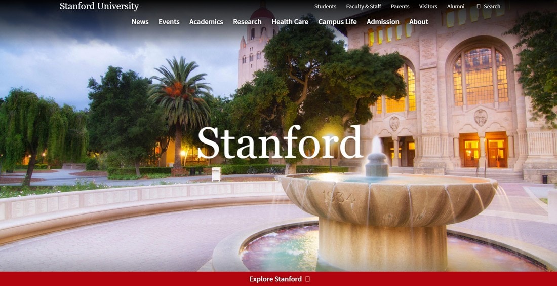
The Stanford University website is a good example of how to get that job done.
10. W3Schools
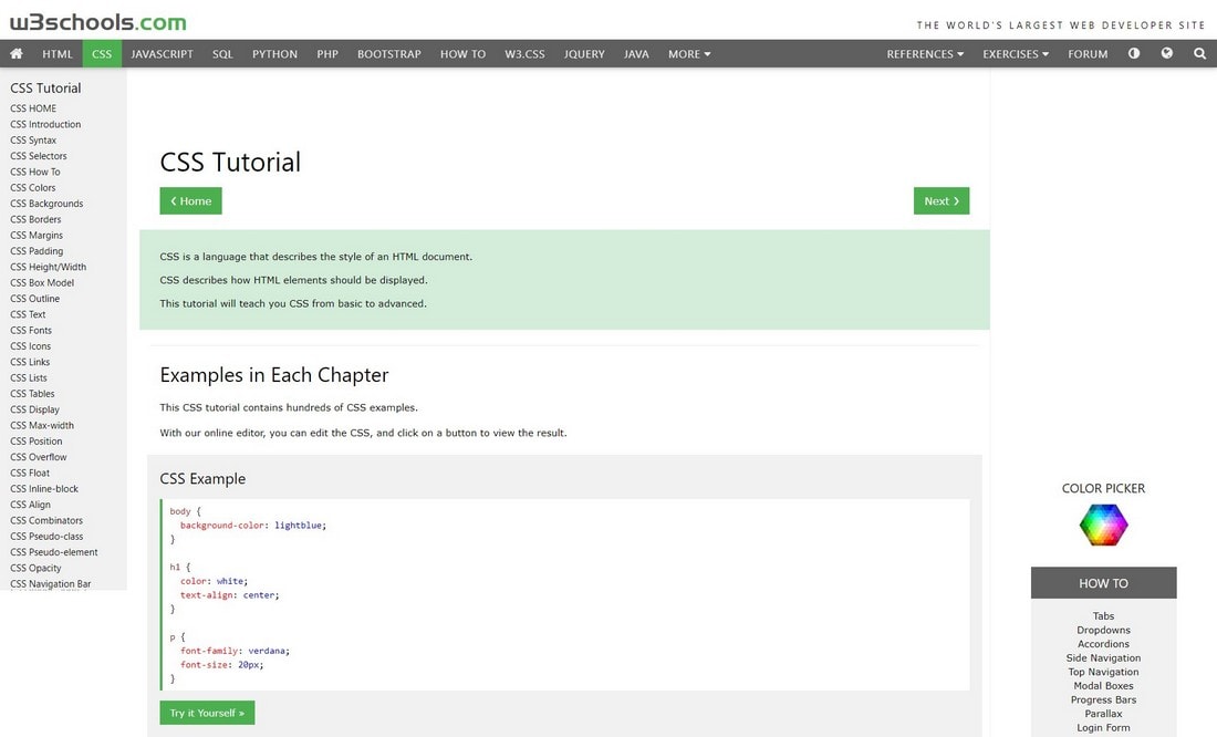
W3Schools is a popular online resource for learning to code. It’s a well-known site for many web designers and programmers, both beginners and experts. According to SimilarWeb, the site quite popular. It receives over 50 million visitors every month.
It features a large collection of informative courses, but the designs of the course pages could use a bit of an improvement.
Why This Website Looks Bad?
W3Schools courses feature short lessons but with a direct hands-on approach. This involves practicing what you learn in each course using a code editor.
However, the code editor needs to be loaded separately to function. This means you need to have two tabs open on your browser to learn a lesson.
How Can It Be Improved?
A better way to approach online learning platform design, especially for coding courses, is to provide a sandbox with live-previews for students to play around with. This is exactly what CodeAcademy does.
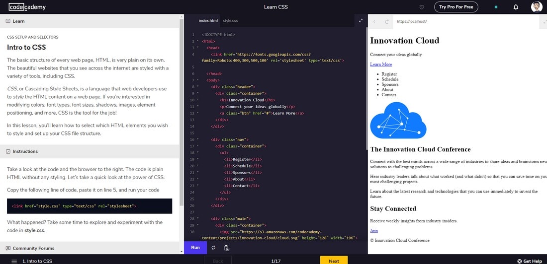
Each lesson in CodeAcademy courses features three panels where the lesson is detailed alongside a code editor and a live-preview. This provides a much easier way for students to learn with a more practical approach. It’s exactly what W3Schools needs.
In Conclusion
If there’s one thing we can learn from all these websites it’s that caring about your brand and company’s online presence is more important today than it ever was. As you can see above, bad website design is all it takes for someone to get the wrong impression of a brand. Let’s hope these companies will finally come to its senses and revamp their websites, at least within this decade.