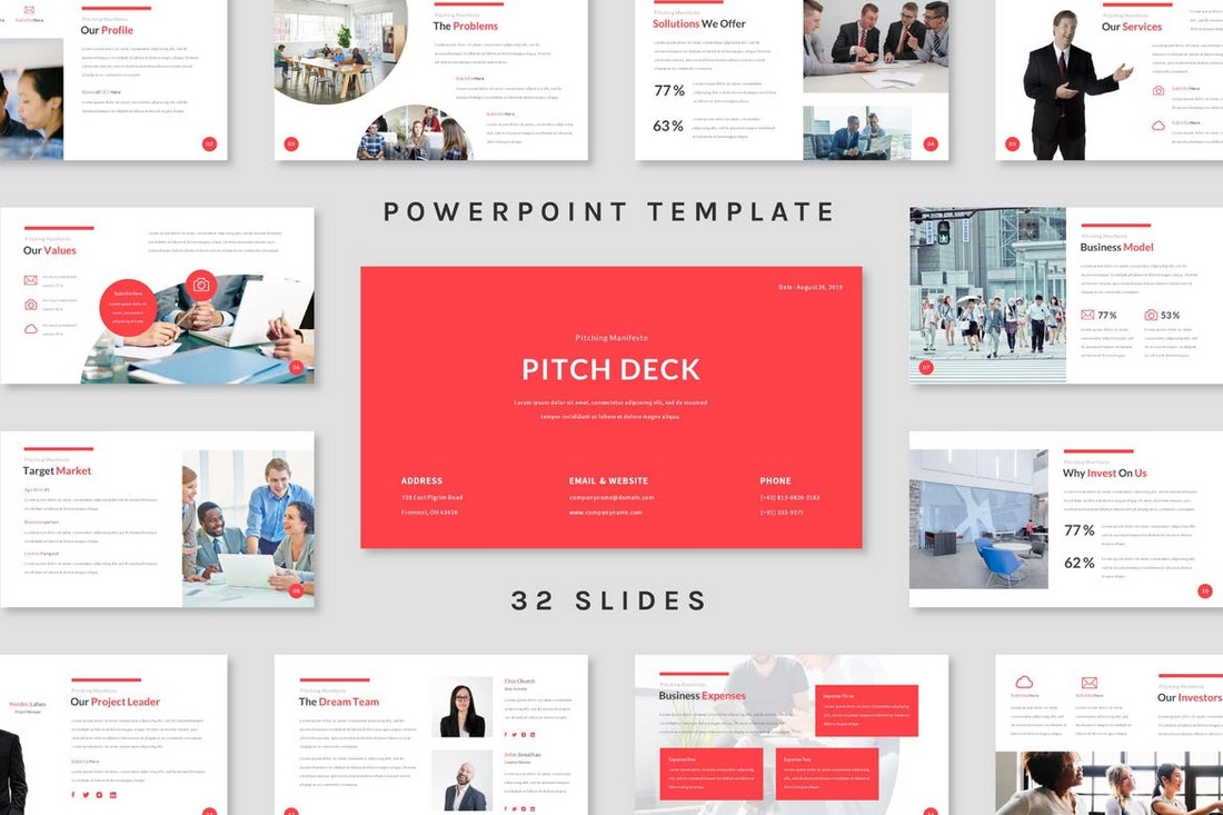
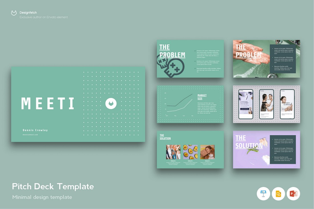
Having a great idea for a startup is not enough if you can’t make others see your vision. Pitch decks are the medium used to bridge this gap. To help visualize your startup idea to investors.
A well-crafted pitch deck is usually the reason behind the success of many modern startups. It’s what earns them the first rounds of funding and get the business up and running.
If you’re also in the process of pitching your startup idea to investors, take a look at some of the pitch deck examples below that made startup ideas into billion-dollar companies.
What Is a Pitch Deck?
A pitch deck is a type of presentation or a slideshow you use to present a startup or business idea to investors. In the world of venture capital, pitch decks are like your CV that you present to win over the investors.
Unlike most other types of presentations, pitch decks are short, concise, and very straightforward. Basically, it’s a short overview of what your startup is about, the problems it solves, and why you think it can be a success.
Although, creating such a precise pitch deck is not as easy as it sounds. Let’s explore some of the famous startup pitch decks and learn why they were successful.
1. Airbnb
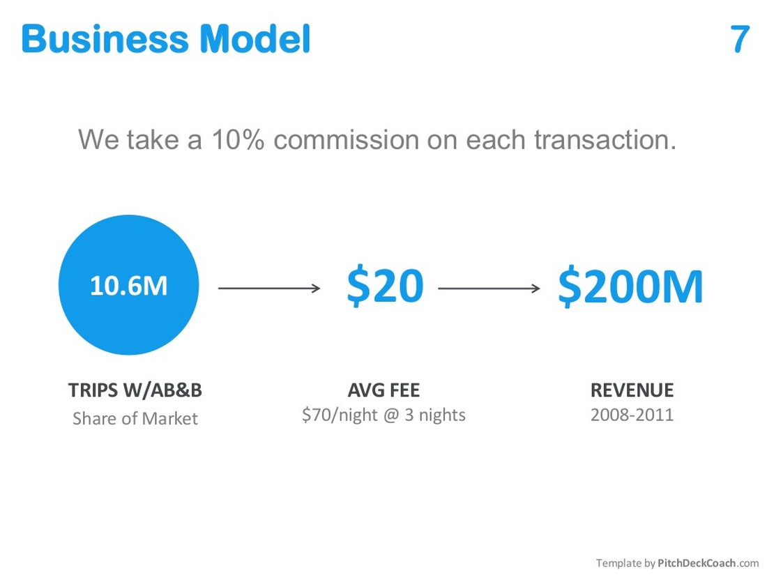
The Airbnb pitch deck is a legend among presentation designers. It’s one of the most perfectly designed pitch decks ever made. And it’s the pitch deck that made Airbnb into the $385-billion startup that it is today.
Why It Worked
Airbnb pitch deck proves that the key to winning is to keep things short. In fact, this pitch deck had only 10 slides. The startup was able to pack all their best information into 10 slides with a clean and modern design.
Recommended Pitch Deck Template
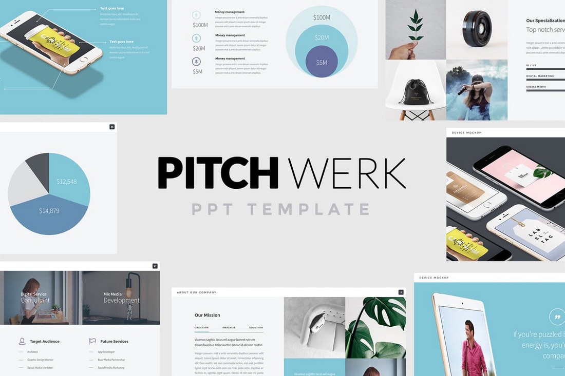
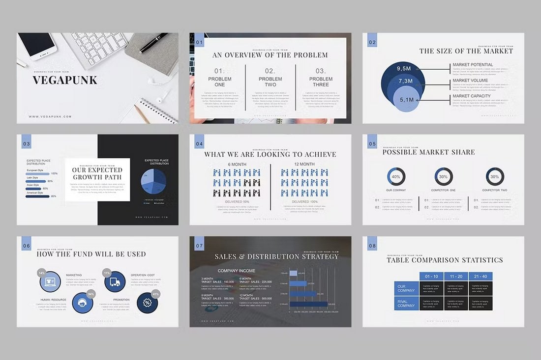
You don’t have to be an expert designer to create such a great pitch deck. Instead, you can use a template. This particular template is perfect if you’re going for a short and sweet approach with your pitch deck design.
2. Square
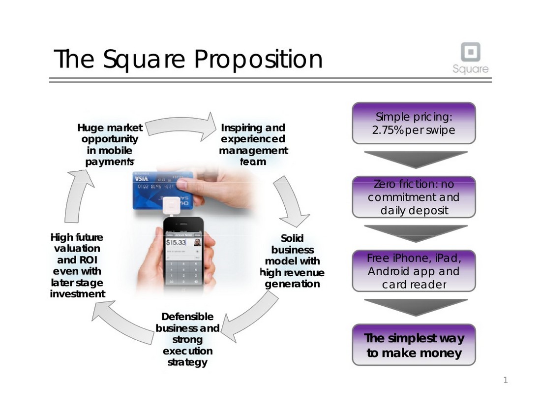
Not all startup ideas can be explained in just 10 simple slides. Startups that aims to bring a new concept into a competitive market requires a well thought out pitch deck with more information. That’s exactly what Square did with its pitch deck to convince investors to invest in the company.
Why It Worked
If you have a more complex startup idea to explain in a pitch deck, use Square’s pitch as an example to learn about what slides to include and what to avoid.
Even though the slides look a bit outdated now, this pitch deck was able to perfectly encapsulate Square as a successful startup. Since this pitch, Square managed to raise over $500 million in funding in multiple rounds.
Recommended Pitch Deck Template
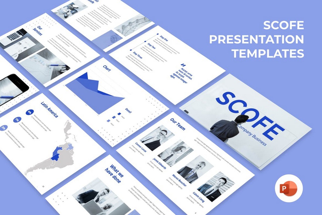
You can use this PowerPoint template to create a more detailed pitch deck while showcasing more information about your company.
3. Facebook
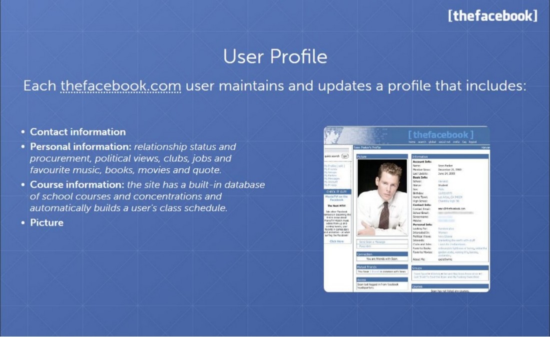
This is one of the earliest pitch decks used by Facebook in their early seed funding rounds. This was back in the day when the company was known as “thefacebook”. At the time, this pitch deck had one of the best designs.
Why It Worked
Facebook wasn’t a brand new startup. It was competing against other more popular platforms like Myspace and Friendster. This pitch deck proves how well the company described the platform in a very simple manner in each slide to help investors understand the purpose of the business.
Recommended Pitch Deck Template
This pitch deck template is ideal if you’re designing a pitch deck similar to Facebook’s design. It has slides with layouts that support a textual approach.
4. Mint
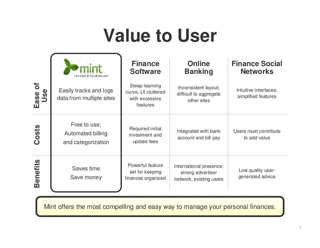
Mint.com created this pitch deck 5 months before launching the startup. Needless to say, this pitch deck is what made Mint.com a reality and made it into a $170 million business only 2 years after launch.
Why It Worked
Featuring a PowerPoint design from 2007, the Mint.com pitch deck is a masterclass on how to highlight the key features of your business while comparing it with competitors.
Recommended Pitch Deck Template
Use this pitch deck template if you also want to craft a set of slides with competitive data and highlights.
5. LinkedIn
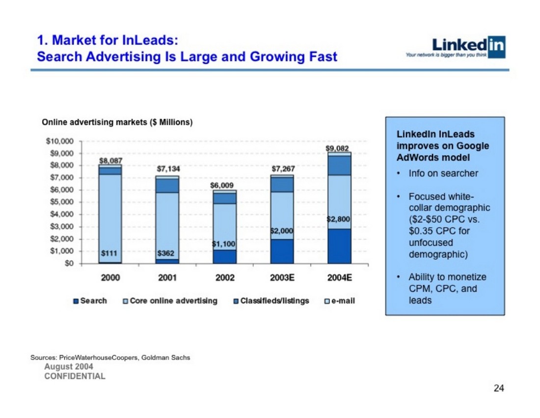
This pitch deck was used in LinkedIn’s series B funding round. As you’ll see from the presentation, it features more information about the company than the usual startup pitch deck. That’s probably what helped the company raise more funds on its way to becoming a $26-billion company.
Why It Worked
The LinkedIn pitch deck packs a lot of data and statistics in almost every slide in the deck. Visualizing this data is what made it look more interesting. You’ll notice that the deck features all kinds of graphs and charts.
Recommended Pitch Deck Template
This template also comes with editable infographics, charts, and graphs to help visualize data more effectively.
6. Buffer
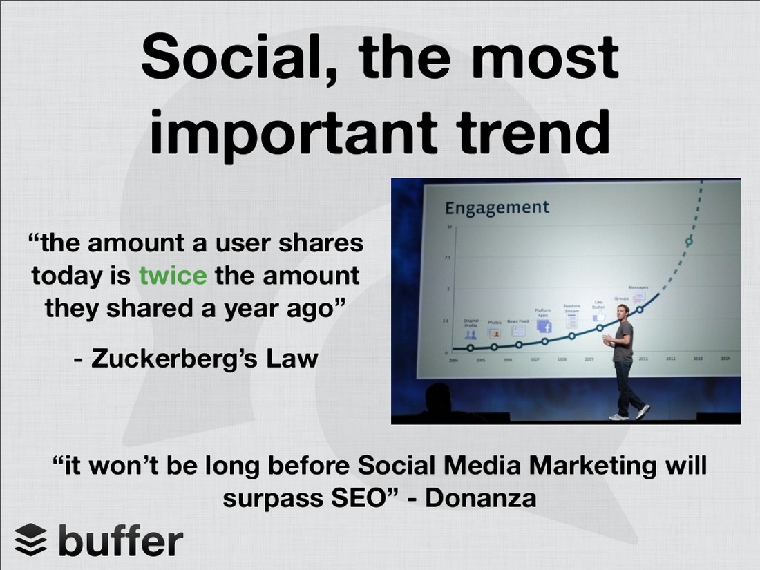
Buffer is a startup that started out small but made it into a well-known name in the world of social media. The company is now valued at over $80 million. This is the slide deck the company used to raise its first $500K funding.
Why It Worked
The simple and clean design made this pitch deck a success. It also summarized the entire startup into 12 slides. With big bold titles and brief descriptions.
Recommended Pitch Deck Template
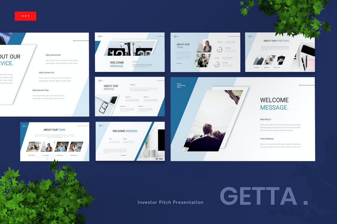
If you also prefer pitch decks with big titles and text, this template is perfect for you.
7. Foursquare
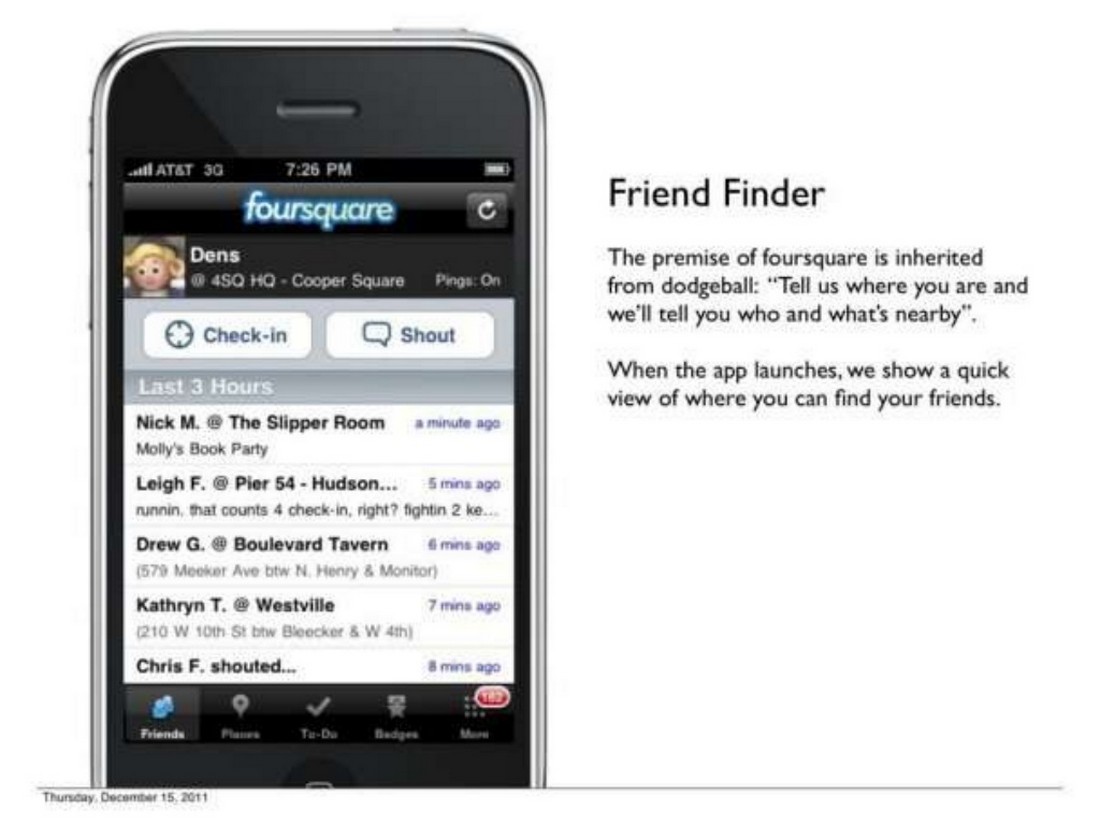
This is the very first pitch deck Foursquare used to showcase the company to investors. And it’s the pitch deck that got the company off the ground with over $1.3 million initial funding.
Why It Worked
Foursquare used the pitch deck quite cleverly to show off features of the service using app screenshots. This helped prove and convince investors of how effective and simple it is to use the app.
Recommended Pitch Deck Template
Use this template and make sure to add lots of screenshots and images in your pitch deck as well.
8. Canva (Previously Fusion Books)
Before Canva was the go-to platform for designing social media graphics, it was known as Fusion Books. Their goal was to replace Microsoft Office as an online publishing platform.
Even though the initial plan didn’t exactly work out, this pitch deck is what helped the startup get its idea off the ground as Fusion Books.
Why It Worked
The dark color theme is an odd choice for designing pitch decks but somehow this one pulls it off quite well. The dark backgrounds also offer better contrast to highlight the text and images above all else.
Recommended Pitch Deck Template
If you’re also thinking about using a pitch deck with a dark theme, this template will come in handy. It features 36 different styles of slide layouts for you to choose from.
9. WeWork
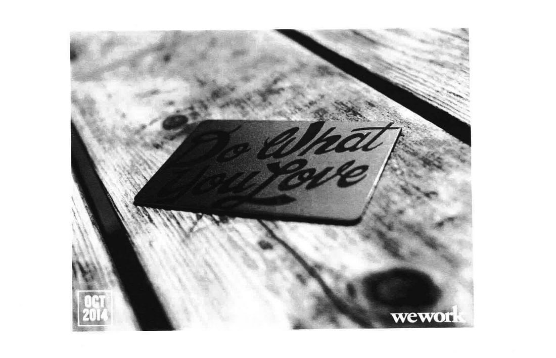
This is the pitch deck WeWork used in its Series D funding round back in 2014. It may look simple and basic but this slideshow helped the company successfully raise $355 million in funds.
Why It Worked
Even though the slides look a bit cluttered, they also use big headings, images, and stats throughout the slides to make them easier to digest and navigate. It also packs a lot of information as well.
Recommended Pitch Deck Template
Much like the WeWork pitch deck, this template also uses very simple slide designs featuring creative illustrations and icons. It uses a very professional design style too.
10. Dropbox
Even though it was designed way back in 2007, this pitch deck features a very straightforward design that makes a convincing case for the company. Dropbox used this pitch deck to get the initial funding for the startup, which is now valued at over $8 billion.
Why It Worked
There’s one common theme used in this pitch deck and its bullet points! Many experts agree that bullet points help summarize information more effectively. And that’s probably what made this pitch deck a success for Dropbox.
Recommended Pitch Deck Template
If you want also want to showcase lots of stats and information in a concise manner, this pitch deck template will help. It features 60 slides with unique designs for presenting a data-driven pitch.
11. Buzzfeed
Buzzfeed used this pitch deck back when it was only generating around 2.5 million page views per month to convince investors of its much larger plans for the future.
The pitch deck helped the company raise over $3.5 million in funds. Now the platform has grown into a giant in the entertainment industry.
Why It Worked
Despite the quirky and rather casual content seen on Buzzfeed pages, this pitch deck uses very professional slide designs that show the plans for the future in a straightforward manner.
Recommended Pitch Deck Template
With this template, you can design a more visual and colorful pitch deck to present your startup and project ideas. It’s great for entertainment-related pitch decks as well.
12. Uber
This is the iconic pitch deck that secured the first $200k in funding to get UberCab off the ground. The tech giant now dominates multiple industries with an enterprise valuation of over $57 billion.
Why It Worked
You’ll see lots of stats, numbers, and bullet points throughout this pitch deck. It also has a large pitch deck with 25 slides that effectively detail the whole purpose of the startup idea.
Recommended Pitch Deck Template
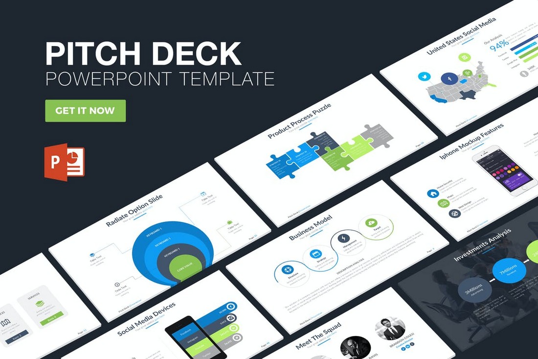
This PowerPoint template is great for showcasing big numbers and stats about your company in an attractive way. It also features lots of charts and graphs for convincing your investors of your success.
13. Mapme
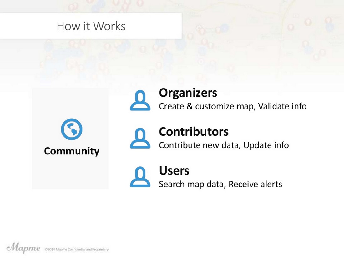
The interactive map-making platform, Mapme used this simple and effective pitch deck to raise $1 million for its seed funding round. And it only has 14 slides.
Why It Worked
Describing the key features of the platform in concise bullet point-style paragraphs is what made this pitch deck a success. It also uses visuals to cleverly show off the app features as well.
Recommended Pitch Deck Template
This pitch deck template will help you create a slide deck with a clean and minimal approach, just like the one used by Mapme.
14. Mixpanel
Imagine raising $65 million using a pitch deck that consists of just 12 slides. That’s exactly what Mixpanel managed to achieve with its pitch deck.
Why It Worked
For a startup that promotes analytics software, you’d expect the pitch deck to have lots of visuals like charts and graphs. But, this pitch deck mostly use text to easily explain what kind of problems the startup aims to solve.
Recommended Pitch Deck Template
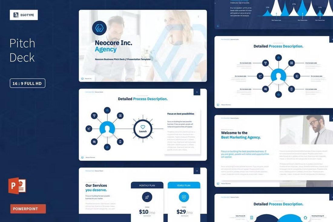
A simple PowerPoint template like this one is great for creating pitch decks with clean layouts and lots of text.
15. Moz
This is the iconic pitch deck Rand Fishkin used to showcase Moz (previously SEOMoz) to investors and raise funds back in 2011.
Why It Worked
What makes this pitch deck different from the rest is how it uses illustrations, and images as a way to describe key aspects with a bit of humor. It may not work for all startups, but it’s probably what made this pitch deck a success.
Recommended Pitch Deck Template
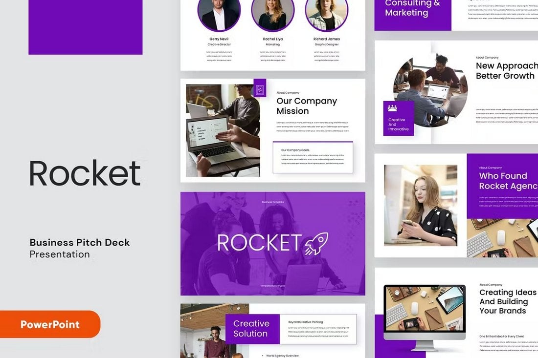
Many of the pre-made PowerPoint pitch deck templates come with vector graphics, icons, and even illustrations you can use in your presentations. Like this one.
Conclusion
Hopefully, you’ll be able to apply some of the tricks used in these pitch decks when creating your own designs. Also, you can check out our best pitch deck templates collection to find inspiration.

