
Color is an element that can make or break a design, and that rule holds true for presentation design as well. Choosing the right PowerPoint color scheme is super-important.
But there’s one extra thing to consider – where your presentation will be given. A PowerPoint presentation can look quite different on a computer or tablet versus on a projected screen.
When it comes to selecting a PowerPoint color scheme, this is an important consideration. Today we’ve rounded up more than 20 stylish PowerPoint color schemes as inspiration. While darker color schemes might look great close-up on screens, opt for lighter backgrounds (for enhanced readability) for projected presentations.
Note: The last color in each scheme is for the slide background.
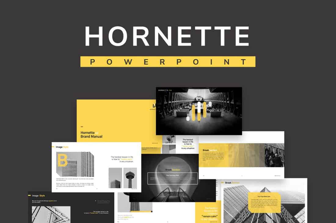
1. Blue and Yellow

Blue and yellow are a classic pairing and can make for a striking presentation color combination. With a bright white background, these hues stand out in a major way.
What really works here is the element of contrast. A darker blue with a brighter yellow create an almost yin and yang effect with color. The only real caution is to take care with yellow on a white or light background with fonts or other light elements.
2. Teal

Teal is a personality-packed color choice. If you are looking for a bold statement with a PowerPoint template, start here.
While the above color scheme also includes a hint of yellow for accents, the teal color option is strong enough to stand alone. You could consider a tint or tone for a mono-look. It also pairs amazingly well with black and white images.
Teal is a fun color option that will provide a lot of practical use with your slide deck.
3. Bright Coral
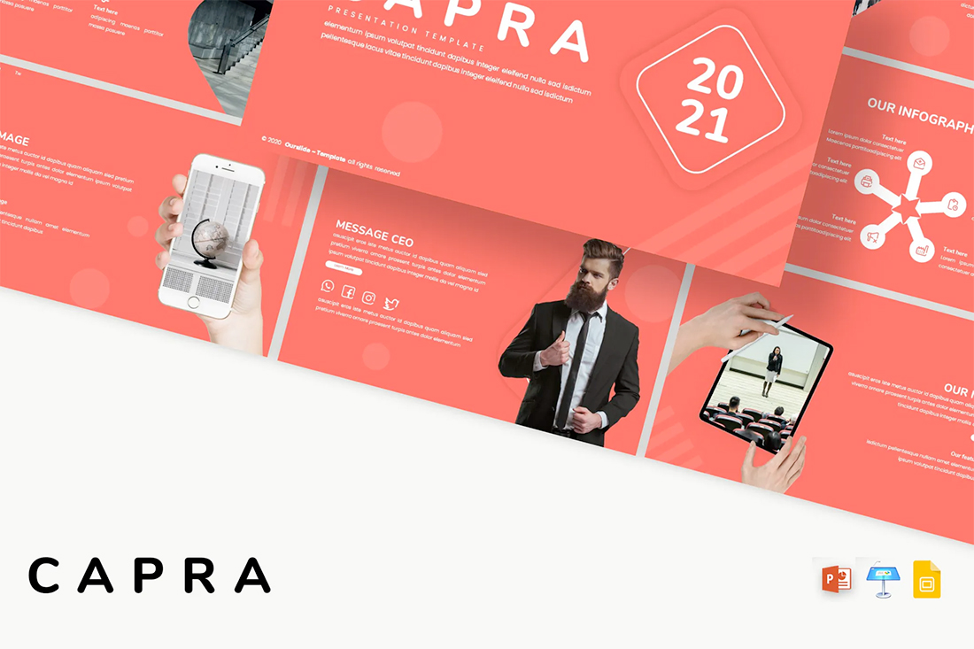
This color scheme is one of those that you will either love or hate. The bright coral color is strong and powerful and generates an immediate reaction.
It’s also quite trendy and will stand out from many of the other more bland PowerPoint colors that you may encounter. This is a great option for a startup that wants to present with a bang or brand that has a similar color in their palette. It may not work so well for more traditional brands or those that are more conservative with their slide designs.
4. Dark Mode Colors
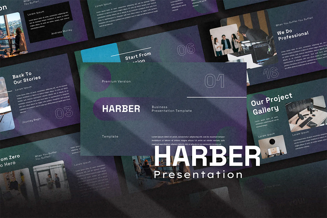
A dark mode color scheme might be the biggest trend in all of design right now, and that also applies to presentation design.
This purple and emerald color pair on black with white text looks amazing. It is sleek, modern, and has high visual appeal without having to use a lot of images.
This works best for digital presentations when you don’t have concerns about room lighting to worry about.
If you aren’t ready to jump in to dark mode on your own, the Harber template above is a great start with nice color, gradients and interesting shapes throughout the slide types.
5. Bright Multi
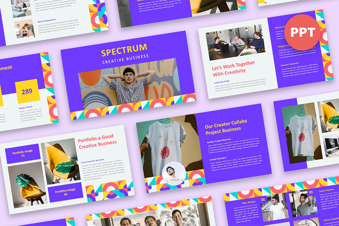
Another concept that never seems to go out of style – rather it just keeps evolving with color options – is a bright multi-colored palette.
This type of color is most common with PowerPoints that have large slide decks with a lot of slide types. Having a wider color palette can help create organization between sections of the presentation or information types.
The nice thing about this bright palette is that it sets a positive mood for the content and isn’t too overwhelming with colors on the same part of the spectrum throughout.
6. Navy and Lime
A navy and lime combination is a modern take on colorful neutrals that are anything but boring.
These colors have a nice balance with a white or light background and are fairly easy to use. With so many brands already using a blue in their base color palette, this is an option that works and an extension of existing elements for many brands. (Use your blue and add the lime to it.)
Also, with this color combination, the idea of a minimal overall slide structure is nice so that the power of the colors and impact comes through. They work beside images in full color or black and white.
7. Modern Blue

When you aren’t planning to use brand colors – or maybe as a startup or independent contractor so you don’t have them yet – a modern color combination can add the right flair to a PowerPoint presentation.
The bright grayish blue in the Lekro PowerPoint template – you can find it here – adds the right amount of color without overwhelming the content. Plus, subtle orange accents help guide the eye throughout this PowerPoint color scheme. https://elements.envato.com/lekro-powerpoint-presentation-67YW3M
8. Blackish and Yellow
While at first pass, black and yellow might seem like a harsh color combination, it can set the tone for a project that should emanate strength. This PowerPoint color scheme softens the harshness of the duo with a blackish color, that’s grayer and has a softer feel.
Pair this combo on a light background or with black and white images for a stylish, mod look.
9. Orange and White

A bright color can soften the harshness of a stark PowerPoint design. Especially when used for larger portions of the content area, such as background swatches or to help accent particular elements.
The Sprint template makes great use of color with a simple palette – orange and white with black text – but has slide ideas that incorporate the color throughout for something with a more “designed” look to it. (And if you aren’t a fan of the orange, change the color for use with this template to keep the modern feel.)
10. Purple
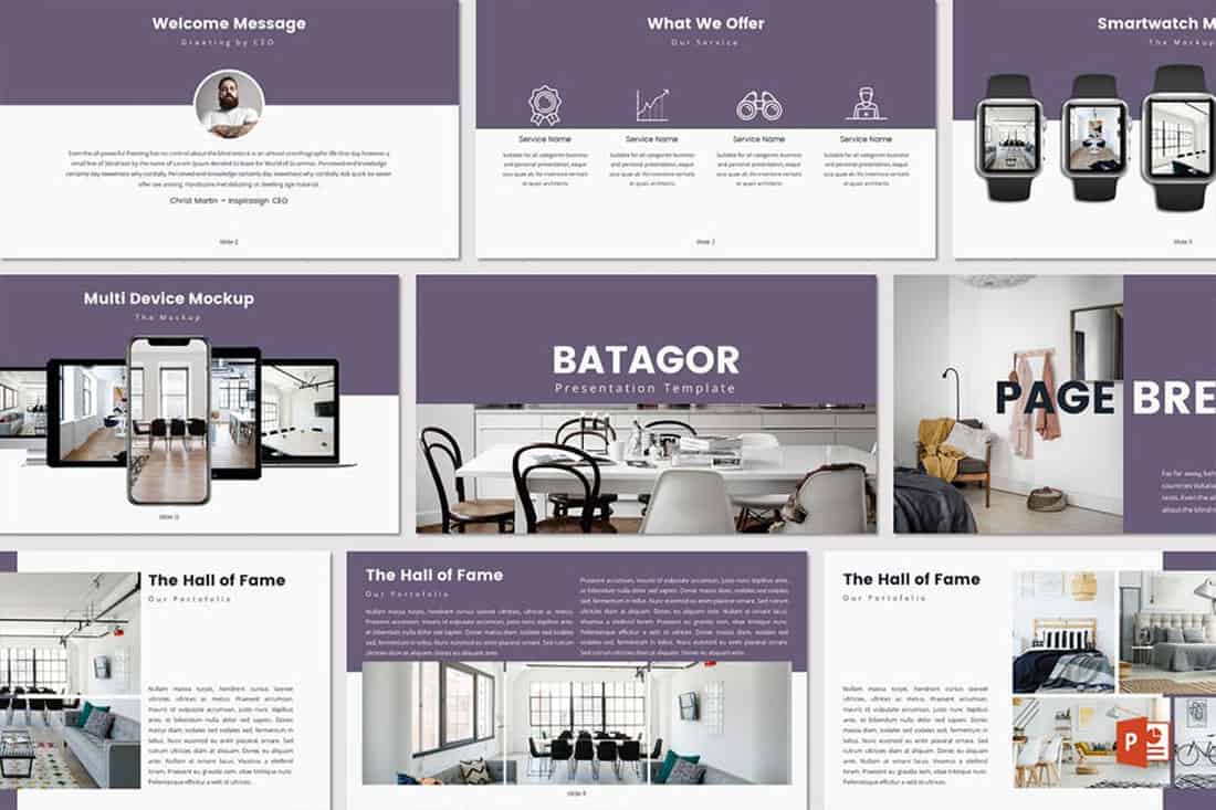
Purple presentations are in. The color, which was once avoided by many in design projects, has flourished with recent color trends.
Because more funky, bright colors are popular, a presentation with a purple focus can be acceptable for a variety of uses. The use in the Batagor template has a modern design with a deep header in the featured color, which works best with images that aren’t incredibly bold in terms of color.
11. Blue-Green Gradients

Another trending item in color is the use of gradients. This trend can be applied to PowerPOint presentations as well.
Use a blue to green gradient for a soft and harmonious color scheme that won’t get in the way of content. Use each hue alone for accents and informational divots throughout the presentation design.
12. Black and White

Minimalism is the design trend that never goes away. A black and white (or gray) presentation screams class and sophistication.
It can also be easy to work with when you don’t want the color to get in the way of your message. And if a design can stand alone without color, you know it works.
13. Reds and Black
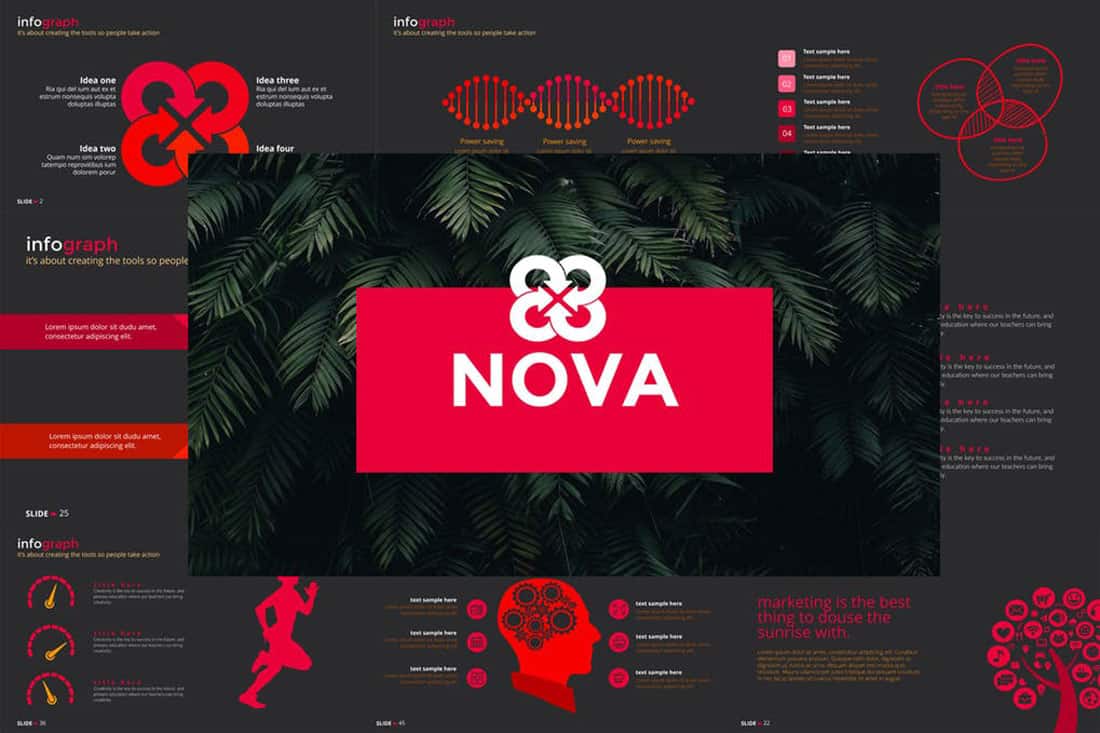
If you are designing a presentation for viewing on screens, such as desktops or tablets, a dark background with bright color accents and white text can work well. (This combination gets a lot trickier on projector displays.)
While reverse text and red aren’t always recommended, you can see from the Nova template that it can be a stunning combination. But note, this modern color scheme is best for specific content and audiences.
14. Blue and Pink
This color scheme is a spin on Pantone’s colors of the year from 2016. https://designshack.net/articles/graphics/how-to-use-the-pantone-color-of-the-year-in-design-projects/ The brighter, bolder versions of rose quartz and serenity and fun and sophisticated.
The unexpected combo sets the tone with a strong, trustworthy blue and adds softness with the paler pink. The colors work equally well with white or darker backgrounds.
15. Blue and Green

Blue and green accents can help a black or white background come to life in a presentation template. The colors here can work with either background style, based on how you plan to display your presentation.
What’s nice about these colors is that they are pretty neutral – since both are found in nature – and can be used with ease for design or text elements in a PowerPoint color scheme.
16. Beige and Gray
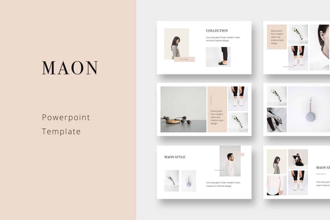
If you are looking for a softer color palette, consider beige and gray. These hues can work well on screens or projected, making it a versatile option.
The nice thing about such a neutral palette is that it gives content plenty of room, so that will be the true focus of the presentation.
17. Tints and Tones
While the purplish-blue-gray in the Business PowerPoint Presentation template is stunning, it represents a greater trend in presentation design. Pick a color – maybe your dominant brand color – and use tints and tones for the presentation color scheme.
By mixing the color with white or black and gray, you’ll end with up with a stunning set of color variations that match your messaging.
18. Bold Rainbow
While most of the color schemes featured here only include a color or two, bright color schemes with wider color variations are trending.
This distinct “rainbow style” can be somewhat difficult to use without rules for each color. Proceed with caution.
19. Bright Neutrals
Lime green is the brightest “neutral” you might ever use. A fun palette that’s versatile can be a solid foundation for a color palette.
It works exceptionally well in the Rouka PowerPoint template thanks to a pairing with a subtle gray background. Using a light, but not white, background can be great for screens and projected presentations because it takes away some of the harshnesses of a white background. The subtle coloring is easier on the eyes for reading and viewing.
20. Rich Browns
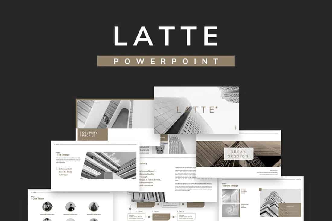
Browns aren’t often what comes to mind when thinking of building a color scheme, but rich browns can be a modern option.
Pair a neutral beige-brown with a darker color for an interesting contrast that works with almost any style of content.
21. Mint Green
Go super trendy with a modern and streamlined palette of mint green and gray on white. While this combination can have a minimal feel, it also adds a touch of funkiness to the design.
Add another hint of color – think orange – for extra accents.
22. Dark Gray and Blue
It doesn’t get more classy than a combination of grays and blues. This new take on a classic color scheme adds another brighter blue as well to pick up on modern trends.
Just be careful with text using a dark background such as this one. White is probably your best option for typography, and look for a font with thicker strokes.
23. Rainbow Themed
While most designers stay away from color schemes with more than a couple of colors, a bright rainbow-style option can work for presentations. It’s visually interesting and can help break up a deck with a lot of slides.
When working with a large color palette, give each color a purpose in the design, so that the overall scheme looks intentional.