Basically, we all need perfect ebook landing page design for a better presentation of products and services we provide on the web. In fact, a well-done landing makes your visitor act for your benefit, while a bad one makes you fail. Unfortunately, tons of business owners neglect the importance of a good landing. For this reason, they put thousands of dollars into the frauds’ pockets to get promoted.

The best option to simplify web development process is to choose ready-made templates developed by professional designers. They are guaranteed to please customers and get the quality of the site to the new level with no time and effort.
Check out a set of landing page template design to share your web design.
What makes website owners refer to the custom-made templates? Why are they so popular now? And is it worth refusing from the web studios?
If you choose between the ready-made templates and exclusive solutions, the comparison is clearly not in favor of the latter. Taking into account some free offers, the cost of development a website template and design actually tend to zero. Moreover, landing page templates are designed for the widest possible range of users – from beginners to professionals. On the one hand, the template is a ready-made design that can be bought by any user. On the other hand, it is the basis, the skeleton of the site, which can be significantly redesigned to fit your needs.
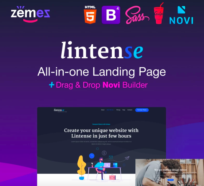
I would like to draw your attention to the innovative all-in-one landing page template and look through other advantages of landing page templates on the example of Lintense.
Lintense – All-in-one Landing Page Template

Designed by the best Zemez specialists, Lintense is your number one choice to build a beautiful landing page for any business niche. Its responsive design allows your visitors to easily view the site on devices with any resolution. The main advantage is that you will have one version of the site, and you will not need to create its mobile version.
Installation and customization processes take a few moments, which means that information about your product/service will appear earlier in the search engines, and you will be able to start promoting it right now. With Novi Builder, you do not need to attend any technical classes to get the appropriate skills – even a beginner will cope with the template.
Lintense comes with 5 perfectly designed templates, SEO-optimized code, effective plugins and technologies, regular updates, and dedicated 24/7 support. Innovative web practices implemented in the product will get your online project to the new quality level.
More features:
- Parallax effect
- Bootstrap framework
- Top-notch performance
- Exceptional design
- Valid and clean HTML code
- Google web fonts
- Google map
- Accurate documentation
In fact, there is a bunch of common mistakes that people make while launching their landings. I would like to highlight them below, so, please pay attention to avoid these mistakes in future.
Poor Page Structure
Basically, the main task of a good landing is to turn your random visitor into the real client. That’s why there is no need to overload the page, it will make people run away immediately!
Bad Graphic
Using foolish stock photos or too heavy images makes you get in trouble with your landing.
Poor Communication Style
The main mission of your landing is to influence on the visitor by sharing the idea of a product or service in the right way. So, you definitely need to speak the same language with your visitors. For example, stupid jokes and youth slang seem pretty stupid on a business landing.
Everlasting Registration Process
The point is that no one will spend the whole day on your page. Therefore, if you really want people to act, make the registration process as fast & simple as possible.
Wrong Call to Action
Additionally, a call to action button is a key element of your page that shouldn’t distract people. So, try to be clear to avoid visitors disappointment and confusion.
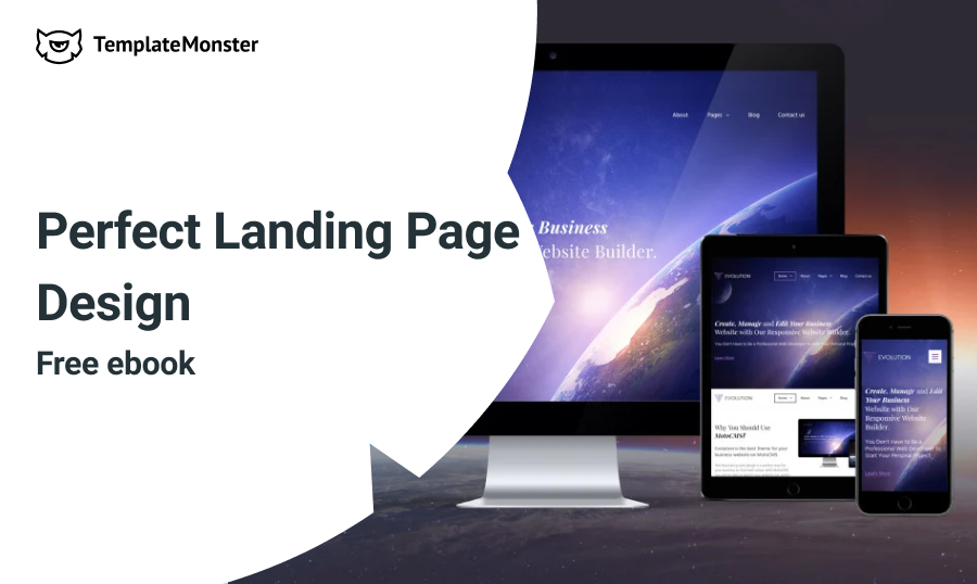
The thing is, that there is no need to suffer because it is fairly easy to create a professional-looking landing. To help you throw all your fears away, I decided to present you a collection of 21 signs of a perfect landing page design that were added to a hassle-free eBook.
Here you will see how a really profitable landing should look like. Moreover, this eBook contains lots of tips & tricks and examples that will help you to pump up the look of your landing page. See the contents and download this free eBook using a form below!
- Foundation. First 6 pages of this eBook allow you to get to know with a landing page as a term and to discover a variety of its types in a light and unobtrusive manner;
- Interesting Headline;
- Valuable Offer;
- Good CTA;
- Eye-catching Imagery;
- Usability;
- Mobile-friendly Page;
- Using Simple Language;
- Clean Design;
- Using Video;
- Benefit Bullet Points;
- Supporting Subheadlines;
- Client Testimonial (Optional);
- Proper Colors;
- Huge Typography;
- Focus on a Customer;
- Perfect Grammar;
- Buttons That Stand Out;
- A Message “Above the Fold”;
- Trust Signals;
- While Space;
- High-Conversion Button Copy;
- Valuable Landing Page Templates Designs
- Final Thoughts.
As for me, I hope that your landing page will be perfect after reading this guide. All signs above will definitely help you to get the most of your page and to promote your services and products.
Stay Tuned!
What do you think about this eBook? What sign in the most important there? As usual, I’m very happy to hear from you, so, please, drop me a line with your thoughts in the comments section below. By the way, sharing is caring, so, do not hesitate to rate and to share this post with your friends! Create stunning landing pages, and enjoy your day! ?

P.S. Still have no inspiration? Take a close look at our premium landing page templates!
The post 21 Signs of a Perfect Landing Page Design [Free eBook] appeared first on MonsterPost.
