
Resume design can be a funny thing. Where’s the line between too little color and too much? We’re featuring 20+ resume color schemes (with stunning examples) to help give you some ideas.
Personally, I believe it is a balance between showing off your personality and design style in relation to the job you are applying for. So, you might have a couple of resume designs, depending on who you are sending them to.
Another factor is printing. Are you going with a design that requires professional printing or are you doing it yourself? Think about all these things as you peruse these stylish resume color schemes for inspiration. (Note: Mixes are provided in HEX, but if you plan to print, make sure to use CMYK color.)
1. Deep Teal and Ivory
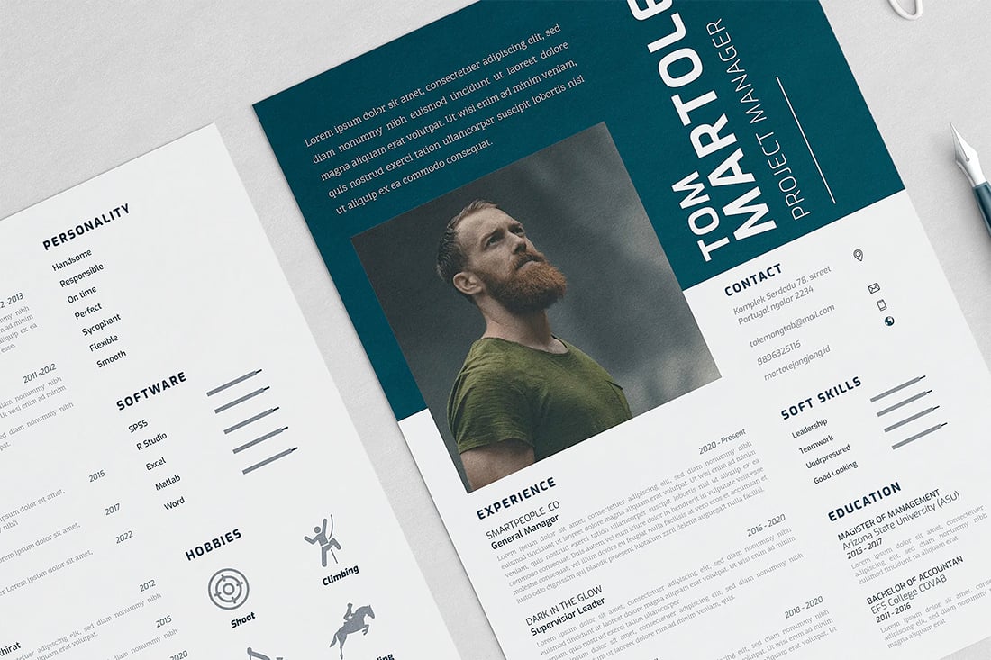
Deep teal and ivory create a modern, yet classic, color scheme for any resume style. You can replicate this design digitally or by buying ivory resume paper and only printing the color sections. What’s nice about this color combination is the element of contract and the fresh feel of the color options, which are a nice sping on the expected blue and white.
2. Neutral and White
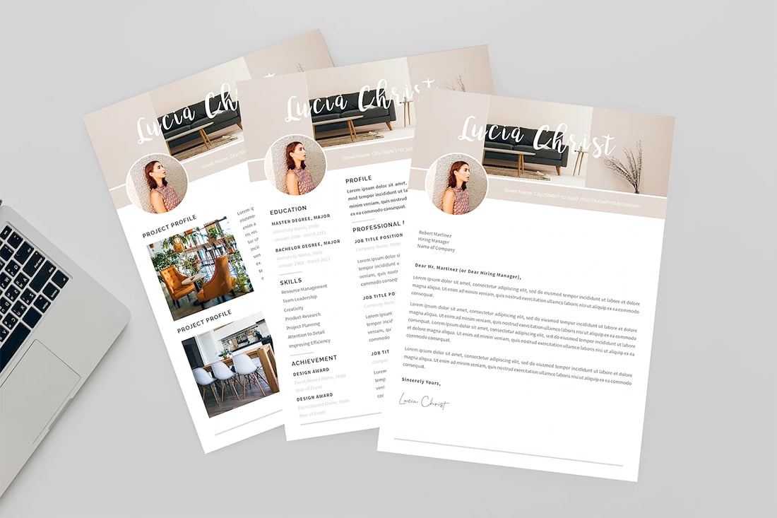
With simple neutral color accents on a white background, this resume color option highlights your experience and content without getting in the way. Use it like the featured template with images or let it stand on its own for an elegant, timeless style with just a hint of color.
3. Classic Grays

Sometimes a simple gray style is just what you need. What’s nice about this resume color scheme is that it uses light and dark grays to create visual flow throughout the design. And it’s amazingly easy to read.
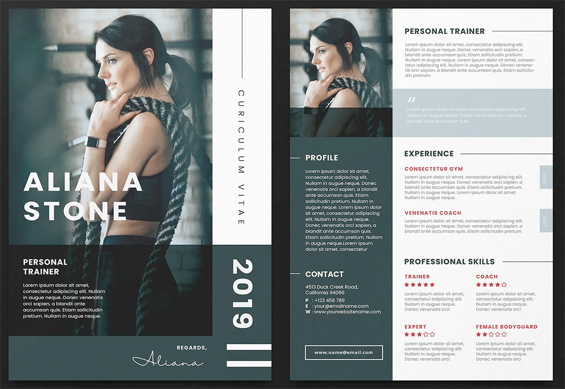
4. Bold Bright Duo

This bold and bright color duo has a feminine feel that’s striking and attention-getting. While it looks amazing, this can be a risky choice depending on industry. Go with a design like this for more creative fields. Also make sure to take special care with typography and contrast so color doesn’t hurt readability.
5. Ivory and Charcoal
A beige resume color scheme is anything but boring. The colors offer a soft palette that puts focus on the content of the resume. The ivory color mimics a thing of the past – buying linen paper to print a resume. You can do that with charcoal-only printing or mimic the entire effect with a PDF.
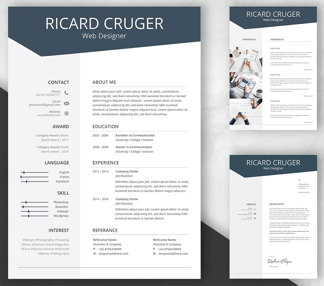
6. Classic Blue and Black
A classic blue resume color palette always works. What’s nice about this option is that blue can be used as mostly an accent color, so you can show some creativity but maintain a highly readable resume. When using a classic blue, stick to a classic palette all the way around with black text or accompanying accents.
7. Bold Brights
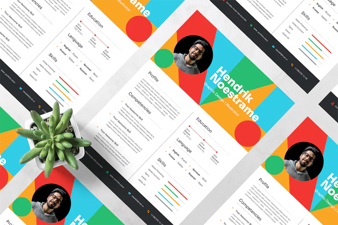
If you want your resume to really stand out, consider a bold bright color palette for header and footer elements. Stick to traditional black for text, though. The bold color palette is trendy; just make sure to invest in quality printing so it looks great in real life.
8. Sorbet Hues
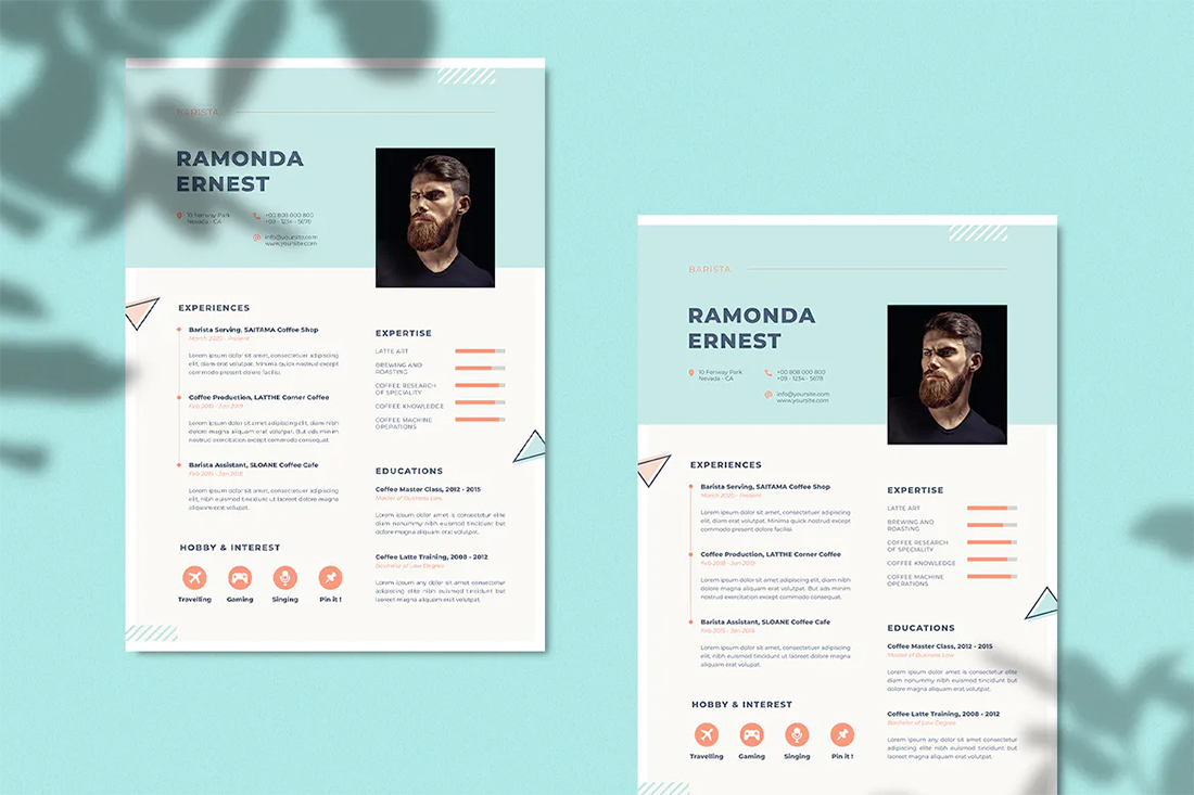
The fun “sorbet hues” pf this resume design are soothing and peaceful. The minty green and burst of orange provide a nice backdrop with additional tints for even more variation. What’s exceptionally nice about this color combination is that it doesn’t have a distinctly masculine or feminine feel.
9. Black and White
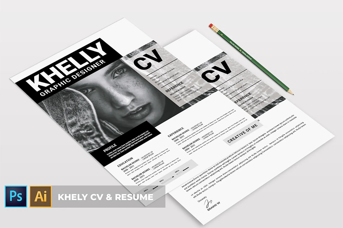
Black and white color schemes are a classic choice for resume design and one that never goes out of style. A black and white color scheme really forces you to design with other elements such as typography or graphic divots. What’s nice about black and white is you can send off a PDF and know it will print as intended for the person on the other end.
10. Bright Blue Monotone
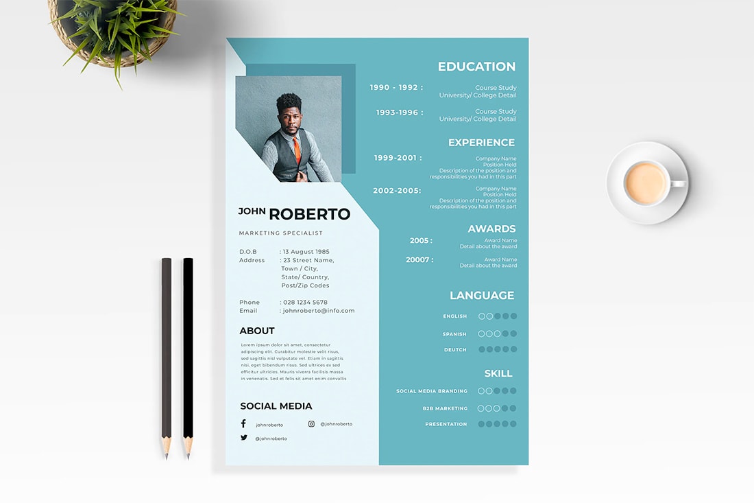
A monotone color scheme is classic and sophisticated. But this design does require professional printing with high color and a full bleed. The bright blue adds a modern touch to a color that’s been a resume staple for decades.
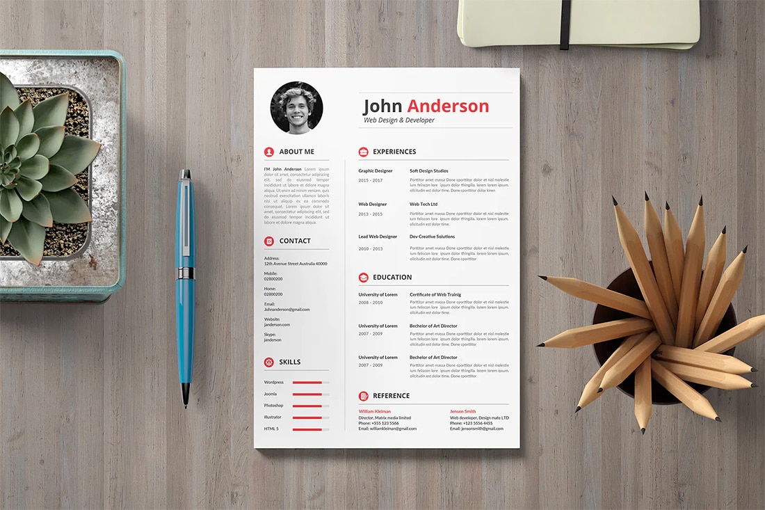
11. Almost Black and Yellow
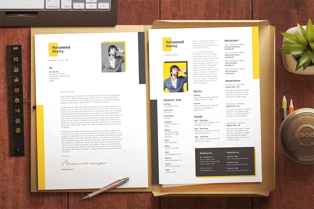
Yellow resume accents are a big trend in color. To avoid a bumblebee or too childish feel, pair bright yellow with an almost black/deep gray. That has a more sophisticated and less harsh feel, while communicating a bright, happy mood. (Just what you want a hiring manager to have when they see your resume.)
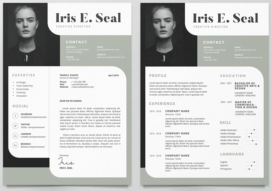
12. Dark Green and Gray
This dark green and gray resume color scheme with rusty red accents is stunning. The color overlay on images helps tie everything together. The highly visual style could get challenging if you have a lot to include, but makes a great simple starter resume. You could also take this palette and use it without images for equally high impact.
13. Black and Gold
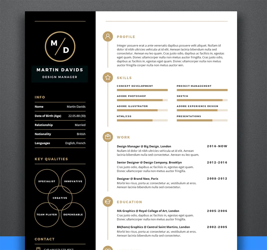
A black and gold resume color palette just seems to ooze sophistication. When using a color pair such as this, streamline other effects with a minimal style that lets your credentials show off.
14. Pale Purple and Gray
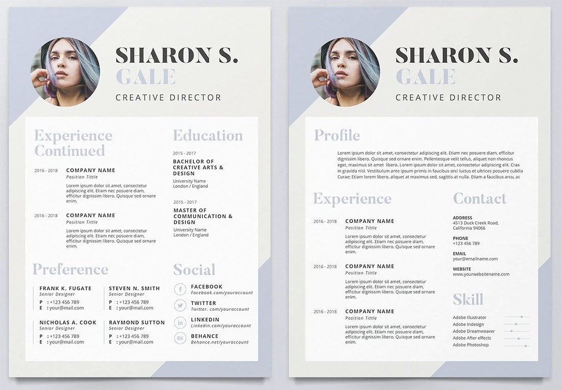
While this color pair does have a softer, more feminine feel, it’s elegant and easy to read. Used in the manner of the example above, the colors serve as a backdrop for a white content area. (Nothing is easier to read.)
15. Black and Red
You can never go wrong with classic black and red (and even a little gray) for your resume. This color scheme is designed for readability and uses color to create a distinct hierarchy with a 60% black for some of the text and red design accents throughout. ¬
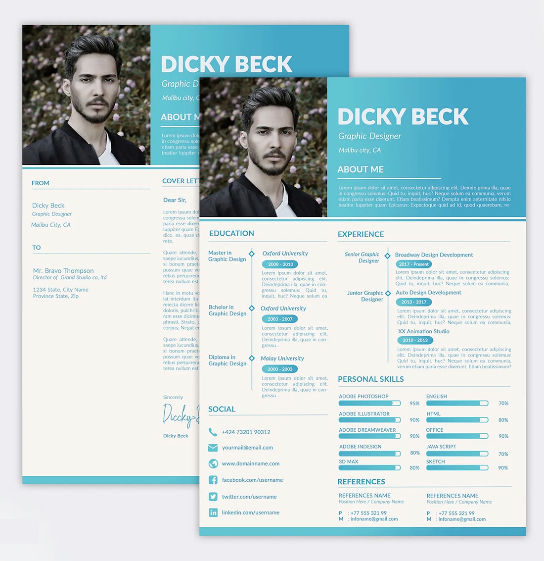
16. Navy and Mint
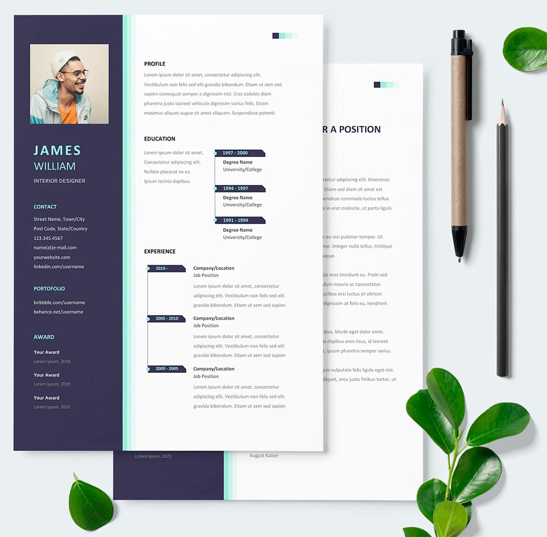
Navy and mint provide a modern resume color option that has a fairly neutral feel. The example above uses mint accents for a fun little color fade that’s easy to implement.
17. Modern Maroon
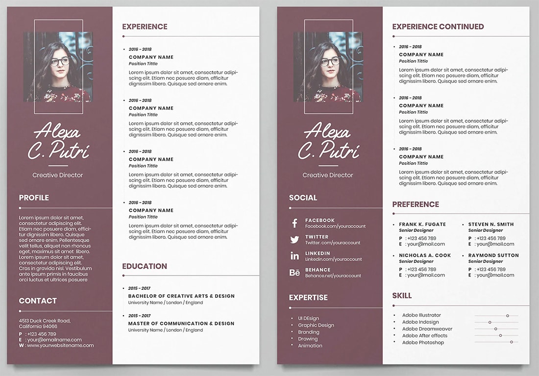
A resume color scheme does not need a lot of options to be effective. Pick one bold color, such as maroon, and pair it with black and white text. It’s modern and striking.
18. Sage Green and Black
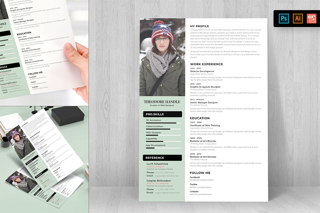
You can apply the exact same concept with a softer hue, such as sage green. Use black accents for high contrast or consider a 60% black for a more subtle feel.
19. Yellow and Coral
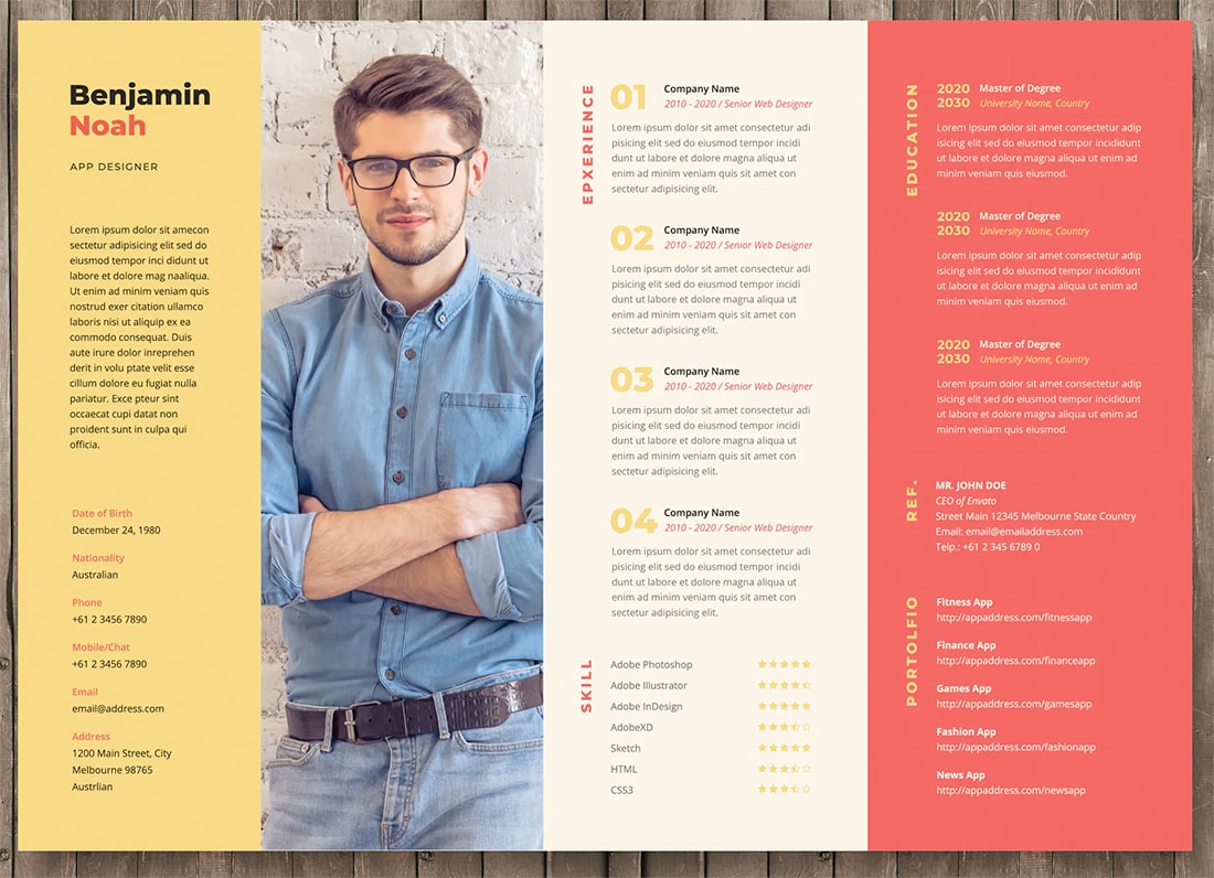
Want to make a big impression with your resume colors? Try this combo of yellows and coral for high impact color that demands attention. The key here is printing. Don’t skimp on quality if you want this resume to stand out.
20. Mossy Green and Black
Mossy green and black create a nice color pair for a resume that has a classic feel but with just enough color to be rather stylish. Experiment with the green color to get just the right complement for you.
21. Steel Blue and Soft Gray
It’s hard to beat the combination of steel blue and soft gray for a resume. It’s classy and elegant. The colors are fairly neutral but not plain. You could also consider a third color accent, but this duo stands on its own.
22. Emerald Green and Yellow
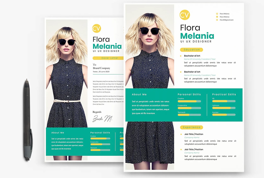
If you are looking for a bold resume color option, this is it. Emerald green and yellow provide a striking color scheme that’s fun and visually interesting.
23. Earthy Browns
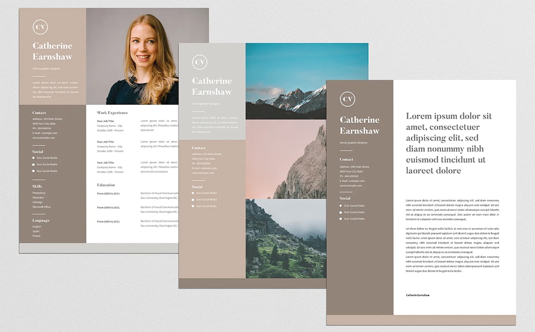
An earthy brown color scheme is a nice option if you are looking for a stylish neutral palette that isn’t gray or blue. Opt for rich browns so that the overall feel doesn’t get drab. This color scheme works great with photos, too.
24. Berry Ombre
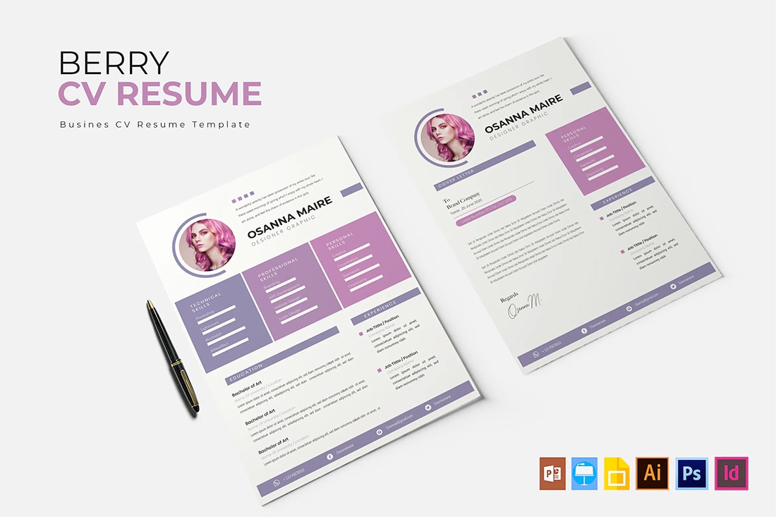
While the berry tones in this color scheme might be too stylish for some, it’s a concept you can apply to other colors. The ombre/fade coloring does create a modern feel that adds emphasis to specific resume content.
25. Blue Gradient
Pick two blues and create a gradient that adds a super trendy look to your resume design. (Gradients are big right now and can show that you are on top of design trends.) And you don’t even really have to use blue here, but this color combo is rather stunning.