I just love digging around portfolio websites for design inspiration. You can learn so much about the personality of a designer from the way a portfolio looks, and the interactions therein.
A portfolio site is also a great playground because it gives you the creative freedom you can’t always express with a normal client project.
Here, we have a roundup of personal portfolio websites that can impart a dose of instant inspiration. Explore new ideas, design trends, and themes that you can take and use in your own projects.
1. Cade Martin
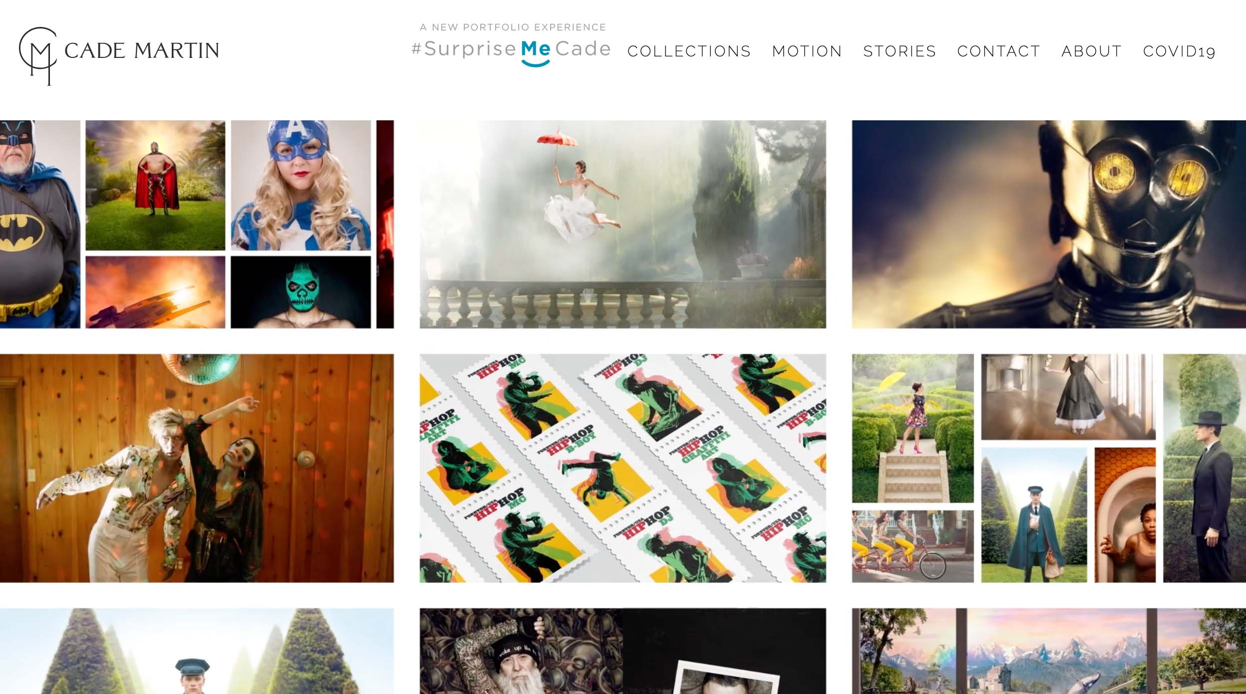
With beautiful and interesting imagery and a well-designed “book” as part of the portfolio, Cade Martin nails it. The website has all the interactive features you’d want online with plenty of extras for those that enjoy a print-minded experience. His artwork is allowed to speak for itself without the rest of the portfolio website getting in the way of the visuals.
2. Suze LaGasa
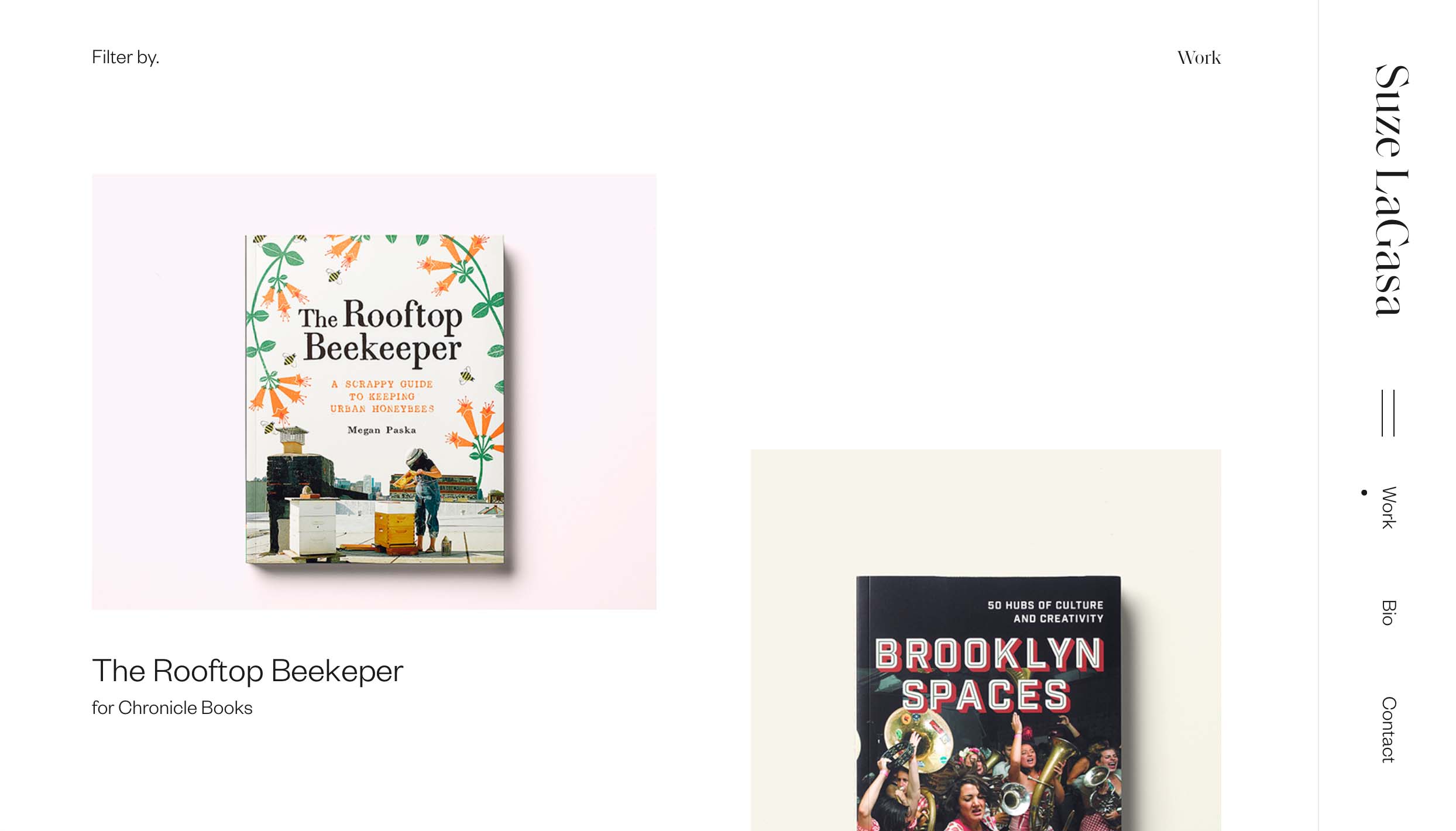
With a lot of white space between elements, each item in Suze LaGasa’s portfolio is allowed to have room to be seen. Subtle animation for each element on the scroll keeps you moving through the elements and the interesting right-side navigation provides a creative boost for a portfolio site.
3. Lou Dos Santos

Dark, moody portfolios are always in style. Pair that visual with amazing typography and you have a winning combination. This example from Lou Dos Santos also includes nice hover/animated effects as well, which is increasingly popular for portfolio design.
4. Brian Holden
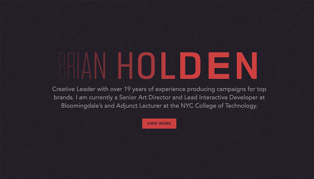
This portfolio site uses a similar home page concept as above but with a little more color and animation that’s always “on.” The button takes you to a more traditional, card-style portfolio page that’s clean and simple. The interactive typeface option that Brian Holden used for his name here is exceptionally nice.
5. Stefano De Rosa
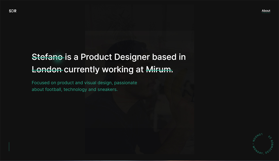
This portfolio looks rather simple on its face, but interactive features really bring it to life and showcase the ability of the designer. Color choices bring Stefano De Rosa’s portfolio to life as well with a simple palette that’s not commonly seen. The most fun feature might be the pointer icon; it’s a solid green circle until you get to a click-element and then it pops into a fun feathered circle of the same color.
6. Elena Saharova
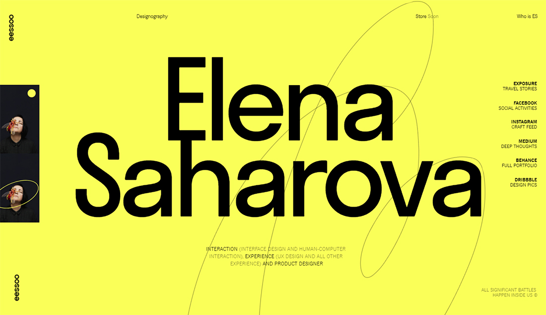
It’s hard to beat a bold, in-your-face portfolio design. That’s just what you get with the bright yellow and black design for Elena Saharova’s work. You can’t help but look and all of the important links – from social media to blogging to design work – is all right on the homepage.
7. David William Baum
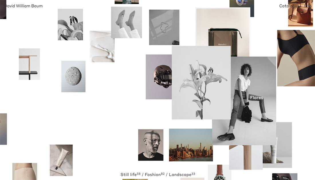
Showing a large number of projects can be a challenge on portfolio websites. You want to show a lot of work, but also create a focal point for website visitors. David William Baum does this exceptionally well with his portfolio thanks to smaller thumbnails that explode into larger images with hover states. Each project clicks to open with an elegant animation and beautiful formatting as well.
8. Diana Toloza
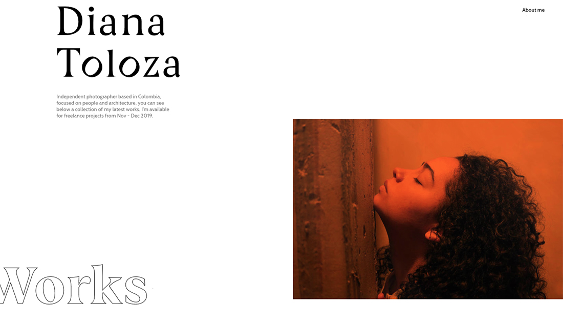
Nice space and cool liquid effects are the main highlights of Diana Toloza’s website design. When you have amazing imagery, this minimal style is the way to go. It highlights the work in the portfolio with a simple design that helps individual pieces shine. Further, she places each new piece almost on a “page” of its own in the scroll, so you can really focus on individual works.
9. Denis Abdullun
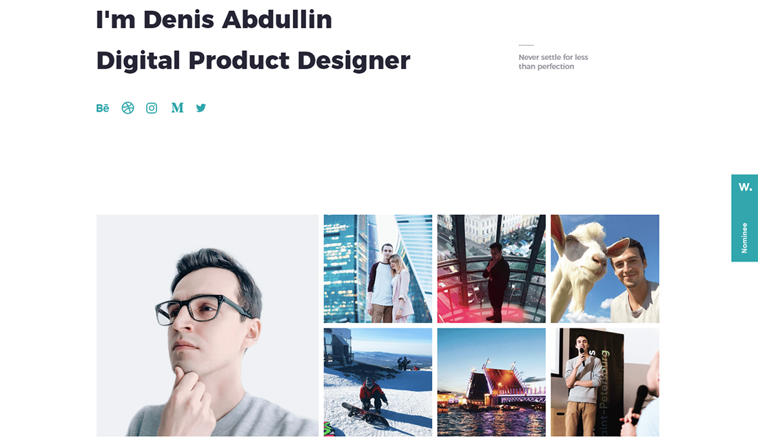
A clean portfolio design can be the best option sometimes. There’s not a lot to think about with it comes to Denis Abdullin’s portfolio, but you can see and find everything you need to know right away. It’s a highly effective design.
10. Ilya Kulbachny
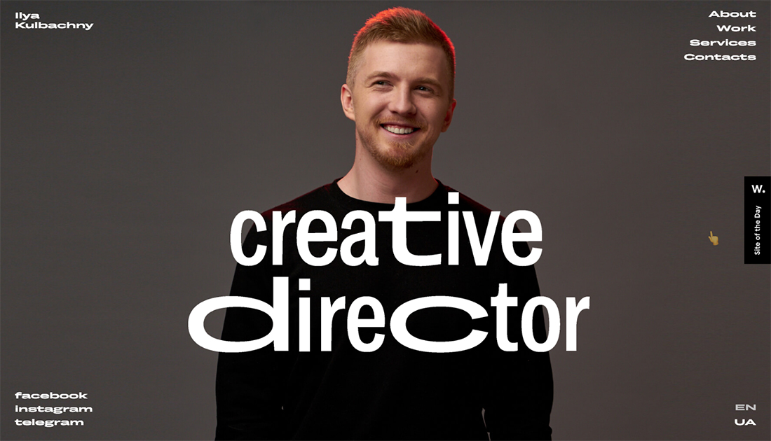
The portfolio of Ilya Kulbachny will push your creative limits with effects on typography and animation. It works well with his role as a creative director, showing off some of that artistic flair. The effects are different, but eyecatching and make you want to keep moving through the design for more.
11. Matt Reyer
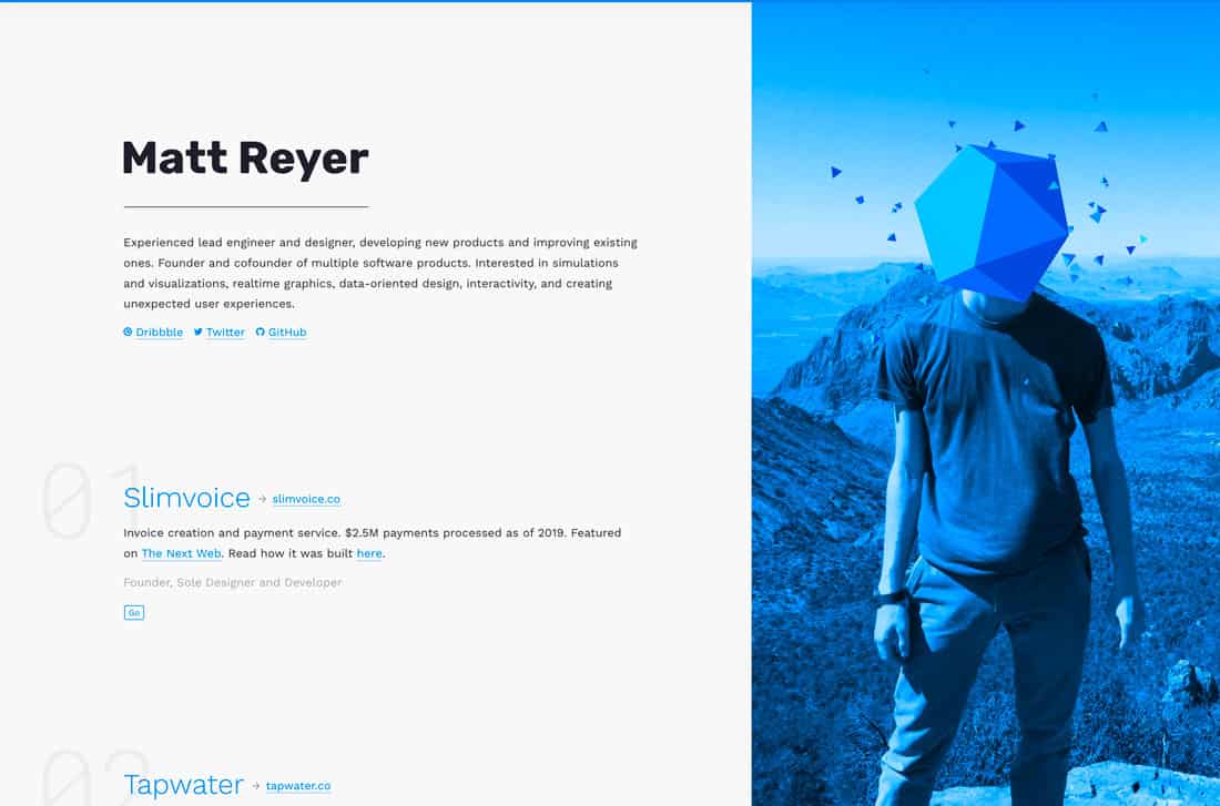
Matt Reyer’s portfolio uses a split-screen design (a great trend for this style of website) with plenty of little interactive surprises. His work is streamlined into an easy-to-digest format with just the right amount of information.
The best feature? As you scroll the geo shapes on his head in the photo spin in time with the movement.
12. Fabian Irsara
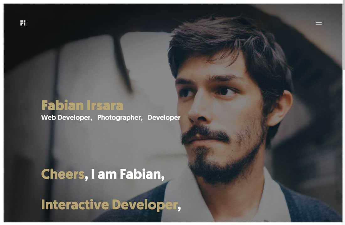
This is how you use a headshot for a website portfolio. The photo is just moody enough to draw you in and the simple animation with what Fabian Irsara does and his interests catch your attention. The simple nature of the design gives the content plenty of room.
One of the best features is that the big words describe how the site was made. And the voice of the words is quite nice.
13. Erik Bernacchi
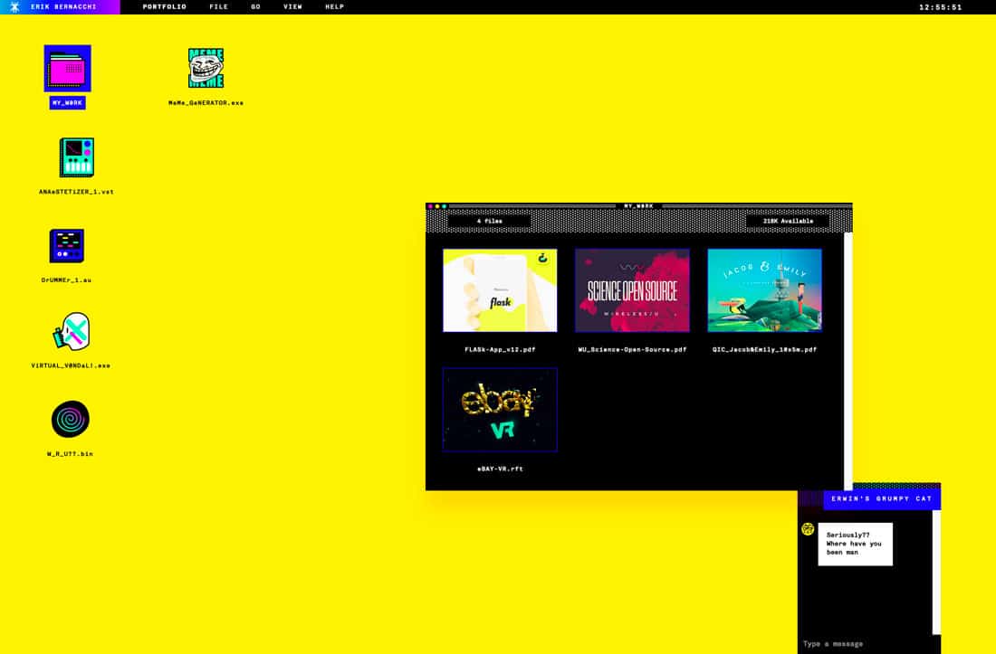
Erik Bernacchi goes with a bold, retro design for his portfolio. But it’s highly interactive and begs to be clicked. And you should. Despite the retro feel of the portfolio, his projects are modern and engaging.
14. Tavano Vincent
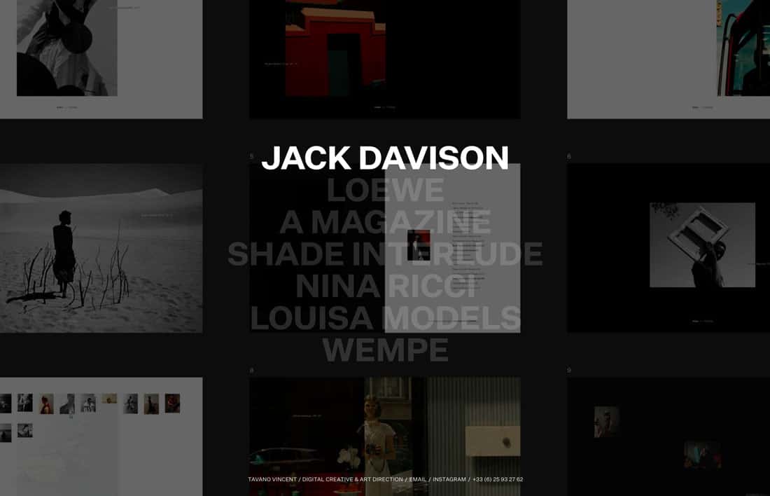
There’s something about interactive surprises that I adore in website design, especially when it comes to personal portfolios. Tavano Vincent uses a simple homepage design … at first glance. But hover over any text element for a more immersive experience.
This is a great way to handle a single-scroll homepage with plenty of elements to keep you moving deeper into the portfolio.
15. Bryan James
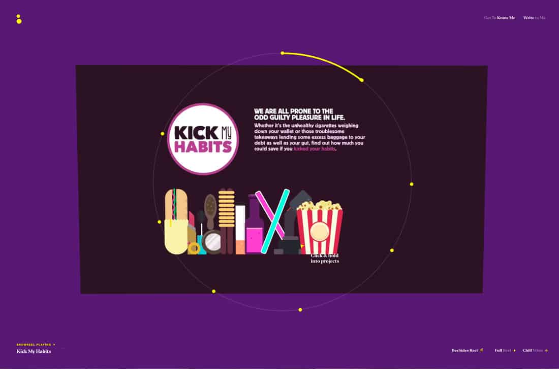
Bryan James nailed it with his portfolio. You can’t stop looking. It’s a combination of projects compiled into a video that gives you an idea of his scope of work. There’s also a great video bio.
This portfolio almost has a documentary style to it and it’s phenomenal.
16. Robin Mastromarino
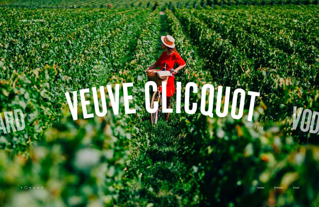
Beautiful artwork and liquid animation make this portfolio by Robin Mastromarino highly engaging. The side-to-side scroll is intuitive, and each screen has an image that’s captivating.
The nice animated effects continue on the about page where her work moves past in the background.
17. David Eperozzi
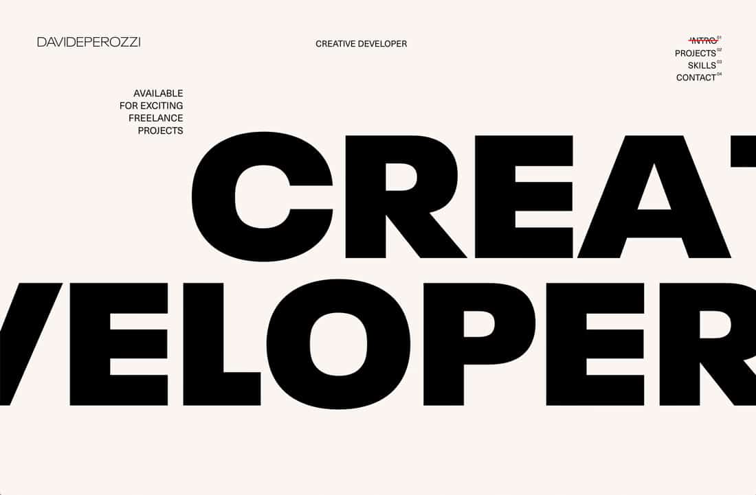
David Eperozzzi uses huge text to draw users into his portfolio. (This is a trending design technique as well.) The interesting thing here is that you have to click through to see projects. No work is featured “out front.”
The site is done well enough that most users will be enticed to do so.
18. Mathieu Levesque
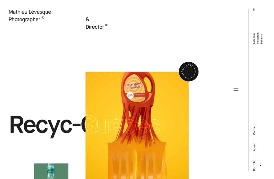
Mathieu Levesque’s photography portfolio has a nice, clean design that could be applied to other types of portfolios as well. Each image has room to read well with blocks of varying sizes. The minimal background and elements bring it all together so the eye knows where to go.
19. Raoul Gaillard
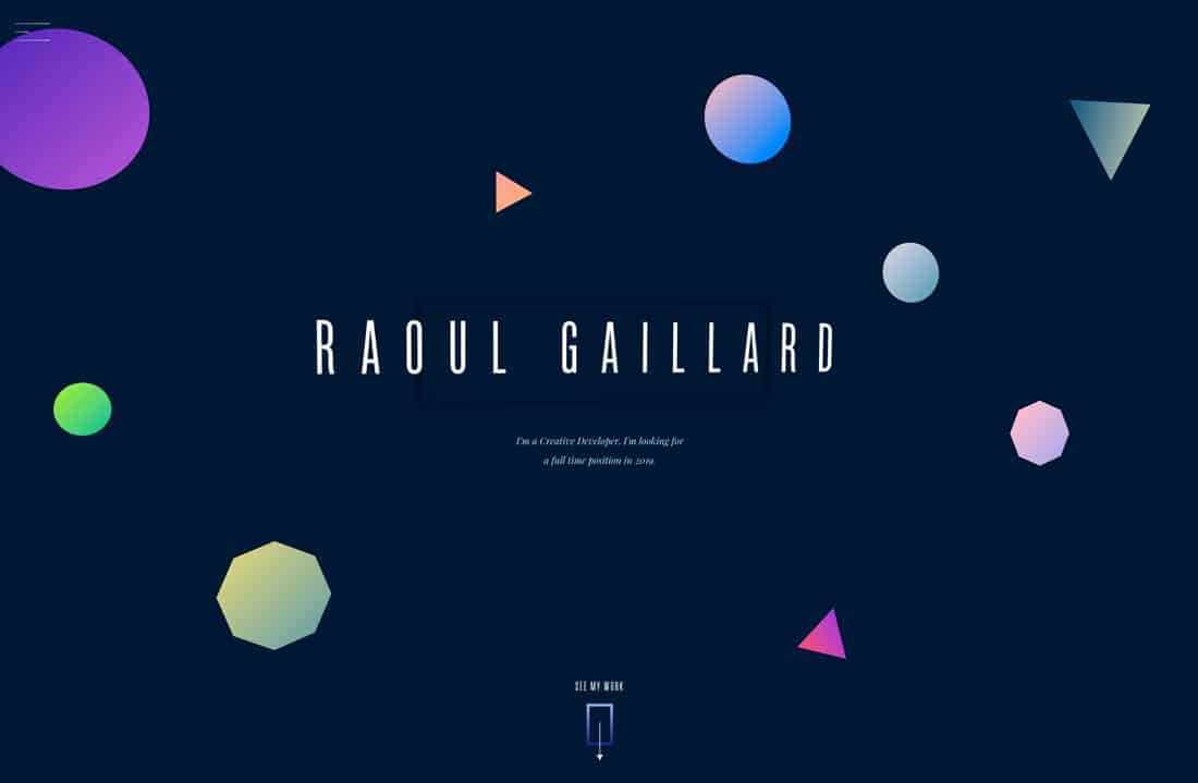
Raoul Gaillard uses gradients, geo shapes, and animation to draw you into his portfolio. The combination of trendy design elements lets you know the content in the portfolio is fresh.
That can be a key element in portfolio design. You don’t want a portfolio to look dated or stale.
20. Marcus Eriksson
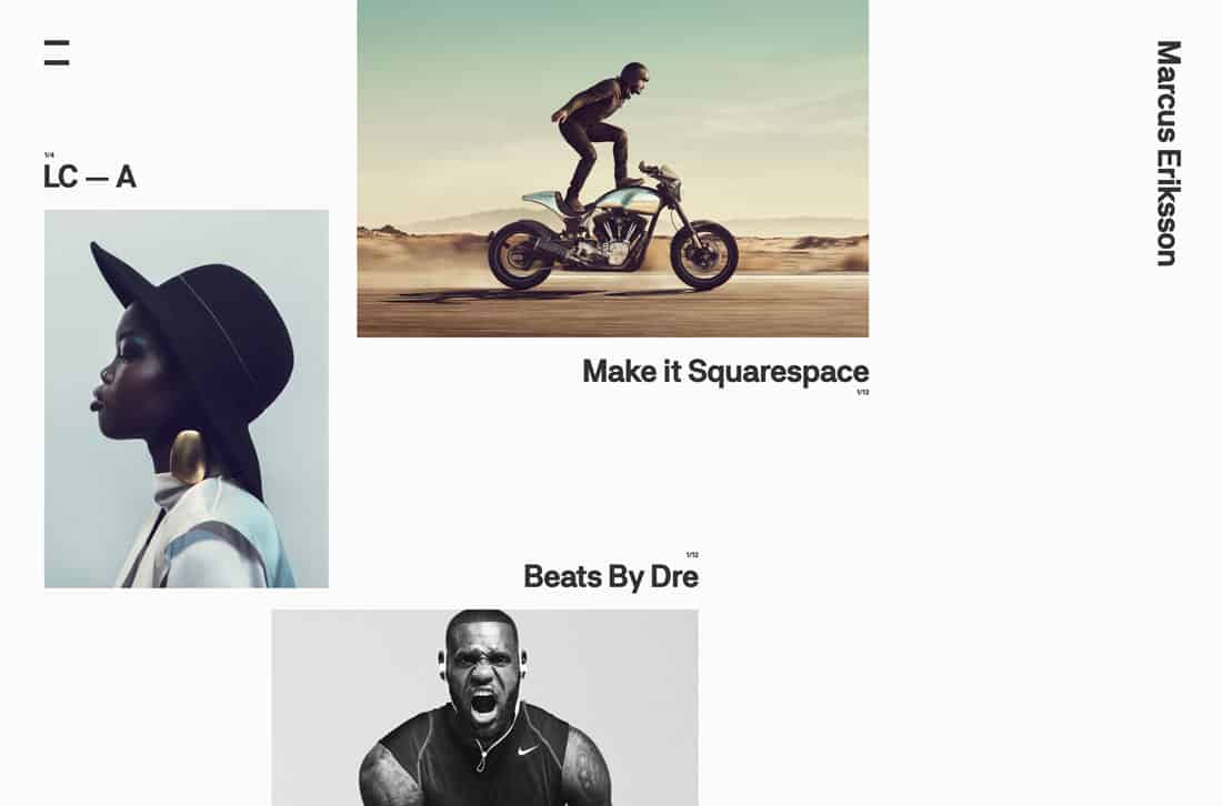
Marcus Eriksson uses clean lines, an interesting grid, and a minimal style to show off his projects. The coolest part of this website might be the directional cues of the images throughout. They keep carrying you through the design with excellent placements.
21. Allison Bratnick
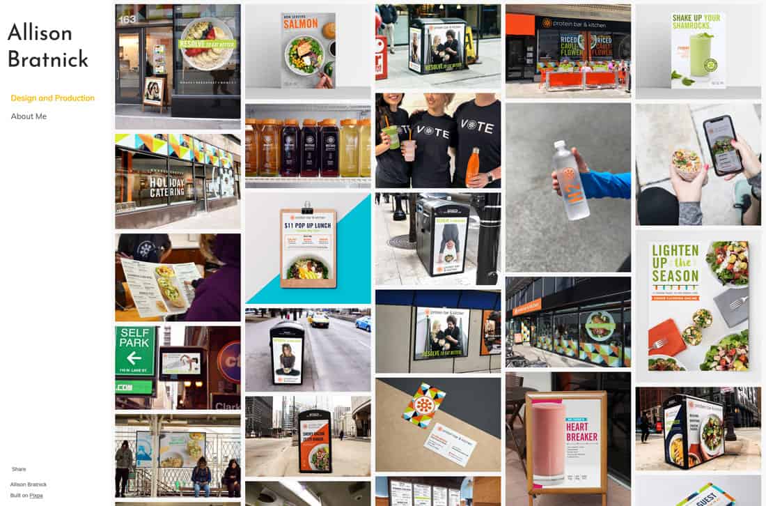
A busy grid can be a risky portfolio concept unless you want to show depth and breadth of work. That’s what Allison Bratnick does here with a portfolio that shows a lot of different projects.
Thanks to neat and clean imagery, the masonry grid-style portfolio works well.
22. Andrew Couldwell
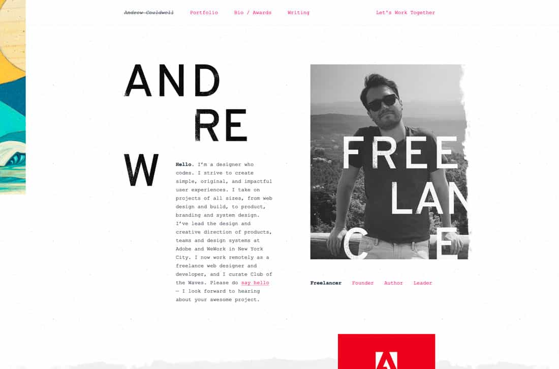
This funky portfolio seems to break so many design rules, but I can’t stop looking at it. The style shows attention to detail and a style that’s both fun and experimental.
And if the funky home screen is a little much, projects fall into a simple grid below.
23. Jeff Angell
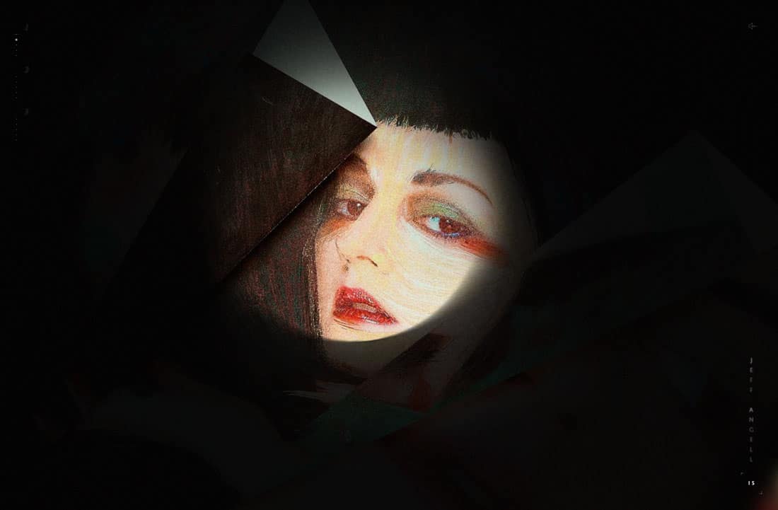
Jeff Angell uses a peek-a-boo style portfolio with nifty animation and effects. It’s a fun and interesting way to show just one or two projects.
24. Kazuki

A great photo and interesting typography are the eye-catching elements for this art director’s portfolio. The classic combination never gets old when it comes to great portfolio design.
25. Chris Tammar
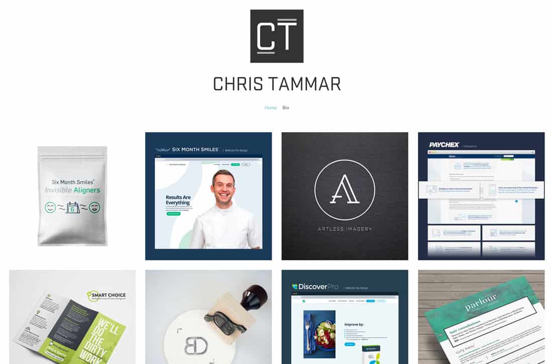
Chris Tammar uses a clean grid with symmetrical projects to show his work. The grid and projects are easy to see and understand, making this a great choice for showing portfolio projects that are less interactive.
26. Camille Pawlak
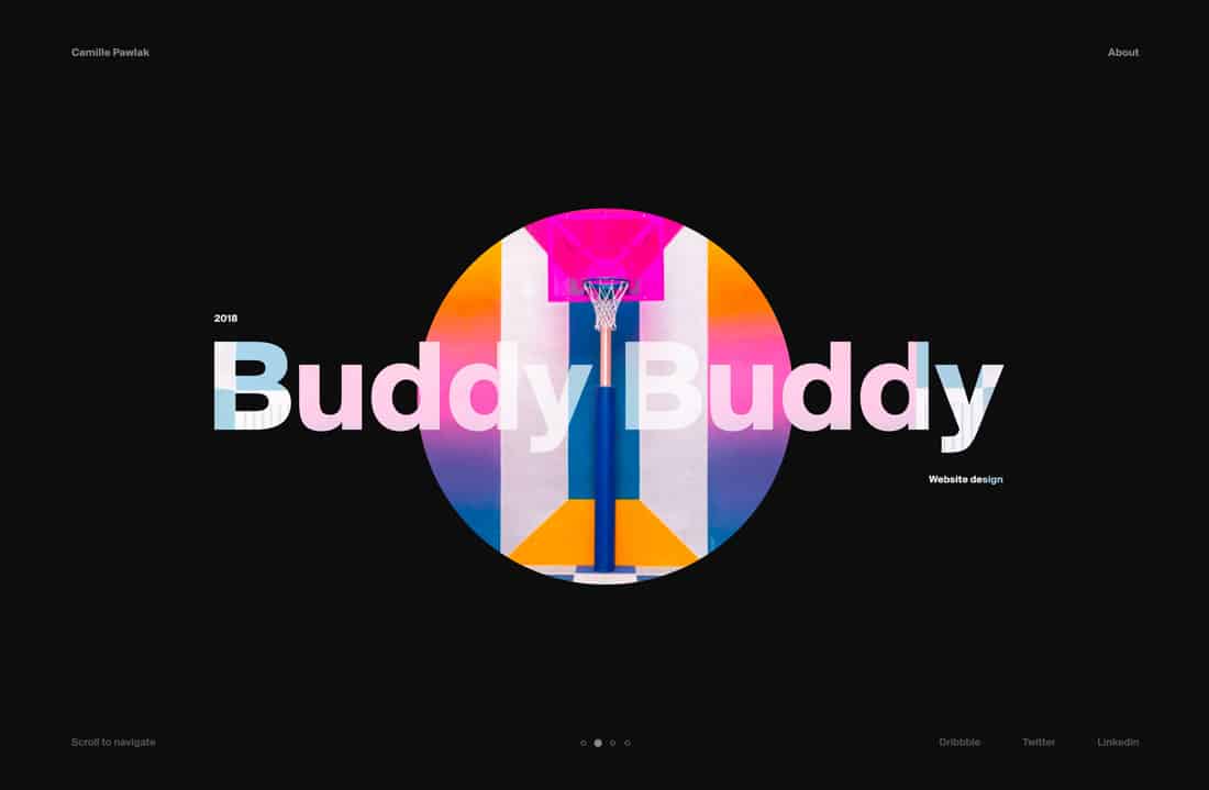
The click/scroll animation on Camille Pawlak’s portfolio website is outstanding. You just want to keep clicking and scrolling to see it in action.
The color choices and simplicity of the background and typography styles also contribute to the overall effectiveness of the design.
27. Steven Hanley
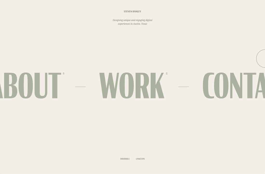
Steven Hanley’s portfolio is super simple. And then it flips from a calming color palette to a bold bright option. That makes you think he can work on varying styles of projects, thanks to the change in his own portfolio design.
28. Meng He
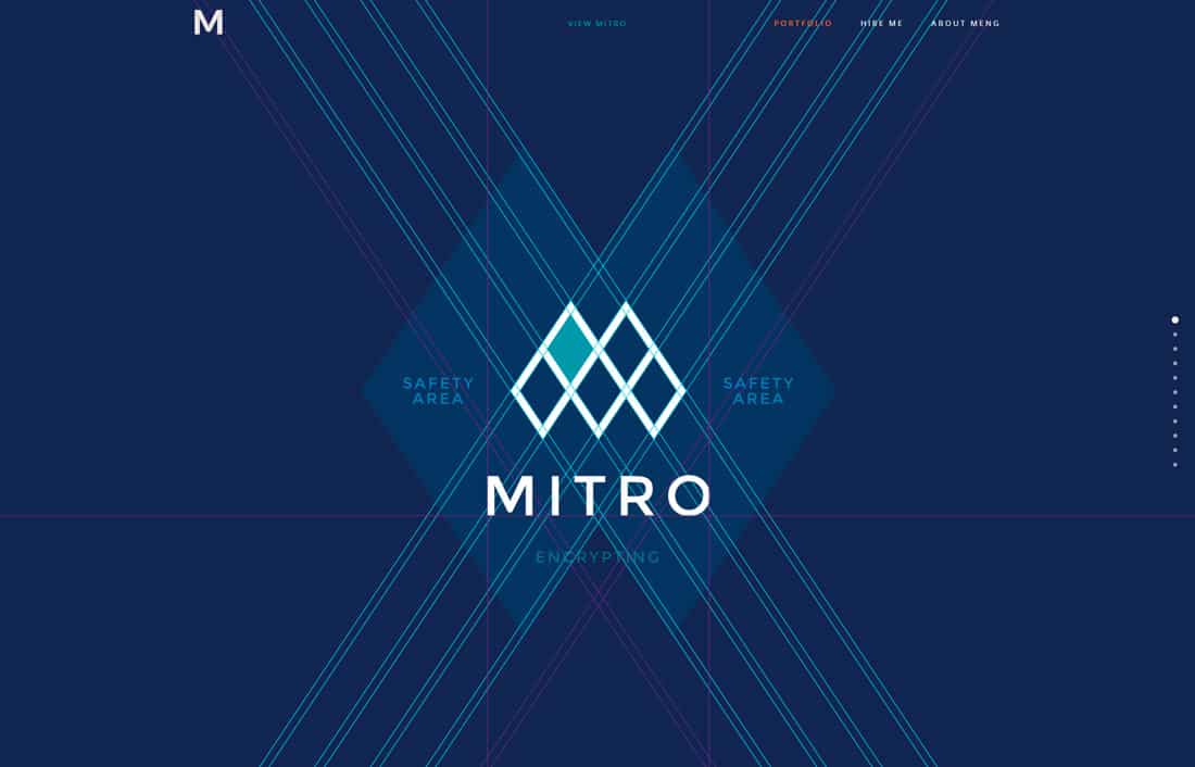
Every scroll “locks” to a screen and new project in Meng He’s portfolio. The technique gives plenty of focus on the work and is a great option for a design showcase.
29. Elizabeth O’Meara
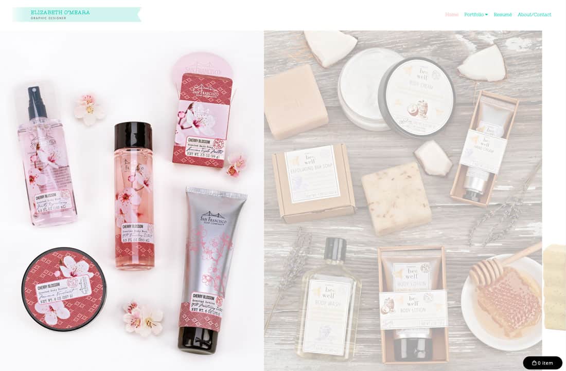
Elizabeth O’Meara has a split-screen design that shows variety in packaging design. The simple homepage is a good intro to her projects.
30. Justine Wargnier
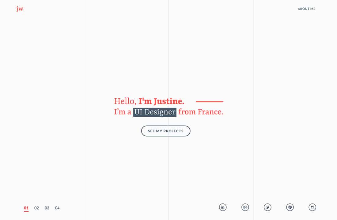
Justine Wargnier’s portfolio opens in a minimal style that tells you who she is with a call to learn more. Each project page is equally simple with an image, description, and link for more.
The streamlined design is easy to look at and dive into with just the right amount of information for each project.
31. Bethany Heck
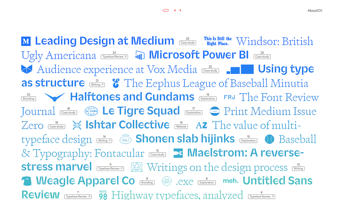
From brands you know in an instant to some that may be new, this list of projects and clients is pretty impressive, and the perfect way to lead off a portfolio website. Bethany Heck’s portfolio combines a brutalist style that shows a mass in work that you can click through to see.
The ombre/gradient style test color treatment is pretty nifty, too.
32. Damian Kujawa
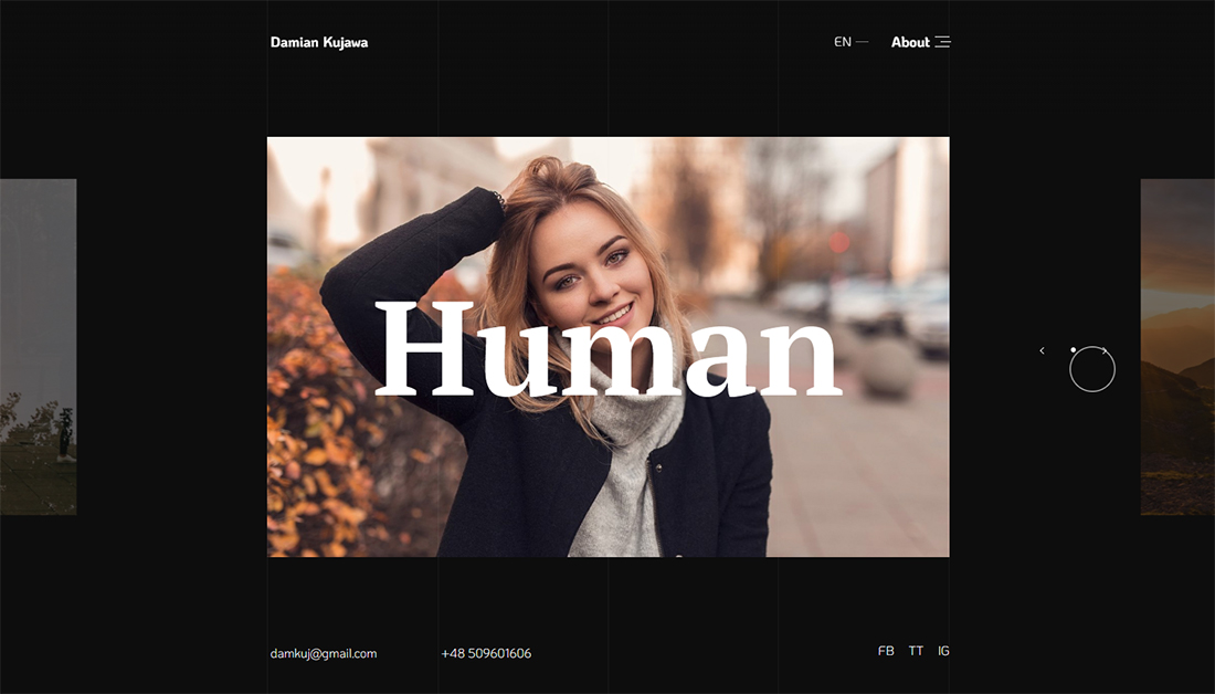
From interactive elements to the cool pop-over nav, everything about this photo portfolio is sleek and elegant with interactive design flair. Damian Kujawa’s site is easy to navigate – even with a left to right scroll – and features each image in a way that communicates stellar photography as well as brand work. Click into each project for even more.
33. Felipe Krust
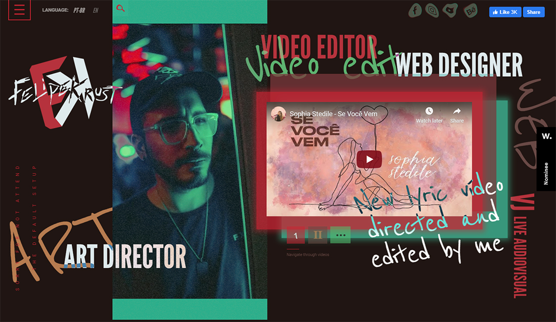
With a harsh brutalist style, the portfolio of Felipe Krust will make you stop and look. With bold color choices, movement and an almost anything goes style, the portfolio is highly visual and interesting. The best part might be the Instagram-story-style video on the homepage that keeps changing.
34. Michael Tilley
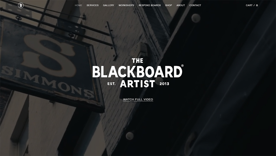
Michael Tilley uses a simple video to showcase his work and projects for The Blackboard Artist. The hand lettering artist is pretty well-known for boards and murals in London and the video portfolio highlights things people might have seen before when they come to this portfolio site.
