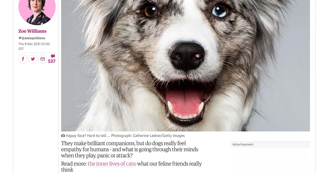
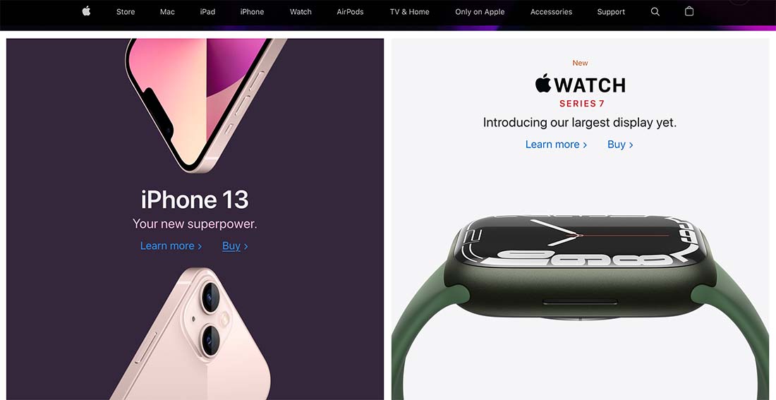
Better hyperlinks will create more useful user experiences. It starts with the words you use in the button or linked copy. (And “click here” is not the answer!)
If you want to generate more—and better—conversions from links, it’s important to focus on writing better microcopy for every link on your website.
These tips, which apply to hyperlinks throughout the design (not button microcopy) can help you think through the process.
Join us as we explore pitfalls to avoid, tips for punctuation, and the types of visual indicators that work well for links.
Don’t Fall in the Click Here Trap
It’s probably the most common link text on the Internet. And the least useful.
“Click here” should be avoided, especially for inline hyperlinks. (There are some arguments that can be made for usage in buttons.)
Here’s the first problem: Click here doesn’t tell the user what to expect or where the link might take them. Is it legit? Is it where they want to navigate to next? Hyperlink text that is vague can actually lead to a pause in the user interaction and confusion.
Here’s another problem. Not everyone is clicking anymore. A large percentage of users might be mobile, therefore “tapping” the link.
Finally, the World Wide Web Consortium (an authority on usability and accessibility) directly says “don’t use click here as link text.” Enough said.
Be Descriptive
Google recommends an introduction for inline link text that helps users understand what will come when they click or tap the words.
This means including a phrase such as “for more information” or “to download the guide” followed by the link itself.
This descriptive lead-in does two things:
- It creates a natural reading flow for the link itself.
- It gives users precise information on what to expect and how to reach that goal.
Start with a Keyword (Or Two)
There’s research that supports beginning hyperlink text with one or two keywords. The reason is that it facilitates scanning.
We all know that users scan website text for easily digestible elements for readability. It’s one reason lists are so popular as well as using subheads throughout long blocks of copy.
Here’s how the Nielsen Norman Group describes it: “Our newest usability study tests how well users understand the first 11 characters of a website’s links and headlines. … 85% of users were able to predict where this link led after seeing only the first 11 characters.”
Don’t Link Punctuation
When writing sentences that include a hyperlink, they will typically end with some type of punctuation. As a best practice, put the punctuation outside the linked text.
This applies to any sentence-ending punctuation. Conversely, if there are marks inside the sentence that are related to linked text, such as parenthesis or dashes, those can be included as part of the hyperlink.
Match Link Text to the Source
When writing a link, match the hyperlink text to the source page title when possible.
This isn’t a foolproof trick. Sometimes the source page title won’t be descriptive enough or is just too long to make sense, but the closer you are to a match, the better.
This way users who click through get exactly what they expect.
If you are linking to a page without a distinct title, use the first big copy that you see. An example here might be for an item in an online shop.
The goal is to create as close of a text match as possible to create a link of comprehension when the user moves from one page or site to another.
Use Visual Indicators
The design is as important as the words here. Good hyperlinks also include visual indicators that help website visitors understand where to click or tap and what interactions they have already encountered.
Don’t try to reinvent the wheel here. Use common and expected user patterns for the most effective hyperlink text design.
- Secondary color that’s different from regular text
- Bold or italic style
- Underline hyperlinks
- Change color for links that have been visited already
Link Lists
Sometimes you’ll find it necessary to include a list wherein every bulleted item is a hyperlink. It can be very tempting to revert back to “click here” or “read more” hyperlink text to keep the entire list from looking like a hyperlink. Resist the temptation.
It is actually better, more accessible, and easier to click or tap links when each item in the list is its own link.
Develop a Style
Hyperlink text rules should be part of your website design style guide. (Many people forget to do this.)
Take these tips and any other design elements that are unique to your website and create a set of rules – apply them in your CSS as well – so that hyperlinks have a defined and unified style.
It will further facilitate usability because links will look like links. Users will know what is expected when they see text elements that look this way.
And do not allow other text elements in the design to mimic the style. That can only create confusion. Hyperlink styles should be unique, obvious, and functional.
Conclusion
All of this information is designed to make your hyperlinks more usable. Good hyperlinks can help users better understand your website and what actions they should take, contribute to link-building and search optimization, and tell visitors that you understand what they are trying to do.
The key takeaway is that short, descriptive text for hyperlinks is ideal.
Good hyperlink text is a subtle sign that you get it and anyone on your website will appreciate the gesture.


