
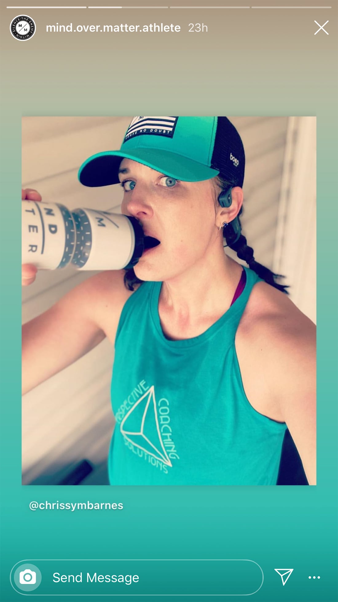
Instagram stories are one of the hottest social media formats. The vertical format allows creators to share videos, photos, and mixed media content in a streaming medium, and introduces an entirely novel layout to design for.
The tricky part is creating stories that are enjoyable, shareable, and help people engage with your account, brand, or even get clicks to your website.
Here, we’re going to look at eight ways to create Instagram stories that help you meet goals, and stand out from the crowd.
Bonus: You can apply these design tips to Facebook stories as well.
1. Storyboard It

Step 1: Develop a plan for each Instagram story. While this format has more of an organic feel than a traditional post, don’t think that you can wing it because it will disappear later. Sloppy stories will turn users away from your feed in a hurry (and they might not come back).
As you would do with any other video format, storyboard your concept. You can even think of an Instagram story as a mini commercial if you like.
Create enough slides to tell a simple story that has a beginning, middle, and end. Right away, you can see that a story should have at least three slides, but don’t go crazy. Long stories won’t get played through the end. Five to seven slides is plenty for most stories.
As you plan each scene, keep it simple. One thought per story slide. They can go pretty fast so keep visual and text reading and comprehension to a minimum so that the concept is easy to grasp at a glance.
2. Mix Media Formats
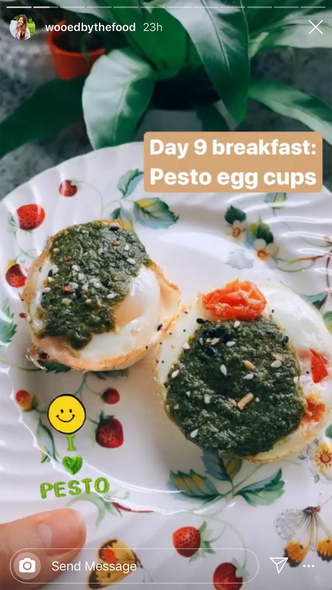
With so many options in Instagram stories, it’s ok to mix media formats. A single story may contain a video, photo, text, stickers, hashtags, tag other accounts, and more.
Stories should contain a mashup of media types.
But there is a word of caution to go with it. Don’t put every type of element on a single slide.
Just like you would with any other design, less can be more. If you plan to add elements such as stickers or hashtags, limit them to one or two per slide. (You can even hide hashtags and tags behind other elements to keep the screen from getting cluttered.)
3. Design with Consistency
Instagram stories should look different and special each time you post, but they should be consistent within a single story.
A design template can help with that if you are struggling. You can find some great options here.
Overall, think about design and brand consistency for users that stumble on your stories. Regular followers or fans should recognize your brand.
Use brand colors (or an Instagram color palette of your choosing), the same fonts, and image or video style that is otherwise associated with your brand online. This isn’t to say you can’t mix it up occasionally, but your brand on Instagram stories should look, feel, and maintain the voice of your brand.
And just be you. Instagram stories are designed for authenticity.
4. Make the Most of Tools You Have
This is where it gets awkward. Different Instagram users have access to different tools within the platform. (Did you know you the swipe up feature isn’t unlocked until you reach 10,000-plus followers?)
Don’t make the rookie mistake of telling users to perform an action that’s not actually available in your account. (Don’t say swipe or click a link if they can’t do it.)
Pro tip: Hide a link to your bio in a button and use that as the call to action.
5. Design in the Main Canvas Area

Nothing is more annoying than text or design elements that are hidden behind user interface elements in a story. This is a sloppy mistake that you’ll want to avoid.
Push key design elements in Instagram stories to the middle of the screen. This makes them easy to see, eliminates overlap, and ensures that tap interaction can happen from either side of the screen.
The default size of an Instagram story slide is 1080 by 1920 pixels and always vertical. But you want to design main content that’s not quite that tall to account for the profile information at the top and reply function at the bottom of the screen.
Keep the main content of each slide to 1080 by 1420 pixels. Split that leftover space evenly between the top and bottom of the screen. Not that the recommendation is not to leave the space blank; just don’t put key content there.
If you have unlocked swipe actions, leave even more space at the bottom of the screen (think 300 pixels) for the up arrow “see more” element.
Be aware of elements in the lower right and left edges of the screen as well. This is the location many users tap to advance stories quicker.
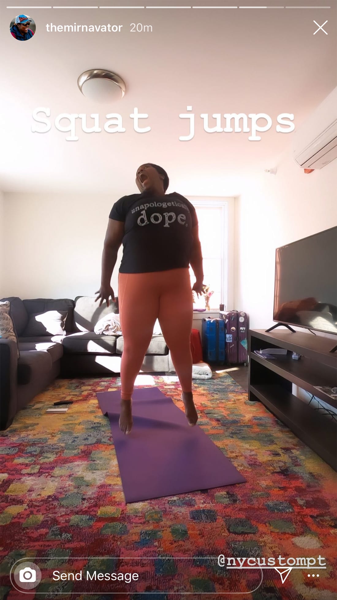
6. Use Interactive Elements
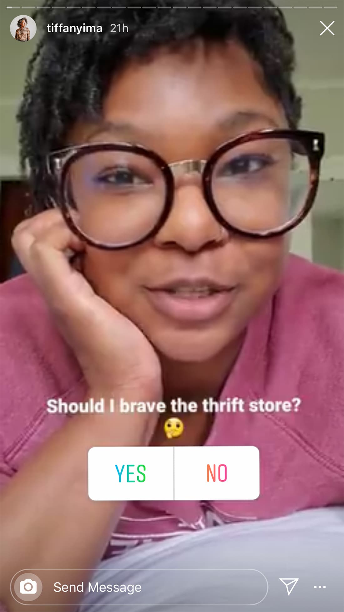
Polls, questions, countdowns, and popular stickers show that you are “with it.” These interactive elements can also help create engagement for your social media account and generate a wider following.
If you plan to use an engagement element (polls are a popular option), don’t use more than once per story. No one wants to play 20 questions, but a simple pulse check can be fun.
Make the most of this information by remembering to engage with respondents and show results of information you collect in a future story.
You can also reshare images from followers and users that tag you.
Use these engagement tools to support other marketing efforts. Are you thinking about changing your logo or starting a podcast? Ask Instagram to get a feel for what a larger audience thinks about your ideas.
7. Highlight Your Best Stories
While Instagram stories are here today and gone tomorrow, you can keep your favorites for a little longer. Create Highlights to capture related content (multiple stories can be populated into category-based highlights).
Highlights show on your Instagram profile page with small badges. You can even design a custom highlight design for each to further support your brand identity.
Added bonus? Highlights are a nice way to “save” stories if you need to show them to stakeholders (or your boss) later on.
8. Design In and Out of the App

One of the most frustrating parts of Instagram stories for designers is the lack of design control in-app. While there are plenty of fun tools, you can’t always create exactly what you have in mind.
Start with design software you love (such as Photoshop) and then finish stories natively on Instagram. This hybrid design model can help maintain brand consistency while using tools that make Instagram fun and engaging.
Designing only outside the app and just bringing images in might end up being a little too flat for this medium.
Remember to start with the standard canvas size of 1080 by 1920 pixels, leaving 250 pixels of “contentless” space that the top and bottom. Think about where you might place stickers or tags as you create the design so you don’t end up with a lot of work and rework. (You may even want to create a few custom templates.)
Not every slide in a story needs additional features, but if you are designing in and out of the app, make sure to leave room for them on some of the slides.
The trick is ensuring that even if you design outside of Instagram that the design and functionality feel native to the social media app.
Conclusion
Instagram stories are a fun tool when it comes to engaging with an audience. While there are a lot of poorly designed stories out there, you don’t have to fall victim.
All of the same things that constitute good design elsewhere apply here. Start with a plan, use tools and techniques that are familiar, and accent in-app to create Instagram stories that are engaging and have a design that you can be proud of.