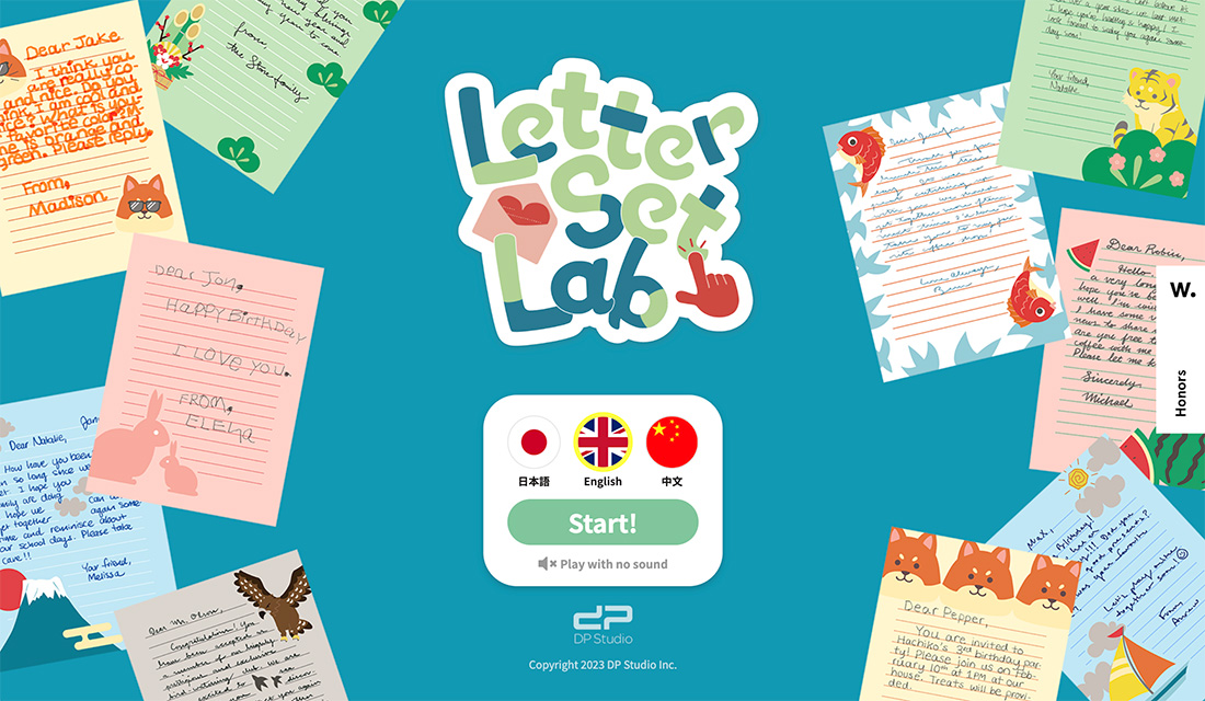
Website design with a hint of nostalgia. That’s what you get from the latest design trend that makes you think of childhood with sticker-style elements, including icons and emojis, that add a little something extra to projects.
This design style is popping up everywhere and includes everything from a full design theme to smaller elements sprinkled throughout.
What’s great is that for a certain demographic, this look has a feel that’s a distinct throwback to the sticker books we had as kids, making this design trend interesting and engaging.
Here’s a look at everything you need to know about the sticker design trend.
What is the Sticker-Style Design Trend?
You’ve probably seen and used them on Instagram or Snapchat – digital stickers that you add to photos or videos. They have a tactile look and feel that bring back the concept of playing with stickers as a kid and add a great element of lightness to design projects.
In this website design trend, stickers are popping up almost everywhere. They can be “stuck” on top of other elements, navigational cues, buttons, or almost anything else.
Digital stickers seem to work best when they have a tactile feel that helps you imagine peeling it off the backing and sticking it on something.
This technique is a fun and whimsical alternative that allows you to break some design rules while creating containers for items that might not otherwise work in the overall design.
Key Characteristics of the Trend
You aren’t going to have any trouble spotting this website design trend. Just look for elements that seem to be stuck on parts of the design.
The thing that most designers are trying to do here though is create an element of digital reality. When looking at the projects, you should be able to almost feel the sticker in your fingers, hear the light “kiss” when adhering it to a surface, or even imagine the stickiness on your fingers.
Further, placements of “stickers” on the screen can make or break this design trend altogether. This can add a distinct level of difficulty for thinking about how these elements might respond on different screen sizes. Every sticker should be in a location that feels natural but a little bit off balance. Often stickers aren’t perfectly aligned or part of a well-defined grid, making a perfectly imperfect design a major characteristic of this trend.
Here are some of the effects or features you might see used with sticker-style elements:
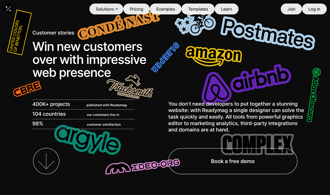
- Thick, often white, outlined edges
- Peeling animation
- Plenty of colors, often bright, that may not “match”
- Layered or overlapping elements
- ”Pop” sounds with stickers on screen
- Quick, zoom animations on hover
- Drop shadows
- Fun typography, often in cartoon styles
- Oversized, emoji-like elements
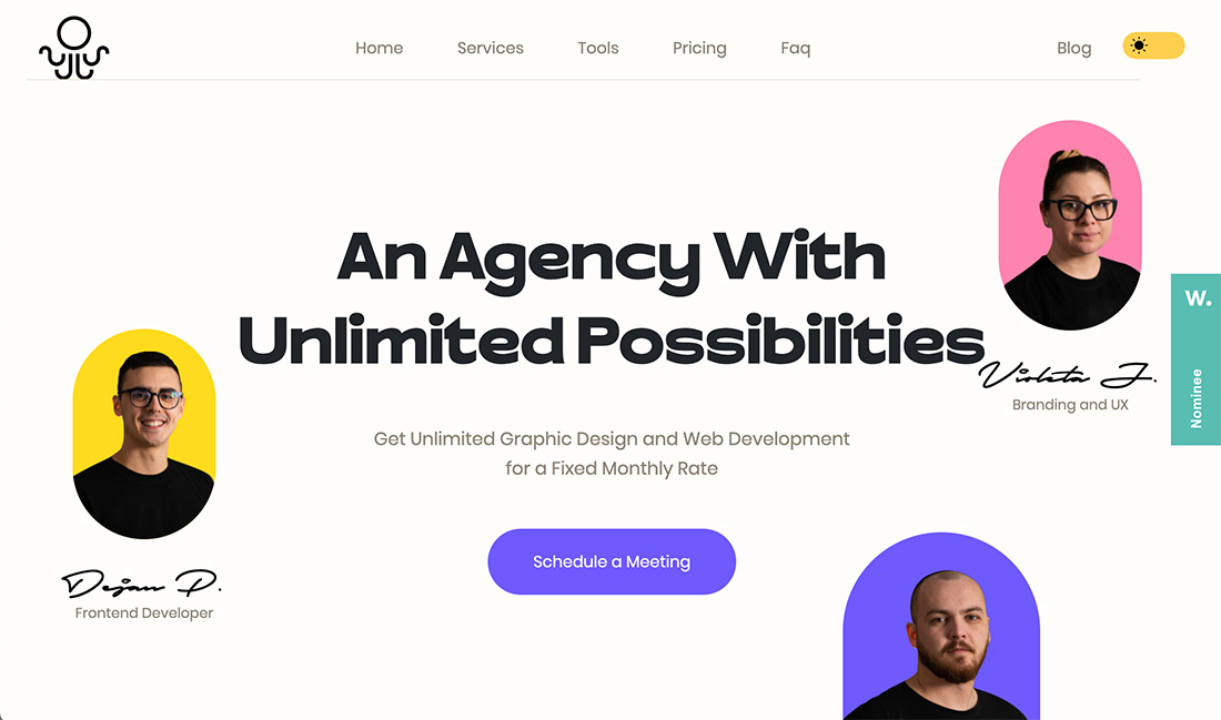
- Colorful containers for headshots or product photos
- Hand-drawn or cartoon-style people or animals
- Perceived, haphazard placements (tilted, etc.) that might be off the grid
- Simple aesthetic
Tips for Using it Well
The No. 1 rule for making this design trend work is to create your stickers first. Each of these little elements is a full design of its own, often packed with detail and intricacies.
If you are using multiple stickers in the design, create your sticker set first. This is a lot like designing a set of icons with multiple pieces in the same scale and theme.
Finally, think about how it all plays together with the other elements in the design. Layers are your friend with elements that stack and overlap. Often backgrounds with sticker designs are rather simple because it can make the stickers easier to see and understand as well as helps with responsive positioning.
Think about the contrast between sticker elements and the background (or foreground if stickers aren’t the top-most layer). The reason many stickers use a thick while outlined border is to create just this element of contrast. (It also helps that printing often requires some sort of design bleed as well, which helps make this feel even more authentic.)
Examples We Love
There are so many different examples of this trend that are done in so many different ways, making it versatile and interesting. Note that almost every example here takes a quite different approach, giving everything a unique feel.
If you are struggling with where to start or need more inspiration for this design trend, look to social media. It has a lot of use there thanks to native “sticker” tools with the most popular platforms.
Milee
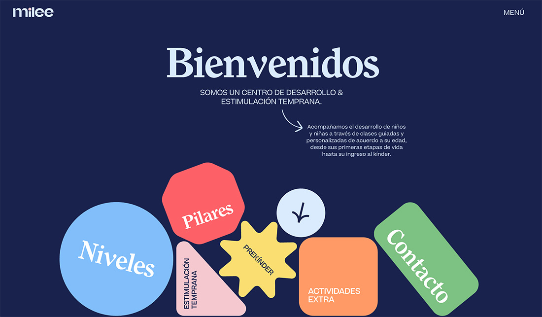
Milee features a super simple aesthetic with stickers that fall and bound to the bottom of the screen as it loads. Then each sticker – which is website navigation – has an off-balance feel with easy animation to help encourage engagement.
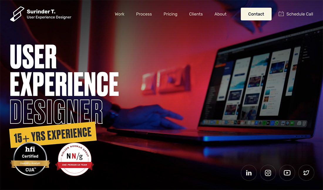
Surinder T.
Surinder T. uses stickers that look the least like stickers of anything else in this collection, but the way the certifications are highlighted for this portfolio is great! Add in the layering with the 15+ years experience sticker and everything comes together beautifully.
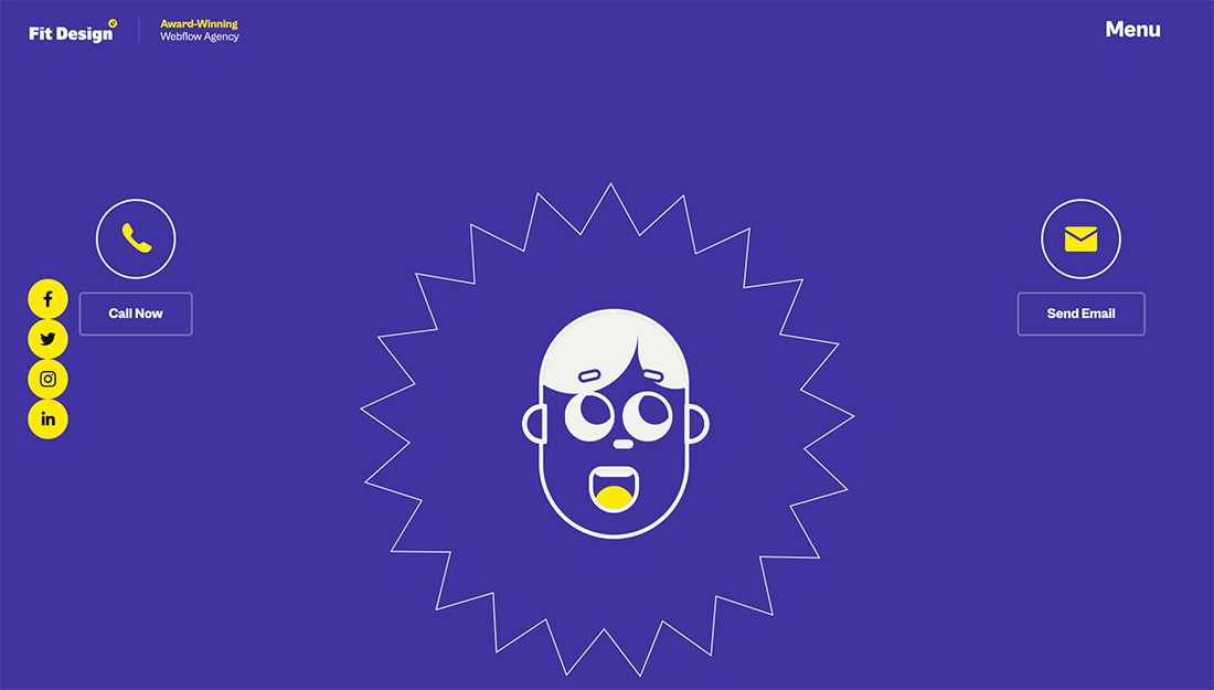
Fit Design
Fit Design mixes an emoji-style face with a sticker-style feel for a lighthearted design with plenty of fun hover effects and animations. (It is highly recommended to click through to get the full effect of this one.)
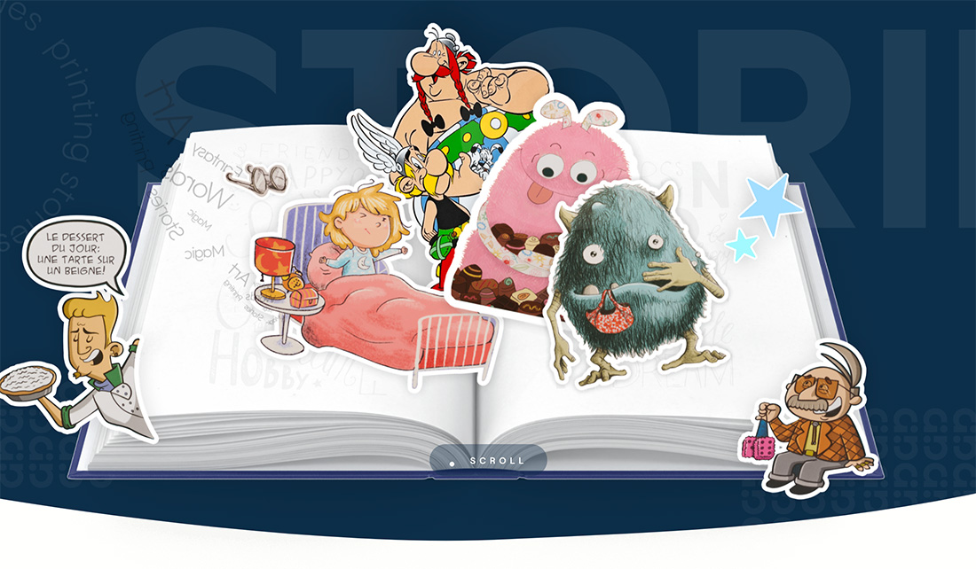
Alternativ
What a great design concept for a printing company. Alternativ uses the imagery of stickers on a blank page to show capability. This is a fun way to use digital assets to show something that can be done in real life.
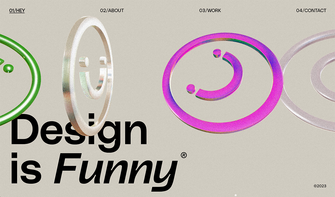
Design Is Funny
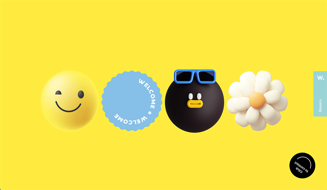
Design is Funny uses three-dimensional emoji animation in a sticker-like way. While this isn’t a true sticker design, it shows that you can evolve the concept and make it your own.
Conclusion
If you are looking for an engaging and lighter way to highlight elements in your design, consider a sticker-style aesthetic. Use emojis as stickers or create your own.
The great thing here is that there are tons of possibilities in a variety of styles to match whatever you may be working on. Have fun!

