Almost everyone you talk to is interested in search engine optimization. And for good reason: You want as many people to see your website as possible and find it in relevant search results.
But did you know that user experience can be one of the most important factors that contribute to SEO and overall search rank? So, you have to start thinking about it at the design and development level or you’ll never get ahead of the SEO game.
Here, we’ve got a few ideas that UX designers can incorporate into every project to help boost search.
Technical Considerations

Some of the most important SEO work starts at the foundational level of website design and planning. Some of these elements fall into the no-brainer column at this point for many designers, although there are plenty of sites out there not following these best practices.
- Safe browsing is a must: Don’t do anything malicious or include malware or phishing content on your website.
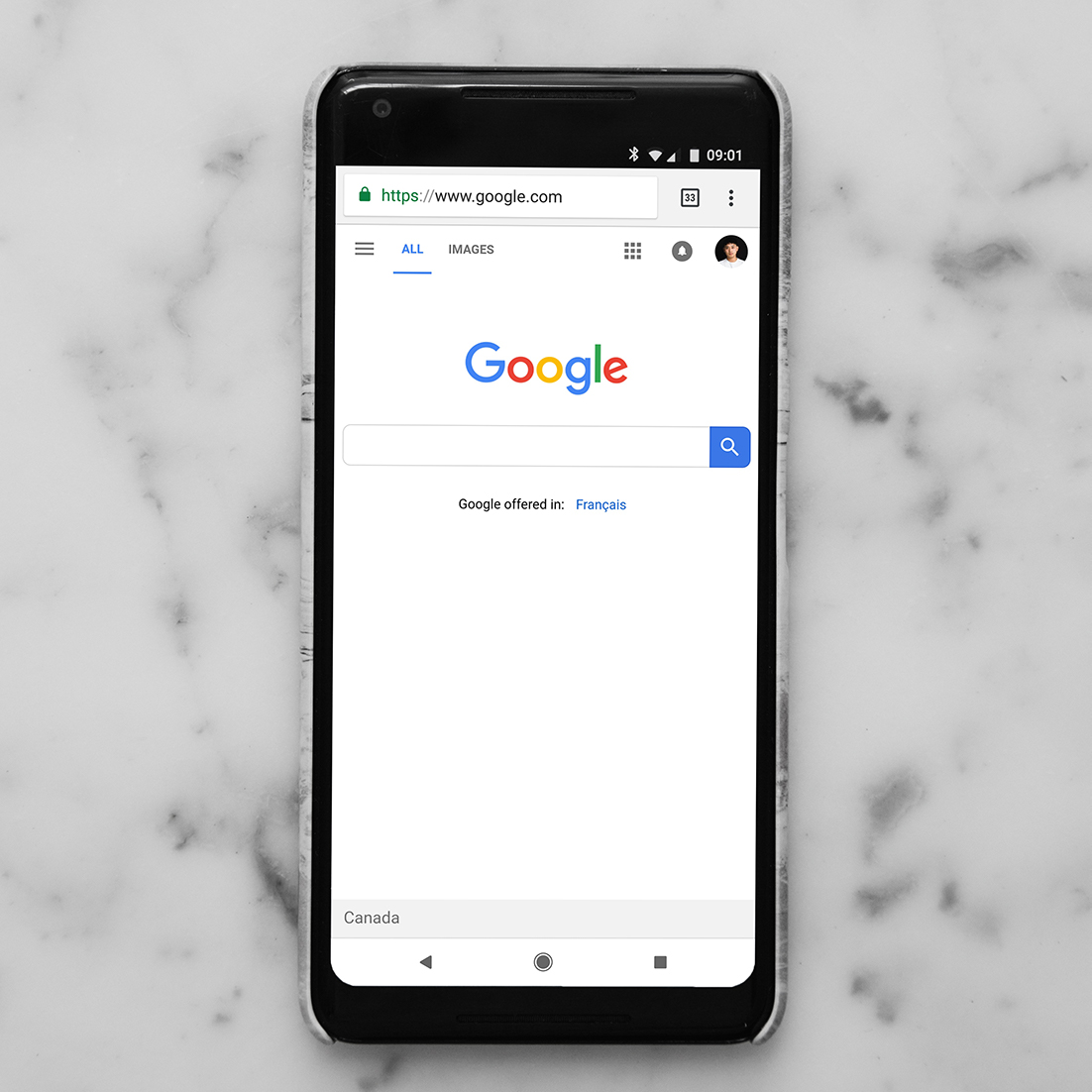
- HTTPS with a valid security certificate: Make it easy for users to trust you and understand that their information is safe and secure. If you have forms or e-commerce on your website and aren’t using HTTPS, you could be losing search rank and conversations due to this factor alone.
- No intrusive interstitials: This is especially important on mobile where full-screen ads and other elements can be difficult to close and block content.
- Avoid designing dark patterns: There are still a lot of designers incorporating inadvertent interactions on purpose. It will only hurt you in the long run because users won’t come back to the website after that initial visit.
User Journeys
A clear user journey makes a website more navigable and functional. Plus, it keeps people interacting with your website longer, increasing time on site and sending signals of perceived content value.
Your job is to make it easy for users to move around and know where to go next.
This happens in a lot of different ways and isn’t the same for every website design.
You might use links or calls to action. The design may be packed with visual cues such as arrows or instructions for what to do next. Tooltips can help users understand unfamiliar information.
There are so many things you can do to help ensure that website visitors know how to move through the website, find what they are looking for, and even complete conversions or goals that are important to you.
And while this doesn’t sound like a direct link to search, it’s a big factor because it creates relevancy for your website and content.
Identification and Hierarchy

Everyone who gets to your website should always know that it is your website. A lot of this relates directly to design and branding.
Another element is user experience. Do elements and interactions work the same way, and consistently, throughout the website?
Think about how the following elements provide information to users and help them make decisions – even if they happen in a matter of microseconds – while interacting with the content and design.
- Site identification, title, and visual identity
- Header tags and visual subheadings to break up content
- Meta data may provide information at the search level, helping users decide to visit your website
- Easy navigation
- Keywords that link user desire and intent to your website content
- Clear calls to action
Page Load Speed

Is your website fast? It matters.
You have almost no time to make an impression. If your website is slow to load or content elements don’t show immediately, many users will leave and never come back.
Build your design for speed with:
- Clean code
- Image compression
- Fast servers
- Caching
- CDN
Digestible Content
Not only should website content include appropriate keywords and relevancy, but it also needs to be digestible. That includes text that’s not heavy visually. Some website visitors will leave immediately if they look at the content and the cognitive load is too much. (That’s why huge blocks of copy can be so overwhelming!)
It’s your job to break up content, particularly if it is heavy with elements that make reading a lot easier. And for the best result, break it down so that content can be scanned quickly. Not everyone will read and will only look quickly for the answer to the question they came for. Make it as evident as possible.
Here’s how you make the content more digestible:
- Write clean copy in clear and simple language
- Use headers and organization; lists are also a good idea, where appropriate
- Incorporate text, images, and video (don’t forget alt and meta information)
- Reinforce calls to action multiple times (important CTAs should be sprinkled so that one appears with almost every scroll to two scrolls on long pages)
- Link appropriately, including internal and external links
Rich Snippets

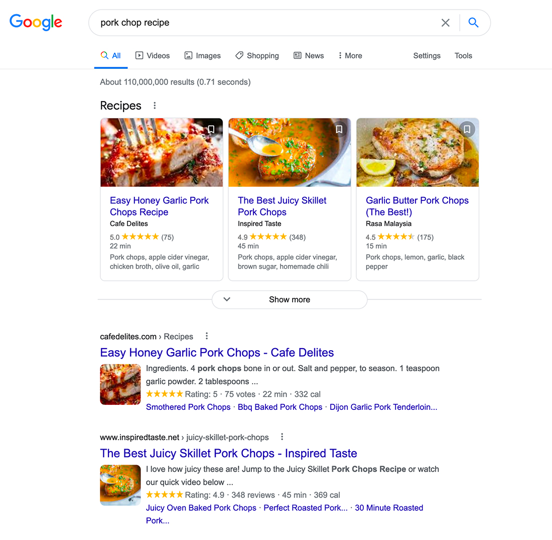
Rich snippets can help more people see content before clicking through to a website, helping entice more users to choose one website over another.
Think about your habits: How many more times do you click the option with an image or additional information over a text-only search result?
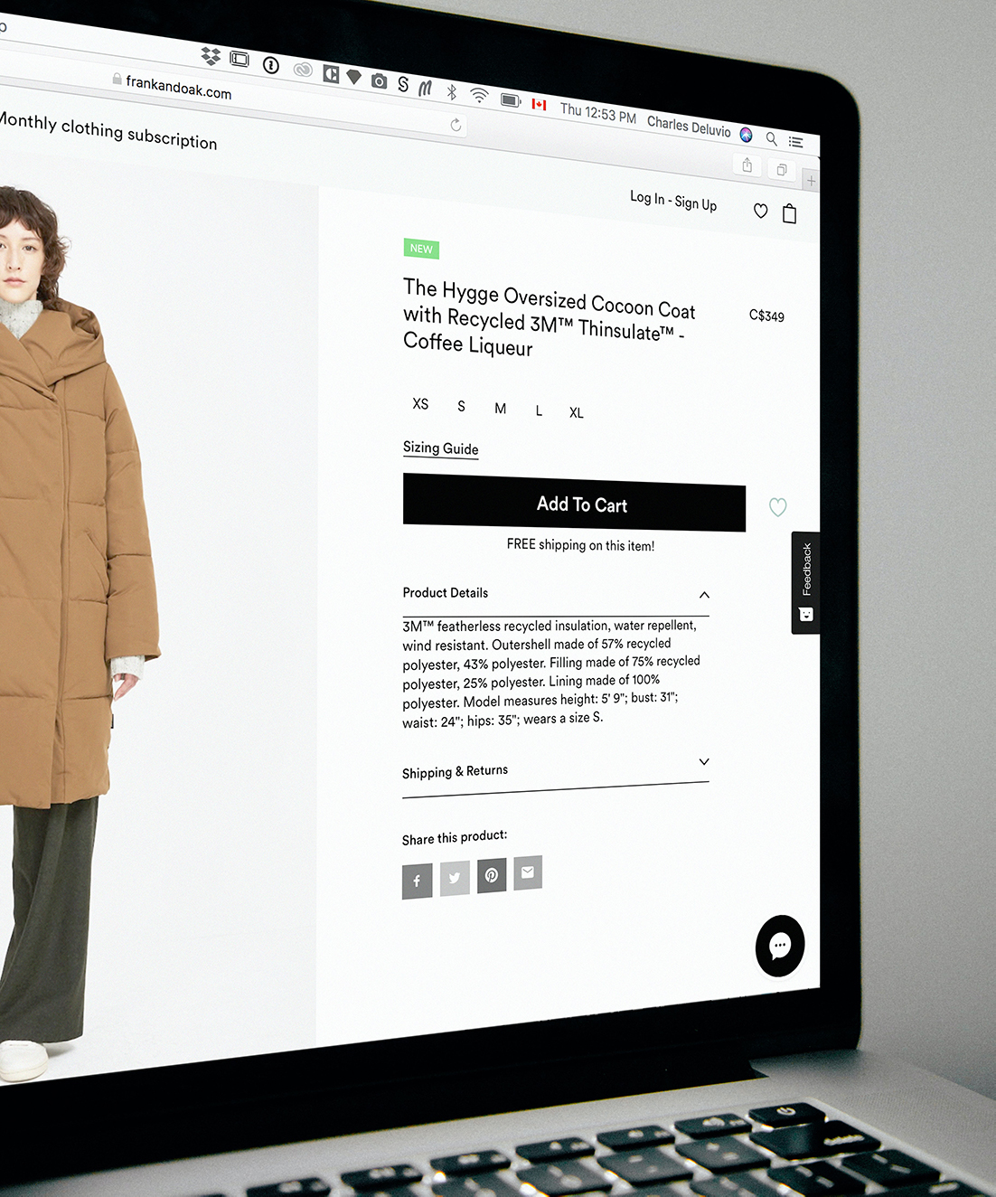
Rich snippets are most commonly used for e-commerce sites for products or to show reviews. They are also especially popular for recipes. But you can also use them on social media and for link sharing. Make sure to include enticing language and visuals to each page or post.
Web Authority

Finally, your website needs to have digital and online authority. This can be complicated and take time, but here’s the headline: The more connected elements you have to a website or domain with the same content, linkages, and verifications, the more credibility they have as a while.
It starts with your domain name. The longer you have it, the better. Connect URLs to keywords on pages so that final URLs provide a glimpse into what each page on your website is about.
Then link connected services, such as active social media accounts or related entities.
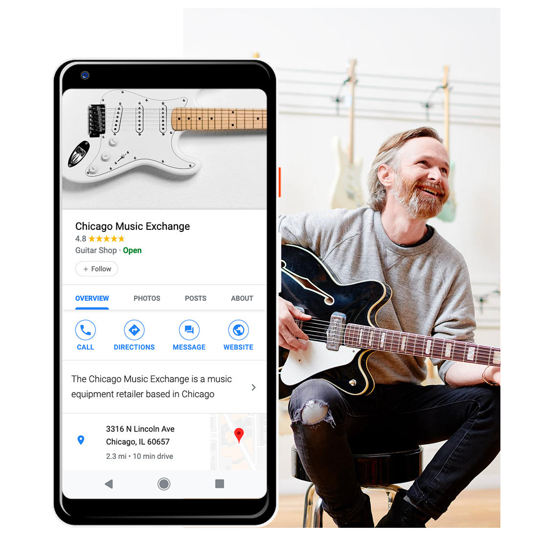
Finally, establish your business on Google with Google My Business if your website is linked to a business entity. This puts your business on the map (literally) and provides additional information to the search engine giant connecting your website to your core business. This is especially important for websites that rely on local customers or search to generate traffic.
Make sure to fill out all the relevant information – business category, information that matches the information on your website, contact information, images, etc. The more information on your Google My Business profile that is in sync with your website, the more connected and authoritative these elements will be in terms of search relevancy.
Conclusion
If you still aren’t convinced that SEO and UX design are directly linked, consult the source. In mid-2020, Google released an update noting how important page experience is “for a better web” and search.
In short, everything you do to create a better user experience will help website visitors stay with your design longer, click around more, and send signals to search engines that the content is valuable and useful. It’s the must-have combination of visuals and content and usability that every UX designer needs to understand.
