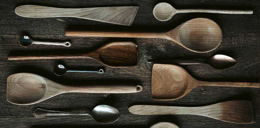
Every chef has their favorite tool. Mine happens to be a wooden spoon I’ve had since forever. I call it “Suzie” (because I’m a weirdo). Some people actually keep their wooden spoons in the family for generations – talk about a collector’s item!
Today, I’m going to share some tips on how the tools you select as a designer can help improve your creative process, and aid you in creating work you can really stand behind.
You’ve Gotta Have Standards
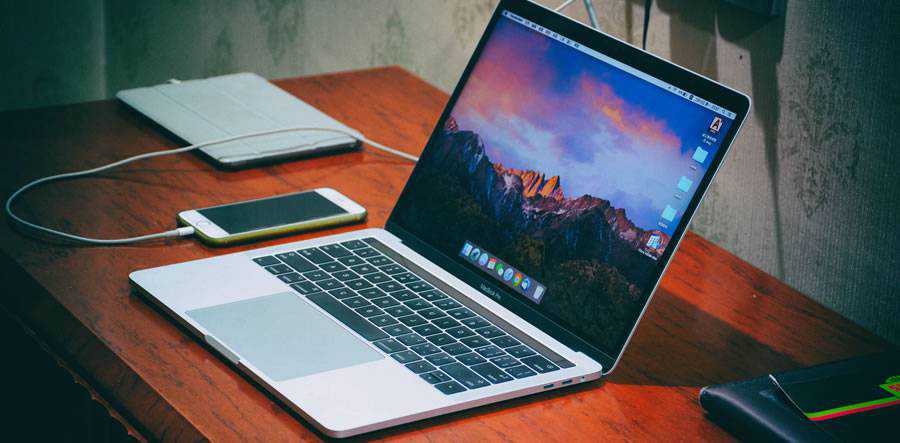
Do you know why so many chefs and cooks prefer wood over other materials? Well, it’s much the same reason many designers prefer Macs and software by Adobe: it’s the industry standard and using it makes your life easier in more ways than one.
Now before you say it, I know there are plenty of professional designers who are perfectly happy running Gimp or other non-standard software on a PC or Linux computer. And their work is just as awesome and up to par as any “Mac person’s.” But, for many designers, the benefits of having a standardized way to communicate with clients, other designers, and/or other departments outweigh the little idiosyncratic advantages of marching to your own drum.
Something else to remember – which might seem insignificant at first, but bear with me – is that you have to consider the technological “culture” into which you’ll be entering as a designer. This applies a bit more to in-house designers than freelancers, although freelancers working for a long-term client may experience the same thing.
My last in-house job was in a PC environment, and there was quite a strong anti-Mac sentiment among my peers. They “tolerated” me propping up my MacBook Pro on my desk alongside the office PC, but they definitely made their feelings clear. I thought it was funny, but a more sensitive person might have gotten their feelings hurt.
People can get mighty serious about their tools. And, as many of you out there have probably noticed, it can get ugly if you’re not careful. If you are totally in love with your tools and wouldn’t consider changing them for the world, by all means stick with them.
But if your peers or clients have a different opinion, be prepared to put up with a lot of their ranting and raving. And preaching and lecturing. And complaining and… yeah. You get the idea.
The Forest For the Trees
Nothing makes you feel like a “Real Chef” like gripping the handle of a huge, weighty, wooden spoon. It may seem a bit cliché, but I encourage you to try it the next time you’re in the kitchen. You can thank me later. Cooking enthusiasts, like designers, can get pretty hardcore about their wooden spoon choices.
Some people look for spoons that can handle stirring all the ingredients in the pot with ease. Others look for good scraping ability – the ability to remove food off the bottom of the pot so it doesn’t get stuck. And of course, you have to have a spoon you can use to taste your food while it’s cooking.
The debate on which wooden spoons handle all three of these tasks the best is endless, fierce, and sometimes a little scary. But enough about that. Consider your own tools as a designer. If you’re a pro, or aspiring to be, odds are decent that you use Photoshop, Illustrator, InDesign, or a combination of all three. Why do you use these programs?
Well, like I said, they are the industry standard. Being able to communicate ideas in a standard format across different people’s systems is an extremely valuable asset.
But there are other factors to consider as well. Believe it or not, some professional designers get by just fine using software that competes with Adobe on factors like price, interface preferences, and software size and speed. As powerful as a program like Photoshop or Illustrator may be, a lot of times you just don’t need all that power.
Some designers might actually be better off trimming down to something sleeker and less clunky. I’m an Adobe user myself, but, well…sometimes, for certain projects, other tools do the job just fine. I’m totally serious.
Beyond The Pale
Alternatives to Adobe software are plentiful, and they are used every day by pro designers. Some are free and open-source, others are web-based, and others may have a simpler or more familiar interface. Again, there are many reasons a designer might choose a non-standard tool, many of which may not be immediately obvious.
Web-based software might be perfect for frequent travelers, for example, while a more familiar interface might increase a designer’s speed tenfold. If you happen to be in the market for alternative software, do your research and figure out what your number one priorities are.
Now Leaving Digitopolis
But wait! Computers may be the fastest and most efficient tool to use, especially in the world of web design, but you know what? Sometimes you don’t want to be fast and efficient. Sometimes you want to let a design simmer slowly over a low fire, stirring it occasionally with your spoon until all the flavors meld together in an exploding cacophony of deliciousness.
What I mean with all the food metaphors (besides the fact that I might just be really hungry) is, perhaps you’re one of those designers who think better off the computer than on it. Computer screens are made up of billions of little glowing pixels, and staring at one for hours on end can be draining on not just your eyes, but your creativity as well. Paper and other non-digital surfaces don’t have that problem.
There are plenty of designers – yes, even web designers – who take the hand-crafted approach to assembling their work. Paper, cloth, yarn, and yes, even food, can be used as tools in your design arsenal.
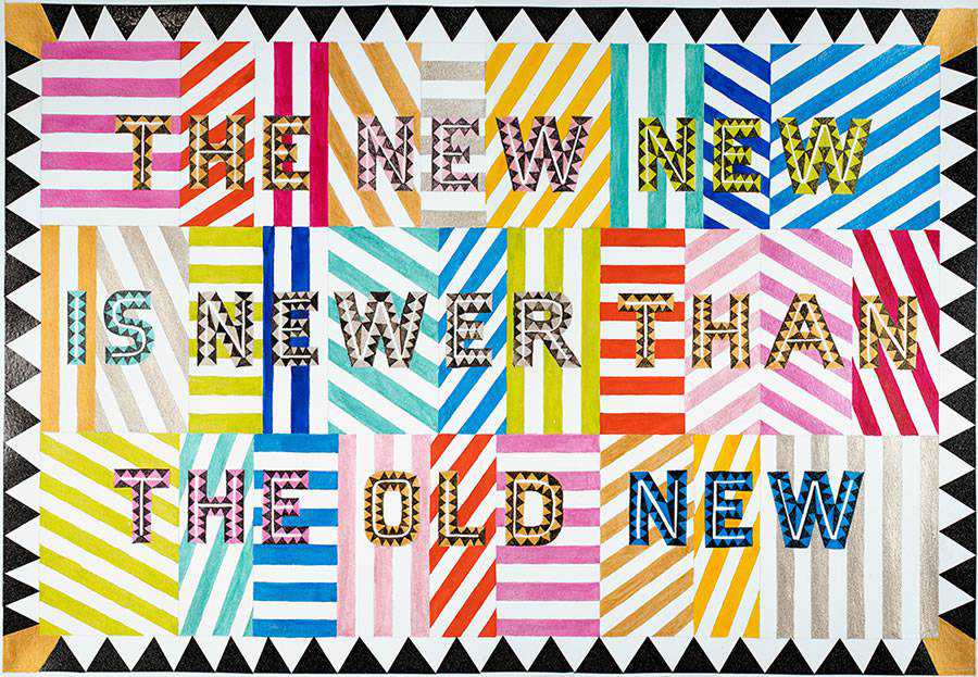
Canadian designer Marian Bantjes, for example, continues to create a stir with her unique designs that feature sugar, tinfoil, fake fur, glitter, flowers, and other unconventional materials.
Choose Your Weapon
Remember, choosing the right tools, just like choosing the right wooden spoon in the kitchen, is a completely personal process. You can listen to someone else rave about the wonders of one tool versus another, but at the end of the day, it’s just a tool.
The decision is yours and yours alone, and a tool can only go so far in helping you with your working process. It can’t create the work for you, nor can it improve any weaknesses you have in terms of technical skill or design sensibility.
There’s absolutely nothing wrong with eschewing the computer, even if it’s only for a little while, in favor of a more experimental approach. The great thing about experimenting is that you can take bits and pieces of the stuff that worked and add it to your regular design process to put a new spin on things.
So, if you really want to play around with paper and scissors and glue for your next project, go for it. As long as you solve the problem put in front of you by your client, it won’t matter how you got there.
Your client will most likely be impressed by your individuality and willingness to take risks, which, if you play your cards right, could lead to more challenging and higher-paying work in the future.
So dig around in the toolbox. Try them all. See what works best for you, and what will become your own personal “wooden spoon” standard for finding solutions to design problems.
For the record, though, a heavy, olive-wood spoon with a long handle and a rounded bowl (not too large) is as close to cooking tool heaven as you can get. According to this cook, that is. Bon appétit!
The post The Personal Process of Choosing the Right Design Tool appeared first on Speckyboy Design Magazine.

