The first response you’ll hear from others about using pop-ups on your website is a long sigh.
Many people discount the idea before it really gets off the ground, but when done well, pop-ups are a valuable conversion tool for websites. (Note the phrase “when done well.”)
They get a bad reputation because so many people use them poorly or implement pop-ups with dark patterns that trick and annoy users.
A good pop-up is actually helpful and helps users on their website journey. Let’s dive in and learn how you can still use these well.
Don’t Cover the Whole Screen with a Pop-Up
Rule No. 1 of using pop-ups should be to never cover the whole screen.
An effective pop-up should disrupt the user with a promo, offer, or suggestion that creates a sense of urgency, helps them down the right path, or delights them with a promotion or coupon.
On the flip side, there is nothing more annoying than a full-screen pop-up that’s difficult to close or has to play through (like many interstitial phone ads).
How big should a pop-up be?
Generally, smaller is better. Let the content dictate the shape and size, but as a rule of thumb, the pop-up should not cover more than 60% of the screen and as little as 20% can be effective depending on content and placement.
Consider these key locations:
- Top banner: Best for a small pop-up such as a simple call to action.
- Bottom corner: This is a prime location for exit pop-ups that offer help or chat bots.
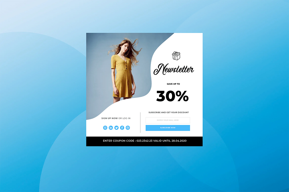
- Center of screen with plenty of room around it: This location is generally the largest pop-up location and features your best offer or content with a direct action.
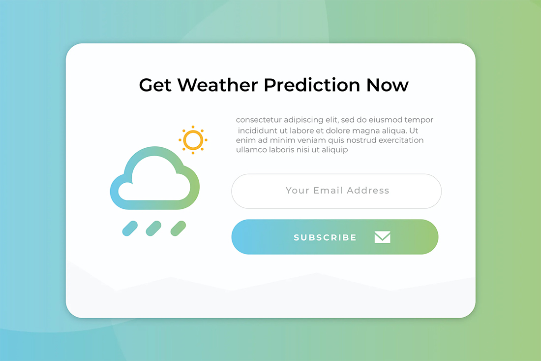
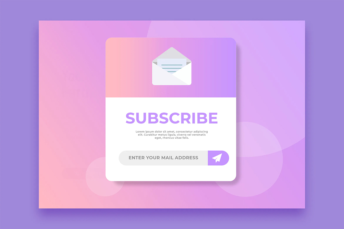
- Bottom banner: Popular option for a simple email signup form.
Time Pop-Ups for Key Conversions
A well-timed pop-up appears on the screen right when a user needs it.
Time pop-ups to coincide with certain actions – or inactions – to help push users along the right path.
Time-based pop-ups can follow different triggers, or rules, such as:
- Pop-ups appear after several seconds on a specific page with content that relates to what is on the page. (Not the same pop-up should appear on every page of your website.)
- Only allow pop-ups to show a couple of times per user and not on every page as soon as it loads. This can get amazingly annoying quickly and even result in abandonment.
- Time pop-ups to appear after the user shows interest, such as staying on a certain page for a specific amount of time or scrolling past a certain location.
- Use smart pop-ups which stop appearing once the user clicks through or performs the desired action. If a homepage pop-up, for example, leads you to a specific e-commerce item, don’t show it on the page for that item or if the user has it in their cart.
Use Pop-Ups That Are Helpful to Users
The pop-ups that users love most are those that actually help them while they are on your website.
These include everything from coupons to links to event information or sales, timely elements, or key content that you know is in-demand based on website analytics.
Use pop-ups to help direct traffic to these key content areas, making life easier for users.
If you have a large complex site, consider a search pop-up with a question such as “What are you looking for?” with an input box that returns search results.
Keep Pop-Ups as Simple as Possible
The primary design flaw with most pop-ups is that they are too complicated.
Think of a pop-up as a simple call-to-action. When it comes on the screen, the user should be able to scan it quickly and interact with the call-to-action. And it should all happen in a matter of microseconds.
Information to include in a pop-up:
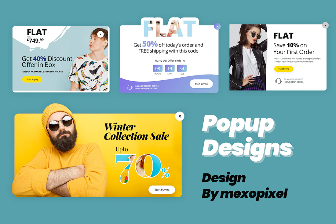
- Image
- Headline or simple message
- Button or form field
Make Pop-Ups Easy to Close or Hide
This is the no-brainer move that sets an intentional pop-up on your website apart from ads.
It should be easy to close with a simple “x,” close button, or link to close. It should not be complicated or tricky.
- Always put the close button inside the pop-up frame. A tiny “x” outside the frame can get difficult to see.
- Make it large enough to click or tap without activating the pop-up inadvertently.
- Ensure that when users click outside the area of the pop-up that it automatically closes.
These options make pop-ups a lot less annoying or troublesome and keep users from being frustrated when they see them.
Use Seasonality to Your Advantage
If you want to create a pop-up that helps users and feels different every time they visit your website, use seasonal imagery and themes. This is a common practice with ecommerce because it works.
If a user visits your website 10 times and gets the same pop-up, it won’t be effective. The content won’t disruptor catch attention any longer.
A seasonal deal, offer, or just image – a la Google Doodle – will make people stop to look and think about the content in the pop-up.
Offer Help to Keep Users on Your Website
Exit intent pop-ups are another popular option because they solve a pain point for users. They appear just as the user is about to leave the website with an offer for a discount or help.
The exact offer that will work for users on your website is something you’ll have to test over time. Play with multiple variations and test the success of each.
Then be selective. Only use pop-ups on certain key pages and content to help keep visitors on your website longer.
Remember to only ask for one interaction in a pop-up. Users will click through or click-to-close, anything else is probably too much for this format.
Design a Pop-Up that Stands out But Feels Like Your Website
One of the problems with pop-ups is that everyone assumes they are ads.
Pop-ups on your website that lead to other content or information therein should look like, have the same voice as, and encourage interaction in the same way as the rest of the design.
Pop-ups should match your website, even if design elements are created to help it stand out.
One design tip that can help here is to create a layer between pop-ups and background content so that pop-ups jump off the screen even more. It can be a risky tactic since you are almost essentially creating a full-screen pop-up but the extra layer and depth can bring focus to the pop-up element so that it is distinctly separated from the background.
This can help make content more identifiable and scannable when other elements have a similar design scheme.
Conclusion
Pop-ups can turn into one of the best elements on your website when done well. They can boost conversions, help users, and encourage interaction.
Remember these tips to make the most of your pop-ups: Make them valuable, relevant, time-based, and easy to close.


