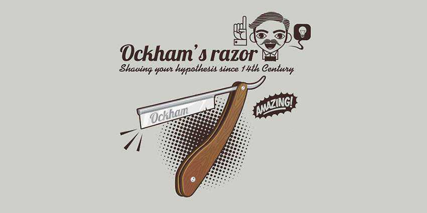
Did you know that designers can use a tool that mathematicians, philosophers, and other academics have known about for hundreds of years? It’s called Occam’s Razor, and it’s a law that states, essentially, that the simplest solution is usually the best or most correct.
For example, if your client is late to a meeting, you would probably assume they got stuck in traffic. It’s a simpler and likelier explanation than, say, assuming they got temporarily abducted by aliens and had to fight through an endless maze of plant monsters to get to the meeting on time
That’s a prime example of the kind of over-thinking that many designers are prone to. We’ll go over the importance of ditching the unnecessary when developing design concepts, and why it’s so hard to do in the first place.
Not only will you be a stronger designer when you insist on simplicity, but your clients will be much happier with your work as well.
Considering New Options
Here’s a scenario that I think perfectly illustrates how designers can use Occam’s Razor to de-clutter their designs. If you know me, you know what I’m about to say: something about food! Okay, so, you and a group of friends go out to eat at a buffet-style restaurant, and you begin piling up a huge assortment of food on your plate. Your friends are giving you funny looks, but you explain that you’re really hungry and will be eating a lot.
However, when you finally sit down to dig in, you get overwhelmed with the variety of options in front of you. Where do you jab your fork first? Decisions, decisions. Your friends are having no trouble polishing off their smaller meals and going to get seconds. It occurs to you that you didn’t have to put everything you were going to eat tonight on your plate at one time. There was a simpler solution right in front of you that you didn’t even consider. Oops.
Design works the exact same way. No matter what you want to accomplish in a design, there is almost always a simpler way to do it that will obtain the same result with less distraction and clutter.
Deconstructing a design concept to its bare elements, while still maintaining the integrity of the design brief allows you to solve clients’ problems with the power of economy. Always go out of your way to make things less complex, because…
Complicating Things Is Natural
I’m not sure why so many people think that simplicity or minimalism in design is easier to do than complexity. But it’s a pretty depressingly common thing for a non-designer to think.
I’ve personally worked with many people who just did not understand what it took to create a simple design layout. And I didn’t even try to strangle any of them. They say in entertainment that you can never be too rich or too thin. Well, in the design industry, you can never be too patient.
Back when I did the in-house grind, a co-worker once told me that whoever created the SPAM logo was: “just a slacker. I mean, how hard is *that* to pull off?” He was under the impression, like many non-creative professionals, that it was somehow “easier” to create something simple like the SPAM logo, because it wasn’t as complex as, say, directing a customer service staff of 50 people (he was a VP of Operations).

Getting A Close Shave
Having designed “simple” logos and directed staff teams, I can say with a fair amount of authority that, if you’re doing it right, the latter is far easier than the former, and here’s why.
As a designer, the most important thing you can deliver to your clients is a way to funnel their core values into a working system. That includes the visuals, of course, but visuals are almost near the bottom of the list for design requirements. Sure, anybody can put some plain text in a box. But the knowledge of whether or not that’s appropriate for the project you’re working on is what makes you the design expert, and not your client.
Always remind yourself that design is about solving a problem and communicating a core idea to your user. Whether it’s a squeeze page on a commercial website, or the can opener in your kitchen, all design should strive to use the fewest amount of elements to make the easiest user experience possible.
If you find yourself stuck in a heavy jungle of clutter, walk away for a minute and ask yourself what simpler way you can use to achieve the exact same effect you’re striving for.
The DNA Of Clutter
Nature is predisposed toward complexity. That means that, in general, simple things get more complicated over time. Single-celled organisms evolve into multi-celled organisms, and so on. Evolution is not the most efficient designer, and sometimes nature’s solution to a problem is to just evolve something else to solve it.
Then, once the need for it is gone, it just sort of sits there. That’s why we have an appendix, tonsils, and other weird remnants of things we once needed for survival, but now… not so much.
And it’s not just us. There are plenty of examples in the animal kingdom of species that have vestigial, or formerly useful, limbs, organs, behaviors, and instincts. They aren’t useful anymore, but, thanks to Mother Nature (also known as the worst art director in the universe), they’re there to stay.
What this all means is that we humans are built from the ground up to take simple things and make them complex. Think about a nomadic people’s village versus a modern metropolis in the West or East Asia. Huge difference in complexity, but all human civilizations started out the same – very simple and basic.
To make something simple from something complex is against our very nature. This is why Occam’s Razor exists in the first place. William of Ockham, the 14th Century English scholar who first came up with the idea, knew that people had a tendency to think up fanciful solutions to problems that only needed a simple fix. Try this explanation the next time you encounter a client who doesn’t think design is a “real” job.
If you struggle with simplifying your designs, remember that it’s not really your fault. It comes with having a human brain and seeing things in many layers. But through your designs, you can constantly challenge yourself and your users to take the simpler road.
You won’t always end up with the world’s most elegant solution, and that’s okay.
But by reminding yourself that there’s always a way to do it simpler, you can ensure you’re always communicating the clearest message.
The post Taking the Occam Razor Approach to Design appeared first on Speckyboy Design Magazine.


