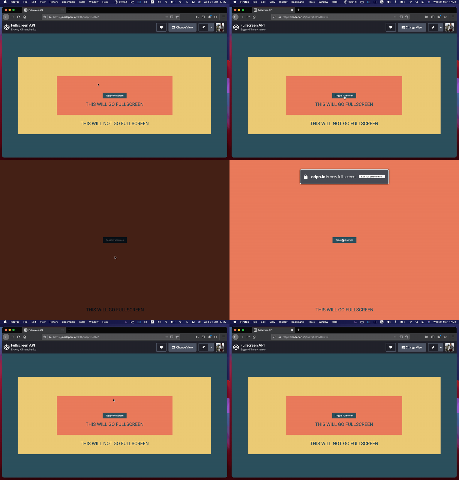
Let’s look at the Fullscreen API in JavaScript. It allows you to do a pretty powerful thing: full screening exactly one particular element you want it to. Not only that, but CSS can help as well with a special selector.
Every major browser has built-in fullscreen functionality in the form of maximizing the browser window itself. You press F11 or ⌃⌘F (WinKey ⬆ on PC) and the browser will fill your monitor, going as far as removing UI components (like the window management buttons).
When you go into fullscreen mode, it maximizes the space for a web page to display, but this isn’t always exactly what you want. More often, you either want to fullscreen some particular element of the page, for example, a video or a game. This is where Fullscreen API comes in handy.

The Fullscreen API helps achieve something that the browser‘s fullscreen modes won’t be able to, like:
- Fullscreen a specific element of the page and not the whole page.
- Match elements in CSS with the
:fullscreenpseudo-class, which checks if a particular element’s fullscreen flag is set. - Full control over when to enter fullscreen.

Let’s do it
First, decide what element needs to be shown in fullscreen mode. After that, the only thing is to check if that element has the requestFullscreen() method, and then call it on the element.
Let’s start with a simple <div> element to fullscreen:
<div id="fullscreen"></div>First, we’ll select it and check if it has the method. If it does, then we call the requestFullscreen method on it. It’s that simple:
let fullscreen = document.querySelector("#fullscreen"); if (fullscreen.requestFullscreen) { fullscreen.requestFullscreen();
}
But, we want to run this code conditionally and not as soon as somebody lands on the page. We’ll make a button that toggles fullscreen mode.
<div id="fullscreen"> <button id="button">Toggle Fullscreen</button>
</div>
let fullscreen = document.querySelector("#fullscreen");
let button = document.querySelector("#button"); button.addEventListener("click", () => { if (!document.fullscreenElement) { fullscreen?.requestFullscreen(); } else { document.exitFullscreen(); }
});Notice how we’re using document.fullscreenElement. If there is an element that has been fullscreen before, then it will return it; if not, it will return null.
It’s also a good idea to check if fullscreen mode was even enabled in the user’s browser at all. For that, we can use document.fullscreenEnabled. It returns a boolean saying whether or not we can use the Fullscreen API in this particular browser. Fullscreen could be disabled by the user, or the browser might not support it.
The last method that we will cover is document.exitFullscreen(). A user should always have the ability to exit fullscreen mode by pressing ESC on the keyboard. We could do some sort of custom way to exit fullscreen mode using exitFullscreen. It doesn’t matter what element was fullscreen; it will go back to window mode after calling this method.
As you can see in the code for our button element, we first check if fullscreen has already been activated. Then, based on that information, we either go to fullscreen mode or we go back to window mode.
Styling fullscreen
The cool thing about the Fullscreen API is that we can match a fullscreen element in CSS. That’s exactly what the :fullscreen pseudo-selector is designed to do!
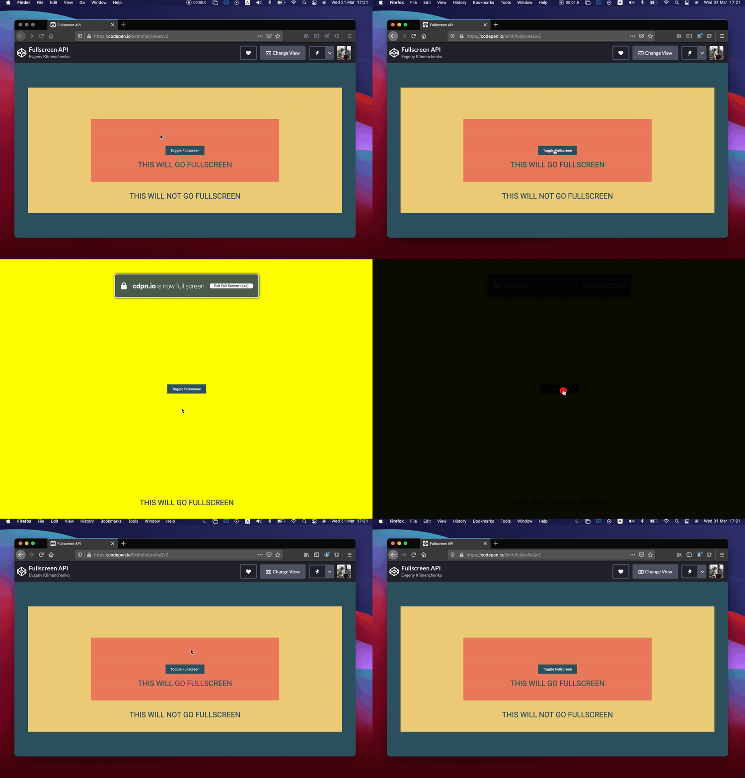
#fullscreen:fullscreen { background-color: yellow;
}
As you can see, the #fullscreen div is the only element that gets a yellow background color when the element is in fullscreen mode, and only in fullscreen mode. The catch is that we can’t actually select any element like this; we can only select the root element that’s in fullscreen mode. None of the child elements will match.
In other words, something like #button:fullscreen won’t select a button that is contained within the fullscreen element — that is, unless we want the button to be fullscreen instead of the div.
Some browsers require a prefix for this to work. Firefox uses -moz-full-screen and WebKit-based browsers use -webkit-full-screen.
#fullscreen:-webkit-full-screen { background-color: yellow;
} #fullscreen:-moz-full-screen { background-color: yellow;
}
Did you know that when we’re in fullscreen mode that there is a pseudo-element that is rendered right below your fullscreen element? By default that pseudo-element is black. If you want to change the styles of that pseudo-element you can do it like this:
#fullscreen::backdrop { background-color: skyblue;
}
Here’s the final example. Keep in mind that fullscreen mode might not work with embedded Pens, so you will need to view it outside this article.
The post How to Leverage the Fullscreen API… and Style It appeared first on CSS-Tricks.
You can support CSS-Tricks by being an MVP Supporter.
