A lot of web design talk concerns itself with what goes on around content. Page speed, design systems, search engine optimization, frameworks, accessibility — the list goes on and on. This gives us at Smashing Magazine plenty to write about, which is great, though it’s worth reminding ourselves what it’s all in service of.
In this third edition of our Web Design Done Well series, we’re honing in on the beating heart of many websites: content. More specifically, editorial content. The Web has given storytellers an incredible selection of tools to work with, and as an occasional semi-competent journalist myself, I love a good scoop.
What follows are examples of web technologies being woven in with editorial content to take it to the next level. We’ll then close with broader tips on thinking creatively about digital content. Even now, overwhelmed by the content production line, the good stuff still shines through.
Part Of: Web Design Done Well
Reuters Lean Into Swiping
In this piece about systemic racism in the US, Reuters shapes the content around swiping, breaking the story up into bite-sized chunks. Reading feels far more purposeful than it would have through a traditional scrolling approach. It’s like turning the pages of a book. On mobile, you literally flick to the next section. It makes for snappy, immediate reporting — and that’s to say nothing of the excellent data visualization on show.
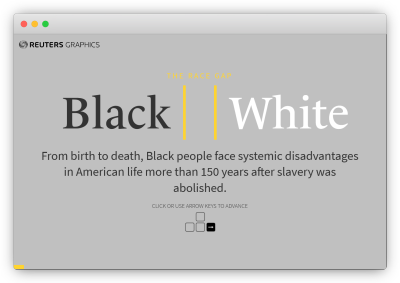
We live in a mobile-first world. There is no point in being precious about this. Yes, magazine spreads have a certain class about them. Yes, a desktop view gives you a bigger canvas to work with. The reality is most people will be viewing what you publish on a mobile phone, so lean into it. For a similar approach, these ‘tap stories’ by The New York Times and Input are also excellent. For those interested in further reading on mobile-centric editorial, The Story by legendary newspaper designer Mario Garcia is heartily recommended.
The New York Times Shows Rather Than Tells
For all the awful things the COVID-19 pandemic has caused, it has at least led to some breathtakingly good reporting. This interactive New York Times piece explains how face masks work by taking readers to particle level. You can see how fibers catch particles, and why different masks have different levels of effectiveness. Any fool can make complicated topics hard to understand, but making them easy to understand? That’s an art form all of its own.
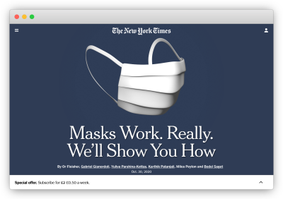
There are a lot of elements at play here. Graphics, color, animation — there’s even an augmented reality experience if that floats your boat. What could so easily have been a dry, stuffy subject is brought to life. And most importantly of all, it’s vital information. Stuff like this is why Gabriel Gianordoli was voted World’s Best Designer at the 2020 Society for News Design awards. Smashing.
The Washington Post Visualises Exponential Spread
The pandemic has also forced data visualization to the front pages of publications all over the world. This article on exponential spreading from March 2020 (remember that?) does an incredible job of visualizing how and why certain viruses become real big problems real quick. From full-blown simulations to little inline sparkline graphs, this is editorial that takes full advantage of its digital setting.
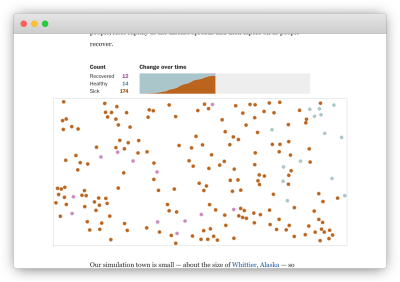
What I especially like about this one is that it never feels gratuitous. Every visual improves the story, to the point where you almost feel sorry for anyone having to explain the same concepts with words alone. It being available in more than a dozen languages at the click of a button is another wonderful touch — a reminder that the Web is in fact borderless. I can only imagine how many people around the world this article has helped.
Here The Marshall Project presents hard-hitting journalism about the US criminal justice system with the elegance and bittersweet beauty of a children’s storybook. In “The Zo”, creative writing, striking illustration, mesmerizing narration, and an important story combine. This is multimedia editorial in full flow.
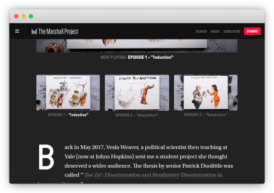
They say that songs can take several forms. The same is true of editorial content online. What you see above was inspired by a 96-page academic paper. That it could find a new audience as an animated series online, then be nominated for not one but two Emmys, is testament to the transformative powers of the internet.
SBS’s Interactive Graphic Novel Is No Novelty
Speaking of the transformative powers of the internet, how about an interactive story. We’re all familiar with film adaptations, radio play adaptations, miniseries adaptations, and so on. Why not web page adaptations? That’s just what Australian broadcaster SBS set out to do with The Boat, an interactive retelling of a short story in Nam Le’s book of the same name.
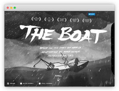
The page’s opening sequence pulls you right in, its words tilting and tumbling with the waves as you read, with the sounds of thunder and rain filling your senses to the brim. As the story settles, Matt Huynh’s illustrations drift by like memories. It’s a remarkably vivid experience, beautiful in its own right as well as a savvy way to bring literature to younger generations.
The Pudding Monkeys Around
I wish I’d come across this in time for the sound edition of this inspiring sites series. No matter, it’s here now. In a truly superb showcase of digital editorial, The Pudding doesn’t so much explain the Infinite Monkey Theorem as live it through music. Don’t know what the Monkey Theorem is? Well, what are you waiting for, the page will do an infinitely better job of explaining than I could. I’ll wait.
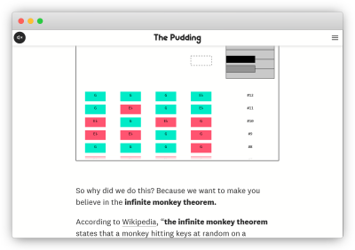
By using interactive four-note examples, the article involves the reader while also making the concept simple to understand. As a final, delightful touch, the page is itself a live, ongoing experiment, randomly working its way through increasingly complex tunes. You can expect it to get “Seven Nation Army” right in about 19 years. One wonders whether a monkey typing at a keyboard for long enough could create the perfect JavaScript framework. Hope springs eternal.
A List Apart: A Class Apart
For all the talk of data visualization, music, augmented reality, and other snazzy tools, there’s a lot to be said for getting the fundamental right. Pages don’t have to be the web equivalent of the Vegas Strip to be eye-catching. A list Apart shows that better than most. Its approach to content will always hold a place in my heart. Title, illustration, copy, blue hyperlinks. Beautiful.
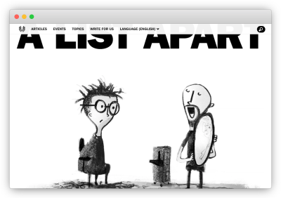
What I now realize was an unsettlingly long time ago, I wrote about the two branches of ‘brutalist’ web design. The gist of what I said was that one approach is loud and brash, the other resolutely functional. A List Apart shows the beauty of the latter done right. The multimedia toolkit is a wonderful asset to have, but even now there are times when only words will do.
Thinking Creatively About Content
For better or worse, the web is absolutely awash with content. A lot of it is great, a lot of it is not. A lot of the talk around it has the cold, calculating cadence you’d sooner expect from industrialists talking about assembly lines. The examples shared above hopefully speak to the value of resisting the urge to churn things out, but let’s be real: most websites don’t have the resources of, say, The Washington Post.
However, there are ways to think creatively about content at all levels, from personal blogs to global publications. Here are a few of them:
- Question your default approach.
We are creatures of habit, including in how we tell our stories. Take the time early on to step back and ask, How could I do this differently? Maybe a photo essay would be more prudent than an article. Maybe a heat map is better than a table. Specialization is important of course, but don’t let it blind you to other, often complementary ways of doing things. - Use free resources.
One of the great gifts of the internet is how much amazing free stuff there is. Like, actually free, on purpose. From photography to graphic design to data visualization tools to audio editing software, the resources you need to transform your content are just a click away. Our freebies tag is a good place to start. - Give content multiple forms.
As The Marshall Project showed especially well with “The Zo”, stories can find new audiences when they take different shapes. Wrote an article? Great, why not record an audio version? Produced a data-driven report? Pretty cool, though is it as cool as it might be if you started plugging those numbers into D3? Only one way to find out. - Experiment.
The examples here are the cream of the crop, but it’s worth mentioning there is a tremendous amount to be gained from trying new ideas and embracing the occasional failure that brings. Iteration is key to the creative process. If you try something and it doesn’t work, fine, no matter. It’s the only way to get to what does work.
There is no one-size-fits-all approach to content, but respecting the story is essential. Web technologies are supplemental, not the main event. Don’t let them be the tail that wags the dog. The best results come when the story is in harmony with how it’s told. That’s the kind of content that sticks with people for years.
