Markdown is a small text to HTML conversion language. It was created by John Gruber in 2004 with the goal of making writing formatted text in a plain text editor easier. You can find Markdown in many places on the internet, especially in locations where developers are present. Two notable examples are comments on GitHub and the source code for posts on Smashing Magazine!
How Markdown Works
Markdown uses special arrangements of characters to format content. For example, you can create a link by wrapping a character, word, or phrase in square brackets. After the closing square bracket, you then include a URL wrapped in parenthesis to create a destination for the link.
So typing:
[I am a link](https://www.smashingmagazine.com/)Would create the following HTML markup:
<a href="https://www.smashingmagazine.com/">I am a link</a>You can also blend HTML with Markdown, and it will all boil down to HTML when compiled. The following example:
I am a sentence that includes <span class="class-name">HTML</span> and __Markdown__ formatting.Generates this as HTML markup:
<p>I am a sentence that includes <span class="class-name">HTML</span> and <strong>Markdown</strong> formatting.</p>Markdown And Accessibility
Accessibility is a holistic concern, meaning that it affects every aspect of creating and maintaining digital experiences. Since Markdown is a digital tool, it also has accessibility considerations to be aware of.
- The good news:
Markdown generates simple HTML markup, and simple HTML markup can be easily read by assistive technology. - The less good news:
Markdown isn’t all-encompassing, nor is it prescriptive. In addition, there is more to accessibility than just assistive technology.
When it comes to ensuring your Markdown content is accessible, there are two big-picture issues:
- There are certain types of content Markdown does not support, and
- There isn’t a Clippy-esque experience to accompany you while you write, meaning that you won’t get a warning if you do something that will create inaccessible content.
Because of these two considerations, there are things we can do to ensure our Markdown content is as accessible as it can be.
The Three Most Important Things You Can Do
It can be difficult to know where to start when it comes to making your content accessible. Here are three things you can do right now to make a large, significant impact.
1. Use Headings To Outline Your Content
Navigating by heading is by far the most popular method many assistive technology users use to understand the content of the page or view they’re looking at.
Because of this, you want to use Markdown’s heading formatting options (# , ##, ###, ####, #####, and ######) to create a logical heading structure:
# The title, a first-level heading Content ## A second-level heading Content ### A third-level heading Content ## Another second-level heading ContentThis creates a hierarchical outline that is easy to scan:
1. The title, a first-level heading a. A second-level heading i. A Third-level heading b. Another second-level headingWriting effective heading levels is a bit of an art, in that you want enough information to communicate the overall scope of the page, but not overwhelm someone by over-describing. For example, a recipe might only need a few h2 elements to section the ingredients, instructions, and backstory, while an academic paper might need all six heading levels to fully communicate nuance.
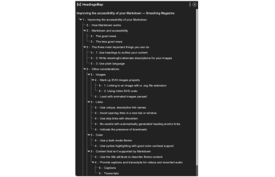
Being able to quickly scan all the headings on a page or view and jump to a specific one is a technique that isn’t limited to just screen readers, either. I enjoy and benefit from extensions such as headingsMap that let you take advantage of this feature.
2. Write Meaningful Alternate Descriptions For Your Images
Alternate descriptions help folks who have low vision or are browsing with images turned off to understand the content of the image you’re using.
In Markdown, an alternate description is placed in between the opening and closing brackets of the image formatting code:
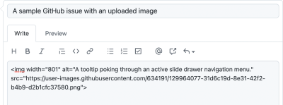
An alternate description should clearly and concisely describe the content of the image and the context of why it was included. Also don’t forget to add punctuation!
Certain websites and web apps that use Markdown input will also try to add alternate description text for you. For example, GitHub will use the name of the file you upload for the alt attribute:
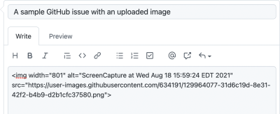
Unfortunately, this does not provide enough context for a person who can’t see the image. In this scenario, you want to communicate why the image is important enough to be included.
Examples of this you’ll commonly see on GitHub include:
- A visual bug, where something doesn’t look the way it’s supposed to,
- A new feature that is being proposed,
- An annotated screenshot providing feedback,
- Graphs and flowcharts that explain processes, and
- Reaction GIFs for communicating emotion.
These images aren’t decorative. Since GitHub is public by default, you don’t know who is accessing your repo, or their circumstances. Better to proactively include them.
If you need help writing alternate descriptions, I’d enthusiastically recommend the W3C’s alt Decision Tree and Axess Lab’s Ultimate Guide to Alt Texts.
3. Use Plain Language
Simple, direct language helps everyone understand your content. This includes people:
- With cognitive considerations,
- Who don’t use English as their primary language,
- Unfamiliar with the concepts you’re communicating,
- Who are stressed or multitasking and have limited attention spans,
- And so on.
The easier it is for someone to read what you write, the easier it is for them to understand and internalize it. This helps with every form of written Markdown content, be it blog posts, Jira tickets, Notion notes, GitHub comments, Trello cards, and so on.
Consider your sentence and word lengths. Also, consider who your intended audience is, and think about things like the jargon and idioms you use.
If you need help simplifying your language, three tools I like to use are Hemingway, Datayze’s Readability Analyzer, and the xkcd Simple Writer. Another site worth checking out is plainlanguage.gov.
Other Considerations
Want to go the extra mile? Great! Here are some things you can do:
Images
In addition to providing alternate descriptions, there are a few other things you can do to make your Markdown-inserted images accessible.
Mark Up SVG Images Properly
SVG is a great format for graphs, icons, simple illustrations, and other kinds of imagery that uses simple shapes and crisp lines.
There are two ways to render SVG in Markdown. Both approaches have specific things you’ll need to be on the lookout for:
1. Linking to an image with a .svg file extension
Note: The bug that I’m about to describe has been fixed, however, I’m still recommending the following advice for the next couple of years. This is due to Safari’s questionable tactic of tying browser updates to system updates, as well as hesitancy around updating software for some people who use assistive technology.
If you’re linking to an SVG as an image, you’ll want to use HTML’s img element, and not Markdown’s image formatting code (![]()).
The reason for this is that certain screen readers have bugs when they try to parse an img element that links to an SVG file. Instead of announcing it as expected as an image, it will announce it as a group, or skip announcing the image entirely. To fix this, declare role="img" on the image element:
<img role="img" alt="A sylized sunflower." src="flower.svg" />2. Using Inline SVG Code
There are a few reasons for declaring an image as inline SVG code instead of using an img element. The reason I most often encounter is to support dark mode.
Much like with using an img element, there are a couple of attributes you need to include to ensure assistive technology interprets it as an image, and not code. The two attribute declarations are role="img" and aria-labelledby:
<svg aria-labelledby="svg-title" fill="none" height="54" role="img" viewBox="0 0 90 54" width="90" xmlns="http://www.w3.org/2000/svg"> <title id="svg-title">A pelican.</title> <path class="icon-fill" d="M88.563 2.193H56.911a7.84 7.84 0 00-12.674 8.508h-.001l.01.023c.096.251.204.495.324.733l4.532 10.241-1.089 1.09-6.361-6.554a10.18 10.18 0 00-7.305-3.09H0l5.229 4.95h7.738l2.226 2.107H7.454l4.451 4.214h7.741l1.197 1.134c.355.334.713.66 1.081.973h-7.739a30.103 30.103 0 0023.019 7.076L16.891 53.91l22.724-5.263v2.454H37.08v2.81h13.518v-.076a2.734 2.734 0 00-2.734-2.734h-5.441v-3.104l2.642-.612a21.64 21.64 0 0014.91-30.555l-1.954-4.05 1.229-1.22 3.165 3.284a9.891 9.891 0 0013.036 1.066L90 5.061v-1.43c0-.794-.643-1.438-1.437-1.438zM53.859 6.591a1.147 1.147 0 110-2.294 1.147 1.147 0 010 2.294z"/></svg>
You’ll also want to ensure you use a title element (not to be confused with the title attribute) to describe the image, similar to an img element’s alt attribute. Unlike an alt attribute, you’ll also need to associate the id of the title element with its parent svg element by using aria-labelledby.
If you’d like to go deeper on accessibly marking up SVG, I recommend Accessible SVGs by Heather Migliorisi, and Accessible SVGs: Perfect Patterns For Screen Reader Users by Carie Fisher.
Load With Animated Images Paused
Animated GIFs are another common thing you’ll find with Markdown content — I find them more often than not being used by a developer to express their delight and frustration when discussing a technical topic.
The thing is, these animations can be distracting and adversely affect someone who is trying to read through your content. Cognitive considerations such as ADHD are especially affected here.
The good news is you can still include animated content! There are a few options:
- Use the
pictureelement, using filetypes such as.mp4and.webmthat can load in a paused state, or - Use a solution that gives play/pause functionality to a
.gif, such as Steve Faulkner’sdetails/summaryhack, or the freezeframe.js library.
This little detail can go a long way to helping people out without having to abandon a way for you to express yourself.
Links
If you write content online, sooner or later you’re going to have to use links. Here are some things to be aware of:
Use Unique, Descriptive Link Names
Some forms of assistive technology can navigate through a list of links on a page or view the same way they can navigate through headings. Because of this, you want your links to hint at what someone can expect to find if they visit it.
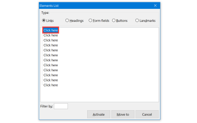
Learn more about [how to easily poach an egg](https://lifehacker.com/this-is-the-chillest-easiest-way-to-poach-an-egg-1825889759).You’ll also want to avoid ambiguous phrases, especially if they repeat. Terms like “click here” and “learn more” are common culprits. These terms don’t make sense when separated from the context of their surrounding non-link content. In addition, using the term more than once can create experiences like this:
Avoid Opening Links In A New Tab Or Window
Certain variants of Markdown such as Kramdown allow you to write code that can open links in a new tab or window:
[link name](url){:target="_blank"}Doing this creates a security risk. In addition, this experience is so confusing and undesirable that it is a Web Content Accessibility Guidelines (WCAG) success criterion. It is far better to let everyone using your website or web app make the choice for themselves about whether or not they want to open a link in a new tab.
Use Skip Links With Discretion
A skip link, or “skipnav” is a way to bypass large sections of content. You’ll commonly encounter them as a way to bypass the logo and main navigation on a webpage, allowing someone to quickly jump to the main content.
Skip links aren’t limited to just this use case! Two other examples could be a table of contents and sorting/filtering controls on an e-commerce site.
Another great use for skip links is to allow someone to bypass embedded content that has multiple interactive elements:
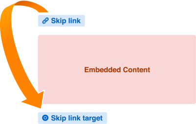
This is also a great technique for allowing someone to bypass a “keyboard trap,” something commonly found in embedded content.
Keyboard traps are where someone who isn’t using a mouse or a touchpad cannot escape an interactive component due to how it is constructed. You’ll typically find these with embedded iframe widgets.
A good way to test for keyboard traps? Use the Tab key!
Without a skip link, someone using assistive technology may have to resort to refreshing the page or view to escape the trap. This isn’t great and is especially troubling if motor control concerns are thrown into the mix. I’m of the school of thought that most people will just close the tab if they run into this scenario, rather than try to wrestle with getting it to work.
In addition to his great post about testing with the Tab key, Manuel Matuzović tells us about his use of skip links, as well as other improvements in Improving the keyboard accessibility of Embedded CodePens.
Be Careful With Automatically Generated Heading Anchor Links
Some Markdown generators automatically add an anchor link to accompany each heading you write. This is so you can focus someone’s attention to the relevant section on a page or view when sharing content.
The issue is there might be some assistive technology issues with this, depending on how this anchor link is constructed. If the anchor link is only wrapped around a glyph such as #, ¶, or §, we run into two issues:
- The link’s name does not make sense when removed from its surrounding context, and
- The link’s name is repeated.
This issue is discussed in more detail by Amber Wilson in her post, Are your Anchor Links Accessible? Her post also goes into detail about different solutions, as well as their potential drawbacks.
Indicate The Presence Of Downloads
Most of the times links take you to another page or view. Sometimes, however, the destination is a download. When this happens, the browser either:
- Opens an app associated with the request file type to display it, or
- Prompts you to save it to the Operating System’s filesystem.
These two experiences can be jarring, especially if you can’t see the screen. A good way to prevent this less-than-ideal experience is to hint at the presence of the download in the link’s name. For example, here’s how you would do it in Markdown when linking to a PDF:
Download our [2020 Annual Report (PDF)](https://mycorp.biz/downloads/2020/annual-report.pdf).Color
Color isn’t related to Markdown per se, but it does affect a lot of Markdown-generated content. The biggest color-related concerns are things you can usually modify if you are using a blogging service such as WordPress, Eleventy, Ghost, Jekyll, Gatsby, and so on.
Use A Dark Mode Theme
Providing a toggle for dark mode allows someone to choose an experience that helps them read. For some, it could be an aesthetic preference, for others it could be a way to avoid things like migraines, eye strain, and fatigue.
The important bit here is choice. Let someone who has dark mode turned on use light mode for your website, and vice-versa (and make sure the UI to do so is accessible).
The thing is, you can’t know what a person’s needs, desires, or circumstances are when they visit your website or web app, but you can provide them with the ability to do something about it.
Let’s also remember that Markdown exports simple, straightforward HTML, and that is easy to work within CSS. This goes a long way to making your dark mode theme easier to develop.
Use Syntax Highlighting With Good Color Contrast Support
Markdown can create blocks of code by wrapping content in triple backticks (```). It can also create inline content wrapped in the code element by wrapping a character, word, or phrase in single backticks.
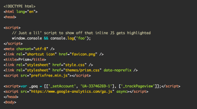
For both examples, many people add syntax highlighting libraries such as PrismJS to help people understand the code example they’re providing.
Certain themes use light-on-light or dark-on-dark values as an aesthetic choice. Unfortunately, this means the code may be difficult or impossible to see for some individuals. The trick here is to select a syntax highlighting theme that uses color values that are high enough contrast that people can actually see each and every glyph of the code.
A way to determine if it is high enough contrast is to use a tool such as WebAIM’s and manually check the color values provided by the theme. If you’re looking for a faster suggestion and don’t mind a little self-promotion, I maintain a color contrast-friendly syntax highlighting theme.
Content That Isn’t Supported By Markdown
Since you can use HTML in Markdown, there are certain kinds of content you’ll see more often than others in Markdown. Here are a few considerations for a couple of them.
Use The title Attribute To Describe iframe Content
HTML’s title attribute is commonly misused to create a tooltip effect. Unfortunately, this causes a lot of headaches for assistive technology users, and its usage this way is considered an antipattern.
The one good use of a title attribute is to provide a concise, meaningful description of what the iframe contains. This description provides assistive technology users a clue about what to expect if they navigate into the iframe to check out its contents.
For Markdown, the most common form of iframe content will be embeds such as YouTube videos:
<iframe width="560" height="315" src="https://www.youtube.com/embed/SDdsD5AmKYA" title="YouTube: Accessibility is a Hydra | EJ Mason | CascadiaJS 2019." frameborder="0" allow="accelerometer; autoplay; clipboard-write; encrypted-media; gyroscope; picture-in-picture" allowfullscreen></iframe>Much like your link text, you’ll also want to avoid generic and repetitive title content. YouTube’s embed code defaults to YouTube video player, which isn’t so great. We can do a little better and update that to YouTube: Video title. This will especially help if there’s more than one YouTube video embedded on the page or view.
As to why YouTube does it this way when it already knows the video title information is another problem entirely.
Provide Captions And Transcripts For Videos And Recorded Audio
Speaking of YouTube, another thing you’ll want to do is ensure your video and audio have captions and transcripts.
Captions
Captions display a text version of video content in realtime as it is being spoken, allowing someone who biologically or circumstantially cannot hear audio to be able to understand the video’s content. Captions can also include sound effects, music, and other cues that are important to communicating meaning.
Most popular video hosting providers have features to support captioning, including displaying them in an embedded context. The important part here is to avoid craptions—manually review automatically generated captions to ensure they make sense to a human being.
Transcripts
Transcripts are caption’s sibling. They take all the spoken dialog, pertinent sound effects and music, and other important details and list them outside of the embedded video or audio. There are many benefits to doing this, including allowing someone to:
- Read through the video and audio content at their own pace;
- Modify the size and presentation of the content;
- Print the content out or convert it into a format that’s easier to digest;
- More easily discover the content via search engines;
- More easily translate the content.
Reader Mode
Like other Markdown-adjacent concerns, Reader Mode can offer a lot of benefits from an accessibility perspective.
If you are unfamiliar, Reader Mode is a feature offered by many browsers that strips away everything other than the main content. Most reader modes also provide controls for adjusting the text size, font, line height, foreground and background color, column width, even having your device read the content out loud for you!
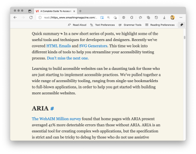
You can’t directly trigger Reader Mode by using Markdown. Longform Markdown content, however, is often rendered in templates that can be set to make them Reader Mode-friendly.
Mandy Michael teaches us how to do this in her post, Building websites for Safari Reader Mode and other reading apps. A combination of semantic HTML, sectioning elements, and a dash of structured microdata are all it takes to unlock this great feature.
You Don’t Have To Do Everything At Once
This is a long post that covers different aspects of Markdown and how it interacts with other technology. It can seem daunting, in that it is a lot of content to cover across a few different subject areas.
The thing about accessibility work is that every little bit helps. You don’t have to address every consideration I have in this post in one big, sweeping change. Instead, try picking one thing to focus on, and build from there.
Know that each tweak and update will have a direct impact on someone’s quality of life when using the web, and that’s huge.
