- How to Get the Best Converting Shopify Themes Due to Successfully Selected Website Template
- Tools for Better Shopify Themes Conversion
- TOP-10 Best Converting Shopify Themes
Have you found your niche and want to be at the forefront of commercialization? Have you decided to open your own online store and actively engaged in its promotion? The leading eCommerce platform Shopify 2.0 will help you successfully cope with this task. Service offers a variety of themes to create a customized design of your website and is filled with a wide variety of useful analytical applications for the study of sales.
Attention Shopify Theme Makers!
Start selling your Shopify themes at the TemplateMonster marketplace. Enjoy author-driven pricing and high commissions. Get a share of up to 70% for exclusive items, and 40% for non-exclusive ones.
With a high-quality Shopify theme on hand, you will launch your project with an excellent design and built-in programs will help to improve the conversion of site visitors into buyers, increase the frequency and volume of purchases. It is the conversion of sales and its increase that affects the fact that a greater number of buyers turned from potential to real.
Using marketing techniques allows to actually increase the number of sales of your site, attract new customers and therefore increase the percentage of conversion. This indicator is one of the most distinctive for commercial sites. On the Internet, you will find many ideas that will help you in promoting your project. Now psychological and behavioral methods of influence on buyers and especially e-marketing are becoming popular. Shopify is an excellent platform to successfully implement your project and conduct serious analytical work with your Internet visitors.
We recommend you visit all relevant links on the TemplateMonster marketplace. So you can choose the most suitable for your business and purchase any of them in a few clicks. Or relax and enjoy a demonstration of Shopify themes by TemplateMonster.
How to Get the Best Converting Shopify Theme?
Shopify is one of the best eCommerce platforms out there. They have started in 2004 and since then many business owners are transitioning to the platform. In fact, there are currently more than 500,000 active stores operating on Shopify аnd together they have increased sales by more than 40 billion. Some of the most famous customers are General Electric, Amnesty International, Tesla Motors, Encyclopedia Britannica, Foo Fighters, GitHub and others.
To run a successful Store there are three aspects of your site that you need to hone:
- Professional design;
- Quality of your images;
- Your “About us” page.
Once you master all the above, you have a chance of making a sale. The best Shopify Stores have a great design.
But if you want to be more confident so you could attract more visitors consider following recommendations:
- Use web page elements that will captivate your audience — full-size images are a great example.
- Use minimal design avoiding chaotic projects. You should choose a target for your webpage and make the conversion path as easy as possible. It is important to remember that less is usually more.
- Explain clearly what you’re selling: you have about five seconds to report what you’re offering. Otherwise, there’s a good chance the buyer will turn off your site and head to your competitors. The same goes for your USP. You need to indicate what sets you apart from the crowd — social proof, a bright, nifty tagline, gorgeous product images, etc.
Buyers like visual effects so it’s no surprise that high-resolution images leave such a good impression on buyers like ones used in this multipurpose Shopify theme. They attract customers while paying attention to the benefits of your product.
Always post different product photos taken from another perspective. This helps the buyer visualize themselves wearing, using or having the item. Online shoppers don’t experience the same sense of security while viewing a product. This is where high-quality photos help to bridge the gap. You could even use the 360°С photography widget to allow shoppers to see every aspect of your product. It is also advisable to use the Zoom function — most often consumers want to see your products more detailed, especially if they are expensive.
It goes without saying that if someone visits your “About Us” page, they have a good chance to learn more about your store and products in general.
So don’t disappoint them. Your “About Us” page should do the following:
- Tell the captivating and bewitching story of your brand.
- Explain in more detail what exactly you offer. If these are 3 levels of goods: including packaging, delivery and other services, tell us about it.
- Provide feedback and other forms of social proof.
It’s also a great place to post your contact information as there’s a chance that after browsing your “About Us” page potential clients have a question they want to ask, — Who knows? Maybe you’ll connect with your next fan. With this advice, you can create your own stores and there are Shopify themes worth it for buying.
Things That Increase Shopify Themes Conversion
A large store always has many channels for attracting traffic, and they all have different conversion rates. It’s stupid to refuse those channels where conversion is low if they are effective on ROI. Roughly speaking, every second citizen buys a used car, but only every forty thousandth — a Bentley. Nevertheless, the economic effect of buying a Bentley allow getting an impressive profit.
Shopify is a place where beginners can create products, manage inventory and share promotions to advertise their own project and take development lessons. Overall it is a beautifully built eCommerce platform with a variety of themes that look modern and stylish but also simple and minimal. Shopify has a well-thought-out set of features. You have the opportunity to install the necessary programs from the store. All tasks from order processing to inventory management are passed back to you. The platform also provides an interface called Shopify Partners where developers can play around with new sites without having to open free trials every time.
You can install new themes to customize full-featured websites and easily navigate from Shopify Partner to the site being launched. Also you’ll get a commission for every invited to Shopify customer. With the app, you can use your credit card reader to swipe a customer’s credit card right there. You can even purchase additional equipment from the company, such as a cash register, receipt printer and even a barcode scanner.
Additionally, Shopify offers a mobile application by means of which users can:
- Respond to disputes about the refund of payments right in the app.
- Review all inventory changes made to their products in the last 30 days.
- Shopify also offers one of the largest app stores of all eCommerce.
The Navigation
Set up a convenient site search. Visitors do not have time to understand the site navigation and look for what they need. According to the study by the Online Marketing Institute, 85% of potential buyers leave the site because of its poor design and 83% leave, because they have to take too many actions before they find what they need. If you want to increase conversion, be sure to set up convenient navigation and site search.
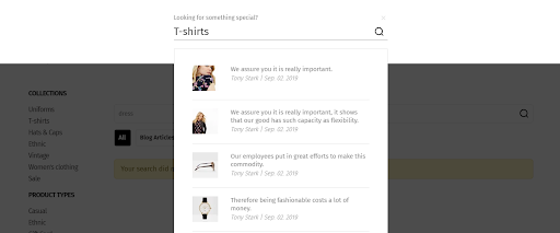
This method looks as if you were searching the entire website, but in fact, it looks for the filtered results of a keyword.
If you have a large assortment or most visitors come to you with a clear understanding of what they need, then the site search function is the first thing you need to configure. Often shoppers are looking for a specific product or are interested in a particular brand. Template Monster designed the search bar in such a way that it is simply impossible not to notice.
It is recommended to observe the following settings:
- search by product name or its catalog number;
- typos and autocorrection search;
- the withdrawal of suitable goods if nothing was found on a specific request;
- search for characters and abbreviations.
Make your search faster and easier with the auto-complete feature. It works like this: the user starts to enter a word, a drop-down list appears with the corresponding goods. It’s great if you can display not only the name but also the image in the list.
The Call to Action
These are tips for creating a call to action that will quickly convert leads to buyers:
- Before sending a call to action message, first, take a couple of minutes to write down what goals you are pursuing with your call and what actions you want your audience to take.
- Start with a convincing verb. The goal is to get your audience to act. Remember, a call to action is always a verb in the imperative form. For example:
- “Call”;
- “Download”;
- “Pick up”;
- “Buy”;
- “Register”;
- “Listen” and so on.
- In addition to convincing verbs, you will need to add “fashionable” words and phrases without abstruse turns. Including too highly specialized terminology in the call, you can get the opposite effect and lose the trust of your audience.
- This may seem obvious, but if your call to action has a deadline, such as “sign up before the end of the month”, it may be an additional incentive for your audience to take action. Much like the upcoming report completion date, customers sometimes need to have these little ticking clocks constantly counting their time.
- The location. If there is not enough text on your page, place the button as high as possible. If your funnel has more content, it might make sense to put your call to action at the bottom. It’s also recommended that you place it on the right side of your sales funnel landing page. What for? According to Gutenberg’s chart, people usually read from top to bottom, from left to right.
- Optimization on all platforms. Most likely, your audience will look at your sales funnel not only on a computer. Thus, you need to make sure that your call to action is clearly visible on tablets and mobile devices.
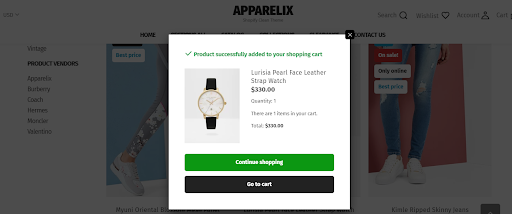
The Heat Map
Perhaps the best way to feel yourself in the shoes of an ordinary site guest is not to read dry statistics on the duration of the visit or the number of pages viewed. You can see in real time which elements on the page attract more attention. It will also be clear which of them are often clicked on, how far they scroll and move a person’s eyes. For this heat maps are best suited.
They are divided into three types:
- Click map. Shows which elements of the site are most often clicked by visitors.
- Map of mouse movement. Shows which elements and zones the cursor most often stops at.
- Scrolling map. Shows how far the page scrolls.
It should be noted that the mouse movement map does not have maximum visibility, since most often the cursor moves to where the person wants to click, so the analysis of this action will give much more reliable information. Having studied it, you can find options to improve the usability of the site. For example, you have an active element, which is a link to the internal section of the page, but the heat map indicates that it is not often clicked on.
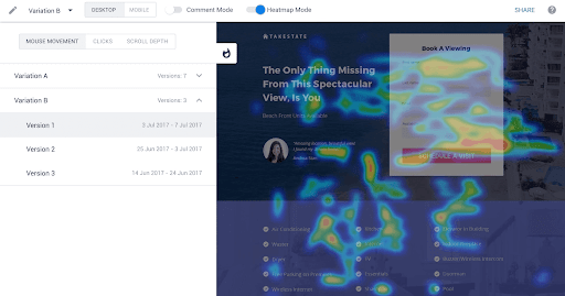
Therefore, it is necessary to make the visitor understand that this element can be clicked. If it is text, then it can be highlighted or emphasized. If the graphic element is to give a word hint, move it to another place or add minimal animation. Conversely, you can find that visitors may misunderstand the purpose of any design elements: click on the arrows or pictures, waiting for a transition to another page or drop-down menu. In this case, you can either clear the site of graphic garbage or endow it with some useful functions.
A scrolling map is especially useful on landings, where it is possible to evaluate which blocks do not hold attention or which patience ends for the visitor, and he closes the page before you get to the most necessary part.
By Authorization Process
Avoid intrusive authorization. Do not force users to register only to visit the catalog or add products. Ask for his data only at the payment stage. The secret is simple: the faster the user goes through the checkout process, the more often they will complete this order. If you want the customer to accurately register an account, invite him to do this after ordering. For example, promise to send information on the status of the application to the indicated mail.
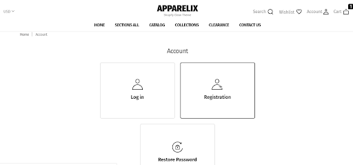
You need to build a sales funnel for your online store, starting with traffic and ending with the receipt of goods. Moreover, this funnel can be with “branches” — for example, for placing an order on credit, for each type of delivery. Each level of the funnel should have its own indicators.
Take for example a questionnaire for the purchase of goods on credit which is on the site of the “Connected”. During the work with her we made several conclusions:
- If you remove one of the fields, the conversion to the order increases, but the bank rarely approves the loan.
- Entering SMS verification reduces conversion, but increases the redemption of goods.
- Many numerous warnings and checks in the questionnaire reduce the conversion but at the same time the number of errors due to which the client is refused to issue the goods.
Another case will prove that all processes must be considered in more detail. Testing the new checkout process without authorization showed a 4% increase in conversion. But having expanded it according to the sources of traffic, we saw that the conversion behaved extremely diverse. On the part of sources, it has grown and on the other part, it has fallen. It turned out that the fall occurred on those channels where there is a high proportion of old visitors. For example, this is direct traffic. That is people who buy often are used to using authorization a personal account. Part of the visitors was so inconvenient to place an order without an account that they either refused to purchase or went offline after it. Further analysis and refinement of the order process allowed us to increase the conversion by another 3%.
Consider 3 options for adding goods to your favorites list on the site:
- Without authorization. Such a list is something like a preliminary basket. Users can add several items there, delete them or send them to the basket.
- With authorization. This option is not as convenient for the buyer as the previous one. You will have to register on the site to use the tool. On the other hand, it will be possible to return to the favorites list after a while. And you can remind about the selected products in the newsletter.
- To browser bookmarks. This is an “ancient” option, not as convenient as the previous ones, but it is sometimes used.
The ideal option is a mix of the first and second methods. Unregistered users can add goods to the temporary favorites list, and registered users can save the list.
Payment Section Optimization
The inconvenient or incomprehensible payment section is one of the reasons why users drop out of the cart. Here are some tips on how to make payment in your online store easy and painless.
Let all the necessary information and the data entry form be located on one page. Firstly, it’s just convenient and secondly, the buyer will immediately see what is required of him.
Do not ask him to indicate the fax number, mother’s maiden name, and the dog’s name. Ask for only a minimum of necessary data.
Reduce the payment process as much as possible. Do not ask the user to be sure to register in your personal account. For those who have already made purchases from you, offer to do it in one click: the system remembers the user data at the first payment and no longer asks to enter them.
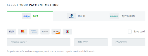
Set as many ways as possible. Do not rely on the fact that each of your customers will have a VISA card or Qiwi wallet. Add MasterCard, MIR, Yandex Money cards to payment methods — this will allow you to expand your audience.
Tests for popup windows to increase conversion
There is a stereotype that pop-ups annoying visitors, and they are useless. This is not so: a global SumoMe study based on an analysis of 2 billion such windows showed that conversion among successful is about 9.3%, some reach 50%, and the average is 3%. Pop-ups work if they are properly configured and included in the content for the benefit of the client. For example, the online store of fruit bars Kutoa increased the conversion to purchase by 147% due to the competent use of them offering a 20% discount.
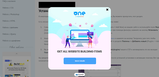
Are you sure that the pop-ups on your site work with 100% efficiency? This is also capable of forming high converting Shopify themes. If you have not conducted tests of popup-windows in order to find out what exactly can “hook” the audience, then most likely — no. Fortunately, you can always correct this annoying misunderstanding.
And if you are wondering what to experiment with in the first place, in this material you will find several options. Greg d’Aboville, Head of Client Success at WisePops and a skilled popup designer based on hundreds of split tests, provides several examples of pop-up tests that can significantly change your current and future marketing campaigns.
Test No. 1 — Window delay
It is generally accepted that the best time for a popup window to appear is right after someone “landed” on the site, but this is not always the case. A window should appear at a time when the visitor is most susceptible to your message. If the pop-up text opens immediately, it may interfere with the process of studying the proposal and knock the user out on the way to his goal on the site. At the same time, if you wait too long, visitors will leave the resource without having met your offer. Of course, if you do not use exit-popup, which appears when you try to close the tab. Choosing the right moment is quite difficult. But split testing will help solve this puzzle.
Test No. 2 — Reducing the amount of text in a popup window
Text placed in a popup window should capture attention and emotionally engage users so that the performance of the target action is less painful for them. However, one should not forget that they may not have enough time to read the entire text. And the only way to find out the optimal amount of information that a visitor needs to submit is to test the length of the text. The corresponding test was conducted by one of the companies that tested a popup-window with a large amount of text and its shortened version.
And that’s why:
- A short text requires less time to understand and make a decision based on it. The purpose of a pop-up window is not to sell anything, but to convince a person to take a specific action. In this case, users needed much less information than if they were making a purchase decision. The concise text will allow you to bring the visitor to the subscription pretty quickly, without forcing him to analyze and reflect on your proposal for too long.
- The fewer words, the more effective personal appeal. It is worth noting that in the abridged version of the text in the example the word “our” (ours) is missing. The consequences of such a step may seem insignificant at first. However, at the same time, the word “your” (your) remained in its place — one of the most powerful words in sales.
- Less text will increase the font. Fewer words will allow you to make the text larger. And if you didn’t already know, then let us know: a lot of marketing research proves that a larger font leads to an increase in conversion.
- The smaller the text, the more noticeable the numbers. According to Unbounce website visitors give preference to headings and materials that contain numbers.
Test No. 3 — Create a stronger title
The title plays an important role in unlocking the conversion potential of the popup:
- he attracts attention;
- draws attention to the benefits that can be missed;
- helps the user to make sure that the submitted offer is addressed to him;
- convinces him to read the text to the end.
Agree that the solution to all these problems is not an easy task. But which title to choose: simpler and more straightforward or florid and ambiguous?
Test No. 4 — Correlation of display time
Delaying the appearance of a window is not the only way to demonstrate your proposal when people are ready to accept it. An important point is the ratio of the time of impression with participation. Those visitors who spent more time on the site will receive your message more favorably.
The Retail
Of course, not all visitors turn into buyers. Someone came just to see, someone was asking the price and someone did not like the assortment at all. However, management seeks to turn visitors into buyers. For business, this is profit, and for employees, monetary motivation.
The performance of organizations in any industry is determined by the number of sales. It is important when a casual visitor has turned into a real buyer. Pay attention to conversion rates. If it is low for visitors and buyers, this means that people come to the store, but do not buy anything.
Experts believe that this happens for two reasons: an error in the calculation of the goods (merchandising) or the low efficiency of sellers. In the first case, it is enough to adjust the location of the products. The correction of the second reason is to train employees.
Each normal organization seeks to increase the efficiency of its work and turn casual visitors into buyers. Moreover, so that they later become regular customers.
For these financiers are advised to adhere to the following simple rules:
- the seller’s constant presence in the buyer’s visibility zone;
- convenient store navigation;
- sellers should be constantly trained in various sales training;
- product and price matching;
- the seller should be friendly and competent, but not intrusive;
- non-cash payment method;
- organization of a children’s room.
It happens that to increase the conversion requires negligible financial costs. However, if there is a need for this, then it must be satisfied.
The Design
Conversion Centered Design is a discipline aimed at solving one specific business problem. The main principle: to direct the visitor along the path to one specific action, using convincing design and psychological triggers, as tools that increase conversion (return).
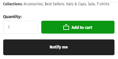
It is desirable that the site looks attractive, while not overloading the channels of perception. If there is a button “Buy” or “Subscribe”, then it should be clearly visible against the background of everything else. You should not use the entire color palette and make a rainbow from the site. Your site is convenient and comfortable for a person to study information.
Now the web resource must have a mobile version because more and more people access the Internet from phones and tablets and not from computers. In this case, pay attention to the font size and the display of all important blocks. The page must have good quality pictures. Video content that many users like is also welcome. In one book on web design, I met a tip to halve the heading of a site. In my opinion, it is as brilliant as it is simple.
When a person opens a page, it is necessary that he sees the main thing, that will interest him. But on many resources, he can only see half the screen, the other section is occupied by the menu and secondary elements. To get to the important information, you have to scroll down for a long time, and this is boring and uninteresting. In this case, there is a high probability that the visitor will close the page without realizing what sellers are offering.
Security
In a survey conducted by Econsultancy, it turned out that 58% of respondents interrupted ordering due to concern about security. On average, the conversion for the payment page is 32%, improving this indicator will allow you to significantly increase the conversion. To understand how many users stop interacting with the site on the payment page, you can build a funnel — maybe this is a bottleneck that you were not aware of?
It is important that buyers are not afraid to send you money. Make sure that your online store has the following:
- logos of popular payment systems: VISA, Mastercard, PayPal;
- https protocol — it provides more reliable protection than http;
- a public offer where all the interactions between the seller and the buyer are described in detail and clearly;
- a separate block about the conditions of return, because buyers choose the goods almost blindly and always assume the possibility of a return if the purchase does not suit them.
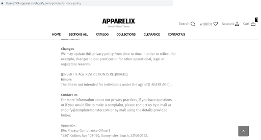
Not everyone attaches value to these nuances, but it is important to comply with them. Without them, there will be no trust, which means people will be less likely to buy from you.
TOP-10 Best Converting Shopify Themes
When it comes to eCommerce, the design of your site plays a key role. This can lead to sales or to a fall, or to an influx of customers. Despite the fact that you probably want to launch a new site as quickly as possible, it is important to first make sure that you have chosen the right eCommerce platform and the best theme for the site. Shopify is the leading eСommerce solution, and we have many beautiful, feature-rich themes.
It doesn’t matter if you need a theme for your own online store or for the design of your client’s website, you won’t lose out with us. Choose the highest converting Shopify themes to get more profit from your activities.
Flairzy Fashion Shopify Theme
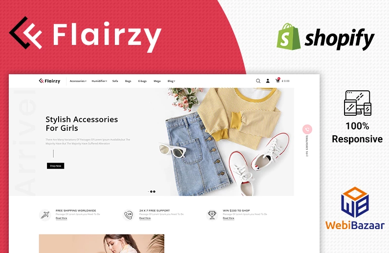
This is the best theme for an online fashion store. Her diverse selection of layout options, appearance and settings, win her all kinds of praise.
The theme provides many features, such as:
· SEO friendly interface;
· detailed product design;
· advanced refinement search;
· cloudzoom;
· convenient view of the product;
· one-click viewing;
· sorting options;
· Drag & Drop.
You can use Google Fonts, Standard Fonts or upload your own font. Responsive design and dynamic layout are personalizes your page. This way you get a fully customizable website with unlimited number of banners including sliders.
The theme boasts a number of unique built-in functions:
· instant grid / list view;
· leaflet and AJAX toolbar that sticks to the menu window;
· alternative images;
· HTML5 and CSS3 editing options and other tools.
This set of tools will help you make the most of eСommerce to grow your online store.
Auto Gusto Automobile Parts Shopify Theme
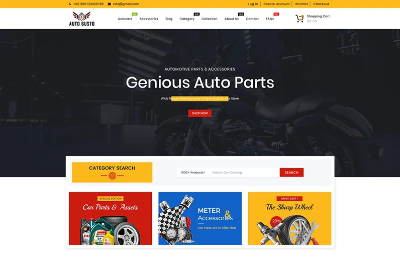
Launch your eCommerce website with a great Shopify theme. It is adaptive to standard screen extensions. It has a convenient control panel with an intuitive interface. For the effective operation of the online store you do not need to have the skills of a programmer. If you have them, use HTML5 / CSS3. The template has:
· Valid XHTML and CSS markup сompatible with all major browsers.
· Zero Javascript Conflicts.
· Google Fonts Included.
· Optimized for Quick Load Tim.
· SEO (Search Engine Optimization) friendly.
In addition, you can Drag and Drop Sections, see Product Reviews, do Unlimited Banners and have an SEO Friendly interface. On the main page is the Sticky Menu and recommended, new, special and best products.
The main characteristics of the site include the following:
· Ajax: Cart, Search, WishList
· Cart Dropdown in Header
· Multiple Language and Currency
· Product Quick View
· Parallax scrolling
· Blogs Module
· Sale Countdown for Product
· Scroll To Top Button
· Product Grid + List View
· Brand logo Slider / Grid on Homepage
· Product zoom
· Extra link blocks in Footer
· Attractive Breadcrumb with parallax image
Dream Auto Parts Sectioned Shopify Theme is great for creating an online shop for selling auto parts and tools. Choose an assortment of goods depending on the calculated profitability. Thus, you can trade tires, batteries, headlight discs, engines and other devices. All powerful convenient functions of this Shopify theme will attract more customers to your online store and increase sales.
Croin — T-shirt Multipage Clean Shopify Theme
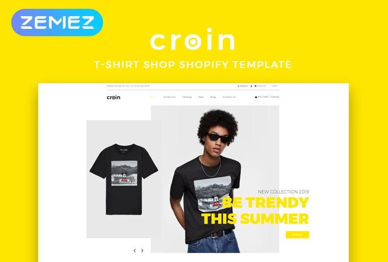
Brave and fresh – two words that describe this Shopify Theme very well. It is aimed at customers who seek quality and clarity. Here you can create a section with banners. They come in two sizes. Attach them to the entire collection.Their size, respectively, is 700×420 and 420×420.
To make a call to action, you can use pictures of the following sizes:
· small (570×320);
· medium (570×570);
· large (570×760).
To attract more customer attention, place your products in columns. Each column of the selected collection displays from 2 to 6 products. Add 9 new exclusive collections to your store and from 6 to 18 logos. Place your product wherever you want and how much you want. When adding stocks, you can set a timer that will count down the reverse time.
To create clients content you can append blocks with an image and / or text. It can be such widgets as:
· YouTube video.
· Product.
· Collection.
· HTML code.
You can change the size of each block 25, 33, 50, 66, 75 or 100%.
Coffee Time — Coffee Store eCommerce Elegant Shopify Theme
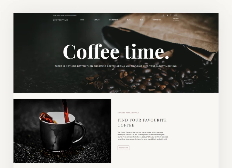
This Shopify theme for coffee stores has a clean design, a responsive layout, support for large inventories, custom modules for blog posts, SEO optimization, social media icons, homepage video support, free stock photos, and more.
To make a call to action, you can use pictures of the following sizes:
· small (370×209);
· medium (370×400);
· large (370×449).
Show your collections with banners for better visualization of products and increased click-through in the collection lists. Choose size 33%. 42% 58% in large and small sizes. You can add up to 9 banners.
Post your Call to Action using images of the following sizes:
· small (570×320);
· medium (570×570);
· large (570×760).
Coffee has long won the hearts of many people. Most of them often look for quality beans. Build your website and give potential buyers the opportunity to find what they need using this Shopify Theme.
BOSS — Apparel eCommerce Modern Shopify Theme
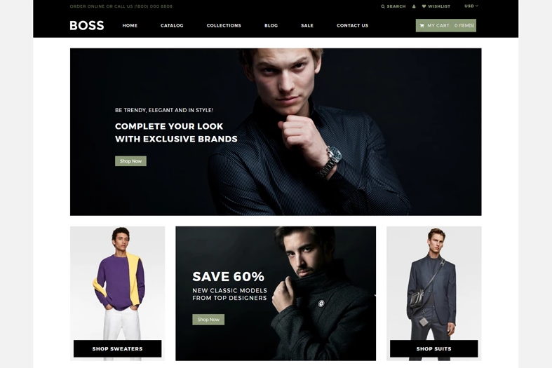
This is a minimalist design theme with which your store will elegantly display on all devices and screen sizes. She will surely give your shop a luxurious and attractive look.
To make a call to action, you can use pictures of the following sizes:
· small (370×209);
· medium (370×400);
· large (370×449).
Start a personal blog. Tell your customers about new arrivals to your store. Post your articles in blocks of 3, 6 and 9 segments. At the same time, pictures of such sizes are available to you:
· small (370×245);
· medium (370×370);
· large (370×493).
In addition, if you do not have programming skills, you can purchase the Shopify theme and edit your online store without coding. BOSS Shopify was designed specifically for fashion stores. Using it, sell clothes, accessories and other goods with the help of ready-made solutions.
Pureleaf Organic
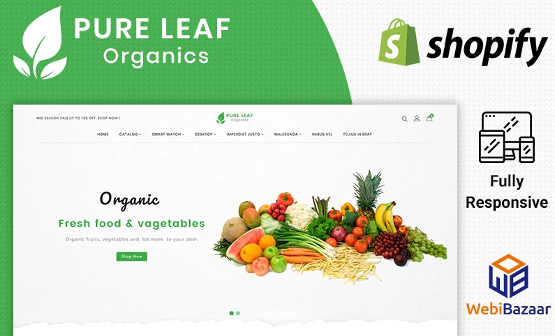
Pureleaf Organic is a modern and professional Shopify theme. It 100% meets the needs of the client and is adapted to create a successful platform. The theme has a high resolution due to which it looks amazing on the screens of all types of devices. It has an easy well-systematized and optimized eCommerce structure. Shopify offers a fantastic platform for you to create a store at no extra cost.
Here are the main modules:
· Quick View Popup. By clicking on Quick View, it displays the product details.
· Add To Cart Ajax. Products supplemented to cart without leaving current page.
· Instafeed. Connect with your instagram account and display instafeed.
· The Latest Blogs. Manage blog posts and display it at the front office.
· Product Reviews. Allows users to post reviews and rate products.
· Search Autocomplete. It will display related product of search item in list.
· Parallax Image. Modules contain background image with parallax effect.
· Responsive Banners. Banners are automatically set in all media.
Demo content is the perfect solution to organize a ready-made shop in just a few clicks. You can modify it very easily to make it fully fit your needs. The theme includes an easily customizable interface with a drag-and-drop feature. Pureleaf is filled with a host of exclusive and popular lineaments for users that can charismatic change your online business.
Additional opportunity:
· Unique product detail design.
· Specify The Search In Advance.
· Convenient product view.
· Product image magnification.
· Last blog.
· HTML5 and CSS3.
· Fully Responsive And Retina Ready.
· SEO friendly.
· Drag & Drop.
· Product Sorting Options.
· One Click QuickView Product.
All images that you will use for the design of the page are protected by the copyright of their owners. Pictures used in live preview are not included in the package.
Toy Store
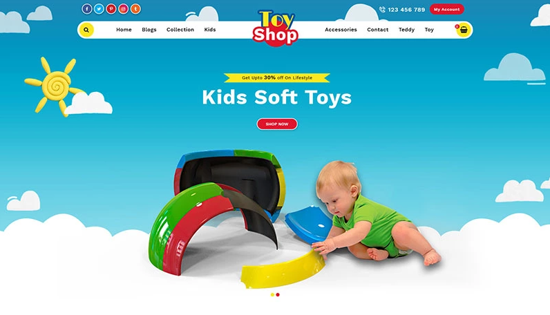
Here you can select page layouts. See all demos. All modules are editable in backoffice and do not require coding knowledge. You can select the contents of the following elements:
· home page;
· collection list;
· product page;
· all blog page;
· single blog page;
· wishlist page;
· Contact Page;
· Maintenance Page;
· All Collections Page.
The main features include the following functions:
· Easy Installation. Complete one-click theme installation.
· Easy to install theme. Theme installation on single click.
· Easy Configuration. All modules are configurable by backoffice.
· Fully Responsive. Look good in all devices (desktop, tablet, mobile).
· Wishlist. Add your favourite product in wishlist.
· Multiple Layout. Switch on another theme by one click at backoffice.
· Sticky Menu. Easy navigate to another page. It displays in all pages in all media.
· Module Configuration. Change module details at back office as per requirement.
· Code Validated. Nice coding and validated for PHP, HTML, CSS, JavaScript.
Medicava — Medical Equipment Multipage Clean

At the present stage of development of society, it is extremely important to monitor your health and treat diseases in a timely manner. Guided by this truth, you can promote your online store. This Shopify theme has specialized buttons that allow you to organize information and filter products according to various criteria. Thus, the client can receive such goods and services:
· medical clothes;
· first aid;
· diagnostics;
· wound care;
· necessary medications;
· call a doctor at home.
Offer your customers detailed product information and share the techniques of famous healers through blogging. Tell the patient how to develop wrist joint contracture more efficiently using the special simulators that are sold in your store.
It is recommended that you add blocks with an image and text to render the content. To do this, use the following buttons:
· YouTube video.
· Product carousel.
· Collection.
· HTML code.
In addition, Medicava offers to display your products in a special carousel. This will allow the customer to view the most popular products or bestsellers without having to go to the product page. Thus, you can display the goods in one or two rows, placing them in 4, 8,12,16 or 20 items with pictures.
Dand — Hair Salon Multipage Modern

More recently, men were not unfamiliar with the concept of “barbershop” — they went to male hairdressers for a haircut, and it was somehow not customary to wear beards. However, in just a few years, the situation changed radically — the barbering culture penetrated the veins of megalopolises, from where it quickly grew into small veins of cities, infecting everything around with the impudent spirit of the harsh male underground.
In addition to standard haircuts, offer customers unusual services, such as:
· head massage during washing;
· pedicure and fish therapy;
· hair removal by fire.
If you want to attract a client with one haircut or want to arrange an action, create a single picture. You can choose the size:
· small (370×370);
· medium (570×570);
· full-width (1170×520).
Shopify theme includes not only attractive design, but also features such as the “map menu”. Here you can find various options for beard haircuts, opening hours, information on service providers, as well as high-quality photographs. Simply put, they offer everything you need to create a successful website for your beauty and health business.
JewelShop — Accessories Elegant

JewelryShop is a responsive eCommerce theme suitable for any type of jewelry store. Modern and elegant design. Its features include: a mega-menu, many layouts, a landing page with the product, a blog and CMS pages, and a parallax slideshow.
This is an elegant eCommerce template specially designed for professional online stores. Sell jewelry in this online store such as:
· earrings and clips;
· rings, including wedding ones;
· bracelets and pendants to them;
· tiaras and jewelry hairpins;
· diamond sets;
· jewelry from famous designers and other related products.
Place in this section any photos: goods, company, collections, etc. Add up to 4 pictures, placing them horizontally and stretching across the entire width of the screen. You can choose their size yourself:
· small (570×320);
· medium (570×570);
· large (570×760).
The template comes with the ability to change color for product pages, advanced navigation with a filter and a pop-up window with a newsletter subscription. In addition, the SEO theme is optimized.
The design of your site is a key element in the success of your eCommerce and must be done right the first time. Use the power of SEO, apply neuro-linguistic programming methods and triggers, thereby reducing the number of refusals from purchases at the basket stage.
Provide compelling material. Make sure your homepage has a clear and compelling call to action. You must be sure that your materials make clear what your store is and what you do. Pay attention to product reviews and reviews.
Read Also
Should You Use Shopify or Wix for Your Online Store? Let’s Find Out Together
Get Additional Income with Shopify
What You Need To Know About SEO for Your Shopify Store
Shopify Partners: What is a Shopify Partner Program and How to Become a Partner?
The post Best Converting Shopify Themes 2021 appeared first on MonstersPost.
