It’s no secret that SVGs are super powerful, and yet, they still manage to surprise. Have you ever considered using SVG’s internal coordinate system to create a responsive image grid, for example, or adding texture to an SVG? In this post, we’ll look into some magical SVG techniques that open up new possibilities.
SVGs have become more and more popular in the past few years. For good reasons. They are scalable, flexible, and, most importantly, lightweight. And, well, they have even more to offer than you might think. We came across some magical SVG techniques recently that we’d love to share with you. From SVG grids and fractional SVG stars to SVG masks, fancy grainy SVG gradients, and handy SVG tools. We hope you’ll find something useful in here.
By the way, a while ago, we also looked at SVG Generators — for everything from shapes and backgrounds to SVG path visualizers, cropping tools, and SVG → JSX generators. If you’re tinkering with SVG, these might come in handy, too.
Generative SVG Grids
Generative art is a wonderful opportunity for everyone who would love to create art but feels more at home in code. Let’s say you want to create geometric patterns, for example. Generative art will take away the difficult decisions from you: What shapes do I use? Where do I put them? And what colors should I use? If you want to give it a try, Alex Trost wrote a tutorial on creating generative art with SVG grids that is bound to tickle your creativity — and teach you more about SVG.

The generative art that Alex creates is a grid of blocks with a random number of rows and columns. Each block has a randomly chosen design and colors from a shared color palette. Alex takes you step by step through the process of coding this piece: from setting up the grid and creating isolated functions to draw SVGs to working with color palettes, adding animations, and more. A fun little project — not only if you’re new to generative art and creative coding.
Generative Landscape Rolls
An awe-inspiring project that bridges the gap between a century-old tradition and state-of-the-art coding is {Shan, Shui}. Created by Lingdong Huan and inspired by traditional Chinese landscape rolls, it creates procedurally generated, infinitely-scrolling Chinese landscapes in SVG format. The mountains and trees in the landscape are modeled from scratch using noise and mathematical functions. Fascinating!

Now, if you’re asking yourself how something as complex might work, you’re not alone. Victor Shepelev wanted to get behind the secret of {Shan, Shui}* and made it his advent project to understand how it works. And, indeed, it took him 24 days to fully dig into the code. He summarized his findings in a series of articles.
SVG Paths With Masks
SVGs have a lot of benefits compared to raster images. They are small in size, scalable, animatable, they can be edited with code, and a lot more. You can’t get the textured feel that raster graphics can provide, though. However, we can combine the strengths of vector and raster to create some charming effects. Like Tom Miller did in his Silkscreen Squiggles demo.

Silkscreen Squiggles is an animation where squiggles fill a rectangular canvas. What makes the squiggles special is that they appear to have a paintbrush texture. The secret: a mask with an alpha layer that gives the simple squiggly paths their texture. Alex Trost dissects how it works. Inspiring!
Grainy Gradients
Noise is a simple technique to add texture to an image and make otherwise solid colors or smooth gradients more realistic. But despite designer’s affinity for texture, noise is rarely used in web design. Jimmy Chion explores how we can add texture to a gradient with only a small amount of CSS and SVG.

The trick is to use an SVG filter to create the noise, then apply that noise as a background. Layer it underneath your gradient, boost the brightness and contrast, and that’s already it. Potential use cases could be light and shadows or holographic foil effects, for example. The core of this technique is supported by all modern browsers. A clever visual effect to add depth and texture to a design.
Adding Texture And Depth
“Analog” materials like paint and paper naturally add depth to an artwork, but when working digitally, we often sacrifice the organic depth they provide for precision and speed. Let’s bring some texture back into our work! George Francis shares three ways to do so.

The techniques that George explores are quite simple but effective. Tiny random shapes added to a canvas at random points, solid shape fills with lines, and non-overlapping circles distributed evenly but randomly with an algorithm. Inspiring ideas to tinker with.
Cut-Out Effects With CSS And SVG
In a recent front-end project that Ahmad Shadeed was working on, one of the components included a cut-out effect where an area is cut out of a shape. And because there are multiple ways to create such an effect in CSS or SVG, he decided to explore the pros and cons that each of the solutions brings along.

In his blog post “Thinking About The Cut-Out Effect”, Ahmad takes a look at three different use cases for a cutout effect: an avatar with a cut-out status badge that indicates that a user is currently online, a “seen avatar” that consists of overlapping circle avatars that are indicators that a message has been seen in a group chat, as well as a website header with a cut-out area behind a circular logo. Ahmad presents different solutions for each use case — SVG-only, CSS-only, and a mix of both — and explains the pros and cons of each one of them. A comprehensive overview.
Fractional SVG Stars
Are you building a rating component and you want it to support fractional values like 4.2 or 3.7 stars but without using images? Good news, you can achieve fractional ratings with only CSS and inline SVG. Samuel Kraft explains how it works.

The component basically consists of two parts: a list of star icons based on the max rating and an “overlay” div that will be responsible for changing the colors of the stars underneath. This is the magic that makes the fractional part work. The technique is supported in all modern browsers; for older browsers, you can fall back to opacity instead. Clever!
Generative Mountain Ridge Dividers
When Alistair Shepherd built his personal website, he wanted to have section dividers that match the mountain theme of the site. But not any mountain dividers, but dividers with unique ridges for every divider.

Instead of creating a variety of different dividers manually, Alistair decided to use a combination of SVG and terrain generation, a technique that is usually used in game development, to generate the dividers automatically. In a blog post, he explains how it works.
If you’re up for some more horizontal divider inspiration, also be sure to check out Sara Soueidan’s blog post “Not Your Typical Horizontal Rules” in which she shows how she turned a boring horizontal line into a cute “birds on a wire” divider with the help of some CSS and SVG.
Flexible Repeating SVG Masks
Sometimes it’s a small idea, a little detail in a project that you tinker with and that you can’t let go off until you come up with a tailor-made solution to make it happen. Nothing that seems like a big deal at first glance, but that requires you to think outside the box. In Tyler Gaw’s case, this little detail was a flexible header with a little squiggle at the bottom instead of a straight line. The twist: to make the component future-proof, Tyler wanted to use a seamless, horizontal repeating pattern that he could color with CSS.

To get the job done, Tyler settled on flexible repeating SVG masks. SVG provides the shape, CSS handles the color, and mask-image does the heavy lifting by hiding anything in the underlying div that doesn’t intersect with the shape. A clever approach that can be used as the base for some fun experiments.
Swipey Image Grids
When you think of “SVG animation”, what comes to your mind? Illustrative animation? Well, SVG can be useful for much more than pretty graphics. As Cassie Evans points out, a whole new world of UI styling opens up once you stop looking at SVG purely as a format for illustrations and icons. One of her favorite use cases for SVG: responsive animated image grids.

Cassie doesn’t build her image grid on CSS Grid but uses SVG’s internal coordinate system (which is responsive by design) to design the grid layout. She then adds images to the grid and positions them with preserveAspectRatio. clipPath “swipes” the images in. The final animation relies on GreenSock to ensure that the transforms work consistently across browsers. If you want to dig deeper into the code, be sure to check out Cassie’s blog post in which she explains each step in detail.
Animated SVG Debit Card Illustrations
What if you could animate a debit card design? Probably not on an actual physical card, but rather for a landing page where you’d like to drive interest towards the card’s design or features? Well that’s an unusual challenge to tackle, and Tom Miller decided to take it on.

In a series of SVG debit card animations, Tom uses GreenSock to animate SVG paths and shapes smoothly, so every card literally comes to life on its own, transforming, rotating, and scaling beautifully, alongside just a few lines of JavaScript. A wonderful inspiration for your next landing page design!
Raster Image To SVG Converter
You need to quickly convert a raster image into an SVG? Then SVGcode is for you. The progressive web app converts image formats like JPG, PNG, GIF, WebP, and AVIF to vector graphics in SVG format.

To convert an image, drop your raster image into the SVGcode app, and the app will trace the image, color by color, until a vectorized version of the input appears. You can choose between color SVG and monochrome SVG and there also are a number of customization settings to improve the output further, by suppressing speckles and adjusting the color, for example. If you install the PWA, you can even use it as a default file handler on your machine. A real timesaver.
Download SVGs From Any Site
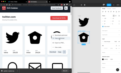
A handy little tool to enhance your SVG workflow is SVG Gobbler. The browser extension finds the vector content on the page you’re viewing and gives you the option to download, optimize, copy, view the code, or export it as an image.

When you click the browser extension, it shows you all SVGs detected on the site. You can quickly download the ones you like or copy them to your clipboard. When you view the code, you can toggle optimization options from SVGO — to beautify the markup or clean up attributes or numeric values, for example. And if you need a PNG version of an SVG, you can export it in any size you want. A fantastic addition to any developer’s toolkit.
Scaling SVGs Made Simple
Scaling svg elements can be a daunting task, since they act very differently than normal images. Amelia Wattenberger came up with an ingenious comparison to help us make sense of SVGs and their special features: “The svg element is a telescope into another world.”

svg element as a telescope into another world, and scaling will become a lot easier.Based on the idea of the telescope, Amelia explains how to use the viewBox property to zoom in or out with your “telescope”, and, thus, change the size of your <svg>. A small tip that works wonders.
Wrapping Up
We hope that these techniques will tickle your curiosity and inspire you to try some SVG magic yourself. If you came across an interesting SVG technique that left you in awe, please don’t hesitate to share it in the comments below. We’d love to hear about it. Happy creating!
