We waste so much today. One way of focusing on what truly matters is by identifying Top Tasks for yourself. Learn how to make tough decisions by focusing on the real, quantifiable evidence that will help create a better experience for your users.
Let us start with a simple explanation of the word “task”. A task is something someone wants to do using your website or app. If you have a technology website, then tasks might include pricing, installation, and troubleshooting. If you have a university website, then tasks might include courses, lecturer/professor profiles, and accommodation. If you have a hospital website, then tasks might include what to do: before treatment, during treatment, and after treatment. If you are running an intranet, then tasks might include training, finding people, pay, and benefits. If you have a website for vaccines, then tasks might include immunity, side effects, and availability.
Now, “Top Tasks” focus on the task itself. Once identified, the next steps include measuring whether people are successful at completing the Top Tasks, and how long it takes them. You’re always trying to improve completion rates and reduce completion times for Top Tasks. It’s about focusing on the outcome from a user’s perspective, rather than the input (content, code, design).
When Should You Consider Using Top Tasks?
- There’s no agreement about what’s most important, and it has been decided that it’s time for some consensus, some unity of purpose and design.
- There’s a need to consolidate and simplify. Too many websites, too many features, too much content. Top Tasks will help you create a single, streamlined, unified approach.
- There is a lot of out-of-date, low-quality content. This tiny task content is cluttering the search and navigation, and you need evidence in order to remove it.
- The navigation is terrible, because it is not focused on top tasks, and instead it is focused on organizational units, systems, ego projects, and vague meaningless terms, such as “Resources”.
- Nobody really knows why they’re doing what they’re doing, whether it really has any value or not. The metrics are all about volume, and chasing volume is not delivering quality or value. Top Tasks is about focusing on what really matters.
It Starts With a Survey
The most essential element of Top Tasks is a survey that identifies a prioritized list of tasks, from the most important tasks (the top tasks) to the least important tasks (the tiny tasks).
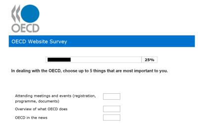
The results from a Top Tasks survey can be used to:
- prioritize features and content on a website or app;
- de-prioritize or remove tiny task features and content;
- design a more effective classification and navigation;
- implement a metrics model based on measuring the success rate and the time it takes to complete the top tasks.
Designing for Top Tasks is about designing for the long term because tasks last. As humans, we do the same core things day in and day out, year in and year out. The first major Top Tasks project I did was back around 2003. It was for a national tourism website, and we ran surveys in multiple countries. The Top Tasks were:
- Special Offers,
- Accommodation,
- Things to Do & See,
- Planning a Trip,
- Getting Here & Around.
In 2020, people still want special offers. They still want a five-star hotel at a two-star price. The tools to help you find that great offer have changed a lot, but the basic top task of wanting a great deal hasn’t and will not change, because deep down we’re all cheap. Another core characteristic of humans is, of course, that we don’t like to be seen as cheap.
When I was carrying out the Top Tasks tourism survey research, I noticed some interesting patterns when it came to search. People weren’t searching so much for “special offers”. Rather, they were searching for “deals”. This is an interesting aspect of search behavior. Sometimes, the words that bring you to a website are not the words that bring you through a website. We found that while people searched for “deals”, they clicked far more on links that said “special offers” once they were on the website. Makes sense. You may search for a “cheap hotel”, but you don’t necessarily want to be greeted on the hotel homepage with a message saying: “Welcome to our dirt cheap hotel!”
Many organizations have said to me that they already know their top tasks because they’ve got search and website analytics. Search and website analytics are simply not sufficient to give you true and comprehensive insights into the top tasks. For starters, they will rarely give you insight on tasks that you have no content on.
Once we did a Top Tasks for a university that specialized in business master’s degrees. A key task that emerged was that potential students wanted to know how doing the master’s would “advance their career”. Nobody was searching to “advance my career”.
The Microsoft Excel Web team noticed that lots of people were searching for “remove conditional formatting”. So, they created a page for this. But the page always got huge dissatisfaction, no matter how much they edited it. Finally, after much research and discussion, they discovered that removing conditional formatting was a symptom. The real task — the true task — was about how to use conditional formatting properly. Top Tasks is about getting to these deeper, truer tasks. Doing it well requires a lot of research, a lot of thinking, and a lot of talking and discussing.
The Top Tasks methodology is a holistic, 360º examination of the entire physical and digital environment. It goes deep and comprehensive, looking at the entire environment that the user exists within, not simply a website or app. So, if you’re looking for a quick fix, if you’re thinking about the low-hanging fruit, stop reading. Top Tasks is most definitely not for you.
Still here? Top Tasks is hard, boring, systematic, rigorous, comprehensive, highly collaborative, time-consuming, and profound work. A typical Top Tasks survey takes about 12 weeks to complete:
- 3-4 weeks to gather an initial list of tasks (typically 200-400).
- 3-4 weeks of collaborative discussions to get to a final list of 50-80 tasks.
- 2-4 weeks to run the survey. Ideally, you want 400-plus responses to get statistically reliable results, but definitely need a minimum of 100.
- 2 weeks to analyze and present results.
Secrets To Success
The more diverse, the more cross-functional, the more cross-departmental, the more user-facing the group of people you get to do a Top Tasks project, the better. If things are working well, you’re going to have deep, almost existential conversations about what is a task, which tasks are relevant, and which are not. If, for example, you were doing a Top Tasks about COVID-19, you’d be examining the total environment, not simply the stuff you have now on your website or app about COVID-19. You’d be trying to get a total map of a pandemic through a series of tasks.
What’s the best group?
- Between three and eight people ideally.
- Broad group of representative stakeholders.
- Genuine experienced people who truly understand human needs.
- If you’re doing an intranet Top Tasks survey, you should have representatives from Support, Marketing, Sales, Products, Web, IT, HR, and Communications.
- If you’re doing a public Top Tasks survey, you should have representatives from Support, Marketing, Sales, Products, Web, and Communications.
- Aim to have the same group throughout the entire Top Tasks process.
I know. I know. I know. Getting this group together is time-consuming and very complicated. If you’re finding it almost impossible, then that’s a message. Your organization is probably not ready for Top Tasks, because if people won’t join the group, then the chances of them or their departments taking the results seriously are very, very low.
Here are the benefits of spending the time and effort to get a great shortlisting group together:
- more rounded and comprehensive task list;
- a much deeper understanding of the organization;
- less likely that tiny tasks from any one department will be over-represented;
- bridge-building and future collaboration;
- identifying tasks that have different names in different departments;
- identifying duplicate content and tools across departments/units;
- greater chance of buy-in and real change when the results are delivered.
When we did a Top Tasks for WHO about COVID-19 in May 2020, here are the top tasks that emerged:
- vaccine (development, availability, safety);
- latest news, latest research (alerts, directives, updates);
- transmission, spread, epidemiology;
- immunity, antibody testing (criteria, availability, accuracy);
- WHO guidelines, standards, decisions;
- symptoms, signs;
- research papers, studies;
- end date, new normal, safe again;
- virus survival/viability/persistence on surfaces, in air.
How did we get to a result like that? The first step is to gather the potential list of tasks. Here are some sources:
- existing website / app;
- top 50 annual search (internal, external);
- top 50 website pages / app sections most visited;
- surveys and research on customers in the last two to three years;
- top 50 annual support, help, feedback;
- competitor / peer websites / apps;
- social media, blogs, communities.
For example, when we did Microsoft Visual Studio, we got lots of great tasks by visiting the independent developer communities. Depending on the complexity of the environment, the initial longlist of tasks can range from 200 to 400. In exceptional circumstances, such as when we did a Top Tasks for the European Commission, it ran into thousands.
Below is a tiny sample of these early tasks for a healthy environment:
- access to my journal;
- advice in cases of physical disability;
- advice on treatment or hospitals abroad;
- advice, guidance, rights, and practical information to relatives;
- aids (prostheses, wigs, etc.);
- aids in the hospital/treatment site;
- alternative treatment;
- analysis and testing of organic food;
- analysis of food safety (pesticide, dioxin…).
You can see that there’s a lot of work to be done to get from this rough list of hundreds to a refined list of 50-80.
Shortlisting: the Hardest Part
Words are by far the most powerful — and often most underrated — invention humans have ever made. Without words, there is no Web. The Web is built from words, from the first search to the last click. Getting the words exactly right, and organizing them in the most intuitive way can prove so challenging that many organizations simply ignore the challenge or address it in the most flippant, derisory manner.
Tasks are the things people want to do on your website or app. More than anything else, they’ll use words to help them complete that task. The shortlisting process will be super intense because it’s a process of editing words. But if done right, it will be super rewarding. It may, in fact, be the first time your organization has come together to discuss and agree on what it is you are about, and what it is you are genuinely useful for. This is a quite profound process.
Getting from a long list to a short list will usually take between two and four weeks. That’s roughly five to eight sessions with the shortlisting group, each session lasting 90 minutes. For each of these sessions, you will have to do an equivalent preparatory session. Have no more than three sessions a week, because this is intense work. Also, it’s good to let the list settle — it will mature and become clearer over time. The longlist shouldn’t be more than 150 for the first shortlisting group session. What this means is that you will probably have to do quite a bit of preparatory work cleaning up the initial list of 200-400 tasks, so that it is ready for that first session.
The art of shortlisting is about slowly stripping away words until all that’s left are the most essential words that describe the most essential tasks. Here are some shortlisting tips:
- Avoid verbs (get, find). Nouns make the best tasks. Verbs are waffly and vague. You don’t need “Find a job”. All you need is “Jobs”.
- Avoid statements (I want to…).
- Avoid questions (Can I…).
- Remove conjunctions. From “Installation and configuration” to “Installation, configuration”.
- Use brackets where necessary: “Conservation (ecology, nature, woodlands)”.
- Keep each task under 65 characters (8-10 words).
- Avoid first-word repetition (no more than four in any list).
- European Commission at work
- European Commission competition
- European Commission directory
- Delete exact duplicates.
- Remove overlaps. This gets hard. Aim for a list of unique tasks, each one separate and distinct from the others.
- Remove brands, products, departments, and subjects.
- University: no subjects, courses (English, Computer Science, Law, etc.)
- Intranet: no departments (HR, IT, Accounting)
- Government: no departments, brands
- Company: no products, brands
- Healthcare: no diseases, conditions
- No audiences, demographics.
- Don’t have:
- Women’s health
- Men’s health
- Don’t have:
- Development policy for Austria
- Development policy for Ireland
- Don’t have:
- Training for developers
- Training for testers
- Don’t have:
- Avoid formats and channels.
- No formats: reports, newsletters, documents, tools, videos, forms, templates
- No channels: Twitter, Facebook, YouTube, Instagram
- Avoid Web conventions: search, navigation, pages
- No Dirty Magnets. A dirty magnet is a word or phrase that can mean different things to different people. It is vague and meaningless and can draw attention because it seems like it might be useful. Examples of dirty magnets include Resources; Knowledge Base; Quick Links, and Useful Links. By far, the worst dirty magnet of all is Frequently Asked Questions, which in my experience is the single worst Web design feature I have come across in more than 25 years of helping design websites.
Preparing the Survey
No. The answer is no, you can’t. Just no. You can’t break up the list. You’re not allowed. It’s not how it works. One single list. One. Randomly presented. You ask people to quickly scan the list and choose no more than five of their top tasks from the list.
The amount of times designers and researchers have said to me, “But people aren’t going to vote on a list that long. It’s too long. We have to break it up.” No. The whole idea and concept of Top Tasks is a single list that delivers a single table of tasks ranked from the one that got the most votes to the one that got the least. If you break up the list, it’s no longer Top Tasks. It’s worked over 600 times. More than half a million people have voted in multiple languages in over 120 countries in the world. Since 2003, I have never had one single instance where it’s failed. Not one.
You will need a framing statement to introduce the task list. When we did a survey on COVID-19 vaccination, the framing statement for the list was:
In relation to the COVID-19 vaccine, select up to 5 things that are MOST IMPORTANT to you.
When you’re writing the framing statement, try not to focus on your website or app. Focus on the world of people. Make it about the vaccine and what’s important to them, not your website and what’s important to you.
The survey typically has three parts:
- the top tasks voting;
- segmentation and demographic questions (role, gender, location);
- website/app experience questions.
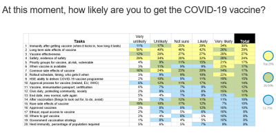
Even after 30 voters, you should expect to see the top tasks begin to emerge. For example, the largest survey we ever did was for the European Commission. We had over 107,000 people voting. The top three tasks were:
- EU law, rules, treaties, judgments;
- research and innovation;
- funding, grants, subsidies.
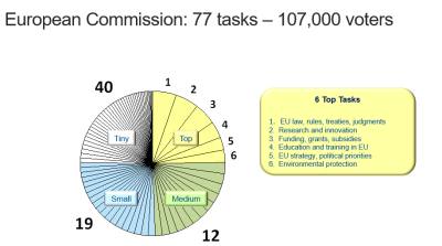
Amazingly, after just 30 voters, these top three tasks had emerged, and they were the same three tasks after 107,000 voters.
However, the more people you get to vote, the more the table stabilizes. We have found that having 400 voters gets us good solid results. The best way to get people to vote is with a popup on the website/app that is the main focus of the tasks.
Solve Deep Needs. Design for the Long Term
There’s nothing cool or fashionable about Top Tasks. It’s a boring, deliberate, methodical process. It’s very much focused on the needs of the user, not the ego of the organization.
When a tiny task goes to sleep at night, it dreams of being a top task. Websites are flooded with tiny task content, and apps are flooded with tiny task features. Invariably, when we do a Top Tasks survey, the ego of the organization is at the bottom of the table — it gets the least votes.
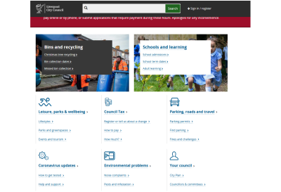
When we did Liverpool City Council in 2009, the top tasks included the following:
- find a job,
- leisure,
- waste,
- libraries,
- schools.
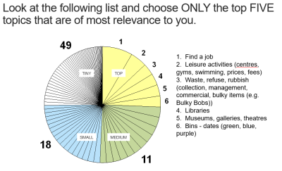
The team analyzed the publishing activities within the council and found that there was an inverse relationship between the importance of the task to a Liverpudlian and the amount of content being published on that task. The more important the task was to citizens, the less content was being published on it. The less important a task was to citizens, the more content was being published on it.
Out of some 4,000 pages, 200 were getting 85% of traffic, and these 200 were not getting the proper care and attention, because the Web team’s time was taken up with dealing with tiny tasks. Top Tasks gave the team the evidence to delete over 80% of their website. The result was a much better experience for citizens.
My passion now is sustainable digital design, and that means designing things that will be as light as possible and will last for the longest possible time. The same tasks we identified in 2009 (waste, leisure, schools) are still on the Liverpool homepage in 2022. Top Tasks can give you a classification, navigation, and information architecture that will stand the test of time because top tasks last. The most important things people want to do tend not to change much over time.
It’s about stripping away and removing the unnecessary, and about defocusing on the tiny tasks. Top Tasks gives you real, quantifiable evidence to make tough decisions that will create a better experience for your users.
(vf, yk, il)
