Note: This article assumes that you have basic knowledge of CSS animations. If you don’t, please check out this guide by Tom Waterhouse before proceeding with the article.
We surf the web daily, and as developers, we tend to notice subtle details on a website. The one thing I take note of all the time is how smooth the animations on a website are. Animation is great for UX and design purposes. You can make an interactive website that pleases the visitor and makes them remember your website.
Creating advanced animations sounds like a hard topic, but the good news is, in CSS, you can stack multiple simple animations after each other to create a more complex one!
In this blog post, you will learn the following:
- What cubic beziers are and how they can be used to create a “complex” animation in just one line of CSS;
- How to stack animations after each other to create an advanced animation;
- How to create a rollercoaster animation by applying the two points you learned above.
Note: This article assumes that you have basic knowledge of CSS animations. If you don’t, please check out this link before proceeding with this article.
Cubic Beziers: What Are They?
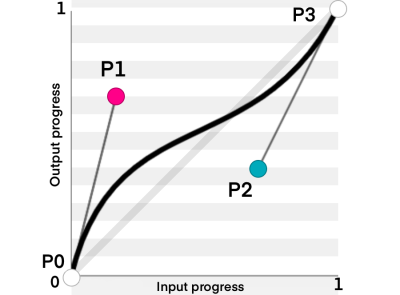
The cubic-bezier function in CSS is an easing function that gives you complete control of how your animation behaves with respect to time. Here is the official definition:
A cubic Bézier easing function is a type of easing function defined by four real numbers that specify the two control points,
P1andP2, of a cubic Bézier curve whose end pointsP0andP3are fixed at (0,0) and (1,1) respectively. Thexcoordinates ofP1andP2are restricted to the range [0,1].
Note: If you want to learn more about easing functions, you can check out this article. It goes behind the scenes of how linear, cubic-bezier, and staircase functions work!

But What Is An Easing Function?
Let’s Start With A Linear Curve
Imagine two points P0 and P1, where P0 is the starting point of the animation and P1 is the ending point. Now imagine another point moving linearly between the two points as follows:

This is called a linear curve! It is the simplest animation out there, and you probably used it before when you started learning CSS.
Next Up: The Quadratic Bezier Curve
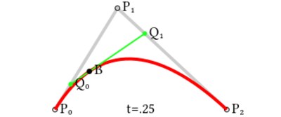
Imagine you have three points: P0, P1 and P2. You want the animation to move from P0 to P2. In this case, P1 is a control point that controls the curve of the animation.

The idea of the quadratic bezier is as follows:
- Connect imaginary lines between P0 and P1 and between P1 and P2 (represented by the gray lines).
- Point Q0 moves along the line between P0 and P1. At the same time, Point Q1 moves along the line between P1 and P2.
- Connect an imaginary line between Q0 and Q1 (represented by the green line).
- At the same time Q0 and Q1 start moving, the point B starts moving along the green line. The path that point B takes is the animation path.
![Animation of a quadratic Bézier curve, t in [0,1]](https://cloud.netlifyusercontent.com/assets/344dbf88-fdf9-42bb-adb4-46f01eedd629/3d3881be-db90-474b-bde1-5dd02e4de1bd/9-advanced-animations-css.gif)
Note that Q1, Q2 and B do not move with the same velocity. They must all start at the same time and finish their path at the same time as well. So each point moves with the appropriate velocity based on the line length it moves along.
Finally: The Cubic Bezier Curve
The cubic bezier curve consists of 4 points: P0, P1, P2 and P3. The animation starts at P0 and ends at P3. P1 and P2 are our control points.

The cubic bezier works as follows:
- Connect imaginary lines between (P0, P1), (P1, P2) and (P2, P3). This is represented by the gray lines.
- Points Q0, Q1 and Q2 move along the lines (P0, P1), (P1, P2) and (P2, P3) respectively.
- Connect imaginary lines between (Q0, Q1) and (Q1, Q2). They are represented by the green lines.
- Points R0 and R1 move along the lines (Q0, Q1) and (Q1, Q2) respectively.
- Connect the line between R0 and R1 (represented by the blue line).
- Finally, Point B moves along the line connecting between R0 and R1. This point moves along the path of the animation.
![Animation of a cubic Bezier curve, t in [0,1]](https://cloud.netlifyusercontent.com/assets/344dbf88-fdf9-42bb-adb4-46f01eedd629/473e4b21-e920-4501-a959-84f1b8350d14/11-advanced-animations-css.gif)
If you want to have a better feel for how cubic beziers work, I recommend checking out this desmos link. Play around with the control points and check how the animation changes through time. (Note that the animation in the link is represented by the black line.)
Stacking Animations
Big animations with lots of steps can be broken down into multiple small animations. You can achieve that by adding the animation-delay property to your CSS. Calculating the delay is simple; you add up the time of all the animations before the one you are calculating the animation delay for.
For example:
animation: movePointLeft 4s linear forwards, movePointDown 3s linear forwards;
Here, we have two animations, movePointLeft and movePointDown. The animation delay for movePointLeft will be zero because it is the animation we want to run first. However, the animation delay for movePointDown will be four seconds because movePointLeft will be done after that time.
Therefore, the animation-delay property will be as follows:
animation-delay: 0s, 4s;
Note that if you have two or more animations starting at the same time, their animation delay will be the same. In addition, when you calculate the animation delay for the upcoming animations, you will consider them as one animation.
For example:
animation: x 4s linear forwards, y 4s linear forwards, jump 2s linear forwards;
Assume we want to start x and y simultaneously. In this case, the animation delay for both x and y will be zero, while the animation delay for the jump animation will be four seconds (not eight!).
animation-delay: 0s, 0s, 4s;
Creating The Rollercoaster
Now that we have the basics covered, it’s time to apply what we learned!
Understanding The Animation
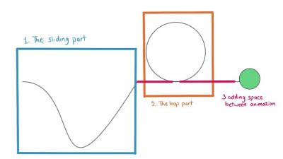
The rollercoaster path consists of three parts:
- The sliding part,
- The loop part,
- There will also be some animation to create horizontal space between the two animations above.

Setting Things Up
We will start by creating a simple ball that will be our “cart” for the rollercoaster.
1. Add this to the body of your new HTML file:
<div id="the-cart" class="cart"></div>
2. Add this to your CSS file:
.cart { background-color: rgb(100, 210, 128); height: 50px; width: 50px; border: 1px solid black; border-radius: 50px; position: absolute; left: 10vw; top: 30vh;
}
I’ll use viewport width (vw) and viewport height (vh) properties to make the animation responsive. You are free to use any units you want.
The Sliding Part
Creating the part where the ball slides can be done using the cubic-bezier function! The animation is made up of 2 animations, one along the x-axis and the other along the y-axis. The x-axis animation is a normal linear animation along the x-axis. We can define its keyframes as follows:
@keyframes x { to { left: 40vw; }
}
Add it to your animation property in the ball path as follows:
animation: x 4s linear forwards
The y-axis animation is the one where we will use the cubic-bezier function. Let’s first define the keyframes of the animation. We want the difference between the starting and ending points to be so small that the ball reaches almost the same height.
@keyframes y { to { top: 29.99vh; }
}}
Now let’s think about the cubic-bezier function. We want our path to move slowly to the right first, and then when it slides, it should go faster.

- Moving slowly to the right means that $P1$ will be along the
x-axis. So, we know it is at (V,0).- We need to choose a suitable V that makes our animation go slowly to the right but not too much so that it takes up the whole space. In this case, I found that
0.55fits best.
- We need to choose a suitable V that makes our animation go slowly to the right but not too much so that it takes up the whole space. In this case, I found that
- To achieve the sliding effect, we need to move
P2down they-axis (negative value) soP2=(X, -Y).Yshould be a big value. In this case, I choseY=5000.- To get
X, we know that our animation speed should be faster when sliding and slower when going up again. So, the closerXis to zero, The steeper the animation will be at sliding. In this case, letX = 0.8.
Now you have your cubic-bezier function, it will be cubic-bezier(0.55, 0, 0.2, -800).
Let’s add keyframes to our animation property:
animation: x 4s linear forwards, y 4s cubic-bezier(0.55, 0, 0.2, -5000) forwards;
This is the first part of our animation, so the animation delay is zero. We should add an animation-delay property because starting from the following animation, the animations will start at a different time than the first animation.
animation-delay: 0s, 0s;
See the Pen [Rollercoaster sliding part [forked]](https://codepen.io/smashingmag/pen/VwxXBQb) by Yosra Emad.
Adding Horizontal Space
Before making the loop, the ball should move along the x-axis for a short while, so there is space between both animations. So, let’s do that!
- Define the keyframes:
@keyframes x2 { to { left: 50vw; }
}
- Add it to the animation property:
animation: x 4s linear forwards, y 4s cubic-bezier(0.55, 0, 0.2, -5000) forwards, x2 0.5s linear forwards;
This animation should start after the sliding animation, and the sliding animation takes four seconds; thus, the animation delay will be four seconds:
animation-delay: 0s, 0s, 4s;
See the Pen [Rollercoaster horizontal space [forked]](https://codepen.io/smashingmag/pen/dyemExY) by Yosra Emad.
The Loop Part
To create a circle (loop) in CSS, we need to move the circle to the center of the loop and start the animation from there. We want the circle’s radius to be 100px, so we will change the circle position to top: 20vh (30 is desired radius (10vh here)). However, this needs to happen after the sliding animation is done, so we will create another animation with a zero-second duration and add a suitable animation delay.
- Create the keyframes:
@keyframes pointOfCircle { to { top: 20vh; }
}
- Add this to the list of animations with duration =
0s:
animation: x 4s linear forwards, y 4s cubic-bezier(0.55, 0, 0.2, -5000) forwards, x2 0.5s linear forwards, pointOfCircle 0s linear forwards;
- Add the animation delay, which will be
4.5s:
animation-delay: 0s, 0s, 4s, 4.5s;
The Loop Itself
To create a loop animation:
- Create a keyframe that moves the ball back to the old position and then rotates the ball:
@keyframes loop { from { transform: rotate(0deg) translateY(10vh) rotate(0deg); } to { transform: rotate(-360deg) translateY(10vh) rotate(360deg); }
}
- Add the loop keyframes to the animation property:
animation: x 4s linear forwards, y 4s cubic-bezier(0.55, 0, 0.2, -5000) forwards, x2 0.5s linear forwards, pointOfCircle 0s linear forwards, loop 3s linear forwards;
- Add the animation delay, which will also be
4.5seconds here:
animation-delay: 0s, 0s, 4s, 4.5s, 4.5s;
See the Pen [Rollercoaster loop [forked]](https://codepen.io/smashingmag/pen/mdLxZdR) by Yosra Emad.
Adding Horizontal Space (Again)
We’re almost done! We just need to move the ball after the animation along the x-axis so that the ball doesn’t stop exactly after the loop the way it does in the picture above.
- Add the keyframes:
@keyframes x3 { to { left: 70vw; }
}
- Add the keyframes to the animation property:
animation: x 4s linear forwards, y 4s cubic-bezier(0.55, 0, 0.2, -800) forwards, x2 0.5s linear forwards, pointOfCircle 0s linear forwards, loop 3s linear forwards, x3 2s linear forwards;
- Adding the suitable delay, here it will be
7.5s:
animation-delay: 0s, 0s, 4s, 4.5s, 4.5s, 7.5s;
The Final Output
See the Pen [Rollercoaster Final [forked]](https://codepen.io/smashingmag/pen/wvjmLKp) by Yosra Emad.
Conclusion
In this article, we covered how to combine multiple keyframes to create a complex animation path. We also covered cubic beziers and how to use them to create your own easing function. I would recommend going on and creating your own animation path to get your hands dirty with animations. If you need any help or want to give feedback, you’re more than welcome to send a message to any of the links here. Have a wonderful day/night!
(vf, il, yk)
