When developing a new feature, what determines whether an existing component will work or not? And when a component doesn’t work, what exactly does that mean?
Does the component functionally not do what it’s expected to do, like a tab system that doesn’t switch to the correct panel? Or is it too rigid to support the designed content, such as a button with an icon after the content instead of before it? Or perhaps it’s too pre-defined and structured to support a slight variant, like a modal that always had a header section, now requiring a variant without one?
Such is the life of a component. All too often, they’re built for a narrow objective, then hastily extended for minor one-off variations again and again until it no longer works. At that point, a new component is created, the technical debt grows, the onboarding learning curve becomes steeper, and the maintainability of the codebase is more challenging.
Is this simply the inevitable lifecycle of a component? Or can this situation be averted? And, most importantly, if it can be averted, how?
Selfishness. Or perhaps, self-interest. Better yet, maybe a little bit of both.
Far too often, components are far too considerate. Too considerate of one another and, especially, too considerate of their own content. In order to create components that scale with a product, the name of the game is self-interest bordering on selfishness — cold-hearted, narcissistic, the-world-revolves-around-me selfishness.
This article isn’t going to settle the centuries-old debate about the line between self-interest and selfishness. Frankly, I’m not qualified to take part in any philosophical debate. However, what this article is going to do is demonstrate that building selfish components is in the best interest of every other component, designer, developer, and person consuming your content. In fact, selfish components create so much good around them that you could almost say they’re selfless.
I don’t know 🤷♀️ Let’s look at some components and decide for ourselves.
Note: All code examples and demos in this article will be based on React and TypeScript. However, the concepts and patterns are framework agnostic.
The Consideration Iterations
Perhaps, the best way to demonstrate a considerate component is by walking through the lifecycle of one. We’ll be able to see how they start small and functional but become unwieldy once the design evolves. Each iteration backs the component further into a corner until the design and needs of the product outgrow the capabilities of the component itself.
Let’s consider the modest Button component. It’s deceptively complex and quite often trapped in the consideration pattern, and therefore, a great example of working through.
Iteration 1
While these sample designs are quite barebones, like not showing various :hover, :focus, and disabled states, they do showcase a simple button with two color themes.

At first glance, it’s possible the resulting Button component could be as barebones as the design.
// First, extend native HTML button attributes like onClick and disabled from React.
type ButtonProps = React.ComponentPropsWithoutRef<"button"> & { text: string; theme: 'primary' | 'secondary';
}
<Button onClick={someFunction} text="Add to cart" theme="primary"
/>
It’s possible, and perhaps even likely, that we’ve all seen a Button component like this. Maybe we’ve even made one like it ourselves. Some of the namings may be different, but the props, or the API of the Button, are roughly the same.
In order to meet the requirements of the design, the Button defines props for the theme and text. This first iteration works and meets the current needs of both the design and the product.
However, the current needs of the design and product are rarely the final needs. When the next design iterations are created, the Add to cart button now requires an icon.
Iteration 2
After validating the UI of the product, it was decided that adding an icon to the Add to cart button would be beneficial. The designs explain, though, that not every button will include an icon.
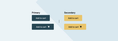
Returning to our Button component, its props can be extended with an optional icon prop which maps to the name of an icon to conditionally render.
type ButtonProps = { theme: 'primary' | 'secondary'; text: string; icon?: 'cart' | '...all-other-potential-icon-names';
}
<Button theme="primary" onClick={someFunction} text="Add to cart" icon="cart"
/>
Whew! Crisis averted.
With the new icon prop, the Button can now support variants with or without an icon. Of course, this assumes the icon will always be shown at the end of the text, which, to the surprise of nobody, is not the case when the next iteration is designed.
Iteration 3
The previous Button component implementation included the icon at the text’s end, but the new designs require an icon to optionally be placed at the start of the text. The single icon prop will no longer fit the needs of the latest design requirements.

There are a few different directions that can be taken to meet this new product requirement. Maybe an iconPosition prop can be added to the Button. But what if there comes a need to have an icon on both sides? Maybe our Button component can get ahead of this assumed requirement and make a few changes to the props.
The single icon prop will no longer fit the needs of the product, so it’s removed. In its place, two new props are introduced, iconAtStart and iconAtEnd.
type ButtonProps = { theme: 'primary' | 'secondary' | 'tertiary'; text: string; iconAtStart?: 'cart' | '...all-other-potential-icon-names'; iconAtEnd?: 'cart' | '...all-other-potential-icon-names';
}
After refactoring the existing uses of Button in the codebase to use the new props, another crisis is averted. Now, the Button has some flexibility. It’s all hardcoded and wrapped in conditionals within the component itself, but surely, what the UI doesn’t know can’t hurt it.
Up until this point, the Button icons have always been the same color as the text. It seems reasonable and like a reliable default, but let’s throw a wrench into this well-oiled component by defining a variation with a contrasting color icon.
Iteration 4
In order to provide a sense of feedback, this confirmation UI stage was designed to be shown temporarily when an item has been added to the cart successfully.
Maybe this is a time when the development team chooses to push back against the product requirements. But despite the push, the decision is made to move forward with providing color flexibility to Button icons.
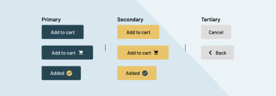
Again, multiple approaches can be taken for this. Maybe an iconClassName prop is passed into the Button to have greater control over the icon’s appearance. But there are other product development priorities, and instead, a quick fix is done.
As a result, an iconColor prop is added to the Button.
type ButtonProps = { theme: 'primary' | 'secondary' | 'tertiary'; text: string; iconAtStart?: 'cart' | '...all-other-potential-icon-names'; iconAtEnd?: 'cart' | '...all-other-potential-icon-names'; iconColor?: 'green' | '...other-theme-color-names';
}
With the quick fix in place, the Button icons can now be styled differently than the text. The UI can provide the designed confirmation, and the product can, once again, move forward.
Of course, as product requirements continue to grow and expand, so do their designs.
Iteration 5
With the latest designs, the Button must now be used with only an icon. This can be done in a few different approaches, yet again, but all of them require some amount of refactoring.
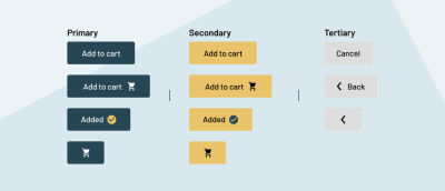
Perhaps a new IconButton component is created, duplicating all other button logic and styles into two places. Or maybe that logic and styles are centralized and shared across both components. However, in this example, the development team decides to keep all the variants in the same Button component.
Instead, the text prop is marked as optional. This could be as quick as marking it as optional in the props but could require additional refactoring if there’s any logic expecting the text to exist.
But then comes the question, if the Button is to have only an icon, which icon prop should be used? Neither iconAtStart nor iconAtEnd appropriately describes the Button. Ultimately, it’s decided to bring the original icon prop back and use it for the icon-only variant.
type ButtonProps = { theme: 'primary' | 'secondary' | 'tertiary'; iconAtStart?: 'cart' | '...all-other-potential-icon-names'; iconAtEnd?: 'cart' | '...all-other-potential-icon-names'; iconColor?: 'green' | '...other-theme-color-names'; icon?: 'cart' | '...all-other-potential-icon-names'; text?: string;
}
Now, the Button API is getting confusing. Maybe a few comments are left in the component to explain when and when not to use specific props, but the learning curve is growing steeper, and the potential for error is increasing.
For example, without adding great complexity to the ButtonProps type, there is no stopping a person from using the icon and text props at the same time. This could either break the UI or be resolved with greater conditional complexity within the Button component itself. Additionally, the icon prop can be used with either or both of the iconAtStart and IconAtEnd props as well. Again, this could either break the UI or be resolved with even more layers of conditionals within the component.
Our beloved Button has become quite unmanageable at this point. Hopefully, the product has reached a point of stability where no new changes or requirements will ever happen again. Ever.
Iteration 6
So much for never having any more changes. 🤦
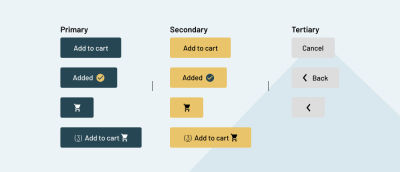
This next and final iteration of the Button is the proverbial straw that breaks the camel’s back. In the Add to cart button, if the current item is already in the cart, we want to show the quantity of which on the button. On the surface, this is a straightforward change of dynamically building the text prop string. But the component breaks down because the current item count requires a different font weight and an underline. Because the Button accepts only a plain text string and no other child elements, the component no longer works.
Would this design have broken the Button if this was the second iteration? Maybe not. The component and codebase were both much younger then. But the codebase has grown so much by this point that refactoring for this requirement is a mountain to climb.
This is when one of the following things will likely happen:
- Do a much larger refactor to move the
Buttonaway from atextprop to acceptingchildrenor accepting a component or markup as thetextvalue. - The
Buttonis split into a separateAddToCartbutton with an even more rigid API specific to this one use case. This also either duplicates any button logic and styles into multiple places or extracts them into a centralized file to share everywhere. - The
Buttonis deprecated, and aButtonNewcomponent is created, splitting the codebase, introducing technical debt, and increasing the onboarding learning curve.
Neither outcome is ideal.
So, where did the Button component go wrong?
Sharing Is Impairing
What is the responsibility of an HTML button element exactly? Narrowing down this answer will shine light onto the issues facing the previous Button component.
The responsibilities of the native HTML button element go no further than:
- Display, without opinion, whatever content is passed into it.
- Handle native functionality and attributes such as
onClickanddisabled.
Yes, each browser has its own version of how a button element may look and display content, but CSS resets are often used to strip those opinions away. As a result, the button element boils down to little more than a functional container for triggering events.
The onus of formatting any content within the button isn’t the responsibility of the button but of the content itself. The button shouldn’t care. The button should not share the responsibility for its content.
The core issue with the considerate component design is that component props define the content and not the component itself.
In the previous Button component, the first major limitation was the text prop. From the first iteration, a limitation was placed on the content of the Button. While the text prop fit with the designs at that stage, it immediately deviated from the two core responsibilities of the native HTML button. It immediately forced the Button to be aware of and responsible for its content.
In the following iterations, the icon was introduced. While it seemed reasonable to bake a conditional icon into the Button, also doing so deviated from the core button responsibilities. Doing so limited the use cases of the component. In later iterations, the icon needed to be available in different positions, and the Button props were forced to expand to style the icon.
When the component is responsible for the content it displays, it needs an API that can accommodate all content variations. Eventually, that API will break down because the content will forever and always change.
Introducing The Me In Team
There’s an adage used in all team sports, “There’s no ‘I’ in a team.” While this mindset is noble, some of the greatest individual athletes have embodied other ideas.
Michael Jordan famously responded with his own perspective, “There’s an ‘I’ in win.” The late Kobe Bryant had a similar idea, “There’s an ‘M-E’ in [team].”
Our original Button component was a team player. It shared the responsibility of its content until it reached the point of deprecation. How could the Button have avoided such constraints by embodying a “M-E in team” attitude?
Me, Myself, And UI
When the component is responsible for the content it displays, it will break down because the content will forever and always change.
How would a selfish component design approach have changed our original Button?
Keeping the two core responsibilities of the HTML button element in mind, the structure of our Button component would have immediately been different.
// First, extend native HTML button attributes like onClick and disabled from React.
type ButtonProps = React.ComponentPropsWithoutRef<"button"> & { theme: 'primary' | 'secondary' | 'tertiary';
}
<Button onClick={someFunction} theme="primary"
> <span>Add to cart</span>
</Button>
By removing the original text prop in lieu of limitless children, the Button is able to align with its core responsibilities. The Button can now act as little more than a container for triggering events.
By moving the Button to its native approach of supporting child content, the various icon-related props are no longer required. An icon can now be rendered anywhere within the Button regardless of size and color. Perhaps the various icon-related props could be extracted into their own selfish Icon component.
<Button onClick={someFunction} theme="primary"
> <Icon name="cart" /> <span>Add to cart</span>
</Button>
With the content-specific props removed from the Button, it can now do what all selfish characters do best, think about itself.
// First, extend native HTML button attributes like onClick and disabled from React.
type ButtonProps = React.ComponentPropsWithoutRef<"button"> & { size: 'sm' | 'md' | 'lg'; theme: 'primary' | 'secondary' | 'tertiary'; variant: 'ghost' | 'solid' | 'outline' | 'link'
}
With an API specific to itself and independent content, the Button is now a maintainable component. The self-interest props keep the learning curve minimal and intuitive while retaining great flexibility for various Button use cases.
Button icons can now be placed at either end of the content.
<Button onClick={someFunction} size="md" theme="primary" variant="solid"
> <Box display="flex" gap="2" alignItems="center"> <span>Add to cart</span> <Icon name="cart" /> </Box>
</Button>
Or, a Button could have only an icon.
<Button onClick={someFunction} size="sm" theme="secondary" variant="solid"
> <Icon name="cart" />
</Button>
However, a product may evolve over time, and selfish component design improves the ability to evolve along with it. Let’s go beyond the Button and into the cornerstones of selfish component design.
The Keys to Selfish Design
Much like when creating a fictional character, it’s best to show, not tell, the reader that they’re selfish. By reading about the character’s thoughts and actions, their personality and traits can be understood. Component design can take the same approach.
But how exactly do we show in a component’s design and use that it is selfish?
HTML Drives The Component Design
Many times, components are built as direct abstractions of native HTML elements like a button or img. When this is the case, let the native HTML element drive the design of the component.
Specifically, if the native HTML element accepts children, the abstracted component should as well. Every aspect of a component that deviates from its native element is something that must be learned anew.
When our original Button component deviated from the native behavior of the button element by not supporting child content, it not only became rigid but it required a mental model shift just to use the component.
There has been a lot of time and thought put into the structure and definitions of HTML elements. The wheel doesn’t need to be reinvented every time.
Children Fend For Themselves
If you’ve ever read Lord of the Flies, you know just how dangerous it can be when a group of children is forced to fend for themselves. However, in the case of selfish component design, we’ll be doing exactly that.
As shown in our original Button component, the more it tried to style its content, the more rigid and complicated it became. When we removed that responsibility, the component was able to do a lot more but with a lot less.
Many elements are little more than semantic containers. It’s not often we expect a section element to style its content. A button element is just a very specific type of semantic container. The same approach can apply when abstracting it to a component.
Components Are Singularly Focused
Think of selfish component design as arranging a bunch of terrible first dates. A component’s props are like the conversation that is entirely focused on them and their immediate responsibilities:
- How do I look?
Props need to feed the ego of the component. In our refactoredButtonexample, we did this with props likesize,theme, andvariant. - What am I doing?
A component should only be interested in what it, and it alone, is doing. Again, in our refactoredButtoncomponent, we do this with theonClickprop. As far as theButtonis concerned, if there’s another click event somewhere within its content, that’s the content’s problem. TheButtondoes. not. care. - When and where am I going next?
Any jet-setting traveler is quick to talk about their next destination. For components like modals, drawers, and tooltips, when and where they’re going is just as gravely important. Components like these are not always rendered in the DOM. This means that in addition to knowing how they look and what they do, they need to know when and where to be. In other words, this can be described with props likeisShownandposition.
Composition Is King
Some components, such as modals and drawers, can often contain different layout variations. For example, some modals will show a header bar while others do not. Some drawers may have a footer with a call to action. Others may have no footer at all.
Instead of defining each layout in a single Modal or Drawer component with conditional props like hasHeader or showFooter, break the single component into multiple composable child components.
<Modal> <Modal.CloseButton /> <Modal.Header> ... </Modal.Header> <Modal.Main> ... <Modal.Main>
</Modal>
<Drawer> <Drawer.Main> ... </Drawer.Main> <Drawer.Footer> ... </Drawer.Footer>
</Drawer>
By using component composition, each individual component can be as selfish as it wants to be and used only when and where it’s needed. This keeps the root component’s API clean and can move many props to their specific child component.
Let’s explore this and the other keys to selfish component design a bit more.
You’re So Vain, You Probably Think This Code Is About You
Perhaps the keys of selfish design make sense when looking back at the evolution of our Button component. Nevertheless, let’s apply them again to another commonly problematic component — the modal.
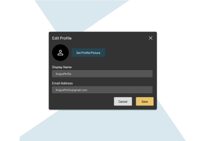
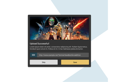
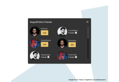
For this example, we have the benefit of foresight in the three different modal layouts. This will help steer the direction of our Modal while applying each key of selfish design along the way.
First, let’s go over our mental model and break down the layouts of each design.
In the Edit Profile modal, there are defined header, main and footer sections. There’s also a close button. In the Upload Successful modal, there’s a modified header with no close button and a hero-like image. The buttons in the footer are also stretched. Lastly, in the Friends modal, the close button returns, but now the content area is scrollable, and there’s no footer.
So, what did we learn?
We learned that the header, main and footer sections are interchangeable. They may or may not exist in any given view. We also learned that the close button functions independently and is not tied to any specific layout or section.
Because our Modal can be comprised of interchangeable layouts and arrangements, that’s our sign to take a composable child component approach. This will allow us to plug and play pieces into the Modal as needed.
This approach allows us to very narrowly define the responsibilities of our root Modal component.
Conditionally render with any combination of content layouts.
That’s it. So long as our Modal is just a conditionally-rendered container, it will never need to care about or be responsible for its content.
With the core responsibility of our Modal defined, and the composable child component approach decided, let’s break down each composable piece and its role.
| Component | Role |
|---|---|
<Modal> |
This is the entry point of the entire Modal component. This container is responsible for when and where to render, how the modal looks, and what it does, like handle accessibility considerations. |
<Modal.CloseButton /> |
An interchangeable Modal child component that can be included only when needed. This component will work similarly to our refactored Button component. It will be responsible for how it looks, where it’s shown, and what it does. |
<Modal.Header> |
The header section will be an abstraction of the native HTML header element. It will be little more than a semantic container for any content, like headings or images, to be shown. |
<Modal.Main> |
The main section will be an abstraction of the native HTML main element. It will be little more than a semantic container for any content. |
<Modal.Footer> |
The footer section will be an abstraction of the native HTML footer element. It will be little more than a semantic container for any content. |
With each component and its role defined, we can start creating props to support those roles and responsibilities.
Modal
Earlier, we defined the barebones responsibility of the Modal, knowing when to conditionally render. This can be achieved using a prop like isShown. Therefore, we can use these props, and whenever it’s true, the Modal and its content will render.
type ModalProps = { isShown: boolean;
}
<Modal isShown={showModal}> ...
</Modal>
Any styling and positioning can be done with CSS in the Modal component directly. There’s no need to create specific props at this time.
Modal.CloseButton
Given our previously refactored Button component, we know how the CloseButton should work. Heck, we can even use our Button to build our CloseButton component.
import { Button, ButtonProps } from 'components/Button'; export function CloseButton({ onClick, ...props }: ButtonProps) { return ( <Button {...props} onClick={onClick} variant="ghost" theme="primary" /> )
}
<Modal> <Modal.CloseButton onClick={closeModal} />
</Modal>
Modal.Header, Modal.Main, Modal.Footer
Each of the individual layout sections, Modal.Header, Modal.Main, and Modal.Footer, can take direction from their HTML equivalents, header, main, and footer. Each of these elements supports any variation of child content, and therefore, our components will do the same.
There are no special props needed. They serve only as semantic containers.
<Modal> <Modal.CloseButton onClick={closeModal} /> <Modal.Header> ... </Modal.Header> <Modal.Main> ... </Modal.Main> <Modal.Footer> ... </Modal.Footer>
</Modal>
With our Modal component and its child component defined, let’s see how they can be used interchangeably to create each of the three designs.
Note: The full markup and styles are not shown so as not to take away from the core takeaways.
Edit Profile Modal
In the Edit Profile modal, we use each of the Modal components. However, each is used only as a container that styles and positions itself. This is why we haven’t included a className prop for them. Any content styling should be handled by the content itself, not our container components.
<Modal> <Modal.CloseButton onClick={closeModal} /> <Modal.Header> <h1>Edit Profile</h1> </Modal.Header> <Modal.Main> <div className="modal-avatar-selection-wrapper"> ... </div> <form className="modal-profile-form"> ... </form> </Modal.Main> <Modal.Footer> <div className="modal-button-wrapper"> <Button onClick={closeModal} theme="tertiary">Cancel</Button> <Button onClick={saveProfile} theme="secondary">Save</Button> </div> </Modal.Footer>
</Modal>
Upload Successful Modal
Like in the previous example, the Upload Successful modal uses its components as opinionless containers. The styling for the content is handled by the content itself. Perhaps this means the buttons could be stretched by the modal-button-wrapper class, or we could add a “how do I look?” prop, like isFullWidth, to the Button component for a wider or full-width size.
<Modal> <Modal.Header> <img src="..." alt="..." /> <h1>Upload Successful</h1> </Modal.Header> <Modal.Main> <p> ... </p> <div className="modal-copy-upload-link-wrapper"> ... </div> </Modal.Main> <Modal.Footer> <div className="modal-button-wrapper"> <Button onClick={closeModal} theme="tertiary">Skip</Button> <Button onClick={saveProfile} theme="secondary">Save</Button> </div> </Modal.Footer>
</Modal>
Friends Modal
Lastly, our Friends modal does away with the Modal.Footer section. Here, it may be enticing to define the overflow styles on Modal.Main, but that is extending the container’s responsibilities to its content. Instead, handling those styles is better suited in the modal-friends-wrapper class.
<Modal> <Modal.CloseButton onClick={closeModal} /> <Modal.Header> <h1>AngusMcSix's Friends</h1> </Modal.Header> <Modal.Main> <div className="modal-friends-wrapper"> <div className="modal-friends-friend-wrapper"> ... </div> <div className="modal-friends-friend-wrapper"> ... </div> <div className="modal-friends-friend-wrapper"> ... </div> </div> </Modal.Main>
</Modal>
With a selfishly designed Modal component, we can accommodate evolving and changing designs with flexible and tightly scoped components.
Next Modal Evolutions
Given all that we’ve covered, let’s throw around some hypotheticals regarding our Modal and how it may evolve. How would you approach these design variations?
A design requires a fullscreen modal. How would you adjust the Modal to accommodate a fullscreen variation?
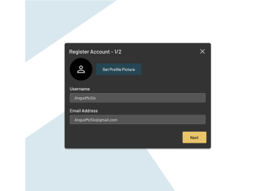
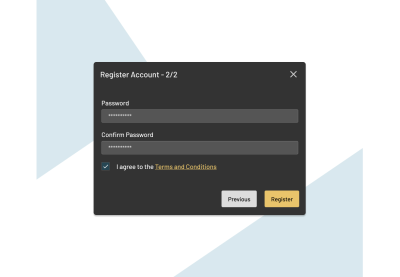
Another design is for a 2-step registration process. How could the Modal accommodate this type of design and functionality?
Recap
Components are the workhorses of modern web development. Greater importance continues to be placed on component libraries, either standalone or as part of a design system. With how fast the web moves, having components that are accessible, stable, and resilient is absolutely critical.
Unfortunately, components are often built to do too much. They are built to inherit the responsibilities and concerns of their content and surroundings. So many patterns that apply this level of consideration break down further each iteration until a component no longer works. At this point, the codebase splits, more technical debt is introduced, and inconsistencies creep into the UI.
If we break a component down to its core responsibilities and build an API of props that only define those responsibilities, without consideration of content inside or around the component, we build components that can be resilient to change. This selfish approach to component design ensures a component is only responsible for itself and not its content. Treating components as little more than semantic containers means content can change or even move between containers without effect. The less considerate a component is about its content and its surroundings, the better for everybody — better for the content that will forever change, better for the consistency of the design and UI, which in turn is better for the people consuming that changing content, and lastly, better for the developers using the components.
The key to the good component design is selfishness. Being a considerate team player is the responsibility of the developer.
(yk, il)
