conic-gradient and radial-gradient. You’ll see how each one of them works in detail, what the differences and similarities are between them, how and where to use them, and some use cases for each.
CSS gradients are a useful CSS feature that can be used to create interesting UI effects or even help us in drawing something without the need to create HTML elements for it. Two gradients that I would like to focus on in this article are conic-gradient and radial-gradient. Each one works differently (conic gradients are curved, while radial gradients are a straight line).
To follow along, you don’t need to know about either radial-gradient or conic-gradient. I will try my best to explain them in a good manner.
Let’s dive in!
What Is A Radial Gradient?
From their name, radial-gradients provide us with the ability to draw radial elements like a circle or an ellipse.
Let’s look at the most basic syntax.
The Most Basic Example
In this example, we have a radial-gradient with two color stops. This resulted in an ellipse-shaped gradient.
.element { background: radial-gradient(#9c27b0, #ff9800);
}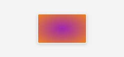
The above is the most basic radial-gradient we can do in CSS. You might be wondering, why it defaulted to an ellipse? Well, let me explain.
If there is no shape name defined in the gradient (circle or ellipse), it will default to an ellipse in case:
- There is no size determined;
- Or, there are two values (for the width and height).
How Does A Radial Gradient Work?
I will go through a series of visuals that will show how a gradient works by incrementing different keywords and additions.
First, let’s get back to the initial example.
.element { background: radial-gradient(#9c27b0, #ff9800);
}
When there are two colors without identifying the shape, the gradient will default to an ellipse, like so:
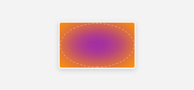
The ellipse is filling the width and height of its container. It looks blurred because the browser assumed that the start and stop points are 0% and 100%, respectively.
Here is how the browser sees the gradient:
.element { background: radial-gradient(#9c27b0 0%, #ff9800 100%);
}
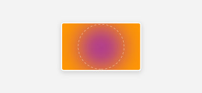
If we append circle before the first color stop, then this is how it looks:
.element { background: radial-gradient(circle, #9c27b0, #ff9800);
}
Now that you have an idea about how the circle and the ellipse look like by default, let’s get into positioning.
By default, both of them are centered horizontally and vertically in their container. In other words, at 50% 50%:
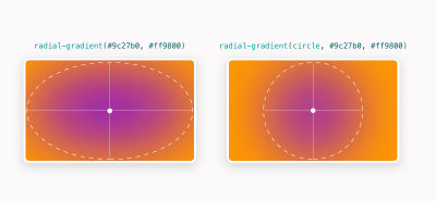
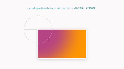
The important thing to notice here is that the positioning happens from the center of the circle or ellipse, so we position a circle at the top left, what will be positioned is the center point.
Let’s take a closer look at a few examples.
.element { background: radial-gradient(circle at top left, #9c27b0, #ff9800);
}
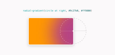
We could also center it on the right side. Adding only right will center the circle on the right 50%:
.element { background: radial-gradient(circle at right, #9c27b0, #ff9800);
}
Here is how it looks:
What Is A Conic Gradient?
The conic-gradient() CSS function creates a gradient that is rotated around the center of the element. Let’s see a basic example.
.element { background: conic-gradient(#9c27b0, #ff9800);
}
Look at how the gradient starts from the center point of the element. It rotates from 0deg to 360 by default.
Let’s see what happens when we add a hard stop value for the first color.
.element { background: conic-gradient(#9c27b0 50%, #ff9800);
}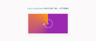
Now the first color fills 50% of the element, while the second one will gradually be shown till 100%.
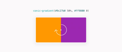
What happens if we apply a hard stop on the second color, too? In the snippet below, the first color will fill 50% of the element, the second one will start from 50% to the end (100%).
.element { background: conic-gradient(#9c27b0 50%, #ff9800 0);
}
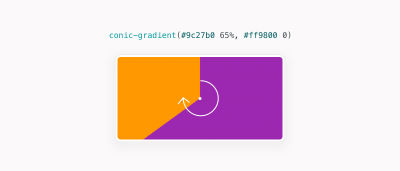
Increasing the first color stop value will create an angled fill:
.element { background: conic-gradient(#9c27b0 65%, #ff9800 0);
}
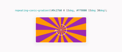
Not only that, but we can also create a repeating gradient using the CSS function repeating-conic-gradient() as shown below.
.element { background: repeating-conic-gradient( #9c27b0 0 15deg, #ff9800 15deg 30deg );
}
The above snippets fill the first color from 0deg to 15deg, then the second color is filled from 15deg to 30deg. With repetition, it will look like the figure below:
Use Cases For Radial Gradients
Oftentimes, we need to add an illustration or a pattern as a background. In case there is a headline and/or secondary text, it might be difficult to read them, of course.
radial-gradient In A Hero Section
Using an ellipse gradient with the same color as the background can help make the content stand out. In the following example, notice how the content is overlapped with the background. It makes it a bit hard to focus on reading than looking at the pattern:

A common fix for that is to add an ellipse with the same color as the background underneath (to make it blend with it).
Here is the hero section with the ellipse (colored in grey, just for demo purposes):

Here is how to reflect that in CSS:
.hero { background-color: #fbfafa; background-image: radial-gradient(#fbfafa, rgba(0,0,0,0) center/70% 70% no-repeat, url("hero-bg.svg"); background-position: center; background-size: 70% 70%, cover; background-repeat: no-repeat;
}
That way, we covered the pattern under the content, it’s much easier to read it now.
Dotted Pattern Effect
In order to create an effect of a dotted pattern, we can use radial-gradient. Here is how it looks:

To achieve that, we can create a tiny circle and the rest of the gradient will be transparent.
Here is how it looks on its own:

When this pattern is repeated, here is how it looks:
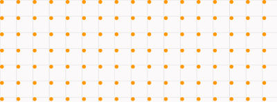
To reflect that in CSS, we need to add a width and height for the gradient. Since gradients repeat by default, it will result in the above pattern.
.dot-pattern { --color-1: #9c27b0; --color-2: rgba(0,0,0,0); background-image: radial-gradient(circle at 2px 2px, var(--color-1) 1px, var(--color-2) 0); background-size: 15px 15px;
}
Image Effects
Combined with mix-blend-mode, radial gradients can create some interesting UI effects for images. In the following example, notice how the circle is positioned at the top-left corner. We can take benefit from that by playing with blend modes to achieve a specific effect.

.thumb:after { content: ""; position: absolute; inset: 0; background: radial-gradient(circle at top left, #9c27b0, #ff9800); mix-blend-mode: hard-light; opacity: 0.4;
}
Use Cases For Conic Gradients
Pie Charts
The first use case that I can think of for conic gradients is simple pie charts. It’s been a thing that we want to do in CSS a while ago, and now it’s possible with ease.

.pie-chart { width: 100px; height: 100px; background: conic-gradient(from 0deg, #b2daf9 128deg, #2096f3 0); border-radius: 50%;
}
Backgrounds And Patterns
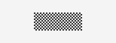
There are tons of possibilities to create a pattern with conic gradients. For this example, I will focus on the checkerboard pattern.

conic-gradient(). (Large preview) Here is what happens in the following gradient:
- The
#fffcolor is covering90degof the element; - Then it’s followed by
#000till180deg; - Then it’s followed by
#ffftill270deg; - Finally, the
#000filled till the end angle (360deg).
.checkerboard { --size: 25px; width: 200px; height: 100px; background-image: conic-gradient(#fff 90deg, #000 0 180deg, #fff 0 270deg, #000 0); background-size: var(--size) var(--size);
}
When repeated and controlled via background-size, it will look like this:
Not only that, but we can achieve really interesting effects by rotating some values in a different way. Here is an example:
.element { background-image: conic-gradient(#fff 90deg, #000 0 136deg, #fff 0 313deg, #000 0);
}
UI Patterns
Sometimes, we might need to generate a random UI pattern that takes different shapes. We can use conic-gradient to achieve that. The idea is that we control the gradient size via background-size, and then change the conic-gradient angle to achieve different effects.
We have an element with a width and height of 200px. Within this element, we will repeat the background.
.element { --size: 20px; width: 200px; height: 200px; background-size: var(--size) var(--size);
}
To imagine it better, each background will have a size of 20px for both width and height, and it will be repeated horizontally and vertically.

Now, each square you see will contain a conic-gradient. For now, I will add two blue shades to demonstrate the concept better.
.element { --size: 20px; width: 200px; height: 200px; background: conic-gradient(#2296F3 0.13turn, rgba(255,255,255,0) 0); background-size: var(--size) var(--size);
}
This is how the conic gradient looks without repeating it:

With repeating, it looks like this. Now, the point is to make the second color transparent, which will result in a triangle shape.

By having a different angle, we can randomize the pattern shape to get interesting effects.

Animating Conic Gradients With @property
We can create interesting animation effects with conic-gradient. However, this isn’t possible by default. We need to use the @property definition to define a custom property that we’ll use for the animation.
@property --conic-mask { syntax: '<percentage>'; inherits: false; initial-value: 0%;
} .conic-mask { --conic-mask: 0%; -webkit-mask: conic-gradient(from 0deg at 50% 50%, #000 var(--conic-mask), #0000); transition: --conic-mask 1s ease-out;
} .conic-mask: hover { --conic-mask: 100%;
}conic-gradient.Cut Corners With Custom Shapes
This is a demo by Temani Afif. The idea is to use conic-gradient as a mask to create cut-corners effects:
See the Pen [Cut corners with custom shape [forked]](https://codepen.io/smashingmag/pen/jOGKjxQ) by Temani Afif.
Conic Gradients
We can use conic-gradient to create subtle gradient effects that have corners darker or lighter corners with other colors. Conic.css is a tiny CSS library by Adam Argyle that features lots of lovely conic gradients.

Using Conic Gradients For Section Backgrounds
I saw this on a demo shared by Scott Kellum. I really liked the way the technique works to add a partial color to a footer while at the same time it looks smooth.
.footer { background: conic-gradient(from 0.25turn at 25% 0%, #FFD9CE, rgba(#FFD9CE, 0) 50%);
}
Conclusion
As you’ve seen, using CSS radial-gradient and conic-gradient functions can result in very interesting (and useful) UIs. However, there is no black and white when it comes to when to use each. Most of the time, it depends on the use case at hand.
I hope you find the article useful. Thanks a lot for reading!
