Are you a designer looking for the best Figma contrast checker plugins? You’ve come to the right place. This blog post will provide an in-depth look at the best Figma contrast checker plugins available and how they can help you improve your designs. Let’s get started!
What is contrast?
Contrast is generally defined as the differences between elements in a composition. In design, this can refer to the contrast between colors, shapes, textures, and tones/lightness. High contrast compositions have strong contrasts, while compositions with low contrast have weak contrasts.
High contrast compositions tend to be sharper and clearer than compositions with low contrast. Users tend to find high-contrast designs to be more striking and eye-catchy than layouts with low contrast. Additionally, high-contrast designs are often considered more visually pleasing than layouts with low contrast.
On the other hand, designers often use low contrast techniques to draw users’ attention to specific areas or elements within a composition.
What is the contrast checker?
The contrast checker is a tool used to assess the contrast of elements within a composition. Checkers will assess contrast based on a set of criteria defined by the W3C (Web Content Accessibility Guidelines 1.0).
Some contrast checkers will also assess the lightness (luminance) of elements within a composition, which is not an official contrast criterion but can still be useful information to designers.
Figma contrast checker plugins
We’ve compiled a list of the best contrast checker plugins available online. These plugins will drastically improve your productivity and efficiency as a designer by automating tedious tasks and ensuring that your compositions meet modern accessibility standards.
See also
A11y
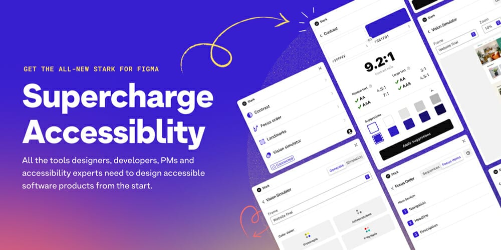
Stark
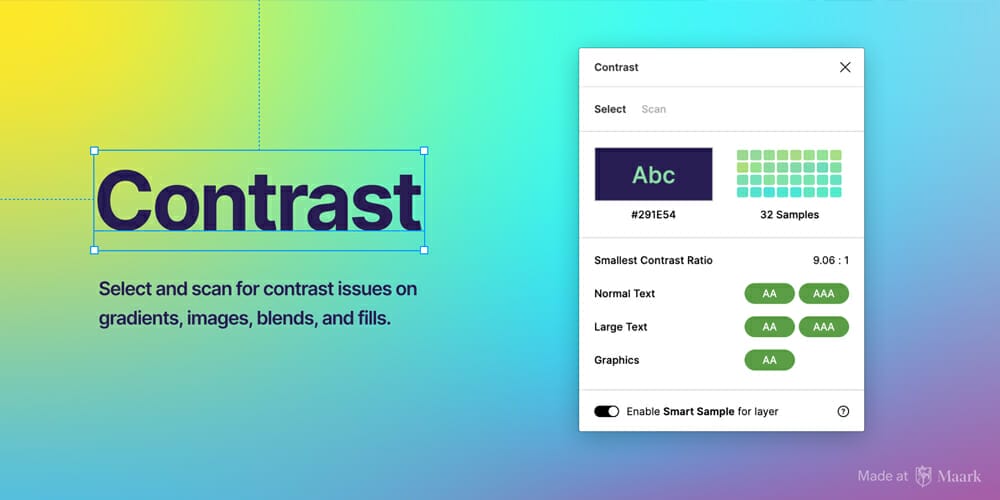
Contrast for Figma
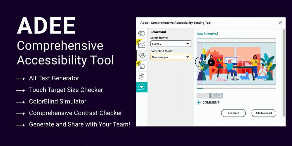
Adee
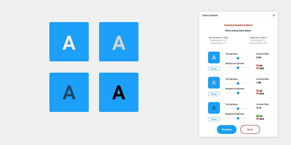
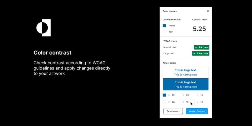
Color Contrast
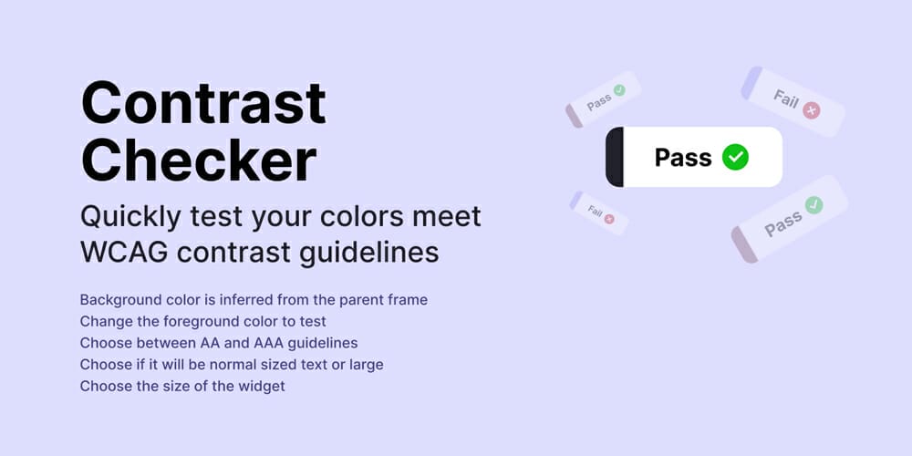
Contrast Checker
Contrast

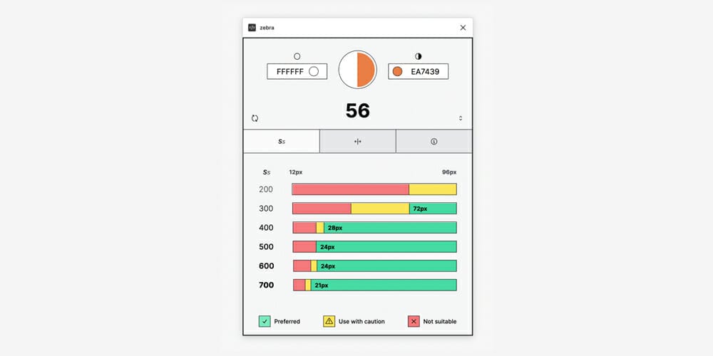
Zebra
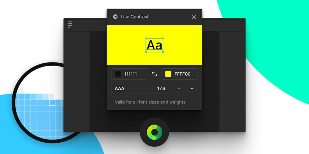
Use Contrast
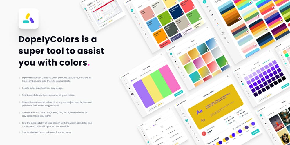
Dopely Colors
The post Best Figma Contrast Checker Plugins appeared first on CSS Author.
