You’ve no doubt wrestled with menus that have nested menus before. I can’t count how many times I’ve hovered over a menu item that reveals another list of menu items, then tried to hover over that nested menu only to have the entire menu close on me.
That’s the setup for what I think is a pretty common issue when making menus — preventing nested menus from closing inadvertently. It’s not the users’ fault; leaving hover between menu levels is easy. It’s also not exactly the web’s fault; the menu is supposed to close if the pointer leaves the interactive area.
Before we dig deeper into the issue, let’s acknowledge that relying on hover interactions for displaying and hiding menu items is already somewhat problematic. Not all devices have a mouse, or a pointer, for that matter. You could argue that click (or tap) interactions are better. Take Amazon’s main navigation as an example. It requires a click to open the main menu and another click to open the nested menus.
Looking past a “hover versus tap” debate, the appeal of hover interactions is obvious. It would be nice to save the user extra clicks, right?
That’s what we’re aiming for in this article. The reason I want to tackle this at all is that I saw Notion showing off its new menu hover interactions.
A li’l quality-of-life update:
Before, you had to be really precise with your cursor so menus wouldn’t disappear on you. Should feel much more polished now 🫡 pic.twitter.com/0yTRz3CMce
— Notion (@NotionHQ) February 24, 2023
While I don’t have inside information about Notion’s approach, I have what I think is a practical way to go about it based on other examples I’ve seen, and I want to show you how I got there.
The Solution: Safe Triangles
The solution is safe triangles. It’s not exactly a new idea, either. Amazon popularized the idea, and Ben Kamens blogged it back in 2013 while introducing a jQuery plugin to accomplish it.
The basic idea is nicely illustrated in this video that Michael Villar includes in a post on the Height app blog.
There has to be a “modern” approach for adding safe triangles to nested menus. I sought out more examples.
Example 1: VS Code
VS Code pulls off a nice hover interaction in its web app.
The VS Code approach uses a delayed trigger of a mouseover event callback in JavaScript. But before the event fires, CSS styles are applied to the :hover state of menu items.
macOS
I’m on a Mac and noticed that macOS also implements some sort of safe triangle in its menus.
I cannot crack macOS open and inspect its code, but this is an excellent example. Notice how the safe triangle works when moving from a top-level menu to a nested menu but not when returning from the nested menu to the top-level menu. It’s the sort of subtle, polished difference we might expect from Apple.
Radix Navigation Component
The open-source Radix library provides a Dropdown Menu component that pulls it off.
What a great job! I found this example from a talk Vercel posted to YouTube where Radix co-creator Pedro Duarte gives a master class on the design challenges of dropdown menus.
The functionality is pretty much the same as the macOS approach, where :hover is not triggered in the sibling elements, making the experience really smooth. Unlike macOS, though, this is code that I can access and inspect.
The Radix approach was hugely helpful as far as informing my own work. So, let’s break down the process to show you how I implemented this into the main navigation of the project I work on, Neo4j.
Demo
I put together a simplified version of my implementation that you can try. The code is written in React, but the solution is not React-specific and can be paired with any UI framework you like.
See that? The second menu exposes the “safe triangle” on hover, showing the hoverable area that allows the nested menu to stay open, even after the pointer has left the hover state.
How it Works
The two key ingredients for this approach are SVG and the CSS pointer-events property.
Mouse Enter and Leave
First things first. When hovering over a menu item that includes nested elements, we trigger an onMouseEnter callback that opens the nested menu, with onMouseEnter={() => setOpen(true)}.
Then, an onMouseLeave callback is responsible for closing the submenu when the pointer leaves the element and its children via onMouseLeave={() => setOpen(false)}. This part is identical to a simple nested menu, but notice <SafeArea /> because this is where the magic happens.
const SafeAreaNestedOption = () => { const [open, setOpen] = useState<boolean>(false); const parent = useRef<HTMLLIElement>(null); const child = useRef<HTMLDivElement>(null); const getTop = useCallback(() => { const height = child.current?.offsetHeight; return height ? `-${height / 2 - 15}px` : 0; }, [child]); return ( <li ref={parent} style={{ position: "relative" }} onMouseEnter={() => setOpen(true)} onMouseLeave={() => setOpen(false)} > <NestedPlaceholder /> {/* Safe mouse area */} {/* This is where the magic will happen */} {open && parent.current && child.current && ( <SafeArea anchor={parent.current} submenu={child.current} /> )} {/* Nested elements as children */} <div style={{ visibility: open ? "visible" : "hidden", position: "absolute", left: parent.current?.offsetWidth || 0, top: getTop() }} ref={child} > <ul> <li>Nested Option 1</li> <li>Nested Option 2</li> <li>Nested Option 3</li> <li>Nested Option 4</li> </ul> </div> </li> );
};
SVG
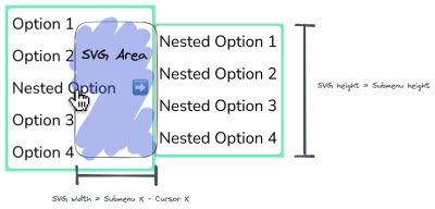
We use SVG to “draw” the safe triangle inside the SafeArea component. When a nested menu is open, we create the SVG as a child element that isn’t visible but is there. The idea is that users interact with it when it is exposed, even if they don’t realize it.
The trick is to make sure that the SVG is rectangular with a height equal to the height of the nested menu and a width equal to the distance between the cursor and the nested menu.

As long as the pointer is hovering over the SVG element, we have something we can use to maintain the nested menu’s open state.
Pointer Events
There are two steps we need to take to achieve this. First, we’ll create a “desired” path that connects our cursor to the submenu.
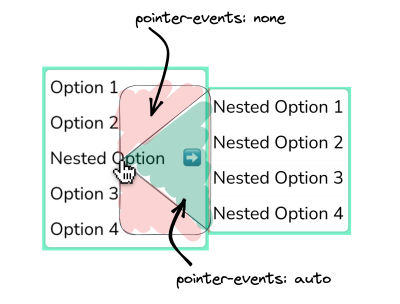
A triangular shape is the most straightforward path we can construct between a menu item and a nested menu. You can visualize what this triangle might look like in the image below. The green represents the safe area, indicating that it won’t trigger any onMouseLeave events. Conversely, the red area signifies that it will start the onMouseLeave event since we’re likely moving toward a sibling menu item.

I approached this by creating a SafeArea component in React that contains the SVG markup:
<svg style={{ position: "fixed", width: svgWidth, height: submenuHeight, pointerEvents: "none", zIndex: 2, top: submenuY, left: mouseX - 2 }} id="svg-safe-area"
> {/* Safe Area */} <path pointerEvents="auto" stroke="red" strokeWidth="0.4" fill="rgb(114 140 89 / 0.3)" d={ `M 0, ${mouseY-submenuY} L ${svgWidth},${svgHeight} L ${svgWidth},0 z` } />
</svg>
Also, to constantly update our safe triangle and position it appropriately, we need a mouse listener, specifically onmousemove. I relied on a React hook from Josh Comeau called useMousePosition in a useMousePosition.tsx file that provides the safe triangle component, designating the mouse position with mouseX and mouseY.
The Safe Triangle
The triangle is the SVG’s only path element. For this to work correctly, we must set the CSS pointer-events property to none, which we can do inline directly in the SVG. Then we set pointer-events to auto inline in the path element. This way, we stop propagating events when they are coming from the path element — the safe triangle — but not when events come from the SVG’s red area.
Let’s break down the path we are drawing, as it’s way more straightforward than it looks:
<path pointerEvents="auto" stroke="red" strokeWidth="0.4" fill="rgb(114 140 89 / 0.3)" d={ `M 0, ${mouseY-submenuY} L ${svgWidth},${svgHeight} L ${svgWidth},0 z` }
/>
We set the pointer-events property to auto to capture all mouse events, and it does not trigger the onMouseLeave event as long as the cursor is inside the path.
Next, we provide the path with some basic CSS styles for debugging purposes. This way, we can see the safe area while testing interactions.
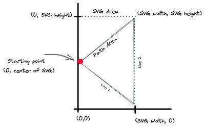
The 0, ${mouseY-submenuY} part is the path’s starting point, designating the center of the SVG’s area.
Then we continue our path drawing with two lines: L ${svgWidth},${svgHeight} and L ${svgWidth},0. The former represents the first line (L) based on the SVG’s width and height, while the latter draws the second line (L) based on the SVG’s width.
The z part of the path is what makes everything work. z is what closes the path, making a straight line to the path’s starting point, preventing the need to draw a third line.

You can explore the path in more detail or adjust it using this SVG path editor.
There Are Some Gotchas
This is a relatively simple solution on purpose. There are some situations where this approach may be too simple, and you will need another creative solution, particularly if you’re not working in React like me.
For example, what if the user’s pointer moves diagonally and touches a different menu item? This approach does not capture that interaction to prevent the current nested menu from closing, but that might not be what you want it to do. Perhaps you want the nested menu to close and need to adjust the SVG with a different shape. An “easy” way to solve this is to debounce a cleanup function so that, on every mouse movement, you call the cleanup function. And after some number of milliseconds have passed without a mouse movement, you would remove the SVG element, and the sibling listeners would trigger as expected.
Another example is the navigation paths. A triangle is terrific but might not be the ideal shape for your menu and how it is designed. After doing some of my own tests, I’ve found that a curved path tends to be more effective, closer to Needle’s approach for a safe area:

Wrapping Up
As you now know, coming up with a solution for nested menus that reveal on hover is more of a challenge than it looks on the surface. Whether a hover-based approach and the clicks it saves are worth the additional considerations that make a better user experience versus a click-based approach is totally up to you. If you go with a menu that relies on a mouse hover to reveal a nested menu, you now have a resource that enhances its usability.
What about you? Is this a UX challenge you’ve struggled with? Have you attempted to solve it differently? Is the “safe triangle” concept effective for your particular use case? I’d love to know in the comments!
(gg, yk)
