
Localization is one of the most interesting fields in terms of user interface: text length may be different depending on the language, default alignments for text might vary, reading direction can be mirrored or vertical, and so many other different cases. In short, it’s an incredible source of diversity, which makes our interfaces and our front-end work way stronger, more reliable, and more challenging.
The Need For Right-To-Left Interfaces
Most languages, like French or English, are meant to be read for Left-To-Right (LTR). However, in these cases, some languages like Farsi (Persian), Arabic, and Hebrew have a different reading direction — Right-To-Left (RTL).
The question is how can we adapt our interfaces to this huge change?
Before CSS Logical Properties
Before CSS Logical Properties, we could make RTL adaptations with different methods:
- Adding a dedicated CSS file only for RTL surcharge/layout;
- Surcharging only parts that need to be adapted in the same CSS, e.g.
[dir="rtl"] .float-left { float: right; }.
Even if these methods are doing the work — I used the second one to create an Arabic version of the Stand Up for Human rights website a few years ago — both of them are quite sub-optimal:
- You need to maintain another file for the first one;
- The CSS file for the second one is a bit heavier, and there might be some issues to deal with (specificity, more properties to add, and so on).
For sure, we can create huge machinery with Sass to produce several builds and use some tools like UnCSS to remove what is not needed, but let’s be honest: this is boring, and it can lead to “non-natural” pieces of code, like in the previous example.
Why CSS Logical Properties Are A Perfect Fit/Promising
This is where the CSS Logical Properties module comes into the game. The main idea of this CSS module is to have a logical abstraction that enables us to produce one layout that will adapt itself depending on the text direction and writing mode (properties like writing-mode, direction, and text-orientation, or dir attribute in HTML). This gives us possibilities like horizontal right-to-left or left-to-right, vertical RTL, and so on.
Implementation In Practice
How It Works
There are a few concepts to understand, already explained by Rachel Andrews here in “Understanding Logical Properties And Values”:
- We no longer think in terms of
left/rightbutstart/end(the same goes fortop/bottom): - We no longer say
widthorheightbut insteadinlineandblock— quite classical. (You’ve probably heard of defaultinlineorblockelements. 😉)
This idea of start/end is not new. You use it probably every day with things like justify-content: start.
Congratulations, you now know — almost — everything! 🎉 Let’s see some practical examples.
Examples
Let’s start with the basics:
| Classical Property | Logical Property |
|---|---|
width |
inline-size |
height |
block-size |
min-width |
min-inline-size |
min-height |
min-block-size |
max-width |
max-inline-size |
max-height |
max-block-size |
Margins follow the same logic:
| Classical Property | Logical Property |
|---|---|
margin-top |
margin-block-start |
margin-bottom |
margin-block-end |
margin-left |
margin-inline-start |
margin-right |
margin-inline-end |
The same goes for padding. Let’s move to the positioning:
| Classical Property | Logical Property |
|---|---|
top |
inset-block-start |
bottom |
inset-block-end |
left |
inset-inline-start |
right |
inset-inline-end |
Simple, isn’t it? float, text-align, and border follow the same path:
| Classical Property/Value | Logical Property |
|---|---|
float: left; |
float: inline-start; |
float: right; |
float: inline-end; |
text-align: left; |
text-align: start; |
text-align: right; |
text-align: end; |
border-top |
border-block-start |
border-bottom |
border-block-end |
border-left |
border-inline-start |
border-right |
border-inline-end |
I won’t detail some others like resize or scroll-margin-top, but instead, let’s look at the particular case of border-radius:
| Classical Property | Logical Property |
|---|---|
border-top-left-radius |
border-start-start-radius |
border-top-right-radius |
border-start-end-radius |
border-bottom-left-radius |
border-end-start-radius |
border-bottom-right-radius |
border-end-end-radius |
A bit different, but easily understandable anyway.
Some possibilities with values are really cool — you can simplify some notations. Here are some further examples:
| Classical Property/Value | Logical Property |
|---|---|
margin-left: auto;margin-right: auto; |
margin-inline: auto; |
margin-top: 0;margin-bottom: 0; |
margin-block: 0; |
margin-top: 1em;margin-bottom: 2em; |
margin-block: 1em 2em; |
top: 0;left: 0;bottom: 0;right: 0; |
inset: 0; 🎉 |
left: 10%;right: 10%; |
inset-inline: 10%; |
This is pure gold in the best world, right? Less code for perfect support of RTL languages! 🎉
Now I’m sorry to brush away some of the stars in your eyes — there are indeed some limitations.
Some Limitations
Missing Syntaxes
CSS Logical Properties are quite new, even if the support is good on recent browsers. However, the CSS Logical Properties module is kind of “young” and needs a level 2.
To give a simple example: our toggle component is using CSS transforms between different states (loading, active, and so on), mostly because transform is a reliable way to have fluid transitions or animations.
So, we have something like this:
.element { transform: translateX(#{$toggle-width - $toggle-width-button});
}
Unfortunately, there is no flow-relative syntax for transform. So, we have to do something like the following:
[dir='rtl'] .element { transform: translateX(-#{$toggle-width - $toggle-width-button});
}
If you want to get an idea of missing stuff like this, you can check opened issues on CSS logical props.
Shorthand Properties
Some shorthand notations are not supported for the moment, like the 2, 3, or 4 values for margin:
| Classical Property/Value | Logical Property |
|---|---|
margin: 1em 2em; |
margin-block: 1em; /* top and bottom */margin-inline: 2em /* left and right */ |
margin: 1em 2em 3em; |
margin-block: 1em 3em; /* top, bottom */margin-inline: 2em /* left, right */ |
margin: 1em 2em 3em 4em; |
margin-block: 1em 3em; /* top, bottom */margin-inline: 4em 2em /* left, right */ |
Don’t use these classic examples with logical needs. You will encounter issues as it’s actually not working. It’s better to be explicit. Also, it’s more readable, in my opinion.
Showing Some Real Issues And Some Solutions
Images Where Reading Direction Is Important
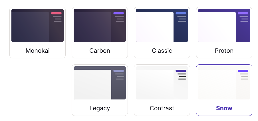
Some images have a direct meaning. Let’s take the example of theme cards:

In this case, if we just apply RTL stuff to this, we would get this:

The order is RTL, but each image does not look like the interface of an RTL user. It’s the LTR version! In this case, it’s because the image reading direction conveys information.
We have a CSS class helper that makes it really simple to achieve this fix:
[dir="rtl"] .on-rtl-mirror { transform: rotateY(180deg);
}
This also applies to any image with a reading direction, like an arrow or double chevron icon showing or pointing to something.
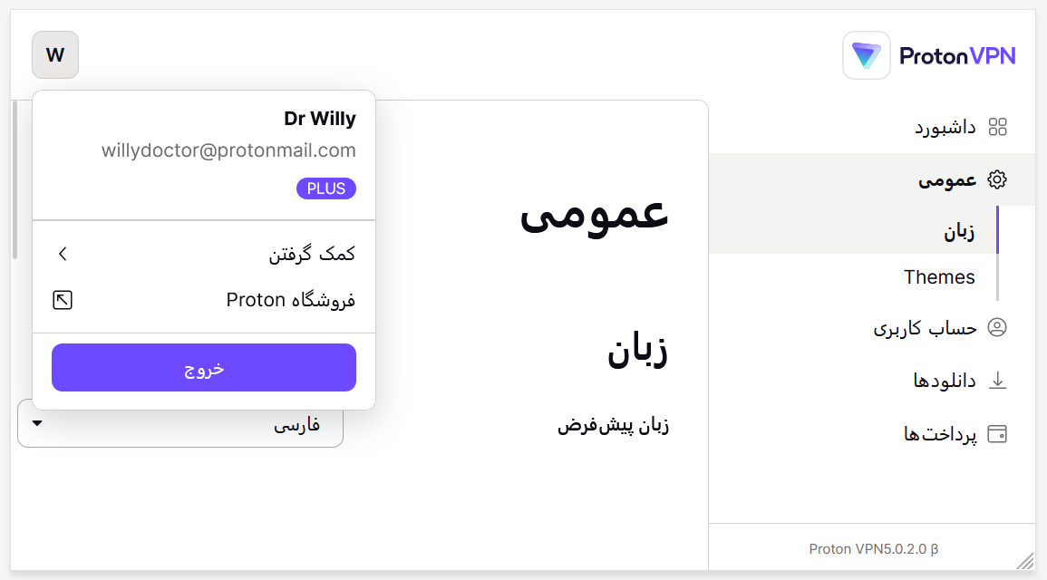
Styles/Values Computed Via JavaScript
Let’s imagine you have a plugin that calculates some positioning in JavaScript and provides the value you can use in JS or CSS. The dropdown library that we’re using provides only the left value in both RTL/LTR contexts, and we transfer to CSS using a CSS Custom property.
So, if we were using this with Logical Properties, i.e. inset-inline-start: calc(var(--left) * 1px);, we would get the following by clicking on the user dropdown:

The solution is simple here. We keep the non-logical property:
/* stylelint-disable */
top: calc(var(--top) * 1px);
left: calc(var(--left) * 1px); // JS provide left value only
/* stylelint-enable */
And we disable our linting for this particular case.
Mixing RTL And LTR content
Even with the best CSS modules, anyone who has already made some RTL adaptations will say that mixing RTL and LTR content sometimes (often) gives crazy stuff.
Let’s take an example on Proton Drive with a component called MiddleEllipsis. The goal of this component is to apply ellipsis before the extension of the file to get something like my-filename-blahblahblah…blah.jpg.
Nothing crazy: we split the content into two parts and apply text-overflow: ellipsis on the first one. You can check the source of this MiddleEllipsis component.
Let’s apply some good ol’ RTL — we should then get the following:
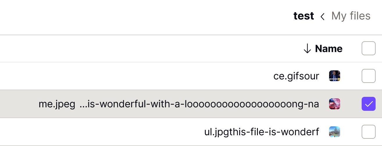
Strange, right? This is simple to explain, however:
MiddleEllipsisstructure is RTL;- And we inject LTR content. (Remember, we did RTL-cut this LTR content.)
The browser does its best, and what is displayed is not wrong from its point of view, but this makes no sense to a person. In this case, we chose to keep the LTR display to keep the purpose of the filenames but aligned it to the right:

Searching For Native LTR Patterns
The MiddleEllipsis example showed that if user-generated content is LTR, then it’s better to display it as LTR.
But we can wonder if there are some patterns that are naturally LTR. The short answer is yes. Below you can find an example.
Phone Number
The phone number might be the most obvious case here as it’s usually using western numbers, which are meant to be read LTR.
If we apply Logical props directly to it, it might give the following:
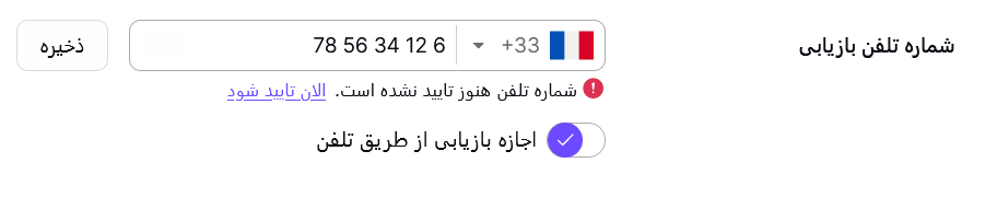
While it’s technically not false, it’s a bit weird to display +33 6 12 34 56 78 like this. In this case, we decided to keep the LTR alignment by default to avoid this strange result.

We have the same case for a 2FA input using western numbers. We don’t yet have the case but imagine a 4-part input to enter an IP address. This would not make sense to display it fully RTL as people would understand 1.0.163.192 instead of 192.163.0.1.
Compatibility
The biggest issue we faced was mostly in regards to compatibility. This can be seen on Can I Use tables for Logical Props:

If the target is only recent modern browsers, there is no problem. But if there is a need for older versions of Safari, for example, the support is pretty bad. And in this case, CSS Logical Properties are not gracefully degraded. Thus everything might look broken.
Several options are possible:
- Serve a CSS build for modern browsers and another one for older ones;
- Transpile everything for each case.
In Proton’s case, as we were not totally ready to ship an RTL language when we merged it, and for other reasons, the decision was taken to transpile everything to good ol’ classical CSS properties. Recently, we found a solution for one case that did need RTL support for Farsi language (VPN account):
- We build two CSS files: one modern with Logical props and one legacy;
- We load the modern one;
- We test the correct support of
border-start-start-radius; - If it’s not supported, we fall back to legacy.
Conclusion
Even if absolute perfection is out of this world, moving to CSS Logical properties is a really interesting move and a good bet for the future: we write less code with these CSS Logical Props, and we reduce the amount of future work by using them, so it really goes in an exciting direction.
As the last takeaway, and even if it would need more work, we did some tests of a vertical RTL display to test further CSS Logical properties.

Looks quite interesting, doesn’t it? 😉
Related Resources
- “W3C i18n resources”, W3C.org
- “RTL Styling 101”, Ahmad Shadeed
- “What Languages Use RTL Scripts?”, Richard Ishida, W3C
- “Opened Issues On CSS Logical Props”, W3C, GitHub
- “CSS Logical Properties and Values”, MDN Web Docs
- “Unicode Bidirectional Algorithm Basics”, Richard Ishida, W3C
- “CSS Logical Properties and Values Level 1,” W3C Working Draft
- “Multilingual Desktop Publishing: Tips & Tricks #3”, Kirill Fedotov, InText
- “Understanding Logical Properties And Values”, Rachel Andrew
(yk, il)