Motion is everywhere in website design. From full-on video to more subtle animations, these elements are a valuable tool in generating user interest and engagement. It can help you follow a trend, capture attention, or offer a more branded experience for your site.
Animated hero elements are an almost obvious trend, but there’s a lot of variance in how it’s done and what degree of success it may have.
Here, we’ll look at this website design trend, examples, and how to make it work for you.
Identifying the Animated Hero Elements Design Trend
This one is easy to identify: Any design that includes animated elements in the hero area counts. That motion can be small or large, simple or complex, and happen once or on a loop. There are so many different ways to animate online and this trend allows for all of them.
Some of the places you might see animated hero elements include:
- Loading animation
- Animated navigation elements
- Video headers
- Animated illustrations
- Text motion or scrolling
- Animated hover states
- Elements that add visual interest on the screen
- Animation that provides information (such as a scroll notification)
Key Characteristics of the Design Trend
Since the obvious characteristic of animated elements in the hero is motion, let’s focus on the characteristics of good animation.
If you follow consider these rules, you’ll quickly see the difference between animation that’s there as decoration and animation that serves a greater purpose as part of the design. That last part is what makes a good, and potentially long-lasting, website design trend.
Key characteristics of a strong animated hero element include:
- It tells a story or helps users understand the design better.
- It is believable or feels like there is a purpose; too much motion can get dizzying. The best animations feel tactile or real.
- It should not get in the way of the rest of the design. If users just see animation and not the rest of the content, it is unlikely they will convert in the way you want.
- It should help users connect with the design and do something, explore deeper, or provide feedback.
- It should entertain users and make them want to further engage with the design (click, tap, or scroll).
Types of Hero Animations
What types of hero animations can you expect to find as part of this design trend? It’s almost a load question because the answer is everything. (But we’ll break it down a little further anyway.)
The type of hero animation that’s best for your website project totally depends on the content and assets you have available. Animations can combine with other trending design elements or stand-alone. (If you click through the examples in this article, you’ll see a wide variance in the types of animations and how they function.)
Types of hero animations may include:
- Shapes or geometry with motion
- Sliders or moving panels of images
- Illustrations or cartoon elements
- Floaters that add subtle motion
- Moving images or illustrations (cinemagraphs)
- Loading elements
- Video
- Liquid elements or blobs
- Hover-active motion
- Bounces or directional states
Then you might think about animation in terms of technology. Generally, hero animations use HTML5, CSS, JavaScript, and SVG. The type of solution totally depends on the project and the type of elements included.
Tips for Using this Web Design Trend
There’s one primary way to ensure that your animated hero element is successful: Design it with purpose.
The challenge is that can be more difficult than it sounds, mostly because many of the tips for creating great animations are contradictory. So here’s what you do. Pick one of these tips and use it. Go big. Create with purpose. And forget that the other tips exist (until you start a new project).
- Create subtle animations that surprise and delight users
- Be direct and bold with animation so that it can’t be missed
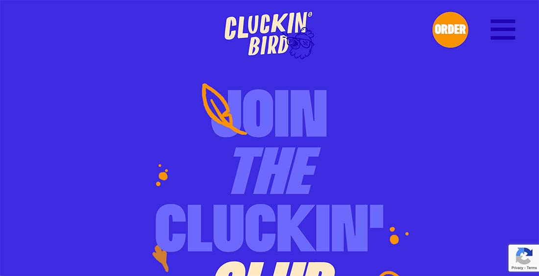
- Use animation to do something users would expect, such as the floating feature in the Cluckin’ Bird exampleDesign something totally unexpected with animation that users will appreciate
- Use them for the full design so that every part of the website includes animated elements
- Design one specific animated element to draw specific attention to one part of the design or storytelling
3 Examples We Love
Animations come in so many forms that picking a few favorites is a little tough. Motion that’s not overwhelming tends to be the leader though. Here are a few examples of animated hero elements that we love.
Days
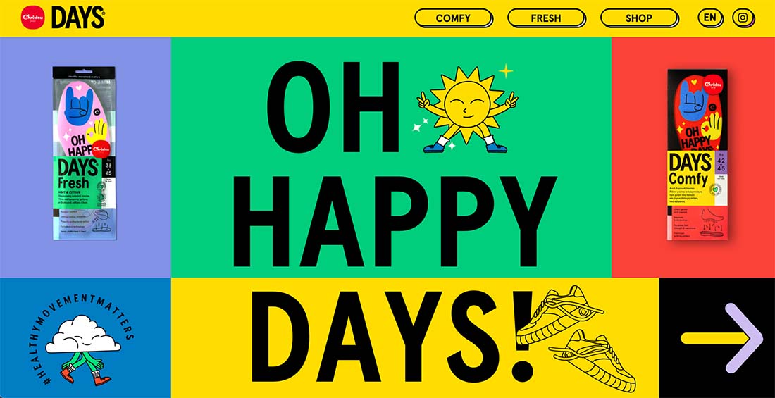
Days has a lot of motion and is an e-commerce site that’s almost hidden in a groovy design. The simple sliding animations are interesting and attention-getting. It’s nice that the sliders show multiple products and bring your attention to them without getting in the way of other content.
Popcornopolis
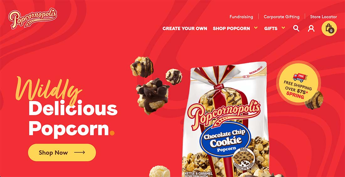
This is the most subtle animation of this collection with popcorn pieces that “pop” into the design as it first loads. And then that’s it. One animated element in the hero area to get your attention and then everything is pretty straightforward. It’s a very effective technique and works particularly well with the content.
Idear Ideas
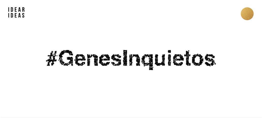
There’s one animated element in this design with two effects that happen separately and simultaneously. (Major kudos to the design and development team here.) The letters come together with lots of tiny dots in an almost magnetic effect as the website launches. Then the letters bust apart and reform with hover states.
Conclusion
Animated hero elements are becoming a staple in design projects. There is though, a lot of variation in technique and between designs that work and those that fall flat.
There’s a fine line with animation between making it work well and being just a little bit too much for the user. When working with this design trend, testing and user feedback is important to ensure that your design is as effective as possible.

