
Cards are a design element that have been popular for a while. The look and function of them have continued to evolve in a number of ways, from tiny cards that are more of an oversized button to full-screen or split-screen cards that denote click or tap functionality.
The reason this trend remains popular is because of the latter. Cards innately cue users into an element of function.
The most popular iteration of cards right now is in a super flat style that works with almost any type of content. While every example below is different, one thing is the same: the combination of card elements in a flat style.
Let’s look at a selection of websites featuring this design trend and ways that you can make it work for you.
Follow the Leader
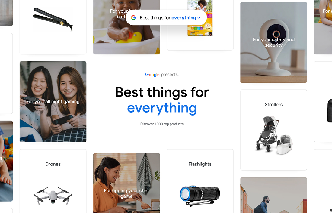
When the designers at Google do something, much of the world follows. Google’s Best Things site, above, is a classic example of this.
What’s nice about each card is that they aren’t stick on the canvas. It seems to move and go on forever, which is a nice feature for a design that’s contained to one screen.
Once you click through any card element, you get even more cards. These are paired with more text to help you navigate and glean information as well as links to help you make purchases of the “best things” you find with this design.
The thing that makes so many cards in tandem work is that nothing feels too heavy or overwhelming. Everything is in the same shape and style and weight is mixed and matched with color can text choices.
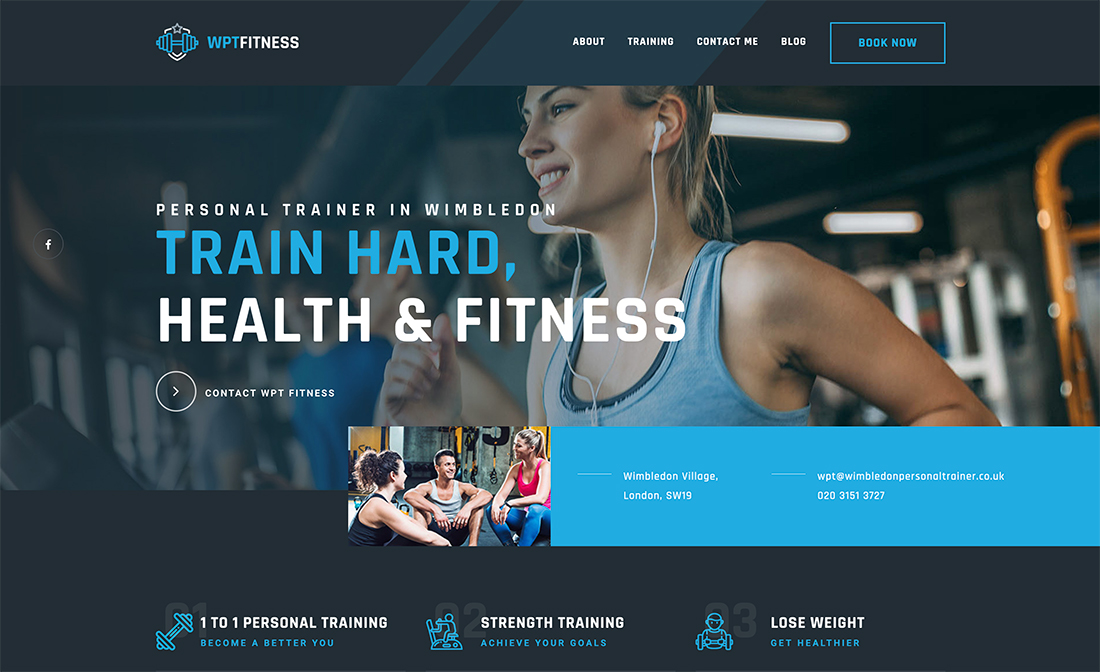
Easy Interaction
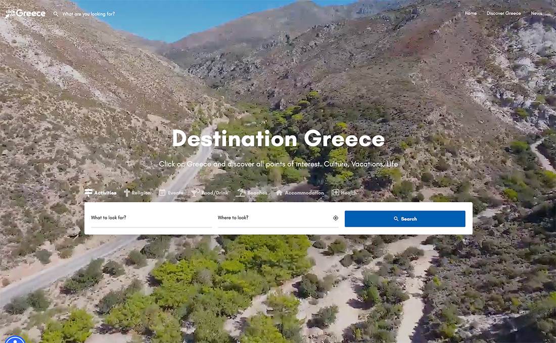
Travel websites are a vertical that have used cards well and keep working with them. Each small card helps the user make a travel choice with ease.
In the examples above, the choice cards take center stage on the canvas with a video background. The simplicity and scale of the cards are a great partner to stunning imagery.
The combination makes you want to book a trip right now.
Color and Illustration
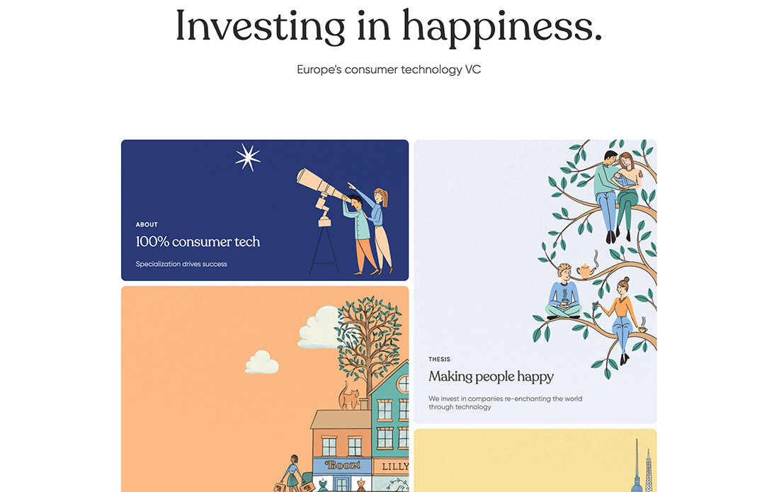
The card website design trend works well for illustrations and alternative content elements that need a container to hold them together.
The website design team for Heartcore, above, provides an excellent example. Without the color backgrounds for each card the information therein – illustration and text element – might seem to be floating haphazardly on the screen.
This technique pulls everything together in a way that unifies the content and design. It’s easy to read, has a nice feel, and implied interaction is easy to understand.
Oversized for Blogging
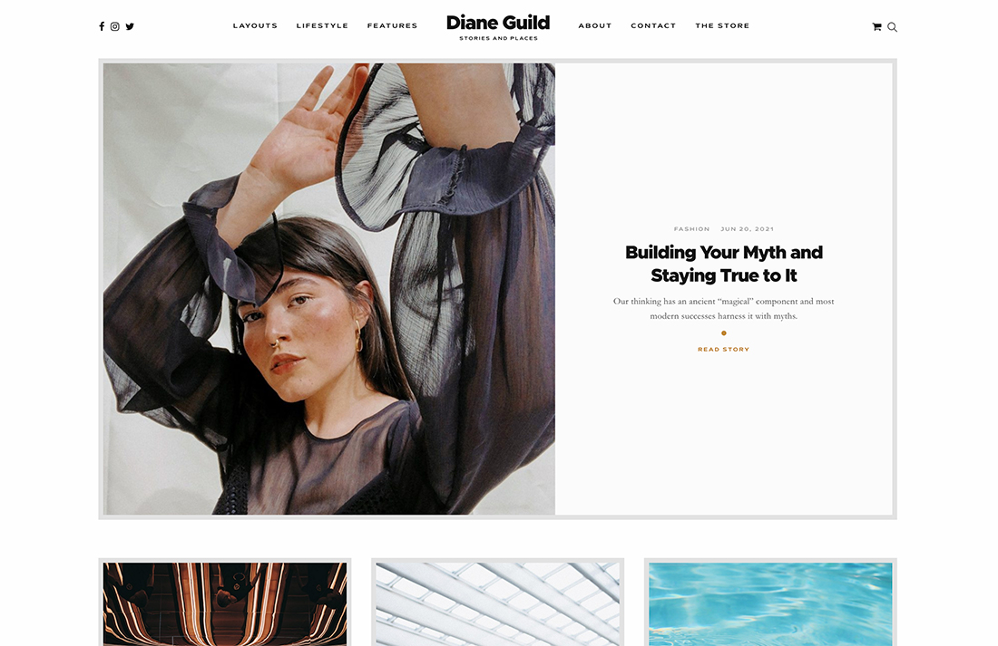
One of the content types that can really benefit from a card-style aesthetic is blogging. What’s different about this example is that each card has a flat design.
Often blog-style cards tend to be a little weightier than what you see here. The layout uses a distinct card that goes all the way across the screen above the scroll and more implied rows of cards using some of the same design elements below.
The open nature of the card elements here – aside from the hero card – keeps the design from getting too heavy and helps encourage reading flow.
Highlight Key Content
Cards are also a great way to drive users to key content elements on the screen. Using cards that feature smaller (inset) images or colored blocks with text, the eye gravitates to certain parts of the screen.
The card, while drawing attention, provides a distinct container for the content to keep elements separate and ensure readability. The extra layer, as seen in the example above, adds depth so that the design feels more engaging.
Keep scrolling (you’ll have to click through the example) to see other card-style blocks for blog and testimonial content.
Make Cards Fullscreen
Cards don’t have to be small to be effective. Sometimes multiple card elements, including fullscreen, can help create the right user experience.
The example above uses a fullscreen card above the scroll and then a grid of smaller cards below. The oversized hero card tells users that this is the most important content available on this website … but there is more if you want it.
The design here is especially nice because while the top card is huge, comparatively, the content is weighted equally. This provides a nice visual balance that makes you want to further interact with the design.
For E-Commerce
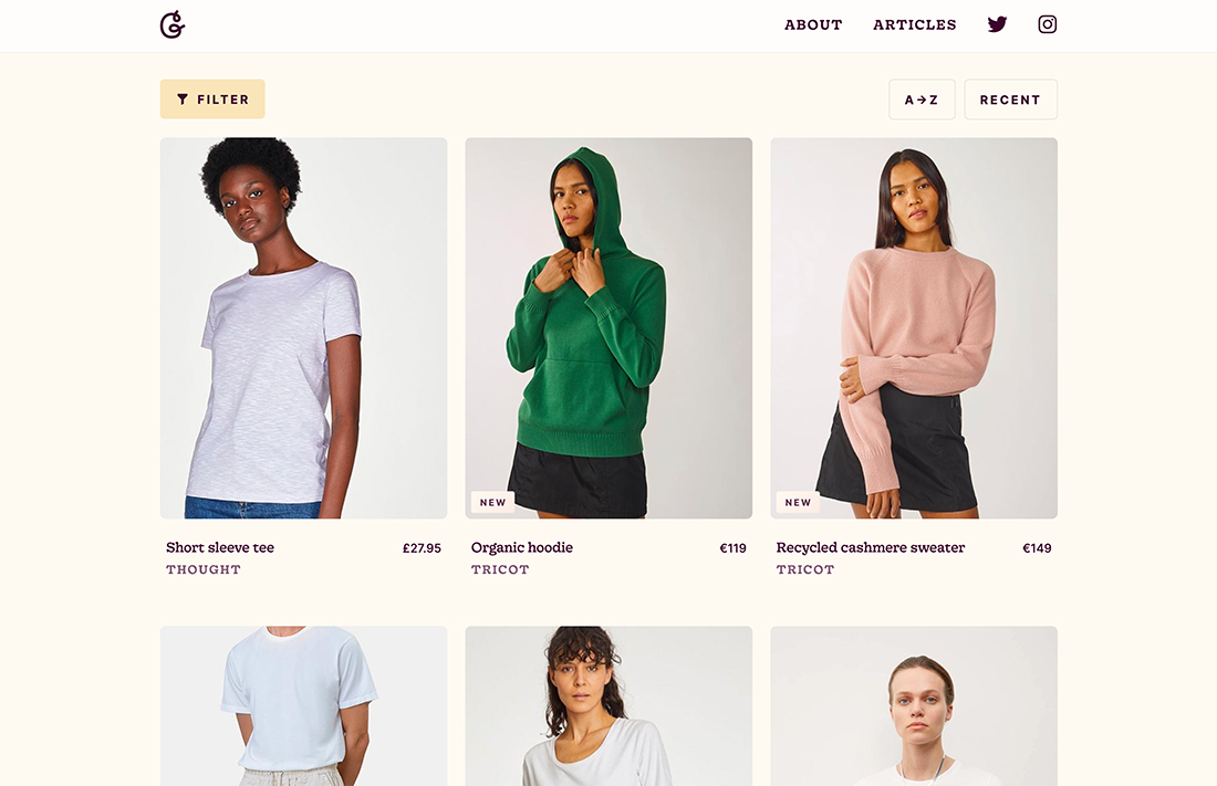
While it’s not something you see all the time, cards can work for e-commerce as well. Cards help create clear differentiation between products and categories.
Good Garms, above, uses subtle animation with each card that shows another view of the product. This use of cards helps streamline clutter for product information and allows shoppers to see more items at once and compare them on-screen.
The thing to note about using cards for e-commerce is that while it can work well for shops with a few items, it can get a little visually overwhelming if there are a lot of items to browse.
From a design standpoint, the other thing that this example does well is ensuring that each row of cards positions well on the screen. Using a tight grid creates a sense of organization with cards that work well for e-commerce. A more masonry-style might add one trick too many and turn users away.
Tactile Engagement
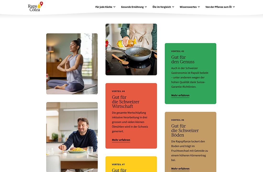
One of the things that really makes flat card design elements stand out is tactile interaction and engagement, meaning each card functions like a card would in real life.
In the example above from Raps Colza, each card flips just like you would flip a playing card on a table.
There’s a tricky balance to making it work in terms of speed of the motion and content on the “front” and “back” of each card. (You almost need the front and back to be interchangeable.)
Play with the speed if you try this technique and get multiple opinions as to how the motion feels and if everything is easy to understand.
Conclusion
One of the best things about a card-style interface is that it gives you control and consistency across devices. Cards can expand or restack across larger screens and then fall vertically on smaller ones without changing the feel of the design.
Then cards are the ultimate button. With a large click area (or tappable area), it’s easy to create and encourage interaction with large touchpoints. (Not getting the engagement you want in a card-style interface? Consider designing a button with a direct call to action inside each card, while maintaining the full card interactivity.)
With so many ways to use cards, there’s no wonder this website design trend keeps coming back in waves. Have fun with it.