
With just the right combination of blur and transparency, you’ve got one of the hottest trends in website and app design – the frosted glass effect.
It is a design technique that uses a gaussian blur, shadows, and transparency to create an element that mimics looking through real-life frosted glass.
Let’s dive into seven different ways to use this design trend.
And, if you need more inspiration, it’s no surprise to know that Dribbble is packed with frosted glass design ideas!
Layered Design Elements
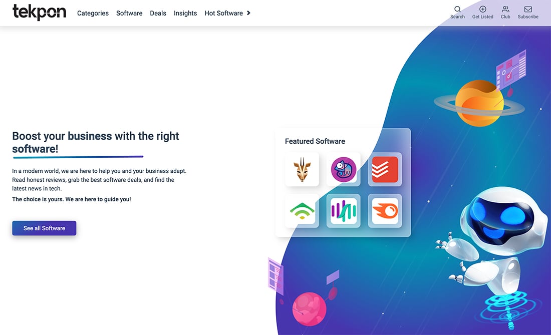
Because of the combination of effects – blur, shadows, and transparency – the frosted glass technique works nicely in a design with multiple layers.
Whether it is for a single element or stacked, such as the example above, it creates subtle depth in a way that allows background elements to push through. This example is nice because you can see the dark and light elements of the background and how the transparency works. Also, note the soft shadow around the white edge of the larger “glass” area so that there is a clear differentiation between it and the background.
The effect is also part of the sticky navigation. If you aren’t sure how to use a glass effect, it can work beautifully for this type of navigation element and can be a good place to start.
Icon Design
Frosted glass icons are a new take on the style of icons that most designers have been using for a long time. This can be a trickier use of the trend, though.
Because icons are so small, frosted effects can add a level of visual complexity to some designs. This is probably most workable for icons that will be used in an oversized manner.
Another viable option is for designs that don’t have a lot of icons and all of the shapes and uses are pretty standard and understandable.
Colorful Background
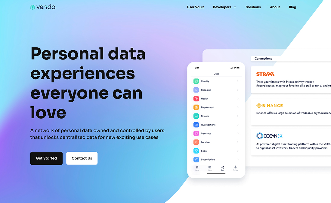
The frosted glass effect can be the basis for a website background.
The trick to making this work is to blur out the background image or colors to the point that the user doesn’t try to guess what the background is made up of. It should just be a softer, almost blob, of color.
Most designers using a frosted glass background are working with cool colors (it emphasizes that winter feel).
The example above uses dual frosted layers with the background and middle-ground element that crosses over the background. The white area and curve into the color background are a strong combination that provides interest for a design without a lot of highly visual elements.
Card-Style Blocks

The frosted glass effect is ideal for card-style blocks to create separation between elements.
In the glass card example above, the design uses a credit card style element but this could be reimagined for almost any similar overlay. Consider using a card-style block in this style as a container for blog posts in a magazine format or as chunky block-like buttons in an app design.
There are plenty of different opportunities to use this display option.
The other thing that this example brings to mind is how to layer frosted glass elements in a dark interface. Note how the frosted glass softens the whole design outline.
Dominant Art
The least common use of the frosted glass effect in website design is probably as a dominant art element, but it can work for this purpose too.
In the above example, the frosted foreground animation serves as a focal point while animated background text scrolls through.
When used as a dominant art element, the challenge with this effect is to ensure that it’s not “too soft.” You want users to understand what they are looking at and know how to interact with it. The key is to not sacrifice usability for a design effect here.
Form and Button Accents
The frosted glass technique can be applied to specific user interface elements within a design.
The landing page concept above is a great example of how to use it for a form field.
What the effect does in this dark design concept is help draw the eye to the action item on the screen. You look there first and know exactly what the gal engagement is.
From a design perspective, having the lighter form field on the dark background helps pull you to it in a way that you wouldn’t with a purely “ghost” or outlined form field, a style that’s been popular because it creates a sleek design element. (Even if it sacrifices some usability.)
Soft Background Layer
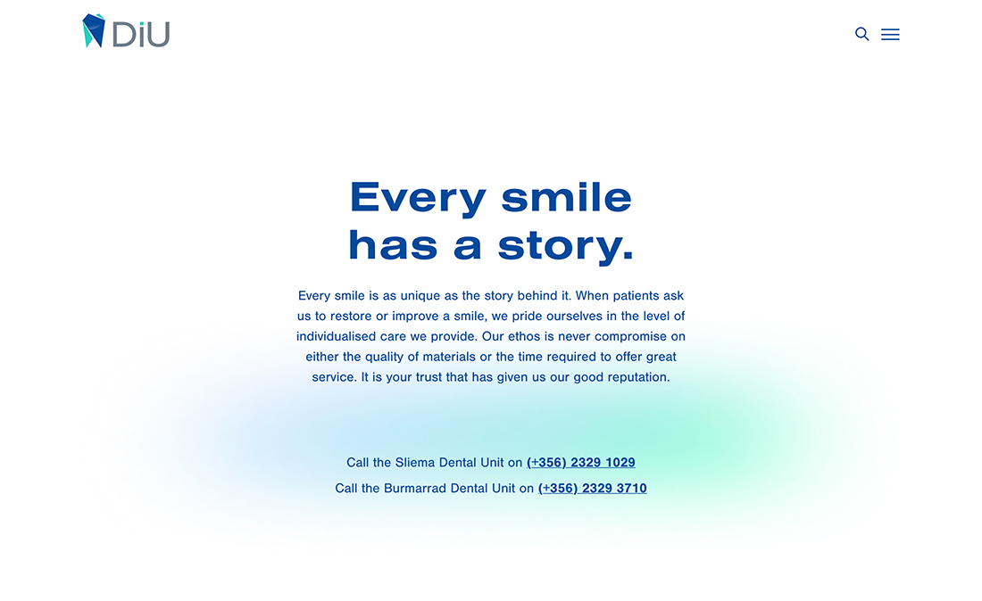
Sometimes the background is super soft and simple thanks to a frosted glass effect. The small area of color against an all-white background can add some visual focus to ensure some movement on the screen.
This is probably the easiest first implementation of a frosted glass element because it is purely in the background without other layers to think about.
While this example sticks to a small area, that doesn’t always have to be the case. Try not to extend the background frosted element to the whole screen though. Having counter whitespace helps emphasize the technique. Otherwise, it might just look like a gradient.
Conclusion
What’s fun about the frosted glass effect is that it can work as a subtle element in small spaces or as the overall design concept for a project. It’s already being adopted by some big names in design… just look at some of the panels on your iPhone when you swipe all the way left or right.
With so many people playing with frosted glass elements, we’re sure to see a lot more of them in the future as well.