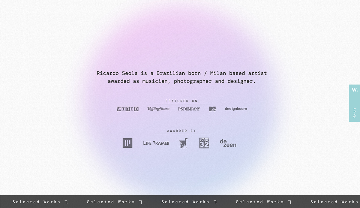
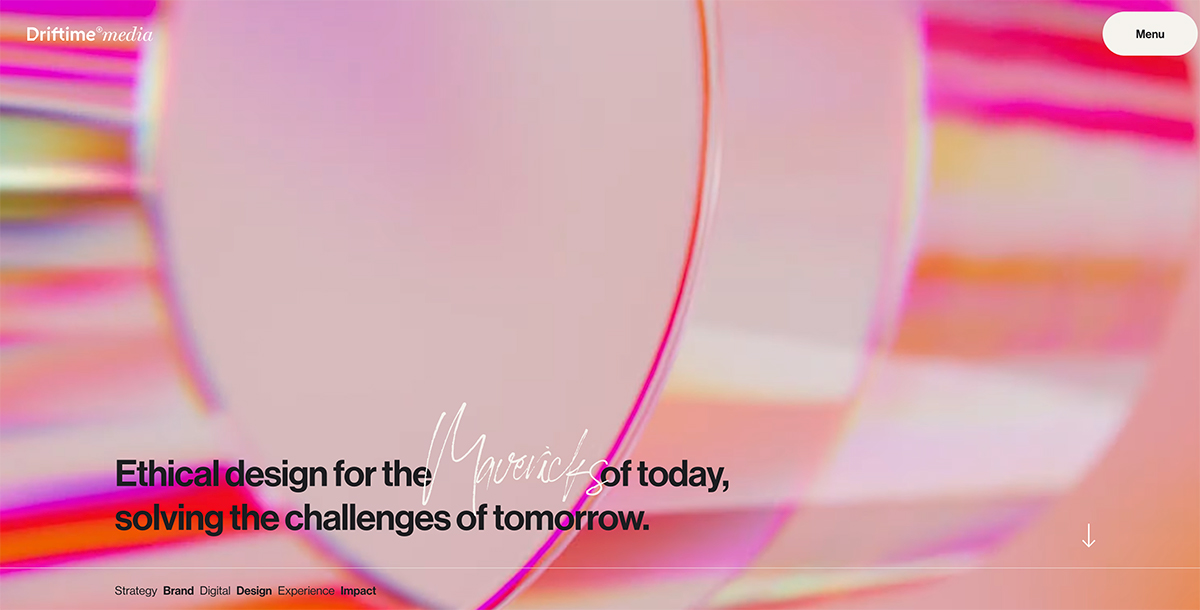
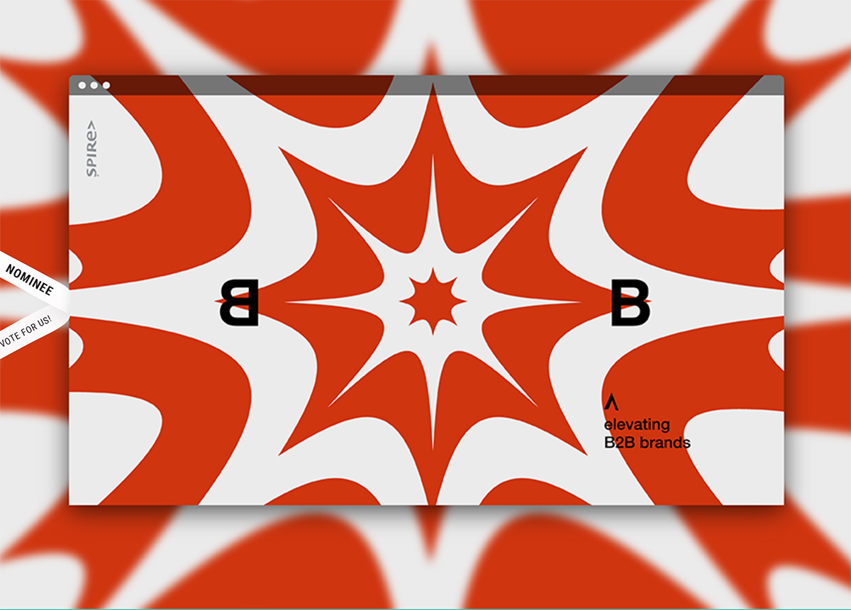
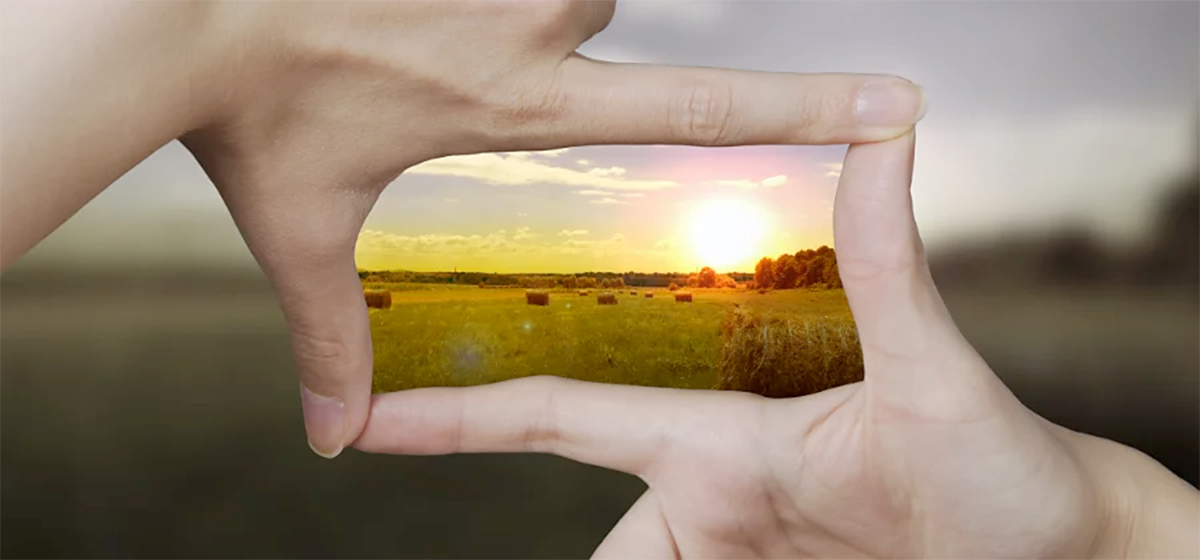
It’s the website design trend that you see everywhere but might not have a name for: gaussian blur.
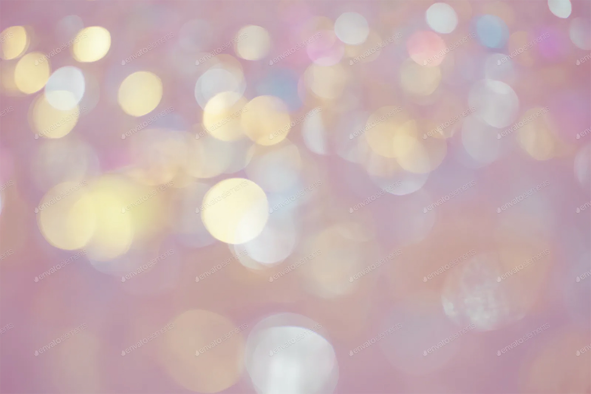
It’s present in several other named trends that have been popular this year and for some time, including the frosted glass effect, creating image depth, bokeh backgrounds, and even for various other background techniques.
Here, we’ll look at this design trend, explore different reasons for deploying it (carefully!), along with examples to help you make the most of it.
Let’s dive in!
What is Gaussian Blur?
Gaussian blur is a term that comes from image processing that uses a mathematical function developed by Carl Friedrich Gauss. (There’s a pretty complicated formula for it if you want to look it up.)
The more simple explanation is that Gaussian blur is a technique that smooths and fades parts of images, generally to reduce noise or add focus to the foreground of an image. Photographers can create a blur effect in the process of taking images or it can be added later using a tool such as Adobe Photoshop.
The larger a Gaussian blur is the less discernable the image behind it will be. A light blur can close the gap between dots in a halftone image, while a large blur can turn almost any image into a colored blob with outlines of shapes.
Common places where a Gaussian blur might be applied in design include on image to create sharper foreground focus or to create a more three-dimensional effect, to clean up noise in an image, to create a background, as the faded area as part of a drop shadow, or to hide elements in an image (such as a face or identifying element).
For purposes of the current trend, Gaussian blur is most commonly used as a technique for developing and creating background elements.
Characteristics of the Design Trend
The key characteristic of this design trend is the use of blurred images and backgrounds. Sometimes you might know what the background element stems from, but that might not always be the case.
You see this effect a lot on social media with images that aren’t quite the right size to fill the frame when the image is centered with the image replicated and blurred in the background.
This popularity and usage of this effect by major platforms might be one of the reasons why Gaussian blur has become a popular effect for a variety of design projects. (We all know that once a major brand starts using a technique, it can rapidly turn into a major trend.)
Awwwards, for example (above), uses a light background blur in this manner.
The variation of blur can vary greatly, but most commonly you can see an outline of shapes in the blur. It’s just enough to create visual interest but not so much that you spend time trying to figure out what’s in the background.
That a fine line when working with this trend. Not enough blur and you just have an image that’s difficult on the eyes. Too much blur and colors and shapes fade into nothingness.
To really master this technique, you’ll want to play with it on a variety of images and with different colors in the base image to work from. You can get more effect with high contrast elements and a softer background with a lower color contrast starting point.
7 Ways to Use Gaussian Blur
The fun part of Gaussian blur as a trend is that it can fit into almost anything. From full background elements to light touches on a single element, there are plenty of ways to use this technique.
As a Subtle Background Effect
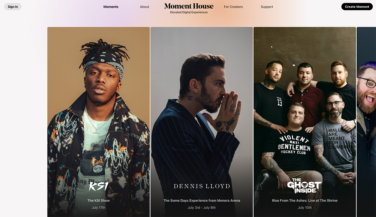
Moment House uses a blurred background effect throughout the design and expands the blur to a full-screen element on pages without other images. It creates a subtle and simple visual consistency as well as keeps the navigation from feeling too stark.
To Create Image Focus
One of the oldest uses of Gaussian blur is to fade out the background of an image to provide more foreground focus. Adviceline Injury Lawyers takes this to another level by combining blur and removing the color from the background so that the focus is on the woman in the image, not what’s behind her.
In an Animated Background
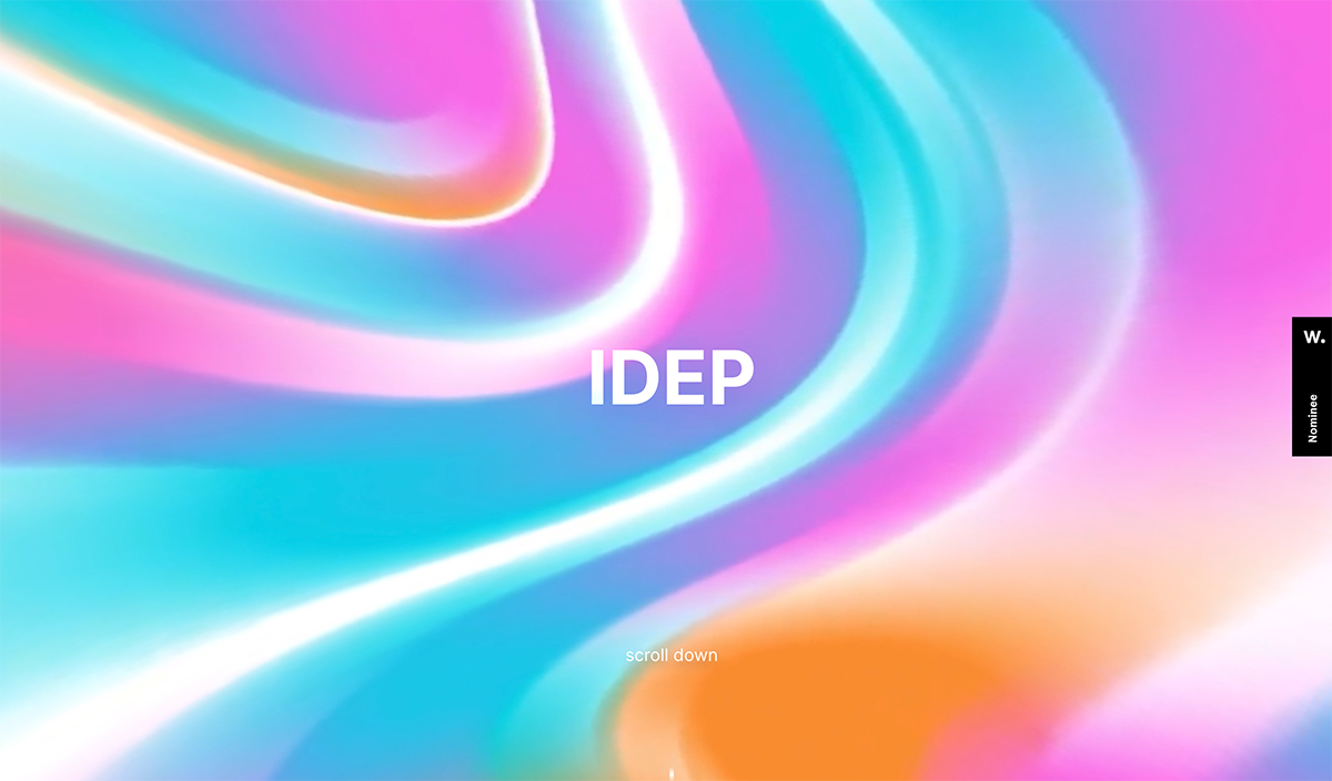
Sometimes a blur is nothing more than just that – a whirl of color. IDEP uses this philosophy and animated the blurred color curves to create something that’s interesting to look at.
To Show Speed or Motion
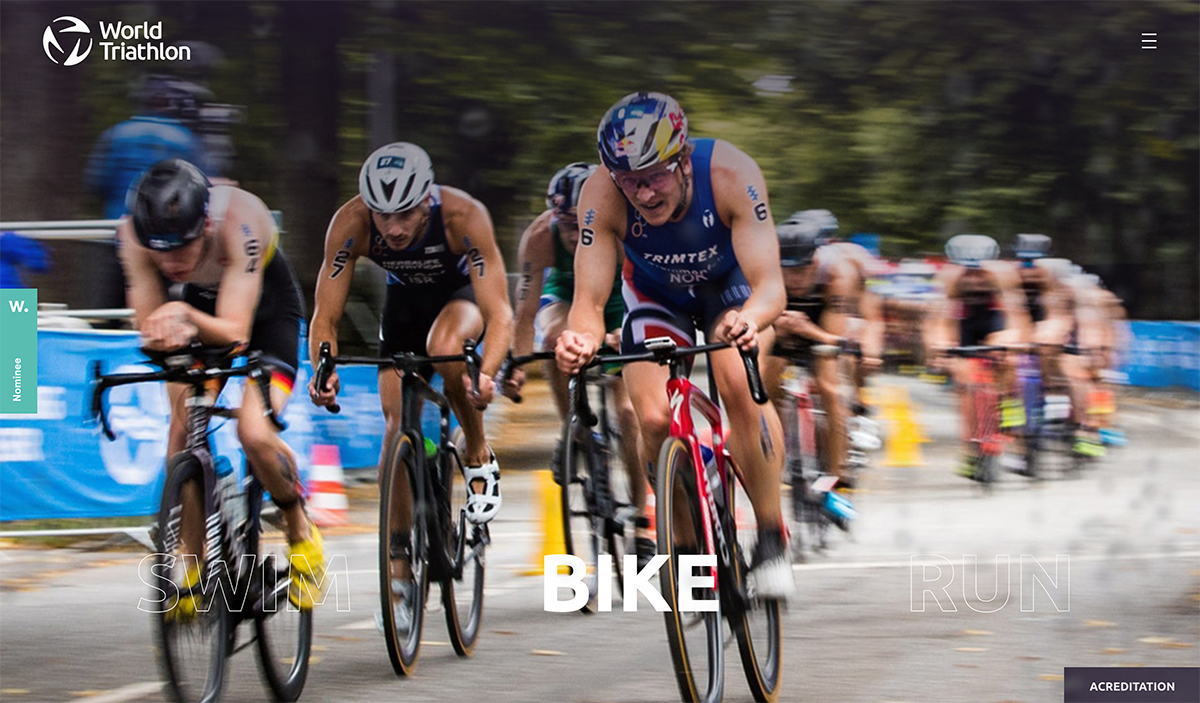
Particularly in photography, the right blur can show speed or motion. World Triathlon uses this concept for photos on its homepage to generate excitement for an event.
To Create Depth on the Canvas
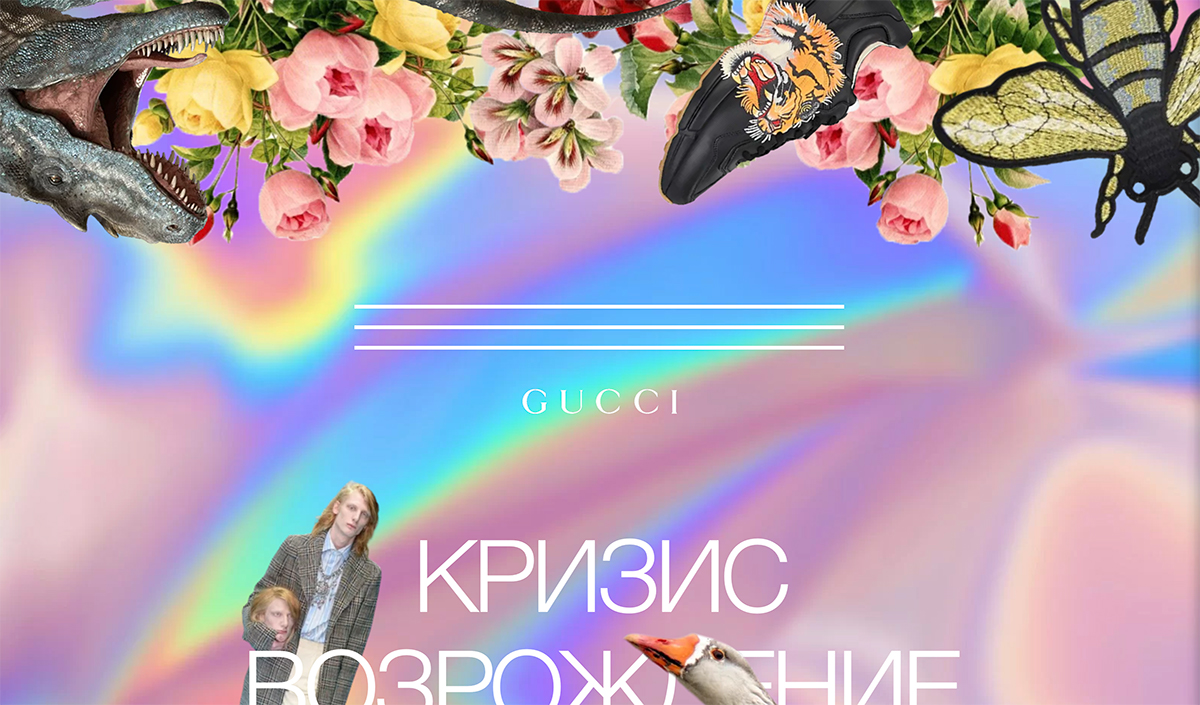
Gucci mixes a lot of design elements here in a wild way, notably with a bright-colored blur in the background that separates layers for a more 3D effect.
For a Neon or Shadow Effect
A Gaussian blur drop shadow is another method for creating depth and dimension on screens. Roccat uses blur in a drop shadow to establish the feeling of multi-layer depth and a neon light effect. SO, there are actually multiple blur effects happening here at the same time.
For Subtle Color Variations
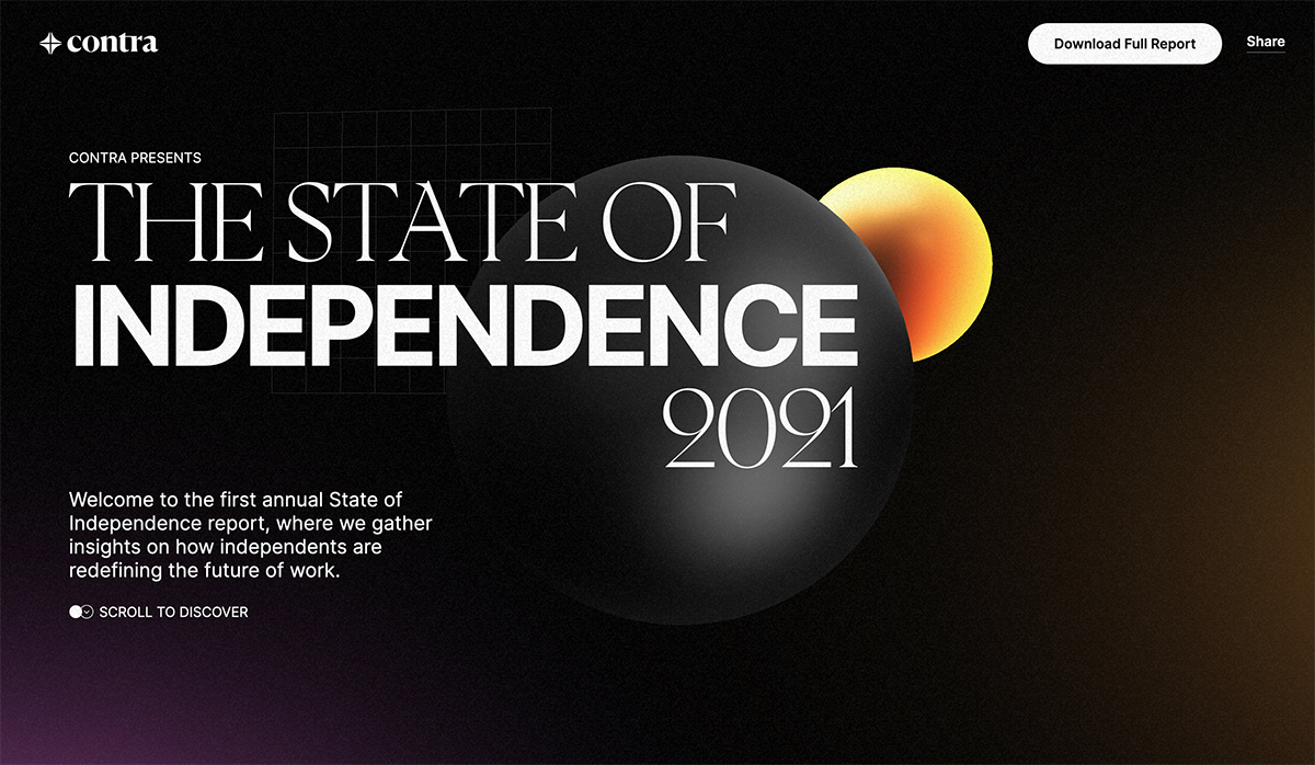
Contra uses Gaussian blur in several locations with this design. The background actual slowly animated with blur that’s made to mimic natural light. Interestingly blur here does the opposite of what many use blur for – there’s actually noise contained therein, rather than being blurred out.
Gaussian Blur Tools and Resources
Learn more about Gaussian blur and how to apply it well with these tools and resources.
- Adobe: Demystifying Gaussian Blur
- Abstract Blur Hallway Stock Photo
- Blurring Images with Python
- Blur Instagram Stories Template
- How to Use Gaussian Blur in Photoshop (Step by Step Guide)
- Zoom Blur Photoshop Action
Conclusion
When you really start to think about it, the use of Gaussian blur in design projects could be an extension of the gradient color trend that’s been so popular for a while now. It’s a different way to create color graduations with more shapes and dimensional elements.
The good news is with a little practice, you can create a stellar Gaussian blur that can work in a number of ways for all kinds of design projects.

