
The web is a little brighter right now. Neon colors are making a comeback. And we’re all for it!
From bright, neon yellow to other popping hues, this design trend is showing up all over the place on a variety of project types. What’s nice about neons is they have an upbeat happy feel – something the world seems to need.
Here’s a look at the neon colors design trend, with examples, and best practices for use.
Ditch the monochrome, get out your neon colour palette, and join us on a journey into the bright and vivid!
What is the Neon Colors Design Trend?
This is an easy trend to see, although it can be a little more challenging to use. The trend is a collection of designs that use neon colors.
While some website designs are going all in, such as the example above, most uses of this trend are a little more subtle.
Neon colors can be a challenge to use because it can be tough to ensure they render just right and unless you are using a dark palette with them, contrast can become an issue. For the most part, neons are a fun accent that can add a certain feel to the design.
How to Identify this Design Trend
This might be one of the easiest trends to spot in terms of visual identification – just look for neon colors.
Neon colors are non-metallic, bright hues that are often extremely bright. A neon look can be applied to almost any color in the rainbow, but the most common is yellow.
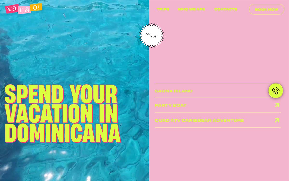
These colors might be part of an overall scheme or used for accents in a design. The latter is the most common. Many of the designs we are seeing as a part of this trend right now have a dark or black background and use neon yellow as an accent.
This solves a lot of contrast problems that might happen with neon yellow on white or light and provides an interesting and funky color combination. Use this concept to set a very distinct mood or tone for your projects.
Key Characteristics and Colors

While neon yellow variations are the most commonly used, that’s not the only way to create a design that uses a bright palette.
Here are a few neon options and their color codes:
- Green #39FF14
- Red #FF3131
- Orange #FF5E00
- Yellow #DFFF00
- Magenta #EA00FF
- Purple #BC13FE
- Cyan #0FF0FC
How to Use it Well
The trick to working with neon color is balancing contrast. Bright colors can degrade quickly on screens and lead to readability issues.
For the most part, design with a neon color in almost the same way you’d use white. The brightness of neon is similar and that can help you make solid design choices that will be the most readable for the greatest number of users.
The second thing to think about with neons is balance. Too much neon color can feel a bit overwhelming. That’s why so many projects use these colors for accents.
Finally, you’ll want to consider mood and overall content theme when working with neon color options. These colors set an innate mood that’s often more fun and light. Neons aren’t always something you think about when you want to set a serious tone. Matching color to the tone of the design is important in this way.
5 Examples We Love
This trend – while somewhat difficult to use – has a lot to love. Here are five examples that use neon color options exceptionally well. Use them for design inspiration.
Metaluxe
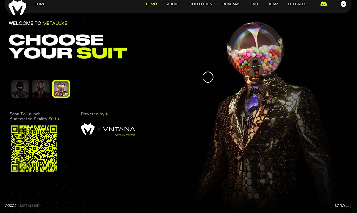
Metaluxe goes all in on a dark background with neon yellow accents. With touches of neon everywhere, the design has a clear eye pattern and you know exactly what to do. The QR code is an especially nice touch.
FIG
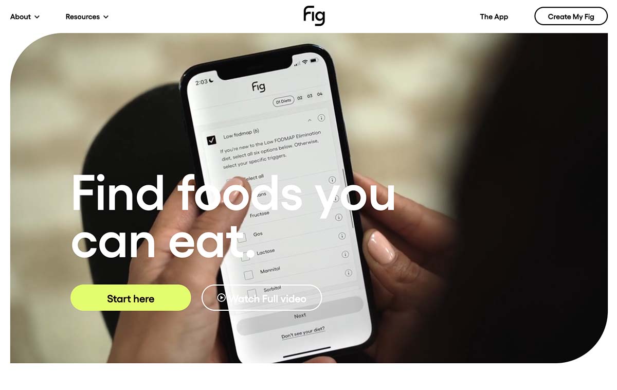
FIG uses neons in a couple of ways as you scroll through the site – primarily yellow and purple. The colors are alternating accents and calls to action and backgrounds. (Both play on the idea of using neons where you might otherwise use white.) It’s one of the most elegant uses of neon color that we’ve seen.
North of Zero

North of Zero is another dark background with neon and white content. The use of space and the funky barcode at the top of this design pull it all together nicely.
Chew Choo
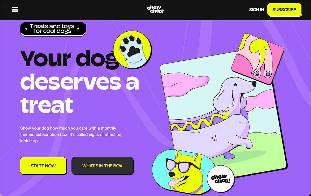
Chew Choo is one of the rare examples where the whole design is rooted in neon colors. Combine that with the content and fun illustrations and it does have just the right feel. The design does a good job of using dark elements to ensure ample contrast throughout the design.
Forward Obsessed Podcast
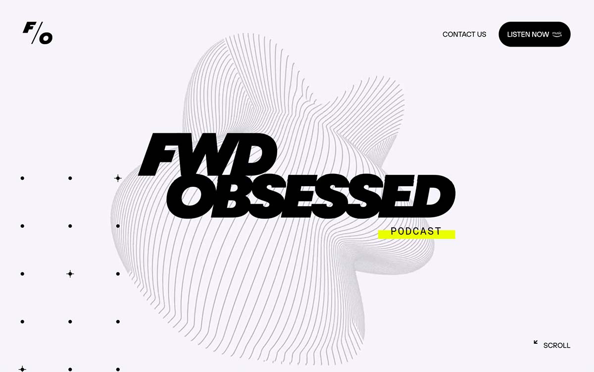
Forward Obsessed only has a tiny touch of neon on the homepage, but it leaves an impression. That same accent/underline is carried throughout the design and stands out on the minimal background. What’s interesting here is the neon yellow is amped up just enough to work well on the white background and not get in the way of black text. When playing with neons, work on the color balance until you get a hue that works with the rest of your design for the greatest impact.
Conclusion
Neon colors aren’t always easy to use and can work best when you think of them as an accent to the overall aesthetic. But with the right content, a full neon color palette can work.
While the most common color is neon yellow, there are other options. Experiment and have fun with these colors to add a little vibrancy to design projects.