It looks like QR codes may be back – and here to stay. QR, which stands for quick response, is a bar code that most phone or tablet cameras read that provides a link to something online.
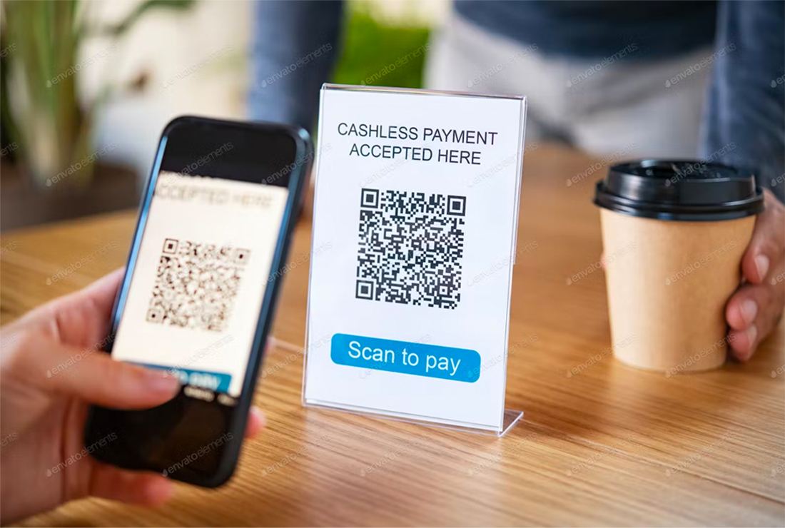
A tool that seemed like it had all but vanished re-emerged as a form of contactless information for things like menus or even to collect payments (such as PayPal, Cash App, or Venmo QR codes).
Using QR codes is more than a design trend; it can be a highly functional component of many design projects.
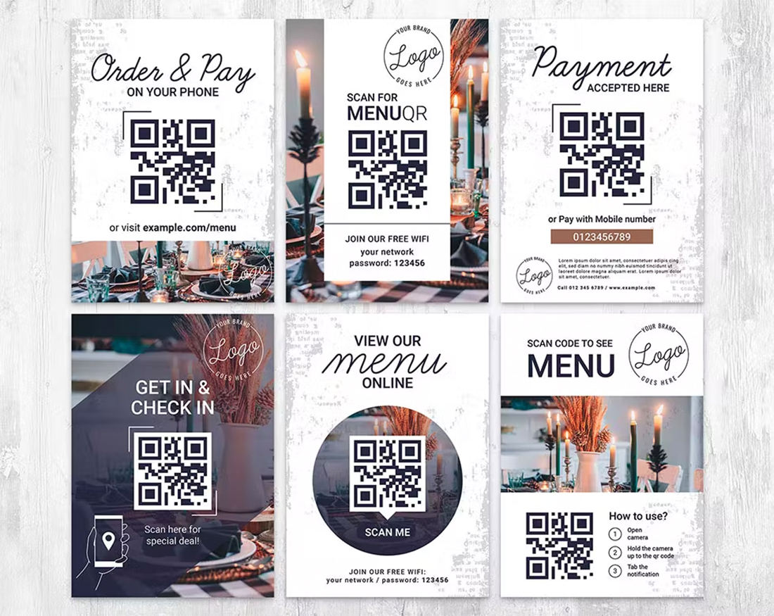
Here are some ideas for using them well (with a few examples from Envato Elements).
Use a Simple Design
When it comes to creating and designing QR codes, there’s no need to get overly creative or break the “rules.” A QR code should be easy to identify and use.
If you try to do too many wacky things – colors, designs within the code, oddball placements, etc. – you could actually do more harm than good and confuse people who are trying to use the code.
Here’s the other major design consideration: A QR code is a functional design element. It should be obvious what it is and how to use it within whatever design scheme you choose.
No matter what you do with the design, if it contains a QR code and users don’t scan it, something is wrong.
Take Care with Size and Scale
Size and scale are very important to think about with QR codes. You have to think about the size and placement based on the environment and medium. Where will the user be in relation to the code when they try to scan it?
In more practical terms, the size of a QR code on a billboard will be much different than on a menu or flyer. Both have to be about the same size for scanning in the camera viewport of a mobile device.
A code that’s too big or small is equally hard to scan. Ideally, you are looking for the code to fit in a comfortable viewing area of the screen so that it is still big enough to tap through for the link.
Ensure Clean Printing
For most design projects with a QR code, there’s printing involved. A clean, crisp print job is essential to ensure the readability of the code.
Blurry printing or out-of-toner spots can render the QR code useless if you aren’t careful.
For the best results, create a QR code that uses pure, or K black, in CMYK printing. This will prevent fuzziness in the color and help create clean lines. If you print and the code is suspect, test it on a variety of phones at various distances to ensure it scans well before distribution.
Provide Instructions or Set Expectations
Most people know what do to with a QR code and have a reasonable expectation of what they do. But it still doesn’t hurt to provide simple instructions such as “SCAN ME” for users who aren’t familiar.
What might be more important is to set expectations in the design with what information is on the other side of the QR code. Tell users what they will get when they scan it before they complete the action.
This action could include anything from buying tickets or a product to signing up for emails to viewing a restaurant menu. You will create a better user experience if people know what will happen with the code before they begin to interact.
Design Enough Contrast
Another major printing consideration for QR codes is the contrast between the code itself and surrounding elements. (There’s a reason that most QR codes are black on a white background.)
While a dark code on a light background is ideal, you can also reverse the color patterns for an equally scannable element.
What might be even more important is the space around the QR code. There needs to be enough room around it with ample contrast so that the phone camera can pick it up with ease and not confuse surrounding elements with the scannable part of the design.
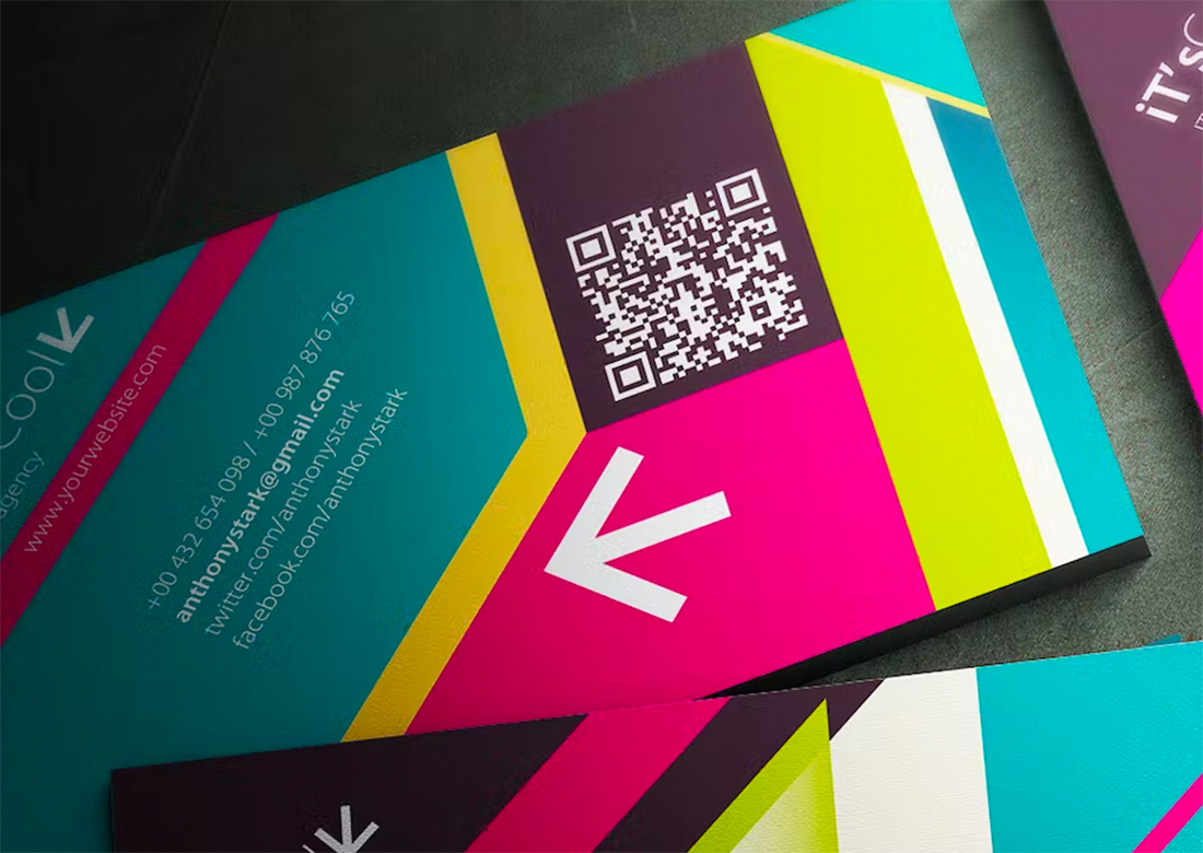
Avoid putting other design elements – particularly lines or dots – close to the QR code because it could potentially impact scanning.
Create Codes with Purpose
This goes almost without saying, but we will anyway. A QR code isn’t something you do for visual purposes. This is a functional design tool and should be used with a distinct purpose or goal in mind.
Check the Terms of Service
There are a lot of sources when it comes to QR code generation tools. There are free and paid services, all with different rules, features, and terms of service.
The latter might be the thing that’s most important to you. Some QR code generators only allow you to have the code for a certain amount of time before the link expires without payment. You may also get limited analytics or tracking with some generators, and others won’t allow you to download a vector or high-resolution version.
Check the terms of service before you create your code to ensure that you have a tool that matches your needs, from reporting to size to the duration of the code. Some of those paid tools are well worth the price.
Don’t Forget to Test It
Regardless of which tool you choose, it is important to test the links and make sure they do what you intend.
If by some chance your design contains more than one QR code, you should test and pair it with instructions for each. (Multiple codes in the same design can be tricky and isn’t generally recommended.)
Design the Destination for Mobile Devices
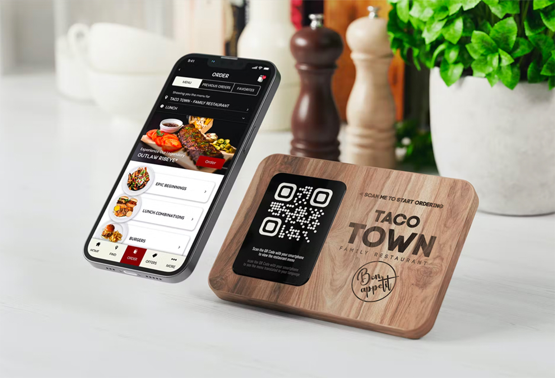
Because QR codes are a tool that’s most commonly used with mobile devices, the destination link should work flawlessly on mobile. If you send a user a QR code to a website that’s not mobile-friendly, the results will likely be less than stellar.
This does not mean QR codes have to go to apps, but a mobile website design is a must. Consider a custom landing page that helps direct traffic from QR code users to exactly what they are looking for.
If you have a restaurant with a menu, for example, the PDF version of the menu is not the best option from a QR code because it can be harder to read than a simple responsive webpage.
Conclusion
QR codes are a great design tool that can help you get offline traffic to an online source. They are popular for businesses that want to provide a contactless option – such as a menu – as well as for flyers or brochures to help someone find additional information.
The primary benefit of a QR code is that it is a more frictionless way to access something online without having to type in a long or clunky URL. With a simple scan, users can access online content with ease (as long as you have created a design that sets them up for success).


