
Almost everywhere you go online, there seems to be some sort of animated effect or element. Here’s one more trend in website design and animation: scrolling text elements.
You’ll know this trend the minute you see it because text elements will move on the screen. Sometimes this effect can help aid readability and understanding, whereas other times it is merely a design element. Either way, it’s an eye-catching effect that can help add a unique element to your design.
Let’s dive into this trend, its characteristics, and some examples.
Identifying this Design Trend
This website design trend is pretty easy to identify at a glance – it includes anything where there are animated text elements that scroll horizontally or vertically on the screen.
Scrolling text may appear in the hero image, but often it is a little bit below the scroll. And that’s a good thing because this type of animation can appeal to users or totally turn them off. There’s usually not a lot of middle ground with moving typography.
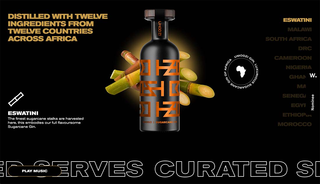
You might also notice from the examples here that most of the designs that feature scrolling text elements have fairly busy designs with a lot of elements in the same space. Scrolling text is just one more piece of that puzzle in these projects.
3 Key Characteristics
While the only thing that you need for this website design trend is an element with moving text, there are some other key characteristics that are common. We’ll note that these additional characteristics may be subject to change as this design trend continues to evolve and shift.
- Oversized typography: Often you can’t read the entire work of phrase without the scrolling animation
- Simple or common phrasing: Easily understandable words aid comprehension with an animated style
- Automatic movement or motion: When you get to the scrolling text element, animation generally happens on its own or with a common scroll interaction
How to Use It Well
When it comes to using this design trend well, consider two key factors:
- Text needs to be easy to read
- The user should have some control over the scroll or motion
Both of these elements contribute to the overall user experience and comprehension of what’s on the screen. Scrolling text animation can be a lot like auto-play video if you aren’t careful (meaning it’s incredibly annoying and frustrating).
Every user reads at a different speed or processes information differently. Scrolling text is ok, but users need to have the ability to control it to enough of a degree so that they can understand what you want them to read.
Finally, as this trend evolves, it would be nice if scrolling text weren’t so frequently paired with busy designs. It works well in the example above, which is simply allowing scrolling text to serve as a visual accent.
Ways to Make It Your Own
So how do you take this website design trend and really make it your own? All of the examples here provide glimpses into different ways to deal with and work with scrolling text elements.
Here are three ways to help customize this element to match your design plan:
- Use words in scrolling text that are important to your brand or design. Emphasizing your brand name (such as the example above), highlighting a hashtag or tagline, or focusing on your unique value proposition or mission are ways to own this design element.
- Use a font choice that’s unique to your brand for scrolling text, and only use it in this part of the design. This will create visual interest for the scrolling text element and tie it to your brand at the same time.
- Allow users to control the scroll. While some scrolling text just moves without controls, letting the user dictate movement by actually scrolling can help the design feel more customized to the person interacting with it. This can also aid readability.
3 Examples We Love
When it comes to any design trend, there are some obvious visual winners. Here are three websites with scrolling text that we think stand out for good reason.
Exgalleria
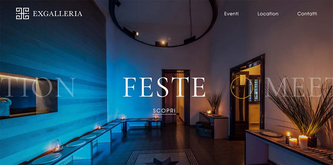
Scrolling text has a distinct purpose here: It helps you navigate the website. There’s enough subtle animation and a fade to cue you into the idea that text scrolls, but the user has complete control with a big mouseover arrow that initiates movement. It also doesn’t hurt that the imagery and typography choices are lovely.
Di Costanzo
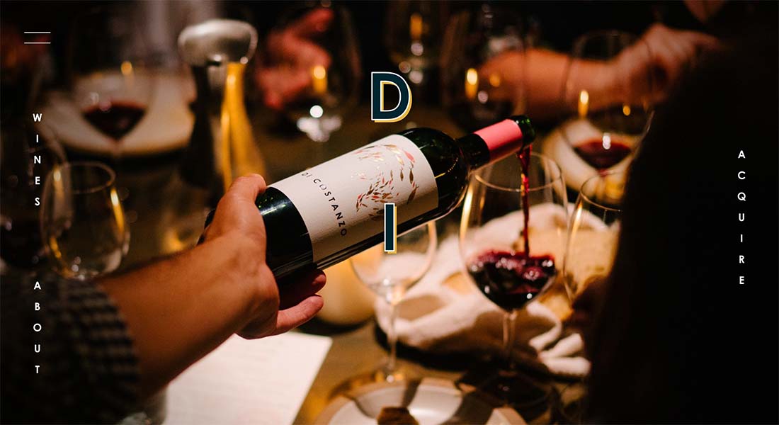
This design flips the idea of scrolling text from every other example here with vertical scrolling text. The result is beautiful and interesting. It makes you want to scroll all the way to the end, too.
Peppa Sauce
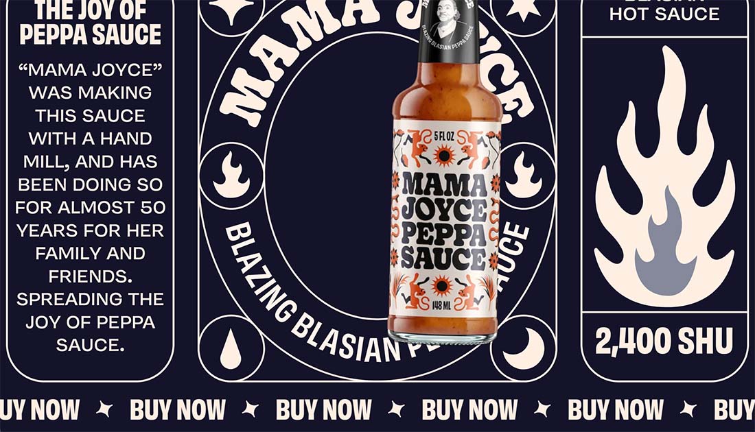
Peppa Sauce is a very busy website design but layers of scrolling text have a nice effect here. All of the motion is user-activated on scroll with text elements that move left and right, up and down, and include various sizes and structures. There’s so much going on that you probably won’t read all of the words, but the right key phrases have the size and placements to make you notice them first.
Conclusion
This is one of those design trends that seems to have almost popped up overnight and is everywhere. It can be interesting and fun but does present some challenges; namely readability and accessibility.
If you plan to use scrolling text in your design, it is a good idea to think about the words before the design here and weigh the pros and cons of the animation being automatic or controlled by the user (the latter is important from an accessibility standard). Most importantly, if you do use this design trend, make sure it has a purpose and works with your overall goals.