
Let’s start with a definition. Readability is a measure of how easy a piece of text is to read. The level of complexity of the text, its familiarity, legibility, and typography all feed into how readable your text is. Readability is a key factor in user experience.
Why would we ever showcase a design trend that features text that’s not readable? Simply, because it is popular. Does it mean that it’s a good idea? It… depends!
You can read on, look at the examples, and decide if it is right for your projects.
Where Did This Trend Come From?
Just because the text isn’t inherently readable doesn’t mean it lacks design value. These designs can be quite stunning and visually interesting.
This trend seems to have spawned from experimental fonts, which are continuing to grow in popularity. And maybe a little bit of design boredom after nearly a year of near isolation and work from home due to the global pandemic.
The latter has also forced designers to balance visual interest without a lot of imagery with people. Masked photos can be awkward depending on the industry, crowds aren’t appropriate, and actually reshooting for your library might be tricky at this time.
So, alternatives emerge. Playing with typography is a solid option.
The examples below highlight different ways that designers are doing this.
Text You Don’t Need to Read
Text can add interest and shift focus to other visual elements without really needing to be read at all.
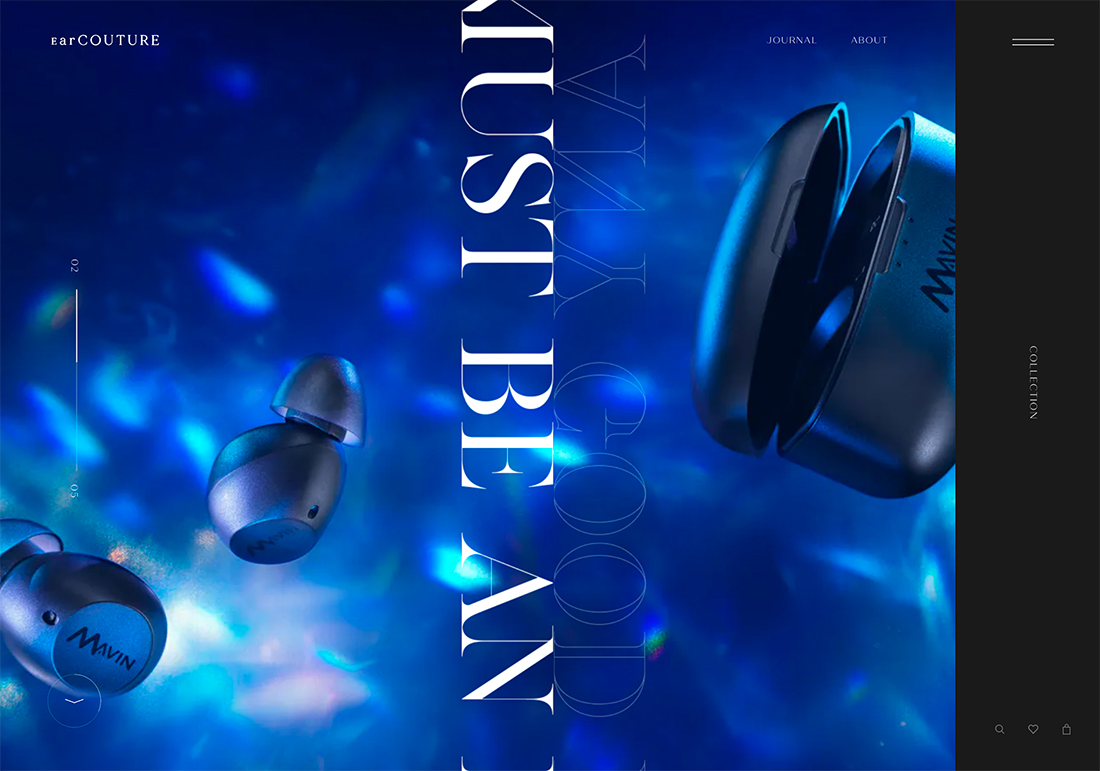
Ear Couture does this well. The dual lines of text moving in the center of the screen almost split the visuals in half so that you move from one side of the screen to the other. It helps create a visual focus for the highly designed products in the background.
Nothing about the text element implies that you should read it, other than the fact that it is text. There are moving filled and outline elements moving in opposite directions; the text is tilted 90 degrees and inversed on one side.
This is a prime – and nicely executed – example of text that has no readable intent behind it.
Liquid Animation
Sonia Presne’s portfolio uses a fun liquid animation for her name that is less important than the work on the screen.
Slider/scroll actions allow you to see the liquid elements and even letters more clearly. It’s designed to be highly visual but then provide necessary information when you need it.
This works because supporting text elements are clear and easy to read. Move to the “About” page and you can see a simple version of her name on the screen clearly, as it should be on an about page.
Oversized Typography
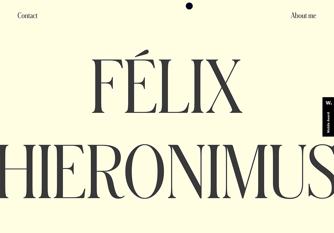
One of the oldest tricks in the book is to make the text so big that it becomes more impactful as a visual tool than a messaging tool. That’s just the case with this example.
The text element is extremely large and feels even bigger due to all caps typesetting and the style of the typeface itself.
It’s an impactful option with just the right number of letters. You should see it as striking first and then try to read the name. This technique is best suited for a portfolio style design because names are inherently hard to read as well. So, there is somewhat of an expectation that text will take a few extra seconds to fully understand.
Rotating Animations (Plus All Caps)
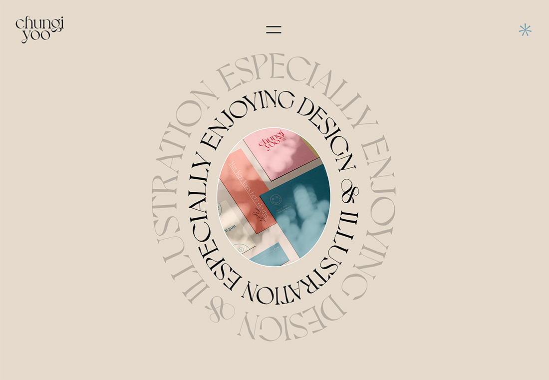
Circular text elements could be considered a trend on their own. They aren’t always hard to read.
Readability can vary widely based on size, font selection, and animation speed.
Here, Chungi Yoo opts for a less readable combination with all caps text in a serif that may have readability issues without this shape and animation. Alternating rotations also make it a little harder to understand.
The question is whether you need to actually glean any information from the words. In this case, maybe not. That’s what keeps you from getting hung up on the design treatment and continuing to flow through the design.
Truly Experimental Typefaces
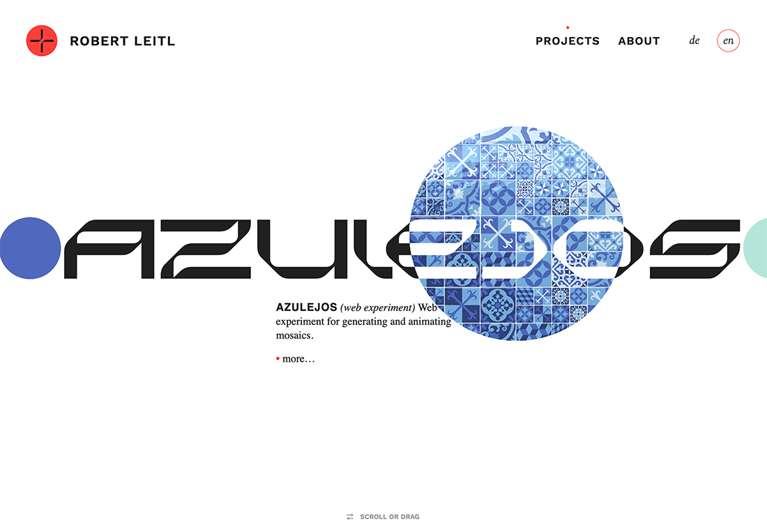
Experimental typefaces are huge right now. This trend is significant enough that you can read more about it here.
In a nutshell, experimental typefaces are often unusual. They are beautiful, unique, and visually appealing. While a lack of readability is not a defining characteristic of experimental typefaces per se, it can often be the case because these fonts are often designed as artwork.
When paired with a simple, more readable option, experimental typefaces can provide an amazing aesthetic that draws website visitors in.
It’s a solid solution for designs without a lot of other competing visuals, such as the example above from Robert Leitl.
Larger Than Life Text as Art
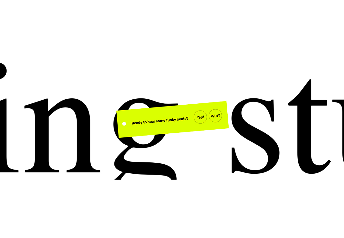
There’s oversized typography, and then there are letters that are larger than life. The latter is near impossible to read unless just the right combination of letters appear at once.
The example above proves this case in point, as certain words become clear as letters move across the screen, but more moments than not it’s just part of the background.
What you really see is the bright yellow-green box with the question at the screen center. This shows that typography here is much more of an art element than a text element.
Conclusion
While readable typefaces are a design staple, this trend is a lot of fun. Here, we’re thinking about fonts and text elements as artistic flourishes, not in the traditional sense of messaging.
Here’s what makes it work: You must support unreadable text with simple, highly scannable typography so that your message and goal aren’t lost. If website visitors spend too much time trying to read something that isn’t supposed to add understanding or meaning, you risk them forgetting why they are there in the first place.
So have fun, but don’t lose track of your conversion goals.