Ideally, mobile designs would be seamless with no need for technical documentation, online help, or tooltips. In reality, even the best designs can benefit from supplemental information. A tooltip provides this supplemental information when users tap an icon, image, hyperlink, or other elements in a mobile user interface (UI). For example:

By identifying the “Solid Fill” and “Radial Fill” functions, the tooltips shown above make it easy for users to find the drawing function they need. These tooltips appear in the proper context and are not obtrusive. A first-time user can easily understand the meaning of each icon while an experienced user is unlikely to find these tooltips distracting. In short, the designer has balanced the needs of new and seasoned users. The result of this successful balance is a set of tooltips that users will perceive as a natural extension of the design experience.
Too often, however, tooltips are an afterthought as shown in the following example of a mobile contrast checker:
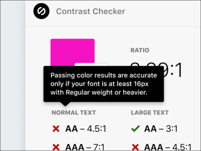
While the explanation about the contrast checker is clear, the text is too long and covers important information on the screen. The result is a clunky tooltip that confuses as much as it elucidates. Avoiding troublesome tooltips requires thought and planning.
How To Design Effective Tooltips
The key to designing tooltips that fit seamlessly into the overall design is to plan for them early in the design process. Specifically, designing useful tooltips requires:
- Proper timing
Paying attention to tooltips and related design techniques during the sketching and early prototyping stages. - Proper implementation
Carefully considering tooltip context, placement, and clarity.
Timing
Timing refers to when during the design process to consider tooltips. By referring to the widely use design sprint, developed by Jake Knapp, we can identify the right stages in the design process to make decisions about design elements like tooltips.
Knapp’s sprint process consists of mapping out the problem, sketching solutions, choosing one solution, building a prototype, and then testing that prototype. In short, generate an idea, build it, and test it. The following image shows Knapp’s five-day design sprint process. I’ve added text to the sketching and prototype days to show when designers and developers should start thinking about tooltips.
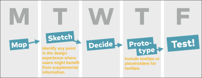
Sketching is the logical place to begin when considering tooltips because potential points of confusion emerge as the layout and preliminary content take shape. Because initial sketches often do not include complete or detailed content, it is not necessary to identify every possible tooltip or even to include all designated tooltips at this stage. Rather, the point is to identify parts of the UI where a well-designed tooltip would help users complete the task at hand or more easily understand content.
For example, a tooltip on a field label makes it easier to fill out the form while also reducing data-entry errors. If it’s not yet clear whether a tooltip is necessary, simply include a callout with a question as shown in the figure below.
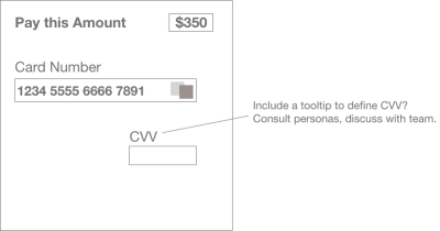
The callout shown above serves as a reminder for the team to discuss before building the prototype. In the “CVV” example above, the team might decide that one persona represents users who are unfamiliar with financial terms and abbreviations. For this group, a CVV tooltip would likely be useful and could easily be incorporated into the prototype as shown below.
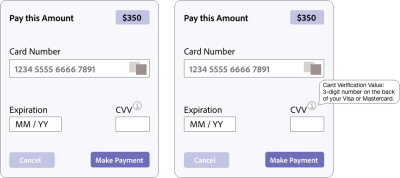
Considering the need for tooltips and other supplemental information early in the design process increases the chance of developing a useful and usable prototype.
Implementation
The increasing complexity of mobile apps and limited space on mobile devices pose a significant challenge to designing effective tooltips.
Designers can meet this challenge by focusing on:
- Context
Check, check, and re-check the context for every tooltip. What might appear obvious to you as the designer could easily confuse a first-time user. The principle of attending to context applies to all aspects of UX and UI design. It’s especially important for tooltips because their necessary brevity will leave users confused if the context is not clear. - Placement
Tooltips should be prominent and easy to find but should not obstruct important information on the screen. - Clarity and brevity
Edit each tooltip for clarity and brevity. As many editors tell their writers: “Cut, cut, and cut some more.” It’s okay to write longer tooltip text in early iterations as long as you remember to keep editing and condensing for clarity.
The tooltip in the following example fulfills these criteria by providing essential information without disrupting the flow in the mobile form.
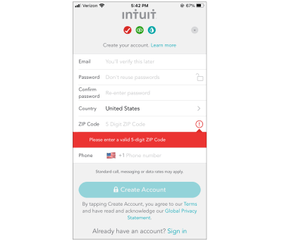
Because space is limited on mobile devices, clarity, brevity, and placement are essential. The tooltip on the Mint registration screen shown above is well designed. It is clear, concise, and appears directly below the zip code field when users tap the information icon.
The Square mobile app shown below provides another example of good tooltip design by helping bi-lingual users select their preferred language.
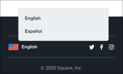
The “English/Español” tooltip shown above is clear, brief, and properly placed. When users tap the flag icon or “English” text, a tooltip appears with the option to select “English” or “Español.”
Well-placed tooltips enhance visual design by providing short, specific explanations when users need them. In the example above, users who are seeking information in other languages know immediately that they can choose between English or Spanish for this website. The language tooltip helps native Spanish speakers who might read English well but feel more comfortable using the Square app in their native language.
Utility is essential but not sufficient. Effective tooltips should be discreet to the point that users barely register their presence. Users only miss tooltips when they aren’t there. This approach to tooltips is an example of the long-standing view that great design is invisible. From this perspective, users never notice the design. Instead, they feel engaged and easily complete the task at hand.
The tooltip shown below on the Google Maps app is easy to find yet subtly integrated into the existing design:
- The icon for muting/unmuting appears in a vertical row of icons.
- The placement of these icons on the right makes them easy to see without obscuring important information on the map.
- The mute/unmute icon follows the same style and color scheme as the search icon immediately above.

This Google map tooltips works because:
- The context is clear. The option to toggle on sound (before pulling out of the driveway) is useful because it’s easier and safer to listen to directions while driving than to look at the phone.
- The placement of the mute/unmute icon in a group of existing icons makes it easy to see without obscuring important information on the map.
- The one-word tooltip is brief, and its meaning is clear.
In contrast, the tooltip shown in the MyZone fitness mobile app below is poorly designed.
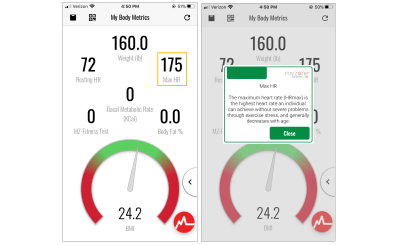
While the context is clear, there are problems with the MyZone app tooltip:
- The placement is clunky because it obscures important information.
- The tooltip text is lengthy, and the explanation of “Max HR” is confusing.
To accommodate this lengthy text and the distracting green bar at the top, the tooltip is unnecessarily large. The result is a tooltip that is not discrete; it does not feel like a natural extension of the design.
Poor placement and confusing explanations are not the only problems users experience with mobile tooltips. A surprisingly common issue is the redundant tooltip. The tooltip example below is part of an illustration of cascading style sheets (CSS) smooth animation. The animation works and the illustration itself is clear; the problem is that the tooltip simply repeats the button text.
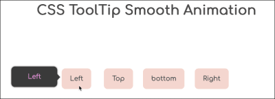
In the article about CSS animation, the illustration shown above is only for demo purposes. Nonetheless, the image would be more useful with a clear and useful tooltip. As used here, the tooltip is not useful.
While redundant tooltips are useless, tooltips that appear in the wrong part of the UI are especially problematic because they distract users from the task at hand.

The screen shown above includes a title in large font with a statement about increasing income. Yet, the tooltip refers to a grid system tip icon that supposedly “boosts the value of your design.” At best, there is a tenuous connection between the tooltip and the main theme on this screen, increasing income. The icon and tooltip might be important, but they are in the wrong place in this app.
More broadly, context is a bedrock UX principle and applies to all design elements. For example, an image of a $150,000 sports car on a site or app targeting budget car shoppers would look and feel incongruous because the image would not match the user’s expectations. In short, the image would likely confuse the targeted user group.
Context is particularly important for tooltips because the purpose of a tooltip is to clarify and provide additional information. A misplaced tooltip does the opposite; it causes confusion.
Where To Use Tooltips
Context is also a critical consideration when deciding where to use tooltips. Because tooltips work best when they amplify a well-designed UI, they are particularly effective for:
- Contextual Help,
- Brief instructions,
- New features.
Contextual Help
Contextual help appears when users are in a specific part of the UI. The following example is from Airbnb. Tapping the icon or “3 reviews” text displays a tooltip with an explanation of reviews and a link that takes users to reviews about the individual shown on screen (the author, in this example).
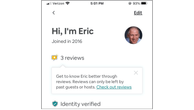
The tooltip shown above is informative because it explains what reviews mean in the Airbnb app and, specifically, in the context of a single profile. In short, contextually specific tooltips appear at the precise moment users need additional information.
Brief Instructions
Instructional tooltips should also appear when users need more information. The difference is that certain aspects of a mobile app might require an explanation at each step to ensure that users can complete the task at hand. For example:
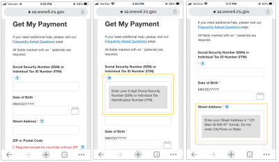
Each tooltip in this part of the IRS app is paired with a specific task such as entering a social security number, date of birth, or street address. Because each tooltip is context-specific, users can easily learn what they need to do during each step and why the IRS needs this information.
New Features
As Sofia Quintero explains in Tooltips: your secret weapon for improving feature discovery, tooltips are an effective way to draw the user’s attention to new features, “To promote and publicize its new GIFs, Twitter displayed a full-screen message to users before gently directing them on how to incorporate GIFs into their tweets using a traditional tooltip.”
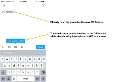
The GIF feature was introduced a few years ago, but it holds up as a useful presentation of a new feature. It’s clear and clean, standing out without dominating the UI. New users will see it while experienced users can proceed without distraction because the tooltip is well-integrated into the UI and does not cover up other screen elements.
Conclusion
Tooltips amplify a mobile UI by providing supplemental information precisely when users need it. Leverage the power of tooltips by considering them when sketching designs and building early prototypes. During implementation, ensure that tooltips will help users by focusing on:
- Context
Effective tooltips appear precisely when users need them. - Placement
Tooltips should be prominent and easy to find but should not obstruct important information on the screen. - Clarity and brevity
Review every tooltip in your app to ensure that it makes sense. Edit for brevity.
For tooltips to reinforce a well-designed UI, use them in parts of the UI where they work best such as:
- Contextual Help,
- Brief instructions,
- New features.
Tooltips are a powerful design pattern with a light footprint that enhances mobile designs when used judiciously.
Additional Resources
(ah, vf, yk, il)


