The eye-tracking methodology can be extremely valuable for usability tests since it records the journey without interfering with the users’ natural behavior. Imagine, for example, that you test a prototype but discover that users are not interacting with the interface how they are supposed to. You most likely think that the buttons might be too small or you need to change the color, font, or position. As a result, you make the buttons more prominent, and still, the users are not interacting with the interface as intended.
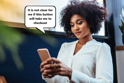
After spending time and resources on improvements, you realize that the problem is not that they don’t see the buttons, but that even when they see them, they don’t know what to do with them. Utilizing an eye-tracking device, however, would help the researcher notice the lack of understanding right away. This is one example of the benefits of using eye-tracking. When the researcher can see through the user’s eyes, recognizing a usability problem sooner would save the client and developer time and money.
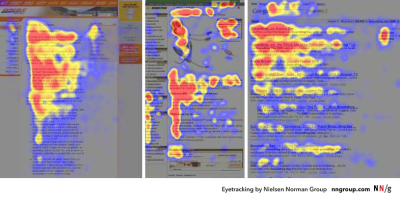
Eye-tracking provides information on how people navigate on a page and how attracted they are to visual elements on the screen, like in this study conducted by Nielsen Norman Group which shows the pattern that people use to scan comparison tables. If you are designing an app or a website, you can test how easy and intuitive it is to complete a specific task, fill out a form, find certain information, or buy a product.
Eye-Tracking Evolution
The first time someone conducted a study observing the movement of the eyes was through direct observations in the 1800s. Since then, technology has evolved, and what started with naked-eye observations has become a sophisticated and accurate technology to measure eye movements.
In the late 1990s, marketing and advertising agencies saw the potential of eye-tracking for the Internet and started using the technology to analyze how people consume content online. One of the few advertising companies that used eye-tracking back then was EURO RSCG/DSW Partners. They used eye-tracking to measure visual attention on banners, animated graphics, and navigational tools in websites. Before those studies, web pages were designed as printed media, with columns and big blocks of text.

It was the implementation of eye-tracking that provided useful insights that helped shape the work of web designers.
For instance, Nielsen’s research conducted in 2006 showed that people read content on the Internet in an F-shaped pattern. Users tend to start reading from top/left. Next, they move to the top/right of the page, skimming through the content that stands out, such as images and subheadings.
Nowadays, hardware and software are designed to conduct eye-tracking studies for marketing, UX, psychological and medical research, gaming, and several other use cases.
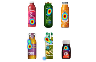
In marketing, eye-tracking is used to test advertising, product placement, and packaging, such as this use case that shows the visual attention that different smoothie brands receive from shoppers:
Another area that has been showing huge potential is eye-tracking in the context of virtual reality. VR headsets use eye-tracking to see where the person is really looking and make the experience significantly more immersive. For PC gaming, eye-tracking allows the player to just look at the object that they want to interact with and press a button instead of using the mouse or controller to guide them to the place the player has their eyes on.
The eye-tracking market is expected to be worth USD 1.75 billion by 2025, being present in different segments and industries.
How Eye-Tracking Works
To incorporate eye-tracking in your research, it is necessary to understand how this methodology works. The researcher uses an eye tracker, namely a device designed to measure the eyes’ movements (usually glasses), or software integrated with a webcam or selfie camera of the smartphone, to conduct a test.

Usually, researchers select areas of the stimulus to be displayed, namely Area of Interest (AOI). In usability, it can be a filter function in the app or an advertisement on the website, for example. The AOI will determine what areas you will calculate metrics for. Besides the AOI, two concepts are extensively used in eye-tracking:
- Fixation
When the person’s gaze stops moving and rests focused on one object. - Saccade
The movement of the eyes between the fixations.
After defining the AOIs and designing the test, it is time for the participants to join the study and interact with your app or website. The metrics and how they will be shown depending on the eye-tracking tool you choose. It also ranges from studying individual recordings to gather data about the behavior of specific users to quantitatively comparing the number of users who looked at an AOI, the amount of time that they spent on it, and the speed with which it is first detected.
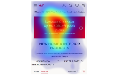
By visualizing the gaze path on video recordings or heatmaps, you can see where the person is looking, for how long, and get actionable data. For example, a long time for the user to first fixate on the AOI (more than 0.15 seconds) can indicate that the AOI should be positioned elsewhere. Or conversely, a long time looking at an AOI can suggest that either it was not clear for the user what to do with that information or simply that the AOI was engaging enough to get the user’s attention for a long time. The data needs to be analyzed in context so that it can be interpreted correctly.
That is why eye-tracking can and should be combined with other methodologies such as surveys, Thinking Aloud (when users verbalize what goes through their mind while performing a task during a usability test), and click rate to provide valuable insights for the researcher.
Eye-Tracking For UX Research
Although some information provided by eye-tracking could be obtained with click heatmaps (visual representation using thermal imaging that shows where people are clicking) or surveys, eye-tracking can also capture data that the participant does not remember, does not describe, or interacts with only visually, without tapping or clicking on it.

With eye-tracking, product designers can get actionable data about how the users perceive and interact with the UI, on both desktop and mobile. However, the price of eye-tracking used to be much higher than heatmaps, as measuring users’ gaze required special hardware to be used in-lab. However, conducting eye-tracking studies became considerably cheaper recently, with software that can transform any webcam or selfie camera of the smartphone into an eye tracker.
Next, we will focus on usability in mobile research and present a use case that shows how UX teams can incorporate eye-tracking in their research toolbox.
Mobile UX Research
Incorporating eye-tracking in mobile UX research was complicated until very recently due to the technological struggle to measure eyes’ movements on the smartphone. Web designers worked until recently with a desktop-first approach. Since 2014, however, mobile users have been gaining more and more importance. Designing for mobile is not only about the size of the screen but also about the users’ behavior. When using smartphones, people are usually distracted, have shorter attention spans, or want to perform a task quickly — such as buying a ticket or finding an address. For this reason, doing UX research for mobile nowadays is essential to many companies.
Eye trackers, the glasses used for most eye-tracking studies, are usually not as precise to track the small screens of smartphones. Therefore, it needed elaborate synchronization of the screen content and the eye-tracking data, resulting in a complex study design and analysis. At the same time, using the webcam does not allow the user to test the app or website in a natural setting; after all, the users usually interact with mobile apps and websites on the smartphone. However, conducting online experiments is a fairly inexpensive way to develop better websites, apps, services, and strategies and make decisions not based on intuition, but on scientific data.
Companies such as Amazon, Facebook, Google, and Microsoft conduct more than 10,000 controlled online tests annually each: they know the investment pays off. Bing also benefited from testing and made revenue-related improvements that resulted in a 10% to 25% increase in revenue per search every year.
Luckily, technology has evolved, from eye trackers and webcams to mobile software, to now enable the opportunity to conduct eye-tracking tests for mobile UX research directly on the smartphone — with no additional hardware required. Software-only solutions can be up to 100x more affordable than eye-tracker studies and allow researchers to conduct tests with participants from all over the world and get accurate results immediately that will help them draw strategies for their digital product.
How To Conduct An Eye-Tracking Study
An eye-tracking study always begins with a question. Let’s say, for example, that you are launching an e-commerce app and want to find out if people see the sales banner placed on the main page. Based on this well-thought research question, you can formulate a hypothesis that reflects your assumptions regarding the users’ behavior, such as “using a photo of the products on sale will drive more conversion”. This will enable you to test predictions and make it easier to analyze the results. After defining assumptions you select the essential metrics to track and measure whether your assumptions indeed reflect the users’ behavior. Next, you create the tasks and the visual stimuli the participants will interact with.
It is very productive for web and mobile eye-tracking research to conduct studies with different versions of your website, application or advertisement, and competitors’ websites, known as A/B testing. By running comparative studies, you will be able to evaluate which elements work best. Once you have designed the test and implemented the study in the testing tool of your choice, it is time to think about the people who will join your study.
For studies where researchers will analyze only heatmaps, it is necessary to recruit at least 30 participants. Although heatmaps are visually appealing and tend to be more popular among researchers, they require many participants to generate more satisfactory results. You can also conduct smaller studies, watching the individual video replays while listening to what they say with the thinking aloud method. For this kind of study, you should have at least six participants joining.
The study can be conducted in-lab or remotely, moderated or unmoderated. In-lab studies demand more time and resources and it is limited to participants who can join the study in person. All the eye-tracking devices and software must be provided in the lab and the study must be monitored by researchers and facilitators.
Remote studies can be conducted with participants from all over the world, which suits companies who have clients located in different cities or even countries. Remote studies can be done unmoderated with the help of tools that can collect and save the data. All the researcher needs to do is to send out the invitation and relax while the technology does all the work.
The metrics available in eye-tracking can vary from tool to tool. Most tools offer qualitative as well as some quantitative results. What is more relevant to you highly depends on the type of study that you run. Some of the most used metrics to measure eyes’ movements quantitatively are Time to first Fixation, First Fixation Duration, Dwell Time, Revisits, amongst many others.
Eye-Tracking Insights
A study conducted by Eye Square, a market research institute, using their in-real context testing and Oculid’s smartphone eye-tracking technology, shows that remote eye-tracking research conducted on smartphones can give insightful data for UX teams.
The Eye Square and Oculid study was based on tests done by 100 respondents across the United States to find out how shoppers interact with e-commerce and what are the elements that get them engaged in a product, with samples being collected during two days. Each tester was given 3 to 5 minutes to complete each test. Two UX-related scenarios were included in this study: an online shopping scenario and a scenario where advertising was tested in context.

The analysis of the study provided deep insights into what customers were doing and why, while at the same time guaranteeing their privacy. It is an automated, anonymous analysis, with full transparency for testers and compliant with the regulation in EU law General Data Protection Regulation 2016/697 (GDPR). The data is recorded only with the explicit consent of the user and deleted according to GDPR regulations.
Here are the findings of the two scenarios analyzed in the eye-tracking study:
1. Online Shopping
When examining or considering online shopping, eye-tracking shows which elements engage the consumers at first sight. Eye Square conducted an A/B test, a process in which two or more versions of a variable (page element, advertising, app) are shown to different segments of users, using Oculid’s eye-tracking technology.
An A/B test is conducted by having two groups interacting with two different versions of the website:
A(the control): this one confirms the hypothesis;B(the challenger): this one is a modification.
The analysis showed that less than 10% of shoppers scroll down to see products that are not visible on the first page.
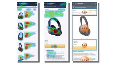
The A/B test also demonstrated that consumers engage with visual triggers they already know, but also with other images that are big and clear. However, the decision-making does not limit to the visuals of the page, but it is also influenced by the content. For example, shoppers tend to spend a long time reading the Product Detail Page, proving the importance of having compelling copywriting on the product page.
The second UX scenario was an advertisement in the social media context.
2. Advertising In Context
In the scenario of the Eye Square and Oculid study where an ad was displayed in context, the participants first viewed an Instagram feed which, amongst other items, showed a video advertising a specific pair of headphones. Subsequently, the participants of the study were asked to shop online for a pair of headphones. Here it was not specified what type of headphones that should be. Participants were directed to the webpage of Amazon where they saw different products from this category with different brands being displayed.
The analysis of Oculid’s eye-tracking data provided by the advertisement in context revealed that the specific headphone displayed in the video advertising received more visual attention than products from the competitor brands. The advertised headphones received 2.4 seconds of visual attention as compared to 2.1 seconds from the closest competitor, even though the closest competitor was listed before.
This was true even though the researched product was listed as fourth in the online shopping platform, demonstrating that the advertisement contributes to getting the customers’ attention. In addition to receiving longer viewing times overall, customers of the Eye Square and Oculid study showed 50% more interactions/clicks with the advertised product than with any other competing product. For UX teams, this study showcases how measuring visual attention can give information about patterns that people follow when accessing a website or an app.
Conclusion
Eye-tracking used to be an expensive and challenging methodology, which turned many researchers away from it and made it difficult for UX researchers to conduct mobile studies. Nowadays, smartphones have up to 50-megapixel selfie cameras and can be used as highly accurate eye trackers to conduct mobile UX research. Thanks to technology and easy integration of study design and data analysis, eye-tracking can be easily incorporated into the researchers’ toolbox.
Including eye-tracking in the process of usability testing can offer many benefits for UX teams. For one, it allows you to test prototypes and make changes based not only on what users say but on what they do, almost like seeing over the shoulders of the users, but in their natural environment. Also, it can provide insights about users’ behavior that will save time and money for the company.
The technology can be used by eye-tracking experts, but also by UX teams that are only familiar with other methodologies. Knowledge about usability testing and some reading about the main metrics of eye-tracking and how to interpret them is enough to get started and try out. Giving a chance to test this methodology can complement usability testing and take it to a higher level.
It is certain that not every question on mobile UX can be answered with eye-tracking alone. As mentioned before, combining different methods is recommended to get different perspectives of users’ behavior. However, the technology combined with online questionnaires, Thinking Aloud, interviews, and so on can offer insights about subconscious processes that affect decision-making and are not obtained through other methods.
