How familiar is this scenario: A team employs modern decision-making methods and performs all design-thinking rituals, but the result remains guesswork. Or this: Soon after having prioritized all features, the key stakeholders change their mind and you have to plan everything again. Both situations have happened to my team and my colleagues quite a few times.
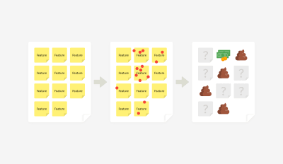
Feature prioritization succeeds or fails because of one tiny thing, and I won’t keep you in suspense until the end of this article to find out. The key factor is selection criteria. But first things first. Let’s see what can go wrong, and then we’ll talk about ways to mitigate those risks.
Flaws of Popular Prioritization Methods
Challenge 1: Non-Experts and Experts Have the Same Voting Power
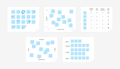
Product teams strive to make the right trade-offs and marry an infinite number of options with limited resources. Typically, a decision appears as a result of collaborative activities, such as dot voting, the value-versus-feasibility canvas, MoSCoW, the Kano model, etc.
While these techniques were invented by different people, they essentially work the same way: Team members put sticky notes with all feature ideas on a board, and then they shortlist the most promising ones. Either participants rate the ideas with marks or votes or they arrange them along the axes according to how feasible, desirable, or innovative each feature is.
Such a manifestation of democracy works great when you involve experts — people who know the topic inside out or who, as Danish physicist Niels Bohr puts it, “have made all the mistakes that can be made in a very narrow field.” When everyone on a team is an expert, then the distribution of votes will indicate the best ideas.
But let’s be honest: Workshops often have a flavor of office politics. For example, a workshop might involve high-power stakeholders with low interest in what you are building, or you might have to invite non-essential specialists who lose motivation and affect the work of the whole team. That’s why it becomes so easy to end up with only two or three people in the room who can make informed decisions.
In real life, “popular” doesn’t equal “the best”. And as a facilitator, you’re eager to bring the strongest opinions to light, which becomes problematic when an expert’s voice weighs the same as a non-expert’s.
Challenge 2: People Don’t Decide Rationally by Default
Even if you involve experts, they could represent diverse areas and domains; thus, they’ll make choices differently. Besides, rational thinking is not the default mode, even for knowledgeable and skilled people.
Humans have to cope with many concurrent thinking processes and are exposed to over 180 cognitive biases. The priming effect is an example: What happens to a person right before a workshop will affect their behavior during the workshop. So, how do you ensure that expertise — not personal preference or emotion — drives feature prioritization?
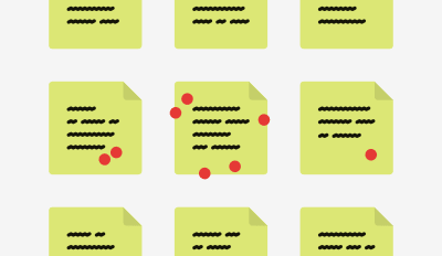
It’s almost impossible to guess the reasoning behind each choice afterwards — unless you somehow support rational thinking in advance.
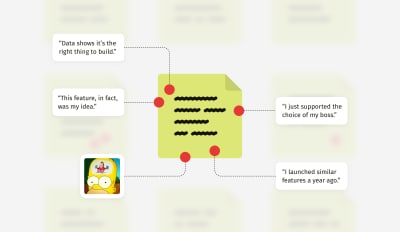
Business is not all fun and games: Teams have to make hard decisions based on data and leave their whims, tastes, and prejudices at the door. As a facilitator, you certainly don’t want to make a business decision based on what stakeholders like or how they feel at the moment, do you? But in many exercises, “I love this idea” turns out to be no less trusted than “This will help our company grow.”
Challenge 3: Measurement Units Are Open to Interpretation
Another trap in prioritization activities is the measurement system, such as:
- numeric marks (from 1 to 5, the Fibonacci scale, etc.);
- symbols (dots, stars, smileys, etc.);
- metaphors (for example, pebble, rock, boulder);
- t-shirt sizing (S, M, L, XL);
- the position of an item on the horizontal or vertical axis of a canvas.
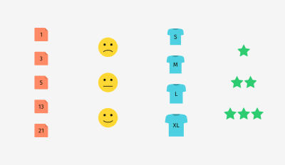
Getting a certain number of votes or special measurement units is intended to balance opinions during a prioritization exercise. But they don’t take into account how differently people perceive reality, not to mention cultural differences on global teams. An aspect that is critical to one person might be insignificant to another.
For example, if I hear “good” instead of “awesome” or “fantastic” from a US client, I know I’m in trouble. It means they aren’t quite satisfied. But “good” is a common expression of praise in Europe. The same goes for votes: An S-size task will mean one thing to an in-house senior back-end developer and another thing to a marketing consultant.
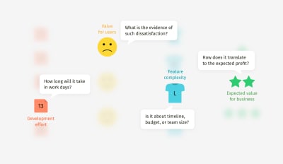
Moreover, many people are now Design Thinking-savvy and Agile-savvy and can subconsciously manipulate votes or intentionally exploit the vagueness of a measurement system to push their own ideas.
If an argument between team members gets out of hand, you’ll spend a lot of time in vain and won’t reach consensus on time. Or worse, the debate will end up in forced agreement of the idea advocated by the most influential stakeholder in the room. So, how can we handle prioritization better?
Overcoming Prioritization Bias
Method 1: Annotated Marks
In one of my projects, we were designing a complex solution that involved technology, business processes, and the expertise of hundreds of people worldwide. Therefore, we couldn’t narrowly define the expected value of features (like user satisfaction or usability) because it wasn’t solely about end users or interfaces.
Our team identified five stakeholder types who would benefit from the solution, and we came up with a descriptive scale to evaluate features. It took into account both stakeholder coverage and the significance of tasks that the solution could potentially help them with.
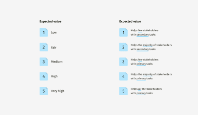
Of course, we could have used a simple scale of 1 to 5, where 1 represented the lowest value and 5 the highest. But it wouldn’t have given us clarity on what each feature’s value means in reality. Besides, evaluating items in a vacuum is always challenging. “Low” related to what? “Medium” compared to what? Such questions will undoubtedly arise.
Another example from the same project: an effort estimation scale. Again, we decided to add real-life descriptions. Instead of the abstract “low”, “medium”, and “high”, we gave marks according to how much workforce and money should be involved in the feature’s implementation. We knew that the factor that would largely determine the level of effort required was whether we could do it ourselves or do it only together with a third party.
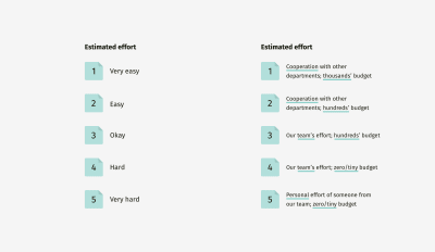
As a result, numbers gained meaning.
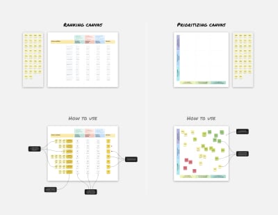
Later, we created a nerdy table that combined multiple characteristics. This helped us to check whether a feature had well-balanced feasibility, desirability, and profitability — simply put, whether it could be done, would be desired by customers, and would make money for the business.
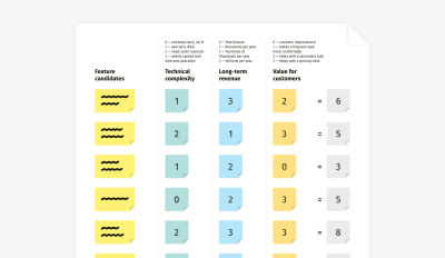
Depending on your project, the criteria can vary. One project might call for you to evaluate revenue potential and implementation effort, whereas in another you might have to focus heavily on ease of adoption, expected deployment effort, and estimated cost of maintenance. In any case, the method remains the same: First, define essential criteria, then build a meaningful scale, and, finally, evaluate.
How to build such a scale? Start from the extremes — the minimal and maximal marks. What does 1 (or 0) mean? What does 5, 10, or whatever the maximum is mean?
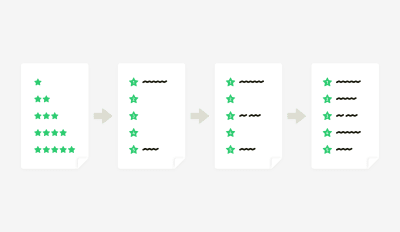
When the minimal and maximal marks are defined (1 and 5 in the example above), you can write a description for the middle mark (3) and then for the remaining marks (2 and 4). Such an approach helps to maintain more or less equal increments between the mark definitions.
In a Nutshell
- Method
Add real-life descriptions to abstract numeric marks. - Strengths
Clarity in selection criteria makes for easier agreement, less subjectivity, and less time spent on discussions. - Limitations
Developing a meaningful scale needs time; such a scale is contextual and might not be reused for another project.
Method 2: Descriptive Canvas
This technique is a logical continuation of the previous one but adapted for use on a canvas. Unlike ranking in a table, a canvas offers more flexible representation and more distinct winners. However, with vague criteria, you run the risk of destroying the whole exercise.
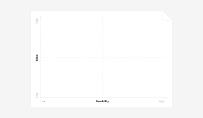
The main problem with low-to-high scales is their categorical nature. No author of an idea will ever admit it is of low value. They’ll stand their ground persuading team members to put the sticky note anywhere but in the “low-low” zone. Alternatively, you might discover that all of the “outsider” ideas just belong to less powerful stakeholders.
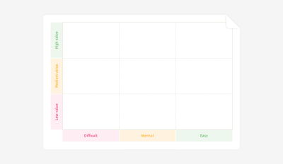
Minimize subjectivity by using concrete descriptions, which participants can match with what they’ve experienced in previous projects. “Difficult” could mean anything, but “Needs external expertise and resources” gives a better impression of the difficulty. The same goes for the expected value: “Solves a proven critical pain” serves as a filter that won’t let people push forward ideas not backed up by any evidence — be it user research, customer support tickets, or market analysis.
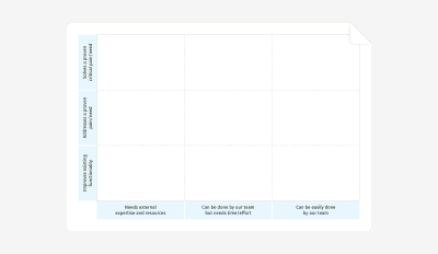
This method streamlines prioritization but at the cost of some time spent on preparing the scale, particularly on formulating concise section names.
When you work with such a canvas, beware of traffic-light color-coding. It might be a decent choice for the final output presentation, but in the workshop, it will increase bias and make people unwilling to let their votes end up in the red area.
In a Nutshell
- Method
Add real-life descriptions to the axes of a canvas. - Strengths
Clarity in mapping criteria makes for easier agreement, less subjectivity, and less time spent on discussions. - Limitations
The canvas works best with three sections on each axis; scales are contextual and might not be reused in another project.
Method 3: Diversified Votes
Voting is a quick-and-dirty way to reach consensus. With anonymity, all votes are accepted and have equal weight. Voting empowers humble stakeholders and lowers hierarchical barriers. However, it also obscures the reason behind each individual choice. And the biggest challenge is that participants need to somehow weigh all possible criteria at once and choose quickly (and, hopefully, wisely).
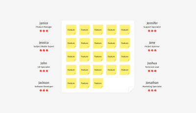
I’ve included classic dot voting in many planning sessions with clients, and often it yielded decisions that we would completely change later. Naturally, I wanted to avoid double work. So, during one of the sessions, we tried an enhanced version and assigned specific colors to people with different expertise — green for the “keepers” of the customer’s voice, blue for people with financial thinking, and red for technical specialists who can evaluate feasibility.
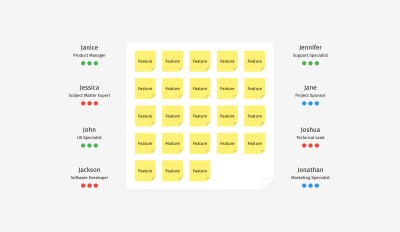
First of all, this approach gave us a sense of what people might have thought about while making a choice. Secondly, we narrowed down the list of feature winners. Only a few sticky notes gained votes from all three colors and were recognized as profitable, feasible, and valuable to customers simultaneously.
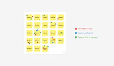
This approach enabled us to focus on the best features and not be distracted by one-sidedly promising items. With classic voting, we usually had five to seven finalists. And diversified voting revealed only two or three top ideas that matched all of the criteria.
In a Nutshell
- Idea
Give people with different expertise dots of different colors. - Strengths
It narrows down the number of final ideas; it takes into account both the number of votes and the balance of various benefits; and it remains a quick and simple exercise. - Limitations
It still doesn’t fully eliminate subjectivity.
One More Thing: Language!
There is one utterance that can ruin prioritization: “Vote for the features you like the most”, or a variation, “Now choose your favorite ideas.” These words open the gates of the Hell of Subjectivity, and they grant your team an official invitation to fantasize and speculate.
Not Recommended
- “Stick the dots on the features you like the most.”
- “Now, please vote for the best features.”
- “Choose the most valuable features and vote for them.”
- “What are your favorite ideas on the whiteboard?”
Instead of giving these unhelpful instructions, put people in a rational mood and help them listen to their inner voice of reason.
Recommended
- “Based on your knowledge and on precedents from your practice, which of the feature ideas would pay off the soonest?”
- “Please recall a recent development project — specifically, how long it took and what slowed or blocked the work. Now, which of the feature ideas on the board would be easiest to implement?”
- “In a minute, we’ll vote on the expected value for customers. Let’s recall what they complained about in support tickets, what they requested in interviews, and what they used the most according to our analytics. So, which of the features presented on the whiteboard address the most critical needs?”
- “Recall your conversations with end users and recent user-research results. Which features address their most acute pains?”
Summary and Miro Templates
Subjectivity is a part of human nature. We inevitably make emotional decisions, but there are ways to make a choice a little less biased. Facilitators have no control over what is happening in experts’ minds, but we can try to put team members in the right decision-making mood. I recommend two fundamental things to streamline decision-making:
- Announce, repeat, and embed meaningful selection or voting criteria into your decision-making process.
- Push people to think about their relevant professional experience and data from prior research, rather than their own preference.
Feel free to use these Miro templates for prioritization exercises.

(cc, ra, yk, il, al)


