When I started writing Touch Design for Mobile Interfaces, I would regularly find an interesting topic or tangent that led far into the weeds, and had to stop myself from pursuing it too far. I didn’t want to become a hermit who dies with a never completed fifteen-volume work on a constantly-shifting topic.
But many are worth chatting about independently, and one that you might enjoy is Fitts’ Law, and how it works with touchscreens. Most interactive designers of any sort will recognize this, and generally know some very small subset of the lessons, by rote. The law as stated is that:
“The amount of time required for a person to move a pointer to a target area is a function of the distance to the target divided by the size of the target.”
Then there are a series of terms and exploitable lessons from this. Some common ones:
- The Zero Point
The pixel under the mouse pointer or cursor is instantly usable, without movement. - Bigger Is Better
A larger target is always easier to click than a smaller one. - Magic Edges
The edges of the screen are “infinitely deep”; you can’t miss the edge as the mouse stops when it gets there. Menus along the top edge, for example, are easier to click than the same size items just a bit offset. - Magic Corners
This infinite depth is doubly true for corners, so those are the easiest to select areas not under the mouse.
Of course, we all know that a lot of this is not universally true. There are other factors that come into play. Overly large buttons actually are quite hard to use, as they stop being perceived as buttons. People focus on action objects, so will try to click the icon or text label inside a button, sapping some of the power of the size.
Or, maybe an edge is not an edge. Or we know where the mouse is, but not the user’s hands. Or there’s no mouse at all.
Watch Your Assumptions
Paul Fitts was a psychologist, who was a senior officer in the US Air Force during the war. He was convinced that too many losses of aircraft and crew occurred because of what would be called poor human factors considerations. He established the Aviation Psychology Research Laboratory at Ohio State University where aside from his well-known research, much important aviation safety work was performed.
A lot of what we do in UX design is rooted in human factors standards, but we have to be careful applying them. They often made assumptions about who the users are, for example. Only fit, young, not-colorblind, generally white European men were studied, as that’s who flew airplanes, and (for the most part) operated complex machinery when the standards moved into industry.
But they also make assumptions about the environment. While an airplane can be harsh and unforgiving, we do know where the pilot is relative to the controls. Even at a computer workstation; however, we have no idea where the user’s hand is. The application of Fitts’ work assumes the hand is on the mouse all the time; zero time or effort to click what is under the pointer. But what if I am typing, or writing on paper, or have just hung up the phone, or any of a thousand other things? This is actually about human movement, not mouse movement, isn’t it?
In design, we make a lot of assumptions without thinking them through. We put controls at the edges of websites and applications, but the edges of viewports are very often not the edges of displays. Web browsers have the chrome around them, and even maximized applications in Windows don’t cover the Task Bar. The bottom edge and corners of your application are not infinitely deep now, are they?
Of course, it’s pretty hard to apply so easily and seamlessly for touch as well.
Where Are Your Hands?
Certainly, Fitt’s work is true. Distance and target size apply pretty much universally. But the simplicity that arises from assumptions in mouse-driven computer systems is not really applicable to touch systems.
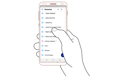
As much as I just raised the issue that maybe the user isn’t holding the mouse, for touch we really never have any idea where the hand is. Really, we don’t. If you haven’t read any of my work, you might think that everyone holds their phone with one hand, and taps with the thumb, like this:

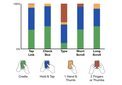
But they simply do not. We’ve got solid information detailed in Chapter 5 of “Touch Design for Mobile Interfaces” that people hold their phones in many ways, and shift how they hold constantly. Even for individual task types, there’s no one way of holding that is preferred, so we can’t design to predict what people are doing with any degree of accuracy at all.

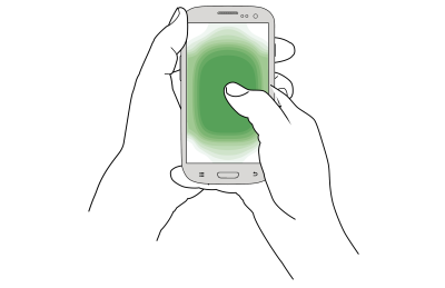
So, where are your hands in relation to the desired target on a phone, tablet, or touchscreen computer? We have no idea. The computer can’t detect it, and we have no guidelines or probability of where the hand is. No one target, and in fact, no part of the screen is closer to the pointer — the user’s hand — than another.
Ethical Design Principles
A few generations before Fitts, F.W. Taylor was creating the field of scientific management with analytical principles that would be fully explored with Gilbreth’s time and motion studies. All of these were considered management practices and were designed to optimize output and efficiency by finding the “one best way” to do a task.
Even in specialist fields like aviation, this has proven to be oversimplified. Humans are not machines, so the last few decades have improved aviation safety again with practices like CRM. Crew Resource Management in a human-centered way to get teams to work together, to solve issues — or more often, avoid problems — alongside checklists and procedures.
The one best way mindset is very much still in business today. It is even the very name for a set of process improvements recently applied by WalMart. I definitely see it filtered down to digital product design teams, developers, and even designers. If you always start with the happy path, and sort of don’t worry about other ways users might work with the system, error messages or error avoidance are unimportant because that’s just the users doing it “wrong.”
UX is supposed to be a user advocate, so for my practice area, at least, I say this sort of thinking is just about unethical.
Now, with the shift to touch and mobile devices, we really must admit there is no place for such a rigid view of the world; we can predict, but must not assume, a lot of things about where users are, and how they work. As we’ll see, these assumptions don’t always apply anyway, so forcing them to fit can be a recipe for confusion and failure.
Trying To Apply Fitts’s Work To Touch
While the context of the investigations by Fitts and others was aviation, machine or controls, the actual math behind it all only deals with one-dimensional movement. How long it takes not to move even across a plane of controls or a screen, but to slide a control from one position to another with some precision.
While you can work with this, the default interpretation of it for mouse-driven interfaces makes some troublesome assumptions. For example, target size is always measured as the horizontal component. Yes, even if it’s a button much wider than tall, and the cursor starts below the target. This is a problem.
For mobile devices, the default behavior after tapping a control or scrolling is to clear the workspace. Sometimes, that means the finger or thumb moves away from the focus area to see what happened, but most of the time it means the fingers move away from the screen entirely, and hover or rest some distance away. Of course, some users move to a disengaged model where they expect to not have to interact with the device for some time at all. Whether that is to get a drink, or put the phone in the pocket, or set it down to watch a video. The phone is now very far away, the user has to take other actions to begin to interact, and perform a somewhat lengthy cognitive shift to return to interaction mode.
Pretty rapidly I realized that trying to apply Fitts’ formula to obtain an Index of Difficulty, then using my experimental data to try to fit a slope of time values to this would be a fool’s errand. There are too many variables, so it would be a life’s work to codify the many types of interaction.
Further, Fitts’ work is known to be not generally applicable already. It only applies well to systems with limb movement. That means your whole arm, not just moving your fingers. Think of how you use a mouse, trackpad, joystick, yoke, or a pen tablet. You move, if slightly, your whole arm for the most part.
For a well-studied counter-example, isometric joysticks and other controls using force sensing instead of movement are not modeled well or need their own modifications or models. While possible, it’s therefore hard to apply these, as you have to model interactions for different parts of your systems in different ways. And have you heard of S. K. Card’s work on this in the 1970s and 80s? No, of course not, as it’s complicated. Practitioners need a boiled-down, simplified version.
From a bit of analysis and investigation of the research results, I find the same for touch interactions. That there’s predictability and repeatability in the findings, but they don’t neatly fit into any existing model.
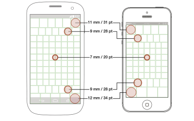
And all in all, that’s why I give the guidelines rather than mathematical models. For portable, touchscreen tablets and handsets, people touch the center faster, and more accurately than the edges.

There are these guidelines (all of them are detailed in the book) for target sizes, and some confounding issues to keep in mind as well — everything to help you to design interfaces and interactions.

Accounting For The Speed Of Everyday Life
In my work to date, such as in the book, I didn’t share time-to-tap on purpose, because they vary so widely by the context of use. But we can provide another guideline here now, about how mobile devices vary in use from the workstation mentality. That, of course, means that most designs should try to set aside the assumption of mouse-driven, focused-attention use.
My favorites are disappearing controls. We see them a lot: in scrollbars, and chrome, and more. But let’s look at the ubiquitous video player, as now an online video is the norm. Say, you tap a video player to start the playback. The controls fade or slide out after a short time, so you can see the video on full screen. When focused, and usually with a mouse, that works fine. You can play then go “ugh, credits” and instantly skip them because the skip controls or progress bar is nearby. Also, you can go push the pointer over a bit to move the playback long, then sit back and watch, as the controls fade away.
On touchscreens, while also distracted by normal life or casually watching, the same amount of time when the controls fade-out is applied, but it isn’t enough to be usable. Fingers are opaque, so we tap, then move our fingers or thumbs off the screen. But maybe we settle in to watch it, and then realize that we have to skip the dumb part. So, now we have to shift our brains back to interactive mode. We orient to what we see, and move all the way back to take action. Of course, by then, the controls — everything is set up for a mouse — have disappeared.
As I said, it is hard to provide useful and actionable guidelines for times. And if I quoted you the times for interaction on touch, I’d also need to give the same for a mouse-driven system, for comparison. It is my general observation — without doing the full run of testing for this specifically — that the times would be similar for similar interactions, but not all interactions and environments are equal.
You can try this to make sure you are designing properly, or to evaluate it better in reviews and demos. Just think of the context, and stuff the phone in your pocket, or sit back and watch the system work, then move back to interaction when it is time. Remember, that even usability tests can result in too much attention from the user, so set unrealistic expectations for use modes and expected speeds. Watch analytics, try to get out for real ethnography, and just observe users all day when you can, and think hard about how people might actually use your product in context.
Moving From WIMP To Touch
Okay, you might think that it’s a lot to remember and to try to figure out how to apply to your work. I have you covered. Just like in the book, after I rant about history, dive into math, cognition, physiology or ethics, I come back and conclude with a simple checklist.
This one was especially hard to put together, as I had to go out and find all the current advice for designing UIs, especially with Fitts’s Law. While some is good or trying its best, there is also some really, really bad advice out there.
Please note: This chart is not entirely moving from the best practice for mouse to that for touch, as it is taking the current advice — good and bad — to the new best advice I can offer.
| Conventional Wisdom for Mouse and Desktop | Best Practice for Touch and Mobile |
|---|---|
| Lay out content top to bottom, left to right, with the most important in the top left corner. | People read and interact in the best and fastest way with the center of the screen. Put your key info in the big scrolling area in the middle. |
| Watch for the fold, so users can see all the info they need. Distrust scrolling, as scrollbars are far away. | Everyone scrolls, because a gesture is easy and common. Make sure users know that there is more content, but expect them to discover it on their own. |
| Keep all control options close for less mouse movement. ‘Cancel’ and ‘submit’ must be right next to each other. | Accidents happen, so keep disparate and especially destructive choices far away from positive actions. |
| Guard dialogs (“Are you sure?”) protect from accidental activation well. | Avoid destructive actions at all, and when required make sure they all have undo methods (or fake undo), not guards before the action. |
| People are focused on the task at hand, and want speed above all. | People live in the world, so are distracted. Don’t time out notifications or provide limited time to perform actions. |
| Edges and corners are infinitely deep, so place menus there for quick access. | Edges and corners are the hardest to tap areas, but are great places to hide low use menus and anchored actions. But just a few; make them big to assure users can tap them successfully. |
| Pop-ups are the best, because they can appear under the mouse, so less movement needed, compared to menus and drawers. | Pop-ups are terrible in so many ways, not least, they are disassociated from their context. Place items in the UI, or use drawers, accordions, and other contextual items to select. |
| Provide the user with tools to select quickly, including jumping the mouse to the primary action. | Empower the user to make informed decisions. Give them enough information to make good choices. For consequential choices, the delay for moving to the action is good, and provides a moment to think if they actually wish to carry that out. |
| Bigger is better, so feel free to pad buttons, and use very long labels for the most important buttons. | Make interactive elements like buttons only as big as needed for the expected location on the screen. Make labels clear and succinct, so users can read them. |
| Radial menus are the fastest possible ones, as all options have equal distance from the initial point. | Radial menus lose much of their value when you get away from the cursor, and they are unexpected, so the learning curve gets in the way of their theoretical value. |
Conclusion
There is this general assumption I see in a lot of places I have worked, that everyone else knows perfectly well what they are doing. We don’t just copy Apple or Amazon, or use Material Design without question, but borrow “inspiration” from competitors or favorite products we use, and believe without question that all design advice is right.
As I’ve just shown, standards and conventions can be wrong. They can be out of date, specific to technologies we don’t use now, narrowly applicable and over-applied, misinterpreted and oversimplified, or misapplied.
Technology, workplaces and everyday life often change the ways that make prior assumptions no longer relevant. We’re well into one of these big changes — the move from the normal computer such as a PC with a mouse and a keyboard to a mobile touchscreen.
But more importantly, we should always ask questions and seek deeper understanding. We should not just blindly follow them, but always consider what the guidelines and lessons mean to our users and our products.
Editor’s Note: In “Touch Design for Mobile Interfaces”, Steven shares his in-depth research about designing for touch with guidelines and heuristics you can apply to your work immediately. Read an excerpt or get the book right away.
