
What do you know about Gestalt psychology? This is probably something you’ve never heard of before. And that is why we must challenge the lack of knowledge and fill this long-felt want. Gestalt proximity principle is known to be applied to the perception and form-generating capability of our senses. In other words, it is all about visual recognition of unified wholes instead of just a collection of simple units. And as people often tend to draw some far-fetched analogies between different things, we can see these principles sufficiently exploited in web design.
Commonly 6 Gestalt laws show how people tend to organize visual elements. Those are proximity, similarity, continuity, closure, symmetry, and common fate. Today we will start by introducing you to the proximity principle in the context of TemplateMonster’s website designs.
The Essence of Gestalt Proximity
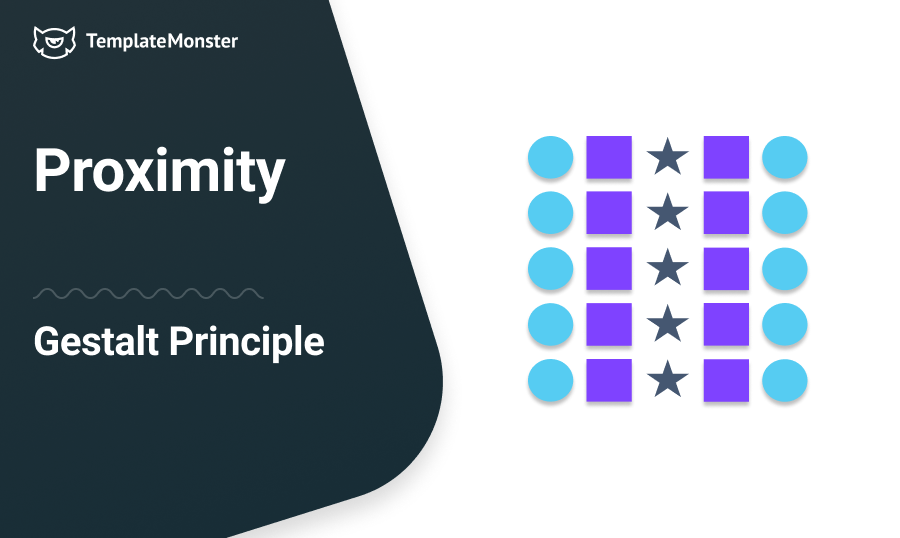
First up, the Gestalt proximity (nearness or physical closeness) states that objects or shapes close to each other appear to be more related than things that are far apart. Even if the items are radically different, they are perceived as a visually connected group if they are placed close together.
As website designing is about organizing the content, the layout and placement of content are everything. The proximity principle calls for related items to be grouped visually, whereas unrelated elements should have enough whitespace in between to communicate they are different. This helps create a website that is easy to get around in.
The whole is greater than the sum of the parts – David Hothersall: History of Psychology.
This means that the bunch of items’ collective presence is more meaningful than their presence as individual unrelated items. Proximity creates related meaning, and the items that are in close proximity to each other imply some sort of communication relationship. This causes us to perceive logical groups rather than separate things and define one group’s importance over the other.
Let us now demonstrate to you the expressive power of gestalt proximity being accomplished in our website templates. These are the first two examples of content-rich templates that illustrate the proper proximity between objects that are related.


Here goes another example of a website template that uses gestalt proximity to develop unity.

Use Whitespace to Define Groups of Items
Physical closeness is easily manipulated with well-organized whitespace (the space with a purpose). The main thing here is that unrelated items and related items should be properly spaced out. You can allow plenty of whitespace around text, images, or other unrelated elements to provide visual separation between them. Or you can provide the same spacing that will indicate that the groups are somehow relevant.

Sometimes, people want to arrange the elements closer but without the excessive spacing in between. In this case, the line break (horizontal or vertical rule) can serve the purpose.

Avoid Even a Split Second of Confusion Over the Items Relationship
Get used to putting titles close enough to the body copy pieces they’re attached to, the same with related descriptions and links, images and their captions, fields, and action buttons. It would help if you communicated clear proximity to avoid the cases when items appear separated instead of being attached, for instance.

Wouldn’t a Better Option Have Been to Use Grid for a Proper Proximity?
Position design elements within the grid-based layout and it will help you easily group the necessary items. It allows for a certain distance between the elements and, in many cases, forces to implement proximity principles without even concentrating on them.

Try Boxed Grouping of Elements
Another way to create unity around elements is to add some tangible connected reference between them or put the related items inside the outline. The new form becomes easy to interpret, telling the viewer that the elements within this box have contextual relatedness.

Types of Proximity Relationships
As for specific proximity relationships, we can mention four different types and illustrate them with the range of products available at TemplateMonster.
Closing edge: implies that the closer items are placed to one another, the more likely they are perceived as a group. Things arranged so can be related to one another in any direction.

Touching: with this kind of proximity relationship we have items that seem to be attached together. It is suggested that it makes for a stronger grouping than the close edge.

Overlapping: when the items are arranged in a slight overlap, they form the strongest grouping in a more complex shape. Thus the feeling of proximity between them is increased.

Combining: in this case, the external element is used to relate or connect items in a certain grouping. And it sets this grouping apart from the rest of the content around it.

Website design with proper proximity throughout its architecture does not overwhelm the visitor with muddled information and ensures the optimal user experience. There are some aspects which you have to consider when designing a website:
- Don’t give the information as one big chunk; express it graphically by grouping the content.
- Make items fit together logically.
- Put more space between the items that shouldn’t be grouped together.
- Should avoid too many separate elements on a page.
- Try not to leave equal amounts of white space between elements unless each group is part of a bigger whole.
- Use design elements to create a clear visual hierarchy.
Your site visitors would literally be lost without you doing these things. But you don’t want to run the risk of losing your visitors because of this, do you?
The post Gestalt Proximity Law in Website Templates [Die Gestalt im Design] appeared first on MonsterPost.