In this shorter series of articles, we highlight design patterns, techniques, and strategies to design better digital interfaces. You can also learn much more in “Smart Interface Design Patterns”, a 6h-video course with 100s of hand-picked examples, curated by Vitaly. Check a free preview.
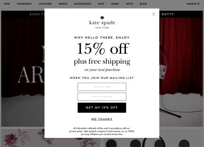
Imagine a shiny newsletter pop-up. A pop-up makes its splendid appearance on an eCommerce site just as you are about to make your way to a product page. You didn’t even have a chance to explore a single product yet; nor did you have a chance to learn about prices and materials and delivery options. But here you are, distracted and annoyed, almost instinctively dismissing that pop-up before even fully realizing what it says.

That pop-up is right there, and it’s there for a reason. It’s there because there are established KPIs and expectations that somebody in the company needs to reach. These KPIs expect leads, and the more charming (or intrusive) that pop-up is, the more leads it will generate, boosting revenue projections and bonus pay-outs.
A Short Story About A Large Pop-Up
A while back I was working with a large eCommerce retailer operating just like that. There was a strong desire to generate new leads, so the team has spent weeks tweaking headings and copy and labels and visuals and calls to action and their positions and backgrounds.
By the end, the pop-up was so large and so loud that you could barely see anything else on the page. And it worked! Indeed, just a few weeks in, the list has started to grow considerably, and there was even a dashboard set up to celebrate new leads coming steadily minute after minute.
It was weeks until the management has discovered that the growth of the list wasn’t resulting in the growth of the revenue.
The company was indeed getting plenty of leads, but those leads were poor and noisy. They were a mixed bag of disposable, temporary emails, creative and non-existent aliases and just random text strings, and as such, they weren’t generating any noticeable revenue at all. These very leads actually cost money because the pop-up — showing up on every other page — drove people away from the site.
It didn’t work because what the company wanted wasn’t just leads; they wanted good leads. They wanted emails with low bounce rates and high opening rates; emails that would have high conversion and high engagement; emails that wouldn’t get filtered out or marked as spam. They wanted new, engaged and excited customers who would trust and love the brand. A loud newsletter pop-up wasn’t helping them get there.
What did help the company was removing the pop-up altogether, and subtly integrating a bit of newsletter messaging all across the site, from product pages to confirmation emails.
Strategy To Generate Good Leads
Over the years studies showed over and over how reluctant people are to respond positively to any promotional message that disrupts their current workflow. This goes for a modal, a pop-up, a notification and anything in-between. In fact, any interruption of a task at hand is seen as a major distraction that needs to be dealt with urgently. And urgently rarely works in favor of user experience.
In the end, it’s all about the right timing. If we want a good response, we need to find the time in a user’s journey when we can almost guarantee that users will appreciate the disruption, and will respond positively. And that means being very thoughtful about the right time and the right places to surface our messages in a humble, respectful way.

There are a couple of options that we can explore:
- Integrated messaging.
The more integrated our messages appear with the rest of the page, and the more
connected they are with a task at hand, the better they will be performing. Think of empty states, 404 errors, product pages and blog posts. - Success moments.
Identify moments when a user completes a task or reaches a particular milestone, and integrate your messaging there. E.g. when an invoice is paid, when a request is approved, when a transaction is completed. - Nonmodal dialogs.
To ease distraction, consider using collapsible nonmodal dialogs that don’t block the rest of the UI. Users can dismiss them for a while, and return back if needed. - Confirmation pages.
That’s where users linger for a while until they get a confirmation email. That’s also a great place to ask users for more details, ask to review email or set up a password and get a 15% discount in return. - Confirmation email link.
As users are eagerly expecting that email, we can allow people to subscribe to a newsletter with one single click on a link in the confirmation email. - Next to the price.
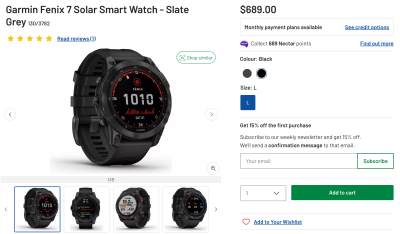
We could integrate the newsletter box on the most important pages, right next to the pricing of a product, prompting them to subscribe to get 10–15% off the first purchase.
What About That eCommerce Retailer?
Of course, what has worked for one company might not work for you, so it’s probably a good idea to try out all these options and see what actually works best.
In the case of the eCommerce retailer, integrating the newsletter box next to the price and making the newsletter pop-up a collapsible nonmodal dialog worked best. This change didn’t produce as many leads as the initial pop-up, but the leads were much better in quality and longevity.
We need to give users a chance to develop trust towards the brand. This requires a more humble approach and a more patient team, but the results might be significantly better, with customers coming back and giving a company exactly what it has always wanted.
Meet Smart Interface Design Patterns
If you are interested in similar insights around UX, take a look at Smart Interface Design Patterns, a 6h-video course with 100s of practical examples. 6h of video content on everything from accordions and dropdowns to complex tables and intricate web forms — with 5 new segments added every year. Check a free preview.

100 design patterns & real-life
examples.
6h-video course + live UX training. Free preview.
(il vf)
